✝️ 🇺🇸 🇺🇦 Dave Burton Profile picture
Jan 8 7 tweets 3 min read Read on X
1/6> annmclan wrote, "but the oceans are already too hot for coral reefs🪸"

You've been lied to, Ann.

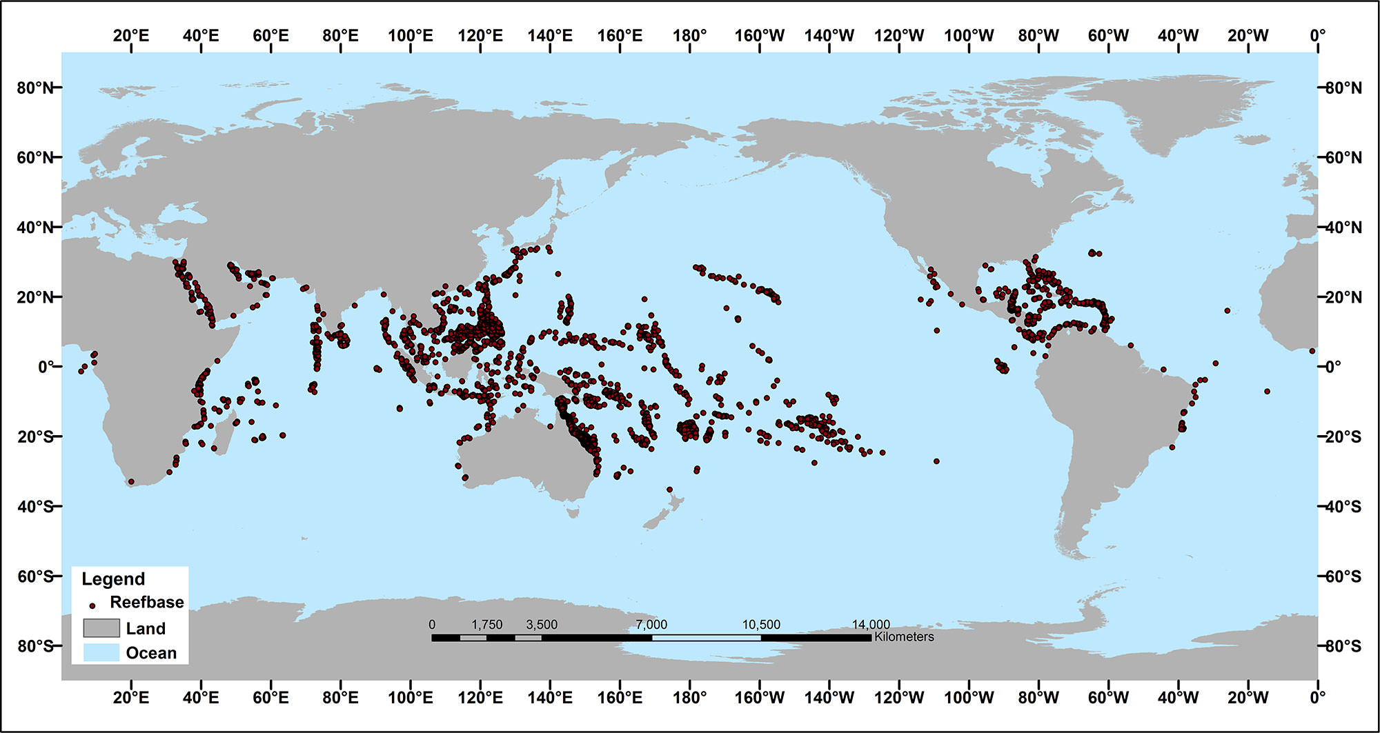
Most coral thrive best in the warmest water. If you look at a map of coral reef locations, you'll see that they're clustered around the equator:
sealevel.info/coralreefmap.j…Image
2/6> Even the very warm southern Red Sea is dotted with healthy coral reefs (unlike the cooler Mediterranean). Why do you think that is?

Some coral inhabit temperate zones, but most prefer tropics. In fact, where there are seasons, corals grow fastest in summer.

In fact, where there are seasons, corals are commonly dated like trees, by "coring" them, and examining the growth rings. The thick rings represent summers, because that's when the coral grows fastest.
@annmclan @Kenneth72712993 @RoelofBoer @Mark_A_Lunn @Willard1951 @GneissName @gazpacho_now @KCTaz @ShroedingerBird @priscian @AristotleMrs @Veritatem2021 @FD2you @DawnTJ90 @BradPKeyes @Callan23474387 @0Sundance @TheDisproof @BointonGiles @DoesThisW0rk @3GHtweets @Climatehope2 @Jaisans @S_D_Mannix @TWTThisIsNow @JustThi30117912 @paulp1232 @MartinJBern @Data79504085 @ammocrypta @ChrisBBacon3 @EthonRaptor @B_Bolshevik100 @rosmadiwahab @Robert76907841 @Anvndarnamn5 @EricWil06256732 @ProfMickWilson @FillmoreWhite @TommyLambertOKC @JohnDublin10 @NoTricksZone @DawnJT90 @DawnTj9 @PeterDClack @FriendsOScience @wattsupwiththat @AlexEpstein 3/6> At 7:20 in this BBC video you can hear how wonderfully healthy the coral are in warmest part of the very warm southern Red Sea, off Eritrea.
4/6> Of course the world's largest coral reef is Australia's Great Barrier Reef. Contrary to what you might have heard, it is healthy.

Moreover, it's about 20 million years old, and it has withstood CO2 levels both much higher and much lower, and temperatures both substantially warmer and much colder, and water levels both higher and much lower, than present. We needn't worry that a degree or two of anthropogenic warming will destroy it.
5/6> Coral reefs are highly resilient ecosystems, with almost 800 identified species of reef-building coral, and highly mobile larval polyps (planulae). Claims that coral reefs are changed by slight differences in water temperature are based on "lab tests," which artificially eliminate that mobility, and hence that resiliency. In other words, they're "junk science."
@annmclan @Kenneth72712993 @RoelofBoer @Mark_A_Lunn @Willard1951 @GneissName @gazpacho_now @KCTaz @ShroedingerBird @priscian @AristotleMrs @Veritatem2021 @FD2you @DawnTJ90 @BradPKeyes @Callan23474387 @0Sundance @TheDisproof @BointonGiles @DoesThisW0rk @3GHtweets @Climatehope2 @Jaisans @S_D_Mannix @TWTThisIsNow @JustThi30117912 @paulp1232 @MartinJBern @Data79504085 @ammocrypta @ChrisBBacon3 @EthonRaptor @B_Bolshevik100 @rosmadiwahab @Robert76907841 @Anvndarnamn5 @EricWil06256732 @ProfMickWilson @FillmoreWhite @TommyLambertOKC @JohnDublin10 @NoTricksZone @DawnJT90 @DawnTj9 @PeterDClack @FriendsOScience @wattsupwiththat @AlexEpstein 6/6> If you want to learn more about the GBR, the go-to experts are Australian Drs. Jennifer Marohasy and Peter Ridd. Here's a wonderfully informative lecture by Dr. Ridd:
@annmclan @Kenneth72712993 @RoelofBoer @Mark_A_Lunn @Willard1951 @GneissName @gazpacho_now @KCTaz @ShroedingerBird @priscian @AristotleMrs @Veritatem2021 @FD2you @DawnTJ90 @BradPKeyes @Callan23474387 @0Sundance @TheDisproof @BointonGiles @DoesThisW0rk @3GHtweets @Climatehope2 @Jaisans @S_D_Mannix @TWTThisIsNow @JustThi30117912 @paulp1232 @MartinJBern @Data79504085 @ammocrypta @ChrisBBacon3 @EthonRaptor @B_Bolshevik100 @rosmadiwahab @Robert76907841 @Anvndarnamn5 @EricWil06256732 @ProfMickWilson @FillmoreWhite @TommyLambertOKC @JohnDublin10 @NoTricksZone @DawnJT90 @DawnTj9 @PeterDClack @FriendsOScience Compilation:


@ThreadReaderApp @Rattibha @threaddotblue unroll

@reSeeIt save threadtwitter-thread.com/t/174447846168…

• • •

Missing some Tweet in this thread? You can try to force a refresh
 

Keep Current with ✝️ 🇺🇸 🇺🇦 Dave Burton

✝️ 🇺🇸 🇺🇦 Dave Burton Profile picture

Stay in touch and get notified when new unrolls are available from this author!

Read all threads

This Thread may be Removed Anytime!

PDF

Twitter may remove this content at anytime! Save it as PDF for later use!

Try unrolling a thread yourself!

how to unroll video
  1. Follow @ThreadReaderApp to mention us!

  2. From a Twitter thread mention us with a keyword "unroll"
@threadreaderapp unroll

Practice here first or read more on our help page!

More from @ncdave4life

Jan 6
1/8》
The temperature indexes are inconsistent, but you can't tell that from Priscian's misleading graph.

An honest graph would offset the traces so you can tell them apart, or else start them at the same temp. Instead he aligned the full-period averages, to hide the spread.

Here's what he's hiding:


What Jim Java / Priscian doesn't want you to notice is that the GISS (and Berkeley Earth, etc.) surface temperature indexes show much more warming than the UAH and NOAA STAR satellite-based lower troposphere measurements.

Land "surface" measurements are air temperatures measured with thermometers in Stevenson screens, usually 1.25 to 2 meters above ground. Satellite "lower troposphere" indexes (UAH, NOAA STAR, RSS) are from higher altitudes. Due to "lapse rate feedback," the (higher) altitudes where satellites measure temperatures should  see a slightly greater  warming trend than is seen 1.25 to 2 meters above the surface. Instead, they see less.


That's good cause to suspect that the surface temperature indexes from GISS etc. overstate warming.woodfortrees.org/plot/gistemp/f…
sealevel.info/GISS_vs_UAH_an…
sealevel.info/feedbacks.html…Image
2/8》
Do the math: 0.92 / 0.59 = 1.56

So, UAH6 & NOAA STAR satellite-based measurements suggest that those high-end surface temperature indexes are reporting at least 56% too much warming.

But even if it is exaggerated, the warming isn't worrisome. After all, humans are a tropical species, and most of the Earth is much too cold.


Warming saves lives, and excess cold causes many times more human deaths than excess heat — even in tropical counties, believe it or not! Here are some recent papers about it:

1. Masselot et al (2023).


2. Gasparrini et al (2022).

Composite of two figures from the paper:


3. Zhao et al (2021).

Discussion:

Summary:


4. Gasparrini et al (2015).

Fig. 2:


Are you familiar with the term "climate optimum?" If you go to ResearchGate or Google Scholar, and search for "Climate Optimum" (or Eemian Optimum, Mid-Holocene Optimum, Roman Optimum, or Medieval Optimum), you'll find thousands of papers using that terminology. Those "optimums" were warm periods.


The reason so many academic papers call the warmest periods in history "climate optimums" is that there is a consensus among historians and scientists that those warm "climate optimums" — including periods warmer than now — were, by all objective measures, better than colder periods.

Or, look at the flip side: cold periods, like the Dark Ages Cold Period (DACP) and the Little Ice Age (LIA). There's a broad consensus that those cold periods were, by all objective measures, worse for humanity than the warm "optimums."


Here's a 1974 CIA study about the threat of global cooling:


This graph from that study shows how cooling temperatures threaten food supplies:


There are no important negative impacts from anthropogenic warming.sealevel.info/GasparriniFig2…
thelancet.com/journals/lanpl…
sealevel.info/GasparriniFig2…
thelancet.com/journals/lanpl…
unherd.com/thepost/bjorn-…
sealevel.info/Zhao2021_Lance…
thelancet.com/journals/lanpl…
sealevel.info/Gasparrini2015…
scholar.google.com/scholar?as_sdt…
scholar.google.com/scholar?as_yhi…
sealevel.info/CIA1974Climate…
sealevel.info/CIA1974Climate…Image
3/8》
Depending on whose temperature index you use, we’ve seen an average of between 0.59 and 0.92 °C of warming since 1958 (when Mauna Loa CO2 measurements began).


That warming has shifted growing zones and “temperature isotherms” slightly toward the poles (northward, in the NH). So, the obvious question is, how far?

That’s easy to answer, by looking at an agricultural growing zone map. Here's one, shared by permission from the Arbor Day Foundation:


From eyeballing the map, you can see that 1°C (1.8°F) = about 50-70 miles latitude change.

Here's James Hansen and his GISS colleagues reporting a similar figure:

Excerpt: "A warming of 0.5°C... implies typically a poleward shift of isotherms by 50 to 75 km..."

That's 100 to 150 km = 62 to 93 miles per 1°C. So, the 0.59 to 0.92 °C of warming which we've seen has caused, on average, a growing zone shift of only about 30 to 86 miles). Ho hum.🥱woodfortrees.org/plot/gistemp/f…
sealevel.info/GISS_vs_UAH_an…
sealevel.info/2015_zones_hig…
pubs.giss.nasa.gov/abs/ha02700w.h…Image
Read 9 tweets
Dec 26, 2023
1/3. MunichRe is not just an insurance company. It's the giant German reinsurance company which bankrolls Rahmstorf and Potsdam Institute (PIK). They're among the worst and most extreme promoters of crackpot climate alarmism, just short of XR.


investors.com/politics/edito…
rogerpielkejr.substack.com/p/2023-update-…
Image
2/3. Hyping climate alarmism is a business strategy for MunichRe, because they realized climate alarmism is good for their business. When people expect worsening disasters, they're willing to pay more for reinsurance.


They're using a updated version of the old "FUD" marketing strategy.
sealevel.info/rahmstorf/
google.com/search?q=defin…
3/3. Do you know where the "extreme weather" nonsense came from? Not from evidence, but from James Hansen's epic confusion.

Somehow he avoided learning about Arctic Amplification. He thought AGW would warm the tropics MORE than high latitudes.


That's a clip of Hansen on Letterman, explaining it. Hansen claimed that the “increasing temperature gradient” [between high & low latitudes] would "drive stronger storms.”

That's just plain wrong. The temperature gradient is DECREASING, not increasing.

You see, "global warming" isn't really very global. Thanks to stronger-than-linear negative feedbacks, such as Planck cooling, warm climates are more stable than cold climates. So AGW disproportionately warms chilly high latitudes. The tropics are affected much less (which is nice, because the tropics are warm enough already).


Hansen wrote a ridiculous book based on his confusion, and did a whirlwind publicity tour, pitching the book & spreading the claim that AGW will cause worsening storms / weather. (That's why he was on Letterman.)


Nearly all climate scientists know that's wrong, but none of them challenged him. Nearly everyone in the climate biz (maybe even Hansen, by now), has heard of Arctic Amplification, but the climate industry is so corrupt that neither Hansen's colleagues nor anyone else in the industry corrected his error.
sealevel.info/feedbacks.html…
amazon.com/Storms-My-Gran…
Read 4 tweets
Nov 17, 2023
1/18.
Zoya Teirstein @zteirstein, please stop spreading climate disinformation. Climate propaganda is killing people. Do you care?

There are NO "climate sensitive diseases." That's unscientific marketing FUD, from the parasitic climate industry.

2/18.
Lyme disease was first identified in chilly Lyme, CT. Rocky Mountain Spotted Fever was first found in frigid Idaho & Montana. Both spread SOUTH — obviously NOT due to global WARMING.
Like every other climate scare, this one is a lie.


There's no evidence at all that climate change is spreading ticks and the diseases they carry, or any other disease. One degree of warming is equivalent to just 50-70 miles latitude change — completely trivial compared to tick ranges.
@zteirstein 3/18.
Here's a tweetstorm where you can learn many things about CO2 and climate that Grist and the rest of the Climate Industry will never tell you.
Read 19 tweets
Nov 15, 2023
1/5》 Do the math, Martin!

WMO estimates a total of 1.15 ±0.13°C of warming since "preindustrial" (late LIA).

At most  80% of human GHG forcing was from CO2, so even if ALL  the warming was from GHG emissions, 1.15°C means at most 0.92°C was from CO2.


Here's the WMO reference:


NCA4 gives a similar figure (1.14 ±0.13°C).

(Aside: those confidence intervals are, IMO, overly confident.)

Here are estimates for the percentage of warming due to CO2.

AR6:


NOAA's AGGI (compare heights at the right edge):


Myhre 1998:


AMS (compare the numbers in the "Rad. Forcing" column):


Kiehl & Trenberth 1997:
google.com/search?q=1.15+…
2/5》 If we got at most  0.92°C of warming from 58% of the forcing of a full doubling of CO2, then (at most) how much warming we could get from a full doubling of CO2?

Ask google:
google.com/search?q=0.92+…
3/5》 Those figures are very conventional estimates, widely accepted by climate alarmists. Yet those same climate alarmists believe that TCR climate sensitivity is 1.5 to 2.0°C/doubling of CO2, and ECS is about 3.0°C/doubling of CO2.

Read 6 tweets
Nov 6, 2023
1/10. Where on earth do you "learn" such nonsense, Willard?

Growing ranges for most major crops cover climate zones with average temperatures that vary by tens of °C. Major crops like corn, wheat, potatoes & soybeans are produced from Mexico to Canada.

Compared to that, a degree or two of warming (disproportionately at night, in winter, at chilly high latitudes) is de minimis -- as is the 0.35±0.13°C between now and what the IPCC calls "1.5°C of warming").
Image
2/10. Willard wrote, "fertilization is the male gamete to female gamete to produce seed/fruit... not the N-P-K addition"

Wrong. In agriculture, that's called pollination.
3/10. Willard wrote, "(yes, it is often temperature sensitive)"

Wrong. Farmers choose planting dates to optimize growing conditions, including temperatures, for their crops.

Read 12 tweets
Nov 2, 2023
1/7. The only trace on that graph which does not show large improvement in cereal yield per hectare is the trace for Niger.

The graph ended with an anomalously bad crop year for cereals in Niger (2021). Fortunately, 2022 was much better; here's an article
worldbank.org/en/news/press-…
2/7. By displaying high productivity countries like the USA along with Niger, you forced OurWorldInData to scale the graphs so that it's hard to see the trend in Niger.

But if you display Niger alone, as I've done here, you'll see that cereal yields declined there until about thirty years ago, but they've improved since then (except for 2021).

Image
@Willard1951 @JimBlack48 @BlasphemousBan1 @S_Metzeler @Anvndarnamn5 @GAJAJW @RClausius42 @Data79504085 @BenKoby1911 @priscian @EthonRaptor @Michael_D_Crow @Mark_A_Lunn @NomadicQuantum @AristotleMrs @ScienceBlog3 @AuroriaEn @AndreGrossza @DenisDaly @Veritatem2021 @JusticeTrudeau @judgementalbe1 @ChrisBBacon3 @Coleski14 @wallytoms0 @Climatehope2 @LesserMegadeath @WernerReinhard5 @S_D_Mannix @ammocrypta @Jaisans @CarrudoDon @LiveLifeBK24 @TheDisproof @Joeyd87745119 @Devonian1342 @Hji45519156 @waxliberty @SuperFoxyLoxy @JaapTitulaer @wjack76995 @Rocky35418823 @NobaconEgbert @balls95652097 @JustThi30117912 @BointonGiles @SeekerTheGreat1 @ubique60 @DaleGribble_666 3/7. The other major staple crop in Niger is cassava. Its yields have improved considerably.
sealevel.info/Niger_Cassava_…
Image
Read 8 tweets

Did Thread Reader help you today?

Support us! We are indie developers!


This site is made by just two indie developers on a laptop doing marketing, support and development! Read more about the story.

Become a Premium Member ($3/month or $30/year) and get exclusive features!

Become Premium

Don't want to be a Premium member but still want to support us?

Make a small donation by buying us coffee ($5) or help with server cost ($10)

Donate via Paypal

Or Donate anonymously using crypto!

Ethereum

0xfe58350B80634f60Fa6Dc149a72b4DFbc17D341E copy

Bitcoin

3ATGMxNzCUFzxpMCHL5sWSt4DVtS8UqXpi copy

Thank you for your support!

Follow Us!

:(