A brief history of your favourite fonts... 

1. Aptos
First Times New Roman, then Calibri... and now Aptos has become the standard font on Microsoft Office.
Created in 2021, it was — like so many other fonts ever since — inspired by the legendary Helvetica.
But how long will it last as the world's default font?
First Times New Roman, then Calibri... and now Aptos has become the standard font on Microsoft Office.
Created in 2021, it was — like so many other fonts ever since — inspired by the legendary Helvetica.
But how long will it last as the world's default font?

2. Times New Roman
Commissioned by The Times newspaper in Britain in 1931 as an update to the "spindly" 19th century typeface they used at the time.
This more solid design actually harks back to Italian typefaces of the 16th century.
The ultimate serif font.
Commissioned by The Times newspaper in Britain in 1931 as an update to the "spindly" 19th century typeface they used at the time.
This more solid design actually harks back to Italian typefaces of the 16th century.
The ultimate serif font.

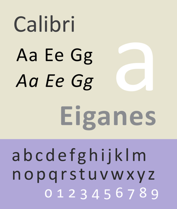
3. Calibri
A baby in the world of fonts, Calibri was only developed in the early 2000s. But, after being made the default font for all Microsoft programmes in 2007, it fast became a force to be reckoned with.
Modern, simplified, "warm"... but rather sterile.
Will it be missed?
A baby in the world of fonts, Calibri was only developed in the early 2000s. But, after being made the default font for all Microsoft programmes in 2007, it fast became a force to be reckoned with.
Modern, simplified, "warm"... but rather sterile.
Will it be missed?
4. Papyrus
An infamous font with humble origins. Graphic designer Chris Costello created Papyrus over six months in 1982 — he wanted to imagine what English letters would have looked like on 2,000 year old Egyptian papyrus.
Unusual, distinctive, legendary, controversial.
An infamous font with humble origins. Graphic designer Chris Costello created Papyrus over six months in 1982 — he wanted to imagine what English letters would have looked like on 2,000 year old Egyptian papyrus.
Unusual, distinctive, legendary, controversial.


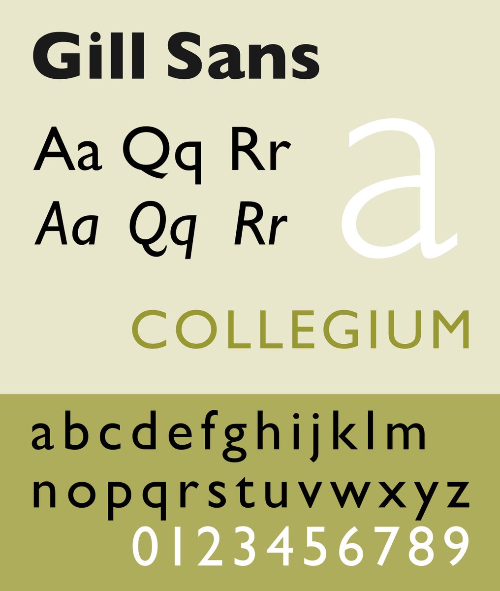
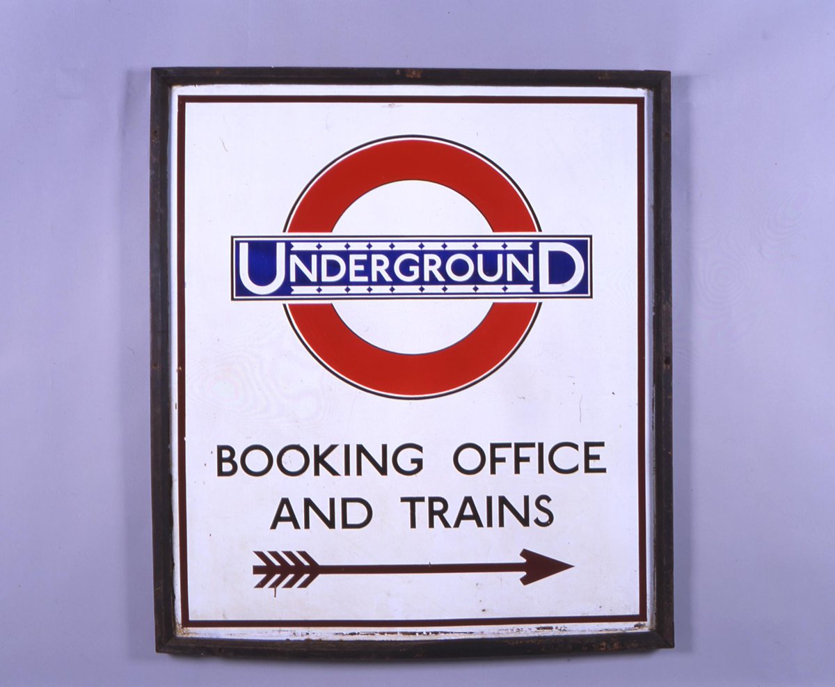
5. Gill Sans
The ultimate British font. Designed by Eric Gill in 1926 and based on the "underground alphabet" created by Edward Johnston for signs on the London Underground.
Penguin Books and LNER both famously use Gill Sans.
Stylish, easy to read, simple but sophisticated.
The ultimate British font. Designed by Eric Gill in 1926 and based on the "underground alphabet" created by Edward Johnston for signs on the London Underground.
Penguin Books and LNER both famously use Gill Sans.
Stylish, easy to read, simple but sophisticated.
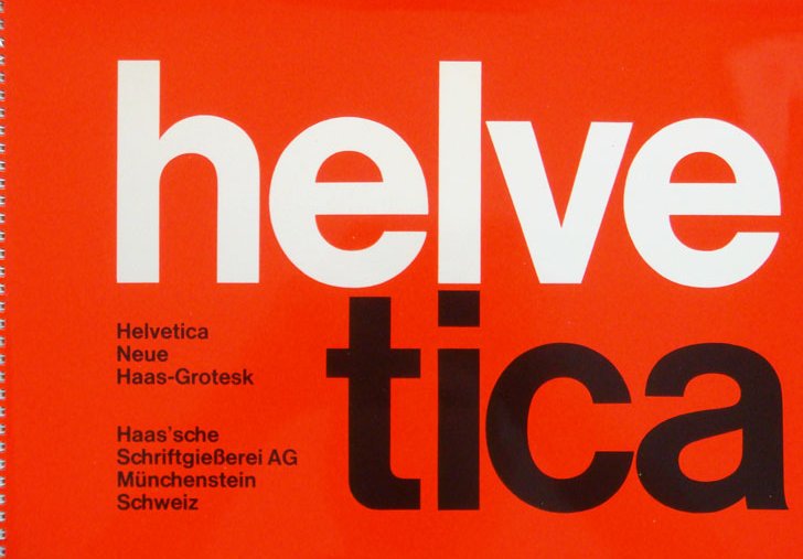
6. Helvetica
The ultimate modern font, created by Swiss designers in 1957 who wanted to produce a neutral, "meaningless" typeface devoid of historical connotations.
Sleek, stylish, clean, ubiquitous, and astonishingly influential — Arial is but one of many imitators.
The ultimate modern font, created by Swiss designers in 1957 who wanted to produce a neutral, "meaningless" typeface devoid of historical connotations.
Sleek, stylish, clean, ubiquitous, and astonishingly influential — Arial is but one of many imitators.
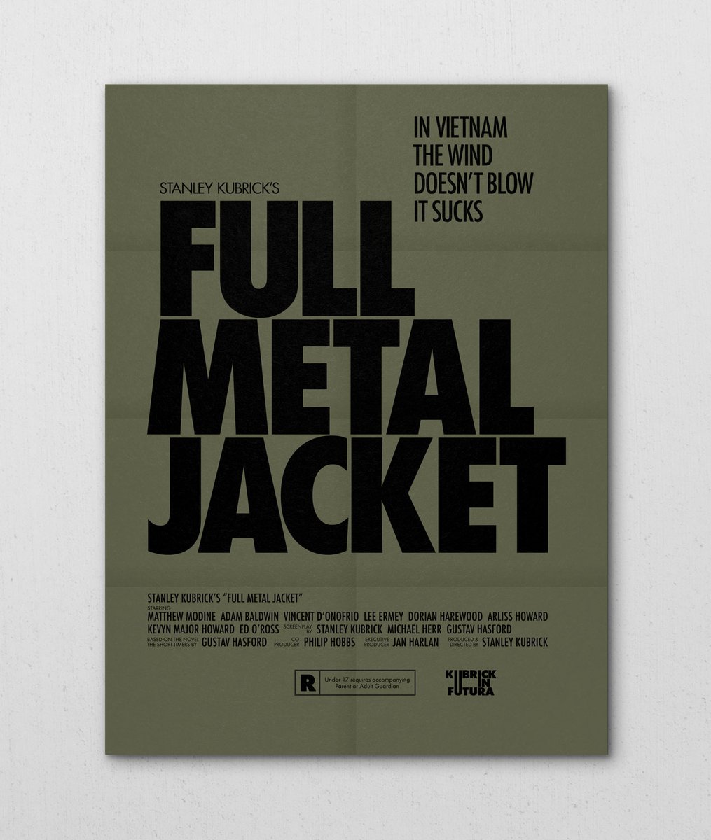
7. Futura
A 20th century typeface heavyweight: futuristic, imposing, & stylish.
Designed by Paul Renner in 1927 under the influence of ideas from the Bauhaus, and a hugely influential typeface in its own right.
Futura Bold was Stanely Kubrick's favourite font.
A 20th century typeface heavyweight: futuristic, imposing, & stylish.
Designed by Paul Renner in 1927 under the influence of ideas from the Bauhaus, and a hugely influential typeface in its own right.
Futura Bold was Stanely Kubrick's favourite font.

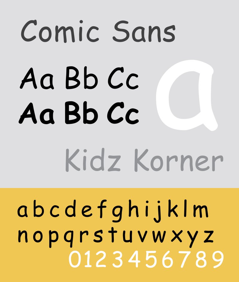
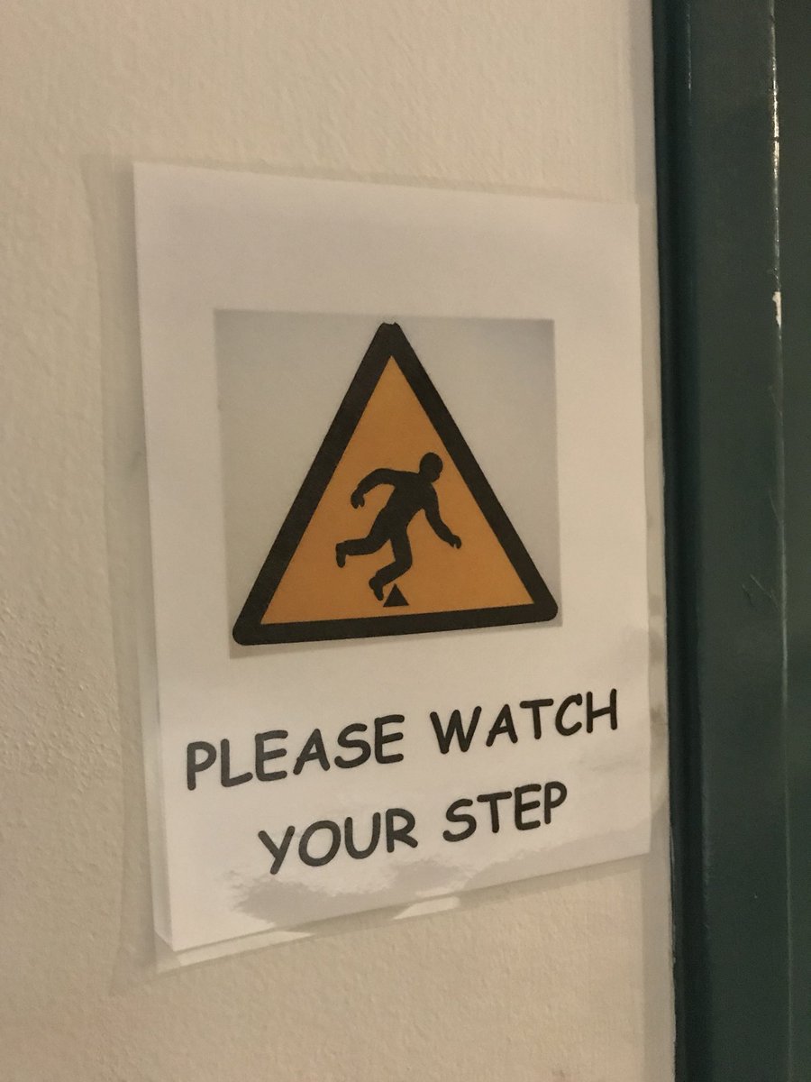
8. Comic Sans
Perhaps the most controversial typeface of all time.
Comic Sans was designed in 1994 by Vincent Connare, based on comic book speech bubbles, intended either for casual use or children's materials.
It's been around since Windows 95 and it's never going away.
Perhaps the most controversial typeface of all time.
Comic Sans was designed in 1994 by Vincent Connare, based on comic book speech bubbles, intended either for casual use or children's materials.
It's been around since Windows 95 and it's never going away.
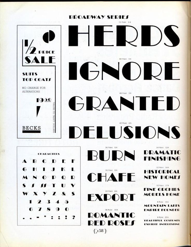
9. Broadway
Typically used to evoke the atmosphere and art of the 1920s... and its Art Deco vibe is authentic.
The highly-stylised and ever-popular Broadway typeface was designed in 1927 by none other than Morris Fuller Benton.
Perhaps a little overused, though?
Typically used to evoke the atmosphere and art of the 1920s... and its Art Deco vibe is authentic.
The highly-stylised and ever-popular Broadway typeface was designed in 1927 by none other than Morris Fuller Benton.
Perhaps a little overused, though?
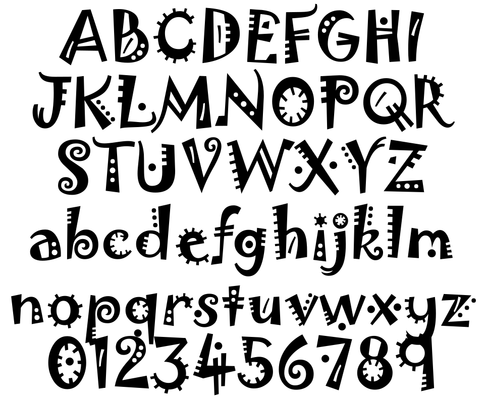
10. Jokerman
Yet another member of that exclusive group of peculiar, playful 1990s fonts which have somehow dominated the world ever since their creation.
Jokerman was designed in 1995 by Andrew Smith and named after a Bob Dylan song.
Yet another member of that exclusive group of peculiar, playful 1990s fonts which have somehow dominated the world ever since their creation.
Jokerman was designed in 1995 by Andrew Smith and named after a Bob Dylan song.
11. Rockwell
The most famous of the once-popular "slab serif" fonts, where the serifs are big and heavy... like slabs.
And Rockwell is older than you might think; it was created in 1934.
Somehow feels exciting and optimistic.
The most famous of the once-popular "slab serif" fonts, where the serifs are big and heavy... like slabs.
And Rockwell is older than you might think; it was created in 1934.
Somehow feels exciting and optimistic.

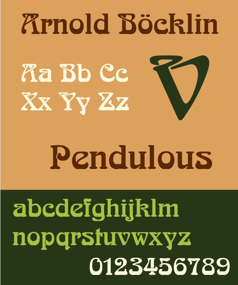
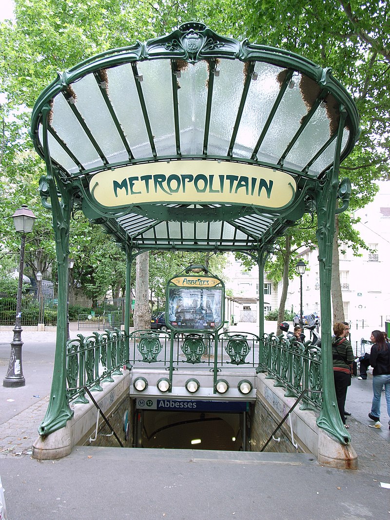
12. Arnold Böcklin
Designed by Otto Weisert in 1904 and named after the painter (most famous for "Isle of the Dead"), this might be the most evocative typeface ever created.
It oozes Art Nouveau, though it is *not* the same font used by Hector Guimard for his Paris Metro signs.
Designed by Otto Weisert in 1904 and named after the painter (most famous for "Isle of the Dead"), this might be the most evocative typeface ever created.
It oozes Art Nouveau, though it is *not* the same font used by Hector Guimard for his Paris Metro signs.
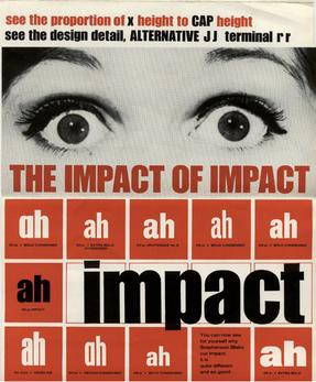
13. Impact
Designed by Geoffrey Lee in 1968 for publicity and advertising in Britain as an alternative to similar European typefaces.
Impact was included in Windows 98... and experienced a rather unexpected revival in the 21st century as the definitive font of choice for memes.
Designed by Geoffrey Lee in 1968 for publicity and advertising in Britain as an alternative to similar European typefaces.
Impact was included in Windows 98... and experienced a rather unexpected revival in the 21st century as the definitive font of choice for memes.
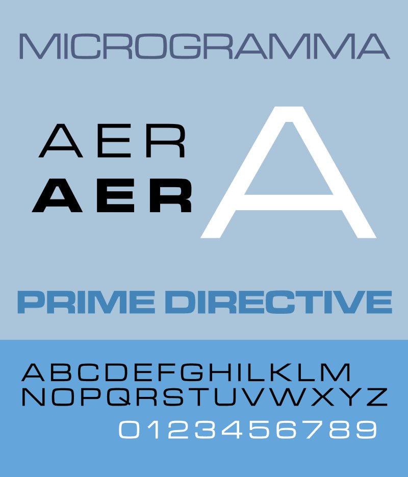
14. Microgramma
Designed by Aldo Novarese and Alessandro Butti (who also made the iconic Eurostile typeface) in 1952, Microgramma was all over graphic design in the second half of the 20th century.
Also popular in science fiction, particularly the Alien films and Star Trek.
Designed by Aldo Novarese and Alessandro Butti (who also made the iconic Eurostile typeface) in 1952, Microgramma was all over graphic design in the second half of the 20th century.
Also popular in science fiction, particularly the Alien films and Star Trek.
15. OCR-A
One of the first Computer Age typefaces, designed in 1966 to be readable both by humans and machines.
Although the real need for OCR-A has passed it lingers on in documentation and has even entered the world of graphic design because of its distinctiveness.
One of the first Computer Age typefaces, designed in 1966 to be readable both by humans and machines.
Although the real need for OCR-A has passed it lingers on in documentation and has even entered the world of graphic design because of its distinctiveness.

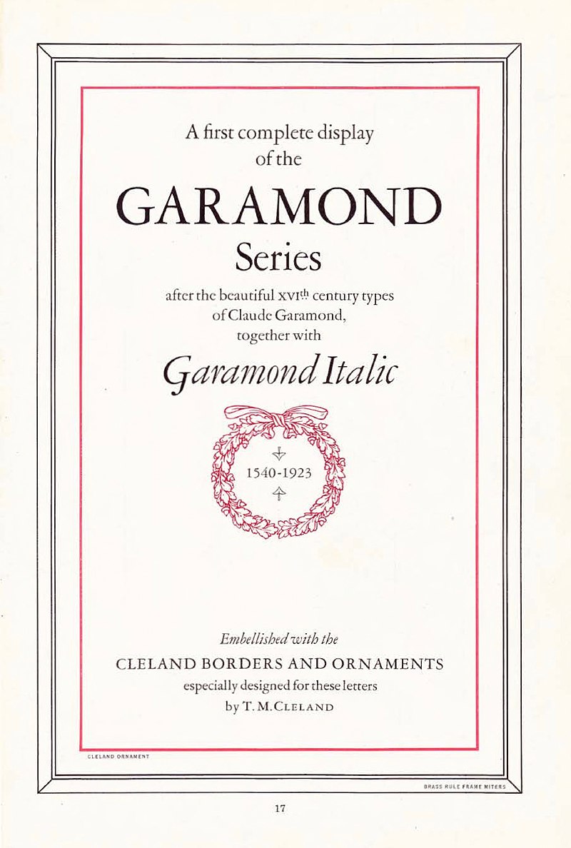
16. Garamond
One of the oldest fonts still in regular use. It was designed in the 1920s as a revived version of a typeface used by the 16th century French publisher Claude Garamond, though the original designer (or "punchcutter") was called Robert Granjon.
Renaissance revival.
One of the oldest fonts still in regular use. It was designed in the 1920s as a revived version of a typeface used by the 16th century French publisher Claude Garamond, though the original designer (or "punchcutter") was called Robert Granjon.
Renaissance revival.
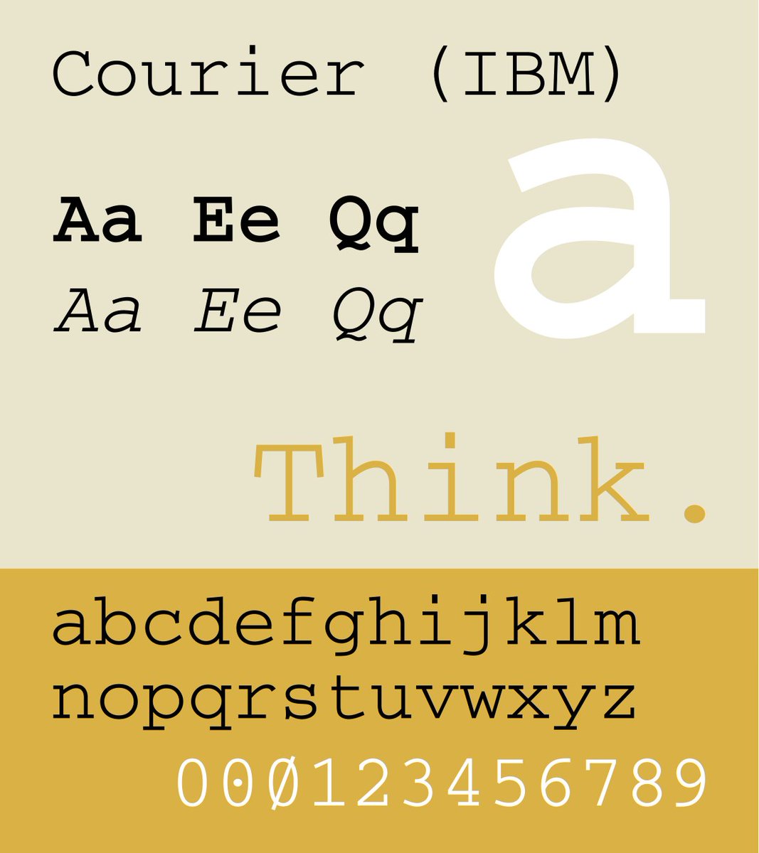
17. Courier New
Added to Windows 3.1 in 1992 as a digitised version of Courier, designed by Howard Kettler for IBM in 1956.
Though it is the classic "typewriter" font, associated with old documents, it has enjoyed a surprising renaissance thanks to its use in coding.
Added to Windows 3.1 in 1992 as a digitised version of Courier, designed by Howard Kettler for IBM in 1956.
Though it is the classic "typewriter" font, associated with old documents, it has enjoyed a surprising renaissance thanks to its use in coding.
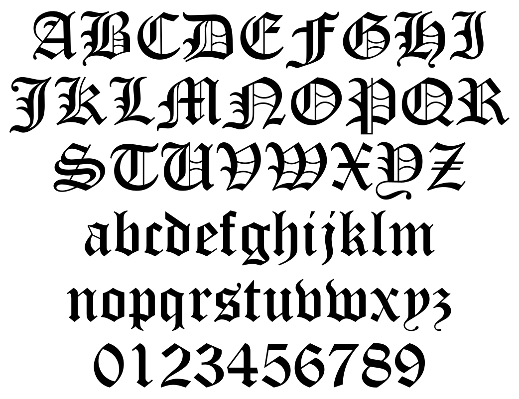
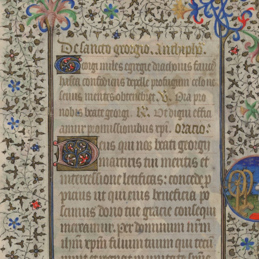
18. Old English
Despite its name, the so-called Old English typeface is really a modern reinterpration of the Blackletter style used when the printing press was first invented in the 1440s, itself based on the style of the hand-written manuscripts of Medieval monks.
Despite its name, the so-called Old English typeface is really a modern reinterpration of the Blackletter style used when the printing press was first invented in the 1440s, itself based on the style of the hand-written manuscripts of Medieval monks.
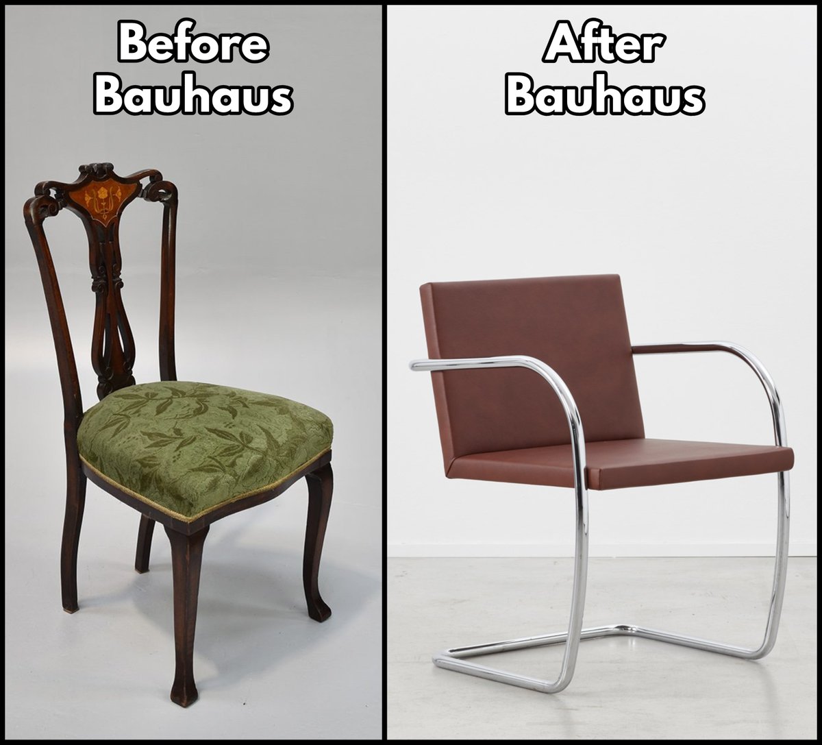
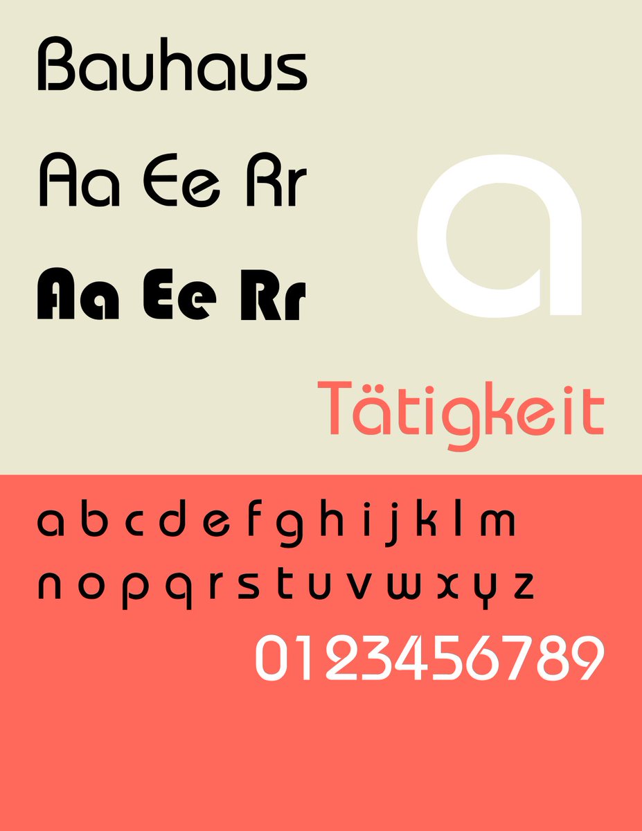
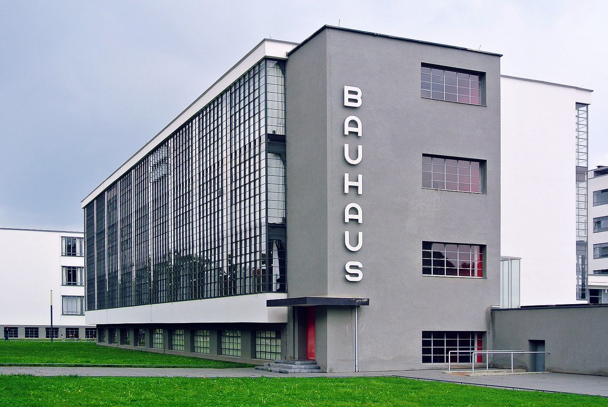
19. Bauhaus
Not actually created by the radical and incredibly influential Bauhaus design school, which flourished in Germany in the 1920s.
But it was based on an experimental "universal font" created for them by Herbert Bayer; the current digital interpretation is from 1993.
Not actually created by the radical and incredibly influential Bauhaus design school, which flourished in Germany in the 1920s.
But it was based on an experimental "universal font" created for them by Herbert Bayer; the current digital interpretation is from 1993.
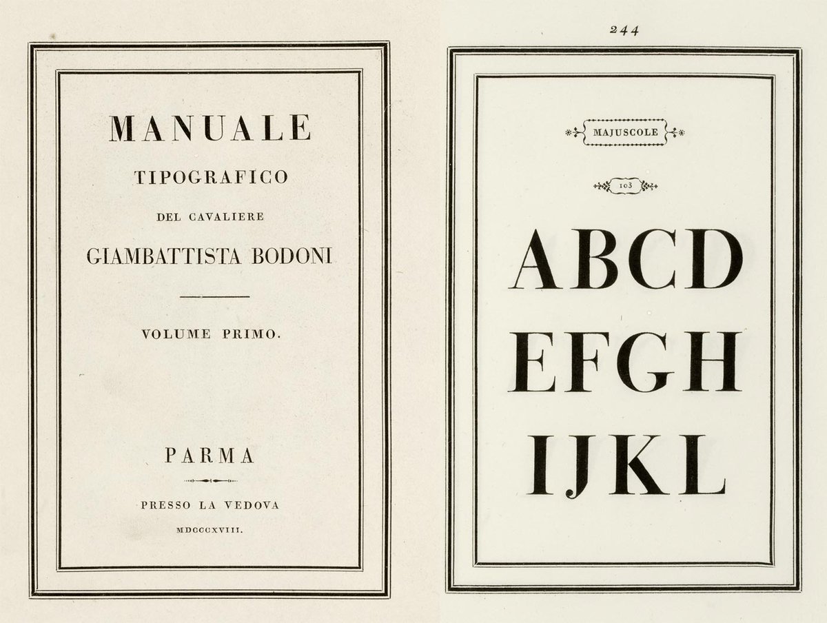
20. Bodoni
Designed by Giambattista Bodoni in the late 1700s, this font — with its extreme contrast between thick and thin strokes — takes us back to a different era of typefaces.
Though rather sophisticated, you can tell it wasn't designed for digital display.
Designed by Giambattista Bodoni in the late 1700s, this font — with its extreme contrast between thick and thin strokes — takes us back to a different era of typefaces.
Though rather sophisticated, you can tell it wasn't designed for digital display.
21. Bank Gothic
Created in the 1930s by Morris Fuller Benton, perhaps America's greatest ever typeface designer, Bank Gothic is more common than you think.
It's been used in everything from the facade of Arsenal's Emirates Stadium to the Grand Theft Auto games.
Created in the 1930s by Morris Fuller Benton, perhaps America's greatest ever typeface designer, Bank Gothic is more common than you think.
It's been used in everything from the facade of Arsenal's Emirates Stadium to the Grand Theft Auto games.

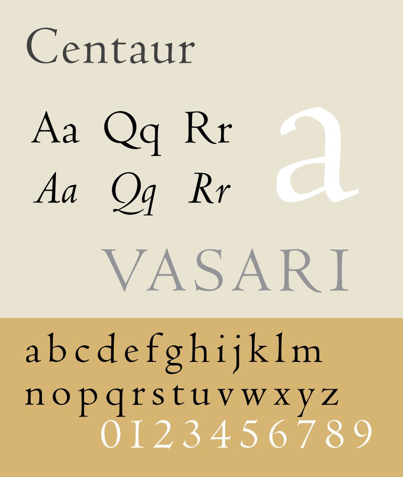
22. Centaur
An underrated font? Perfect for body text or heading, it was designed in 1914 by Bruce Rogers, based on a font used by the Venetian-based French printer Nicolas Jenson in the 1470s. The italic version is called Arrighi.
Always a classy choice.
An underrated font? Perfect for body text or heading, it was designed in 1914 by Bruce Rogers, based on a font used by the Venetian-based French printer Nicolas Jenson in the 1470s. The italic version is called Arrighi.
Always a classy choice.
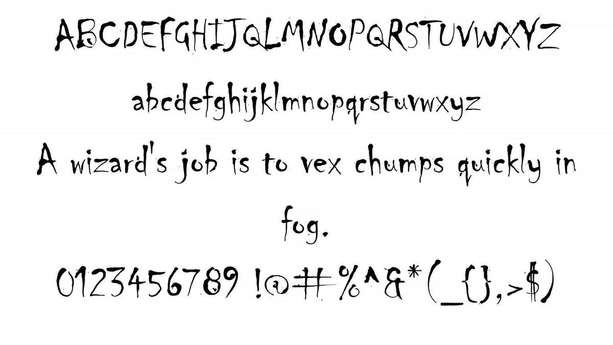
23. Chiller
Created by the same person as Jokerman, a British designer called Andrew Smith, in 1995.
It is the ultimate "scary" font and has been used in everything from film posters to video games.
Another member of that exclusive 1990s club, still going strong.
Created by the same person as Jokerman, a British designer called Andrew Smith, in 1995.
It is the ultimate "scary" font and has been used in everything from film posters to video games.
Another member of that exclusive 1990s club, still going strong.
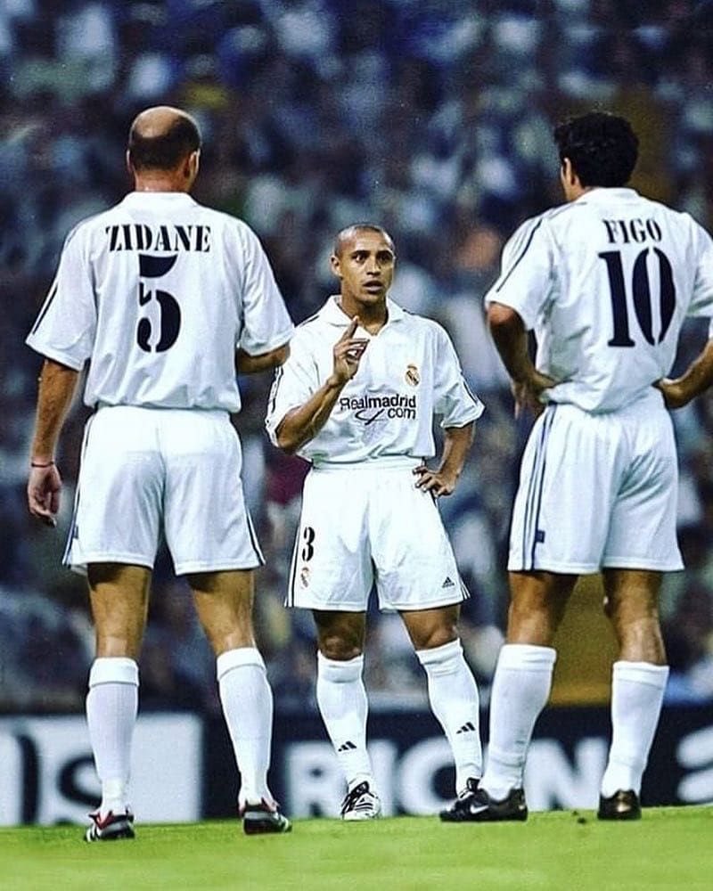
24. Stencil
Two typefaces, both called Stencil, were designed within a month of one another in 1937 by R. Hunter Middleton and Gerry Powell.
Usually associated with the American military, but also briefly used by Real Madrid...
Two typefaces, both called Stencil, were designed within a month of one another in 1937 by R. Hunter Middleton and Gerry Powell.
Usually associated with the American military, but also briefly used by Real Madrid...

• • •
Missing some Tweet in this thread? You can try to
force a refresh