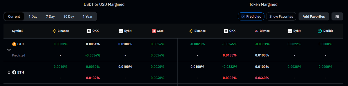
Heatmaps
Educational 🧵
If you like this type of content consider bookmarking and sharing.
1/20
Educational 🧵
If you like this type of content consider bookmarking and sharing.
1/20
Definition
A visual record of limit order history within the orderbook of a specific market.
It also shows, on the right hand side, the real time updated state of the orderbook.
2/20
A visual record of limit order history within the orderbook of a specific market.
It also shows, on the right hand side, the real time updated state of the orderbook.
2/20
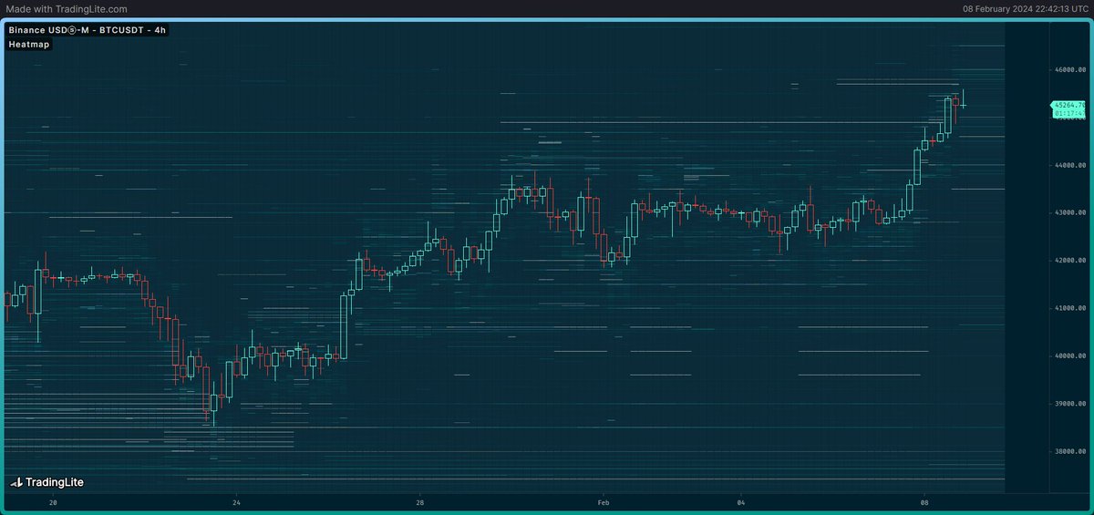
So it's pretty simple: it's a price chart with all of the limit order history slapped on top of it.
All of those bright lines are limit buy/sell orders. The intensity of the brightness indicates the size of the order, the brighter the bigger the size.
3/20
All of those bright lines are limit buy/sell orders. The intensity of the brightness indicates the size of the order, the brighter the bigger the size.
3/20

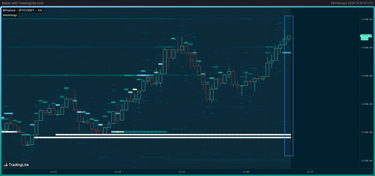
The right most "block" of data (highlighted in blue) is the current state of the orderbook, and everything on the left of it is historical data.
Keep in mind that all of the orders shown are limit orders, or "passive" orders.
4/20
Keep in mind that all of the orders shown are limit orders, or "passive" orders.
4/20
The platform that I use for heatmaps is called Tradinglite. I'm not affiliated with them, it's just what I use.
Added screenshot is a mini tutorial.
If you use my ref we both get some "XP" which allows us to extend our subscriptions:
5/20 tradinglite.com/join?ref=Byzan…
Added screenshot is a mini tutorial.
If you use my ref we both get some "XP" which allows us to extend our subscriptions:
5/20 tradinglite.com/join?ref=Byzan…
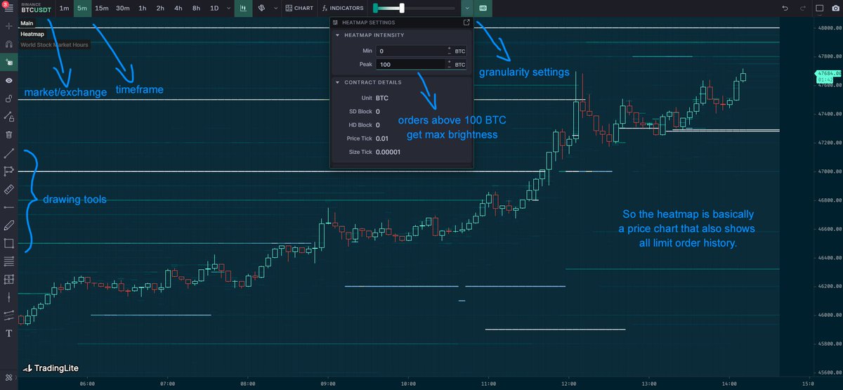
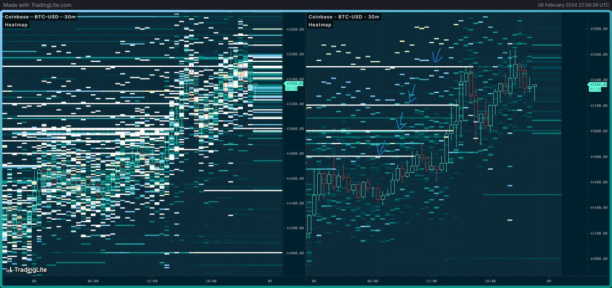
The first thing you'll have to experiment with is the granularity settings.
Here's an example of the same orderbook, but on the left it's unreadable, on the right it's very clear what the significant orders are.
Find the right settings for each market to remove noise.
6/20
Here's an example of the same orderbook, but on the left it's unreadable, on the right it's very clear what the significant orders are.
Find the right settings for each market to remove noise.
6/20
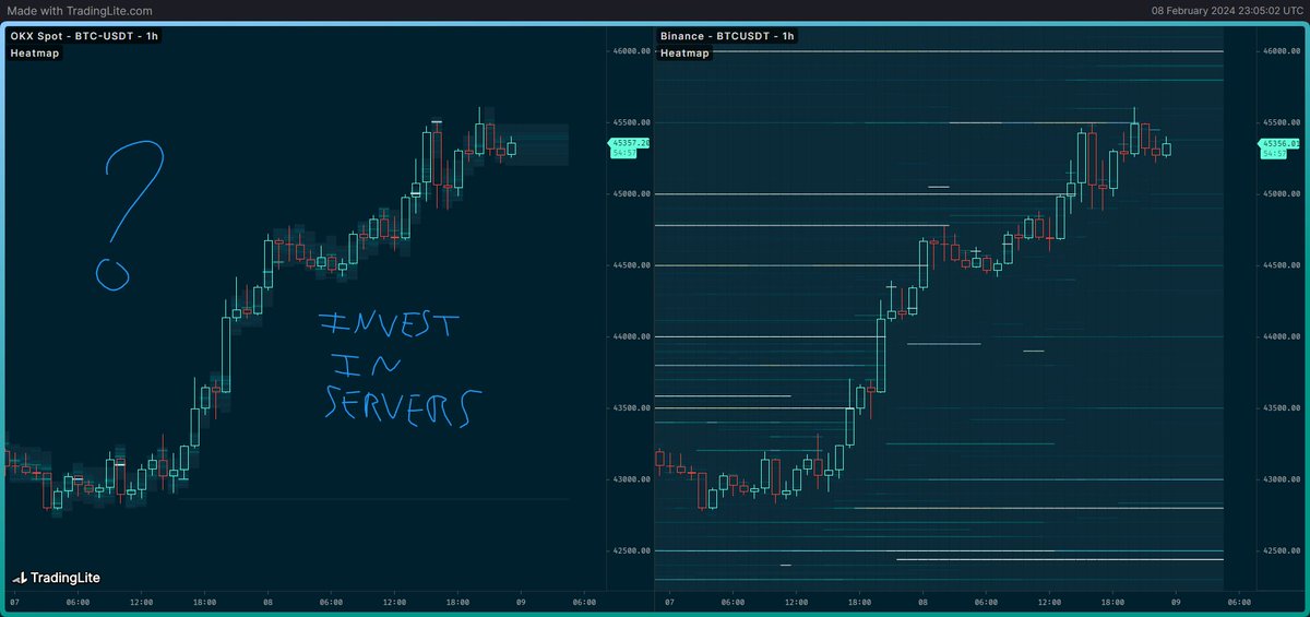
I'll tell you right now that it's not possible to get good heatmaps for every exchange, because some exchanges don't provide any orderbook depth to save on server costs.
Example of the same market, at the same time, for OKX on the left vs Binance on the right.
7/20
Example of the same market, at the same time, for OKX on the left vs Binance on the right.
7/20
So let's get into how we can actually use it for analysis.
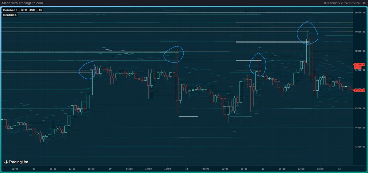
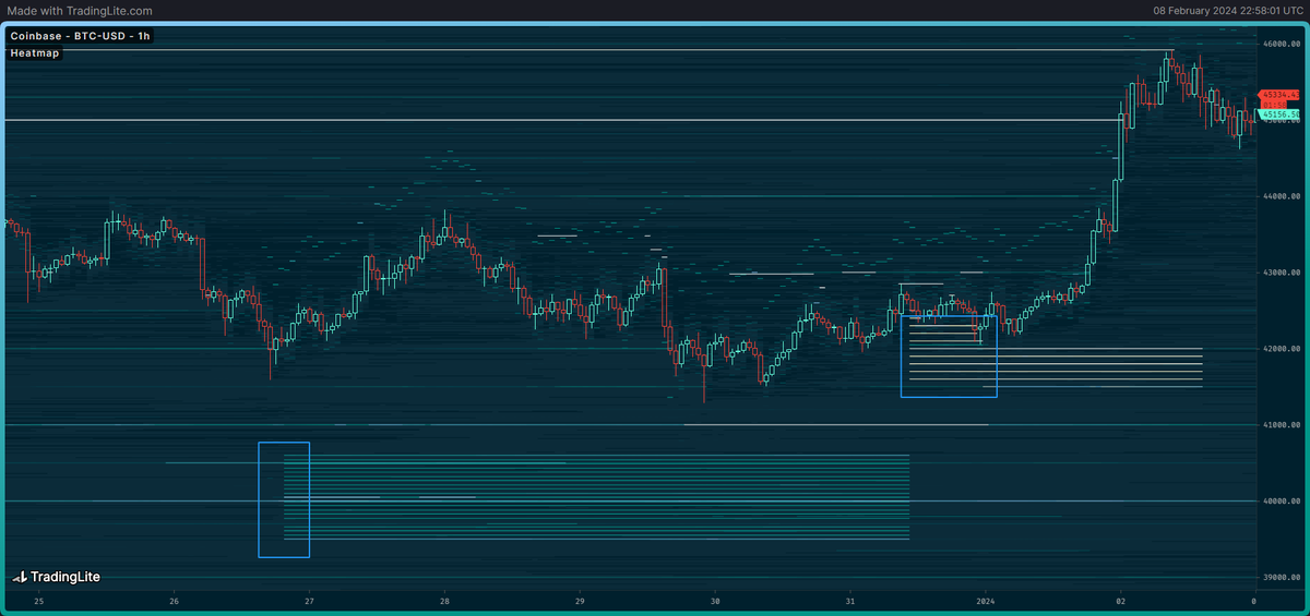
Spotting resistance/support levels.
In this example we can see that there were a bunch of limit sell orders sitting in the Coinbase BTC/USD OB and every time price hit those orders it rejected.
8/20
Spotting resistance/support levels.
In this example we can see that there were a bunch of limit sell orders sitting in the Coinbase BTC/USD OB and every time price hit those orders it rejected.
8/20
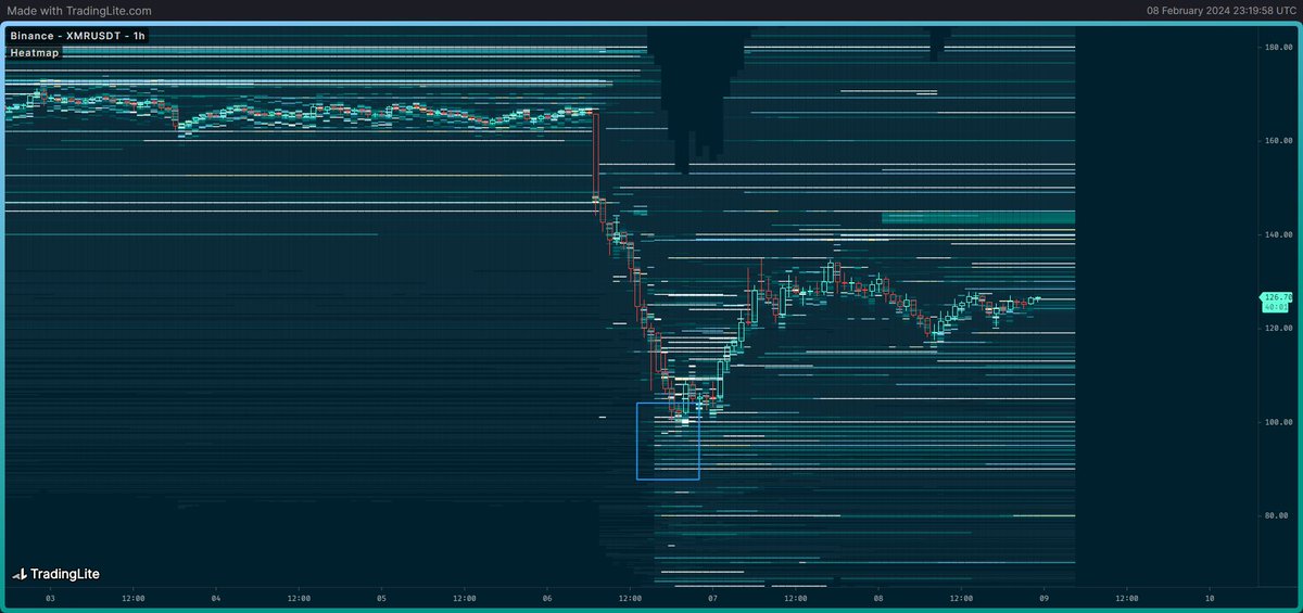
Here's a recent example of XMR when it went into free fall. Where did it bottom out? When it finally reached the massive amount of buy orders on the Binance spot market; no coincidence.
So clearly it can be useful to spot key supply/demand levels.
9/20
So clearly it can be useful to spot key supply/demand levels.
9/20
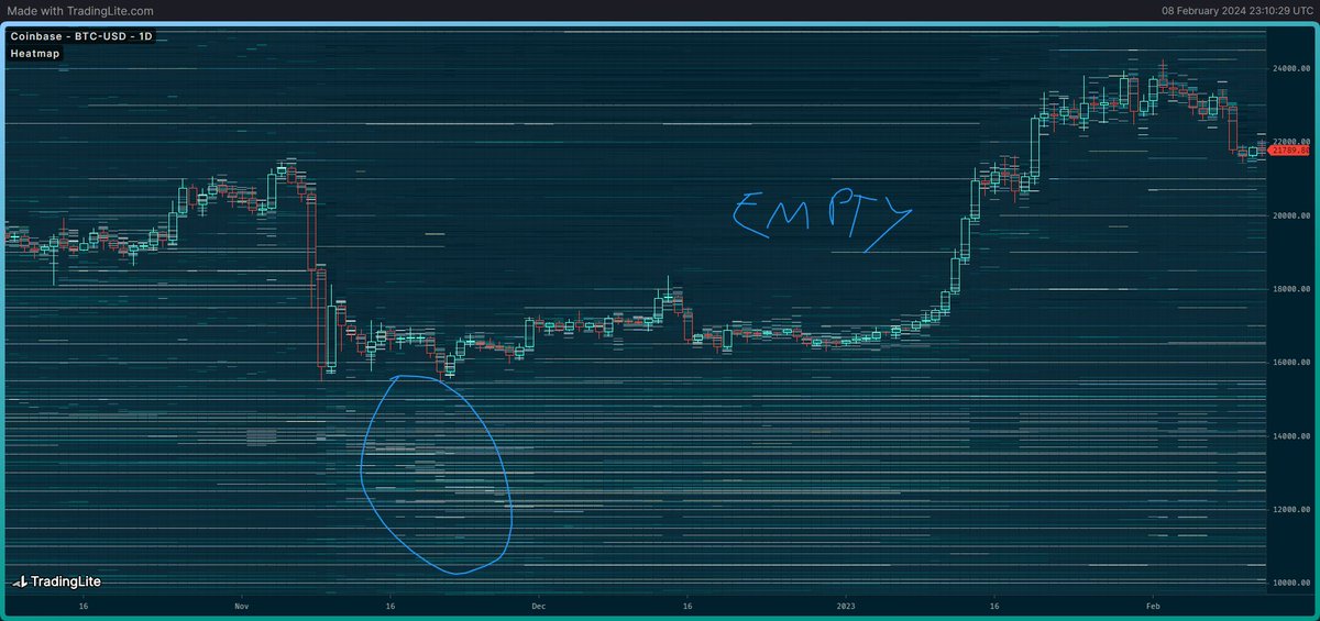
Just for fun, here's the daily heatmap of the BTC FTX bottom in 2022.
Look at the sheer amount of buy orders sitting there on the Coinbase spot market.
Meanwhile the sell side was completely empty because everyone had already capitulated.
10/20
Look at the sheer amount of buy orders sitting there on the Coinbase spot market.
Meanwhile the sell side was completely empty because everyone had already capitulated.
10/20
Heatmaps also allow you to see "limit chasing" in real time.
Here's an example of the market bidding TRX with big spot buy orders. Because there's so much chasing going on, a lot of orders don't even get filled and price continues to move higher, away from these orders.
11/20
Here's an example of the market bidding TRX with big spot buy orders. Because there's so much chasing going on, a lot of orders don't even get filled and price continues to move higher, away from these orders.
11/20
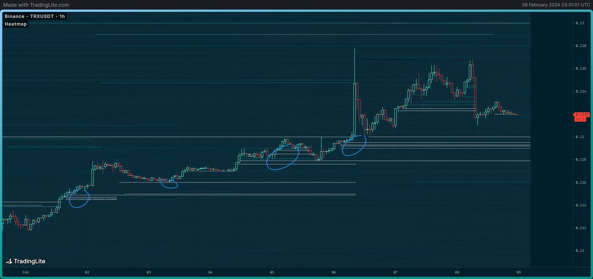
Of course orders can also get front run.
Example of a massive buy wall that couldn't get filled. It seems that this same entity cancelled their orders and moved them higher up. A few got filled but then price ran away anyway.
Have fun market buying buddy.
12/20
Example of a massive buy wall that couldn't get filled. It seems that this same entity cancelled their orders and moved them higher up. A few got filled but then price ran away anyway.
Have fun market buying buddy.
12/20
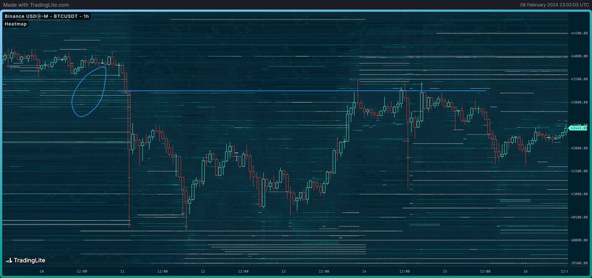
People who got bad entries tend to try to get out at break even. That's why you'll often see previous support turn into resistance and vice versa.
Here's such an example.
Where did price top out? The same level where that big buy wall got filled earlier.
13/20
Here's such an example.
Where did price top out? The same level where that big buy wall got filled earlier.
13/20
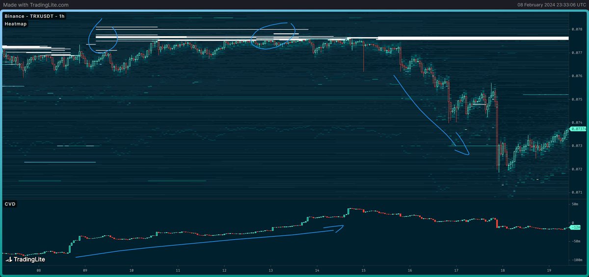
Heatmaps also give you the full picture on cumulative volume delta (CVD) data.
The CVD in this example was going up a lot so there's a lot of market buying, but price went sideways.
Why? The heatmap shows that there were massive amounts of passive sell orders.
14/20
The CVD in this example was going up a lot so there's a lot of market buying, but price went sideways.
Why? The heatmap shows that there were massive amounts of passive sell orders.
14/20

The CVD was deceiving in this instance. It looked like the market was bullish (market buying), but there were actually whales passively offloading a lot of spot.
The market got exhausted eventually and collapsed.
I'll elaborate more on CVD in another thread.
15/20
The market got exhausted eventually and collapsed.
I'll elaborate more on CVD in another thread.
15/20
Finally I want to highlight that different orders mean different things.
Some orders are just market making or algorithms, other orders are from directional traders.
With experience you'll be able to distinguish what order is what, but I'll give a quick tip.
16/20
Some orders are just market making or algorithms, other orders are from directional traders.
With experience you'll be able to distinguish what order is what, but I'll give a quick tip.
16/20

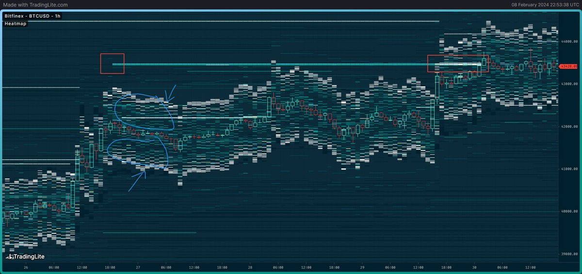
In this example on the Bitfinex BTC spot OB you can see a "band" of sorts with a net of orders (blue) closely following price non stop. Usually they're about the same size on each side.
These are market making orders and algorithms taking advantage of price anomalies.
17/20
These are market making orders and algorithms taking advantage of price anomalies.
17/20

Meanwhile those orders highlighted in red are clearly from actual traders looking to sell, because they popped up out of nowhere, at a specific price level, and they're not moving in tandem with price.
They probably just want to sell at that specific price (they did).
18/20
They probably just want to sell at that specific price (they did).
18/20
It's also important to understand that some markets are more important and have a bigger impact on price than others.
At the moment of writing the most important spot markets are Binance & Coinbase. For perps it's Binance & Bybit. This can change of course.
19/20
At the moment of writing the most important spot markets are Binance & Coinbase. For perps it's Binance & Bybit. This can change of course.
19/20
There are a lot more nuances and intricacies, but those were the basics.
Thanks for reading 🐯🧡
20/20
Thanks for reading 🐯🧡
20/20

• • •
Missing some Tweet in this thread? You can try to
force a refresh