These are eight slightly different versions of The Great Wave Off Kanagawa from eight different museums.
So which is the real one? That's the thing — they're all the real one.
Here's a brief history of art's most famous wave...
So which is the real one? That's the thing — they're all the real one.
Here's a brief history of art's most famous wave...

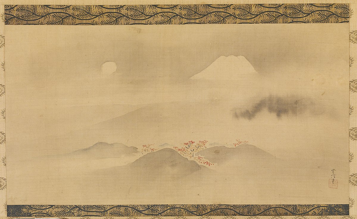
The Great Wave Off Kanagawa is part of a series called Thirty Six View of Mount Fuji, created in 1831 by Katsushika Hokusai.
And so it is only one of hundreds of fabulous designs produced by Hokusai.
Here are four more from that 1831 series.
And so it is only one of hundreds of fabulous designs produced by Hokusai.
Here are four more from that 1831 series.

And The Great Wave is not a painting — it's a woodblock print in a style called "ukiyo-e".
The artist would make an ink drawing on paper, to be pasted onto a wooden block and then engraved.
This engraving was used to print multiple copies of the original design.
The artist would make an ink drawing on paper, to be pasted onto a wooden block and then engraved.
This engraving was used to print multiple copies of the original design.

The roots of ukiyo-e are important.
Traditional Japanese art, heavily influenced by that of China, was never about pure "realism" in the same way as European art.
Rather, it sought to capture the essence of a place, the mood of a moment, almost like visual poetry.
Traditional Japanese art, heavily influenced by that of China, was never about pure "realism" in the same way as European art.
Rather, it sought to capture the essence of a place, the mood of a moment, almost like visual poetry.
And it could be startlingly minimalist, like the mysterious and dreamlike Pine Trees Screen by Hasegawa Tōhaku, from 1595.
Such art was usually monochromatic, painted with ink on silk — and notice how little of the screen is actually painted here.
Such art was usually monochromatic, painted with ink on silk — and notice how little of the screen is actually painted here.

Western technoques of perspective entered Japan via Dutch merchants in the 17th century.
But Japanese artists didn't imitate Western painting — they synthesised its methods with their own traditions.
Notice how Ōkyo uses vanishing point in his quasi-abstract Cracked Ice Screen:
But Japanese artists didn't imitate Western painting — they synthesised its methods with their own traditions.
Notice how Ōkyo uses vanishing point in his quasi-abstract Cracked Ice Screen:

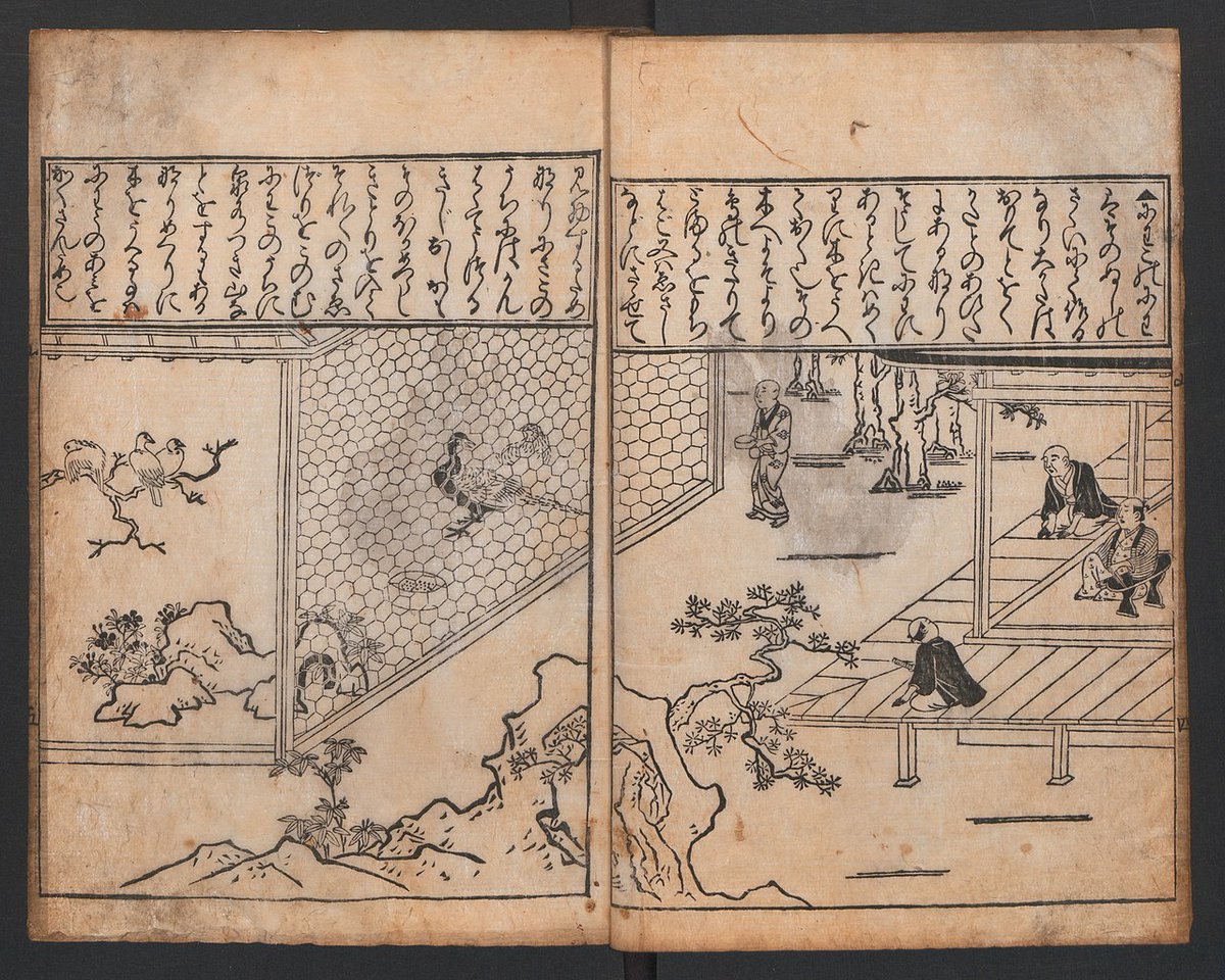
Hishikawa Moronobu was one of the first artists to develop what has become the highly distinctive ukiyo-e style.
He drew on these disparate themes — Chinese styles, traditional Japanese forms, Western methods — to create something new and cohesive in the 17th century:
He drew on these disparate themes — Chinese styles, traditional Japanese forms, Western methods — to create something new and cohesive in the 17th century:
Crucial about ukiyo-e prints is that they were a deeply commercial form of art — they were not "high art", but art for the people.
The middle classes of Edo, Japan's capital, were living lives of increasing luxury, and ukiyo-e prints were both a reflection and part of that.
The middle classes of Edo, Japan's capital, were living lives of increasing luxury, and ukiyo-e prints were both a reflection and part of that.

A key moment had come in the 1740s when Okumura Masanobu introduced full colour into the previously two or three-toned prints, a technique known as "nishiki-e".
From one design thousands of prints could be produced and sold.
From one design thousands of prints could be produced and sold.

So a novel, popular artform was born, all about depicting the lives of people who were buying these prints.
And that traditionally stylised depiction of reality endured — artists were unafraid to simplify or alter the real world to craft an impression of a moment.
And that traditionally stylised depiction of reality endured — artists were unafraid to simplify or alter the real world to craft an impression of a moment.

Many ukiyo-e prints depicted the women of the legalised red-light districts in Edo — a sign of the era's hedonism and prosperity.
Take Utamaro's many series with titles like "Beautiful Ladies" or "The Physiognomies of Women":
Take Utamaro's many series with titles like "Beautiful Ladies" or "The Physiognomies of Women":

Or kabuki actors, a form of Japanese theatre involving dance, sumptuous costumes, and stylised drama.
The somewhat mysterious Sharaku produced many such designs in the 1790s.
Theatre-goers could buy prints of their favourite actors, not unlike modern posters.
The somewhat mysterious Sharaku produced many such designs in the 1790s.
Theatre-goers could buy prints of their favourite actors, not unlike modern posters.

Hence the name ukiyo-e, which means "Images of the Floating World."
The Floating World was a metaphor for the luxuries, pleasures, and ease of this new urban lifestyle.
So ukiyo-e prints became big business, with hundreds of publishers competing to cater to this market.
The Floating World was a metaphor for the luxuries, pleasures, and ease of this new urban lifestyle.
So ukiyo-e prints became big business, with hundreds of publishers competing to cater to this market.
But in the 1840s licentiousness in art was restricted by government reform — and so ukiyo-e turned to landscape.
It was in this situation, combined with a growing domestic travel and tourism industry, that Hokusai rose to prominence.
He even made fishing prints:
It was in this situation, combined with a growing domestic travel and tourism industry, that Hokusai rose to prominence.
He even made fishing prints:

In 1834 Hokusai made a series called A Tour of the Waterfalls of the Provinces.
He harked back to traditional Japanese landscapes, infused with Buddhist ideals about nature, and presented it with his own, striking visual language.
A world away from European art at the time.
He harked back to traditional Japanese landscapes, infused with Buddhist ideals about nature, and presented it with his own, striking visual language.
A world away from European art at the time.

Another of the landscape ukiyo-e masters was Utagawa Hiroshige.
With Eisen he produced The Sixty-Nine Stations of the Nakasendō in 1842, a series of views from a major road through Japan.
These were places and scenes with which many people would have been familiar:
With Eisen he produced The Sixty-Nine Stations of the Nakasendō in 1842, a series of views from a major road through Japan.
These were places and scenes with which many people would have been familiar:

Beyond landscapes and scenes from urban life, ukiyo-e prints also featured images from mythology and folk tales.
This design was created by Utagawa Kuniyoshi, another of the great 19th century ukiyo-e artists.
This design was created by Utagawa Kuniyoshi, another of the great 19th century ukiyo-e artists.

One of the best designers of this sort of ukiyo-e was Tsukioka Yoshitoshi.
His prints of ghost stories, legendary generals, and warriors brought an unprecedented complexity of form and sense of drama.
His prints of ghost stories, legendary generals, and warriors brought an unprecedented complexity of form and sense of drama.

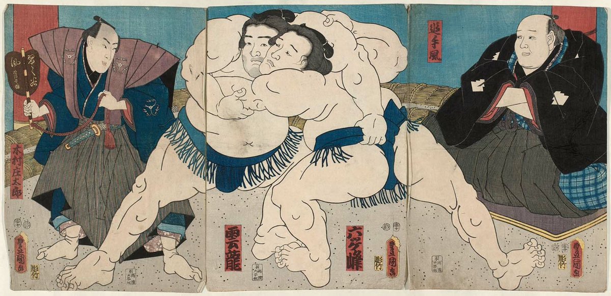
And, sometimes, ukiyo-e were incredibly playful.
You can see why they had such broad appeal; there was something for everybody.
In some sense these prints are almost like popular entertainment before radio, television, cinema, or the internet.
You can see why they had such broad appeal; there was something for everybody.
In some sense these prints are almost like popular entertainment before radio, television, cinema, or the internet.

So you can see that the difference between a painting and a print isn't trivial.
An oil painting, for example, exists in one place at one time.
Imitations can be made, but without quality photography there can be no truly accurate copies — there is, fundamentally, only one.
An oil painting, for example, exists in one place at one time.
Imitations can be made, but without quality photography there can be no truly accurate copies — there is, fundamentally, only one.

Unlike prints, which by their nature don't have a single form, but exist as thousands of versions.
Hence museums around the world have slightly different versions of the Great Wave off Kanagawa, all of which are original prints of Hokusai's design.
A different sort of art.
Hence museums around the world have slightly different versions of the Great Wave off Kanagawa, all of which are original prints of Hokusai's design.
A different sort of art.

After the Meiji Restoration in 1868 Japan opened its borders to international travel and trade — this followed a 250 year period of strict isolation.
Via trade ukiyo-e prints soon flooded Europe, and they quite literally changed the history of art.
Via trade ukiyo-e prints soon flooded Europe, and they quite literally changed the history of art.
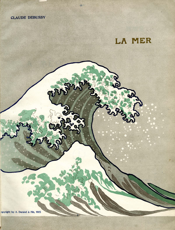
With their heavily stylised realism, vivid colours, focus on mood, unusual angles, and depiction of ordinary life, ukiyo-e prints were a direct inspiration for the Impressionists and all who followed them.
Van Gogh collected and even made his own copies of Hiroshige prints:
Van Gogh collected and even made his own copies of Hiroshige prints:

One of the last great masters of ukiyo-e was Hasui Kawase, a 20th century artist who led the "Shin-hanga" movement, which sought to revive the methods of traditional ukiyo-e.
His prints are, true to form, fabulously atmospheric and visually striking snapshots of life and nature.
His prints are, true to form, fabulously atmospheric and visually striking snapshots of life and nature.

So The Great Wave Off Kanagawa isn't a painting but an ukiyo-e print designed for popular consumption and mass distribution — a difference crucial in its appearance, nature, and influence.
None of which prevents it from being one of the most stunning works of art ever created.
None of which prevents it from being one of the most stunning works of art ever created.

• • •
Missing some Tweet in this thread? You can try to
force a refresh