A brief history of the colour orange: 

First: the word itself.
A strange word, one of few that famously cannot be rhymed.
It comes to modern English from Middle English, itself from Old French, via a host of other languages, originating in Sanskrit and before that Dravidian, as a name for the fruit.
A strange word, one of few that famously cannot be rhymed.
It comes to modern English from Middle English, itself from Old French, via a host of other languages, originating in Sanskrit and before that Dravidian, as a name for the fruit.

So the word orange was originally used in English to refer to the fruit.
From there, at some point in the 16th century, it was adapted to refer to the colour of that fruit.
Before that? The colour orange was simply called red-yellow.
From there, at some point in the 16th century, it was adapted to refer to the colour of that fruit.
Before that? The colour orange was simply called red-yellow.
Orange's most important meaning, anywhere in the world, is in relation to Buddhism and Hinduism.
For these religions it is the holiest colour, dating back to a time when saffron, used to make orange dye, was the most expensive spice of all.
For these religions it is the holiest colour, dating back to a time when saffron, used to make orange dye, was the most expensive spice of all.

Hence saffron is what the colour orange is called in many parts of the world, taking its name from the spice rather than the fruit.
And today, as they have been for centuries, the robes of Hindu and Buddhist monks are dyed with saffron:
And today, as they have been for centuries, the robes of Hindu and Buddhist monks are dyed with saffron:

Thus the presence of orange — or, more specifically, saffron — on the Indian flag, to represent values of strength and courage, as descended from its religious connotations:

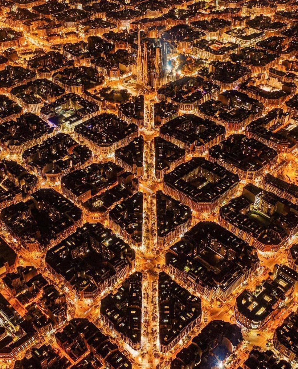
Otherwise, although red and yellow are the most common colours for warning signs — because they have the highest visibility to the human eye — there are certain circumstances when orange is more appropriate.
Specifically, whenever water is involved.
Specifically, whenever water is involved.

This is because orange contrasts with blue more effectively than any other colour; thus everything from lifeboats to lifebuoys are usually orange.
It also explains astronauts' orange suits — so that if they land in the sea upon their return to Earth they will be easier to spot.
It also explains astronauts' orange suits — so that if they land in the sea upon their return to Earth they will be easier to spot.

It's also why the Golden Gate Bridge was painted this colour:

And it even explains with the plethora of film posters that feature orange and blue together, relying on the naturally effective contrast between the two colours to get our attention:

Another vital association is that orange has been, for most of human history, the colour of the night.
First with candles and torches, then gas lamps, and then sodium-vapour lamps — it is only recently that orange street lights have been replaced with white LEDs.
First with candles and torches, then gas lamps, and then sodium-vapour lamps — it is only recently that orange street lights have been replaced with white LEDs.

Orange is a "warmer" colour on the Kelvin scale, which measures colour temperature, meaning it is less intense.
Warmer colours make us relax; colder colours wake us up.
Thus the replacement of orange street lights is literally making us more stressed and affecting our sleep.
Warmer colours make us relax; colder colours wake us up.
Thus the replacement of orange street lights is literally making us more stressed and affecting our sleep.

Orange is also associated with Protestantism by virtue of a long-winded historical coincidence which begins with a small Medieval state in southern France called the Principality of Orange.
Its etymology differs from the fruit — it comes from Arausio, the name of a Celtic god.
Its etymology differs from the fruit — it comes from Arausio, the name of a Celtic god.

In time Arausio became Orange and eventually the House of Orange — a noble dynasty which ended up ruling the Netherlands — adopted the colour as their own.
The House of Orange fought on the Protestant side in the Wars of Religion, thus forming a bond with the colour.
The House of Orange fought on the Protestant side in the Wars of Religion, thus forming a bond with the colour.

This association was further cemented when William of Orange became King William III of England in 1689.
He defended the Protestants of Ireland, who thus took orange as their colour.
Thus the green of the Irish flag represents Catholics and the orange represents Protestants.
He defended the Protestants of Ireland, who thus took orange as their colour.
Thus the green of the Irish flag represents Catholics and the orange represents Protestants.

And, of course, the fact that the House of Orange ruled the Netherlands — and continues to reign there — means that Dutch national sports teams wear orange.
This is one of the most unusual kit colours in sport, and therefore iconic:
This is one of the most unusual kit colours in sport, and therefore iconic:

As for art, orange has a rather underwhelming history.
It was used relatively rarely in Western European art, and during the Renaissance its primary association was revelry.
Thus the deities Bacchus and Pomona were often, though not always, depicted in orange:
It was used relatively rarely in Western European art, and during the Renaissance its primary association was revelry.
Thus the deities Bacchus and Pomona were often, though not always, depicted in orange:

But orange flourished in the 19th century, partly thanks to newly invented pigments that were incredibly vivid, especially chrome orange.
In Britain it was used by Dante Gabriel Rossetti, leader of the radical Pre-Raphaelites, and by Frederic Leighton in his famous Flaming June.
In Britain it was used by Dante Gabriel Rossetti, leader of the radical Pre-Raphaelites, and by Frederic Leighton in his famous Flaming June.

The Impressionists of France, meanwhile, exploited the contrast between orange and blue to full effect.
Still, they used it relatively rarely, usually to accentuate the sun — though, in this painting of Venetian twilight, Claude Monet did indulge in it rather heavily:
Still, they used it relatively rarely, usually to accentuate the sun — though, in this painting of Venetian twilight, Claude Monet did indulge in it rather heavily:

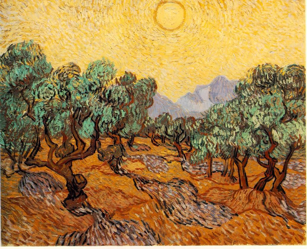
Even Vincent van Gogh, the master of vivid colours, was far more restrained in his use of orange than of yellow — it was normally used to support other colours, as in The Starry Night.
Only rarely did van Gogh let orange dominate his paintings.
Only rarely did van Gogh let orange dominate his paintings.
In nature orange is also a relatively rare colour — at least compared to greens, reds, browns, and blues.
We only see it at special times of day, like sunrise or sunset, or certain times of year, as with the leaves and flowers of Autumn — or the pumpkins of Halloween, of course.
We only see it at special times of day, like sunrise or sunset, or certain times of year, as with the leaves and flowers of Autumn — or the pumpkins of Halloween, of course.

So while orange is important in countries like India or China, where it is sacred, or in the Netherlands, where it is a national colour, in other parts of the world it lacks any particularly important assocation.
A fact seemingly reflected in polls of favourite colours:
A fact seemingly reflected in polls of favourite colours:

And carried across to the most popular colours for cars, where orange again sits below one percent:

And that is a brief history of the colour orange — incredibly important in some places (including the highly specific example of Penguin Classics!) but of little note in others.
An underrated colour, or not?
An underrated colour, or not?

• • •
Missing some Tweet in this thread? You can try to
force a refresh