1/33. Part 2 of 4 of my series of THREADs on Inflation and the Economy discusses the positive characteristics Americans should consider when they evaluate the economy.
Part 1 on the negatives is here:
Part 1 on the negatives is here:
https://x.com/Historian_Steve/status/1823507621107958150
2/33. COVID brought about three rounds of fiscal stimulus. One came with the CARES Act of March 2020. The second was passed in December 2020 and the third was part of President Biden’s American Rescue Plan in March 2021.
3/33. A typical individual could expect over $3,000 combined from these checks. According to an analysis from the Census Bureau, stimulus checks substantially reduced hardship from food shortages, financial instability, and anxiety.
nytimes.com/2021/06/02/us/…
nytimes.com/2021/06/02/us/…
4/33. Food shortages fell 42% between January and April 2021.
H. Luke Shaefer, co-author of this study and a professor at the University of Michigan, concluded that 5.2 million children had escaped food insufficiency in 2021, a figure he called dramatic.sites.fordschool.umich.edu/poverty2021/fi…
H. Luke Shaefer, co-author of this study and a professor at the University of Michigan, concluded that 5.2 million children had escaped food insufficiency in 2021, a figure he called dramatic.sites.fordschool.umich.edu/poverty2021/fi…
5/33. Moody’s Analytics released a report showing that the American Rescue Plan (ARP) resulted in 4 million more jobs, a 2% reduction in unemployment, a doubling of GDP, while adding only 0.35% to inflation.
moodys.com/web/en/us/insi…
moodys.com/web/en/us/insi…
6/33. While scholars debate the extent to which fiscal stimulus contributed to recent inflation, the report from Moody’s was broadly in line with another from the Francisco FED that found that the ARP contributed just 0.3% to inflation.
frbsf.org/research-and-i…
frbsf.org/research-and-i…
7/33. A robust fiscal stimulus was a deliberate policy choice on the part of the Biden administration. The assumption was that the last stimulus during the Great Recession was much too weak. Austerity took over. A tepid recovery ensued. Resentment grew.
8/33. The historical lesson the Biden administration drew—that the Obama administration was too cautious given that 2008 was the worst downturn since the 1930s—was a sound one. The results I’ll go over bear this out. We CAN learn from history.
9/33. It took 20-30 months to recover all of our pre-recession jobs. Compare that to 70 months during the Great Recession. The pre-recession peak occurred in mid-2022, after which we continued to add jobs. Today we have maybe 159 million jobs. 

10/33. Biden consciously chose to prioritize full employment and poverty reduction. Instead of forcing the poor to bear the costs of a protracted and subdued recovery like the 2010s, we spread these costs throughout the entire population through temporary inflation.
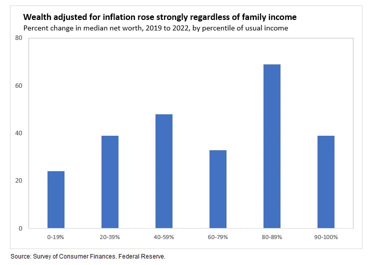
11/33. Stimulus checks prevented job losses and bankruptcies. Poorer Americans saved more during the pandemic than they had in decades. Wealth rose for every income group between 2019 and 2022. If you lump all these groups in the graph together, the average increase exceeded 40%.
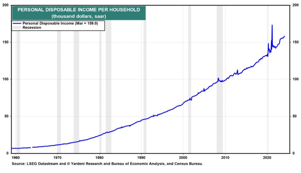
12/33. Personal Disposable Income per household continued to rise. We avoided a double-dip recession despite highly confident predictions of one.
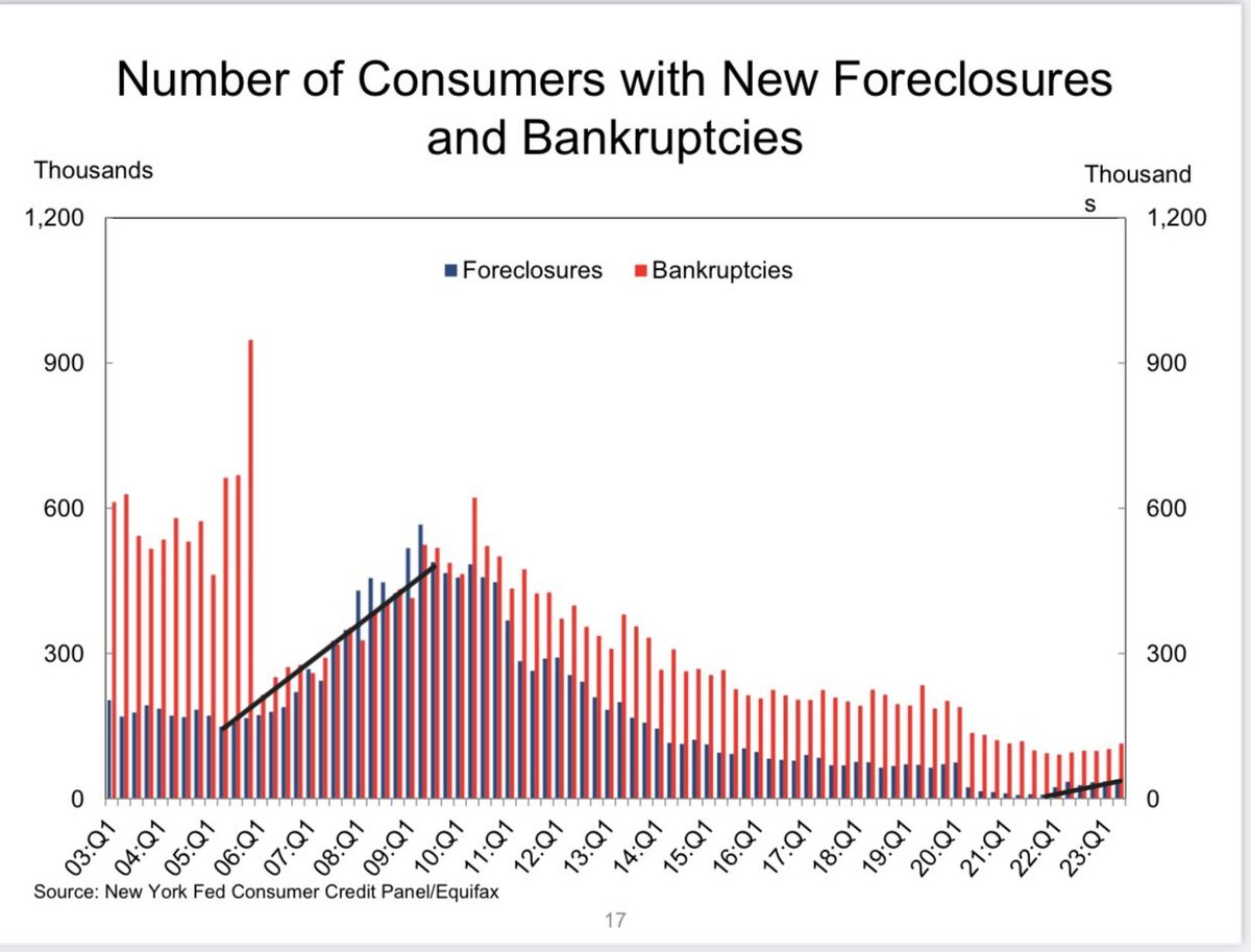
13/33. The number of foreclosures is still low in spite of higher interest rates. This is probably because we have a lot less sub-prime loans and ARMs compared to the pre-2008 era and because so many locked in fixed rates around 3% in 2020.
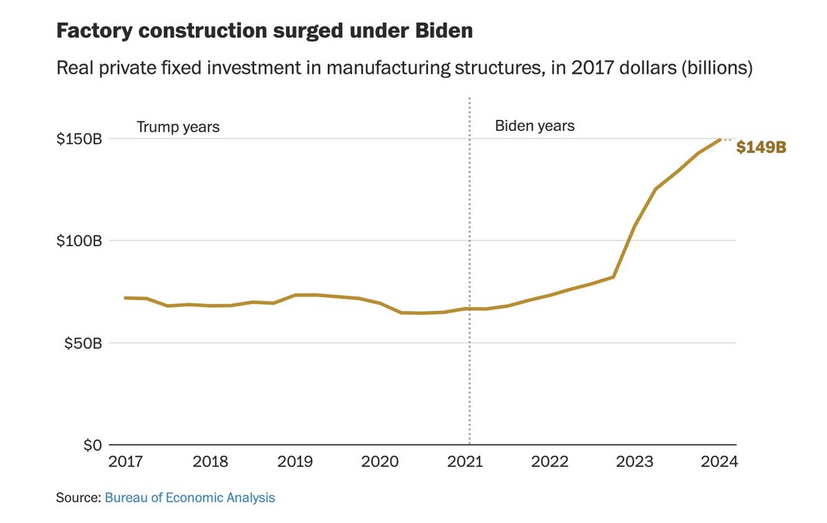
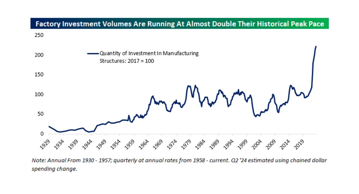
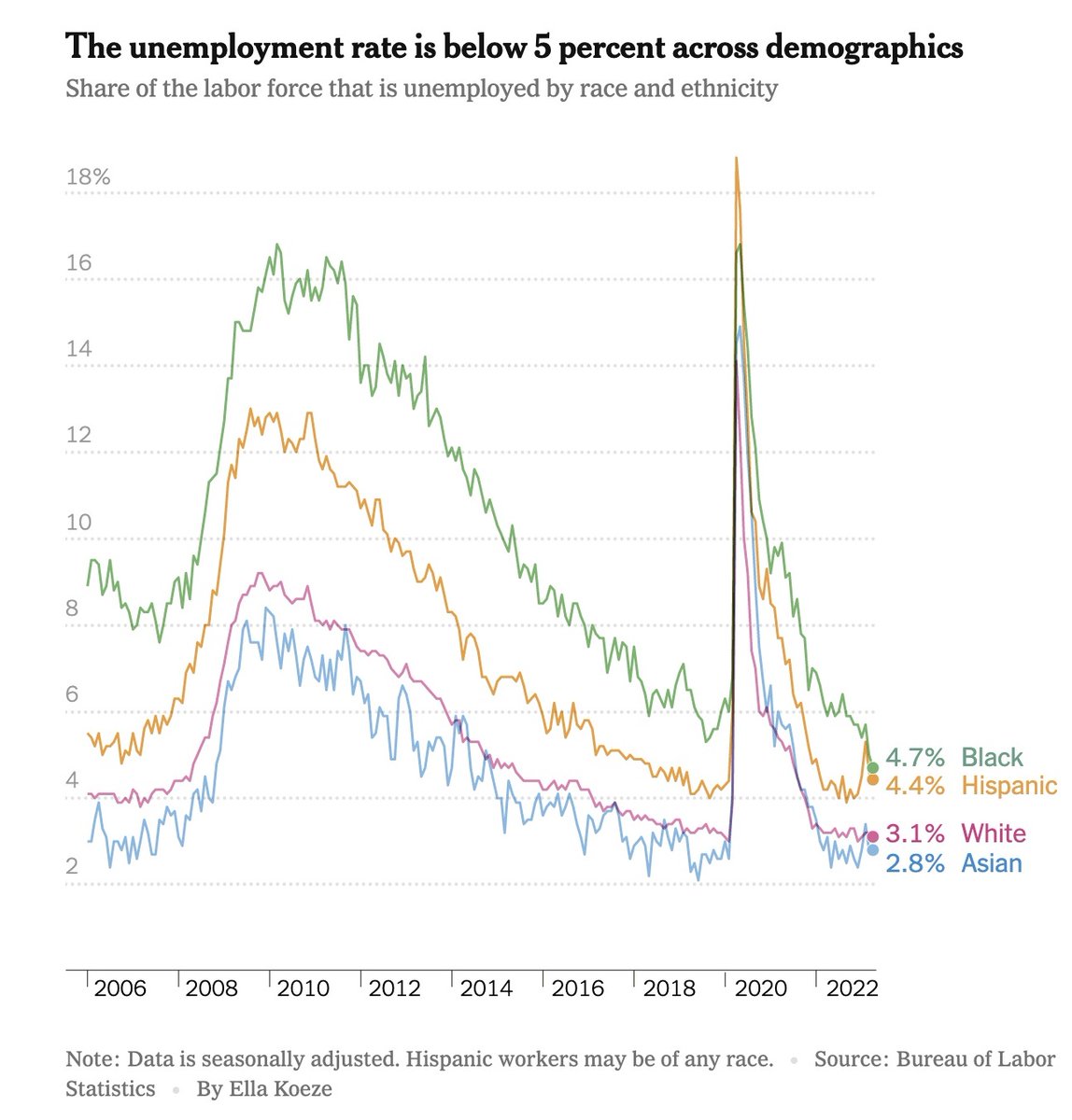
14/33. Compare Factory Construction Spending in the Biden and Trump administrations. Factory Investment is running at almost double its historical peak.
15/33. Compare Annual GDP per capita in the U.S. with Europe and Japan. Compare the recovery in the U.S. with those of all other G-7 countries. We’ve had the best recovery.
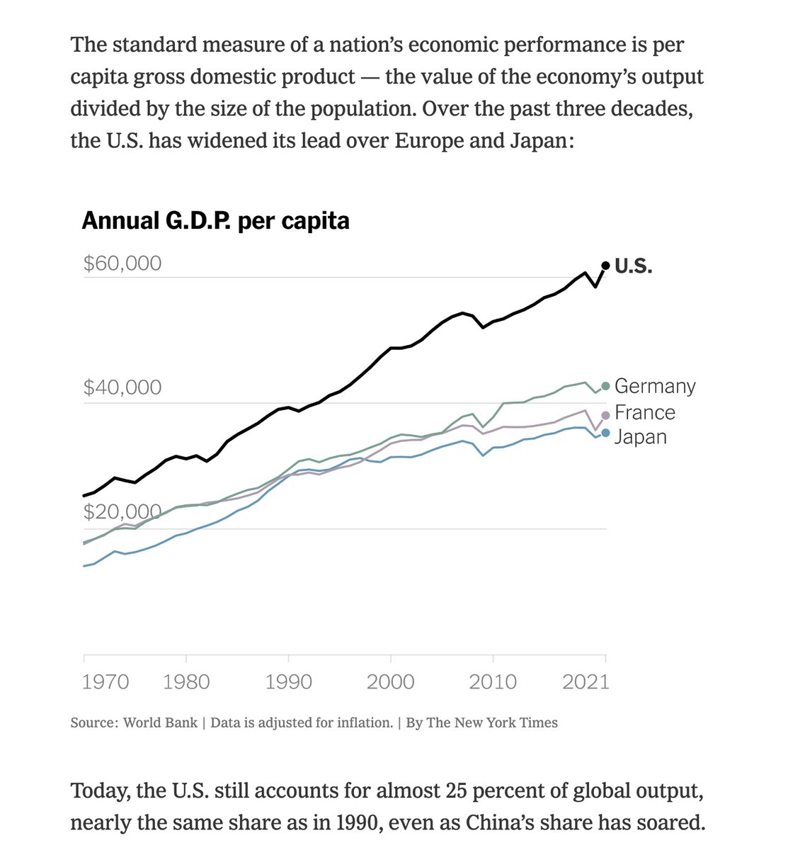
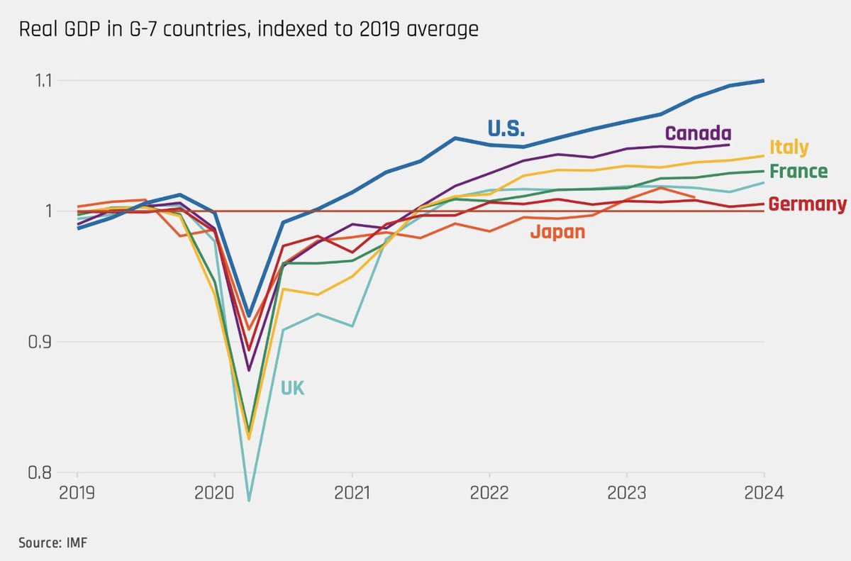
16/33. Our recovery could very well be viewed as the envy of the western world. We’ve had twice as much growth as any other rich country and without significantly higher inflation.
17/33. How have we managed such strong growth without higher inflation compared to other countries? My reasons are:
- fiscal stimulus was greater here
- we have an entrepreneurial spirit and culture of hard work
- immigration provides cheap labor that keeps costs down
- fiscal stimulus was greater here
- we have an entrepreneurial spirit and culture of hard work
- immigration provides cheap labor that keeps costs down
18/33. Real Wages of low-wage workers grew 12.1% between 2019 and 2023. According to the Economic Policy Institute, black men, young workers, and working mothers experienced particularly fast wage growth over the last four years.
19/33. Inequality among wage workers decreased. These developments stood in stark contrast to trends that prevailed over the previous decades.
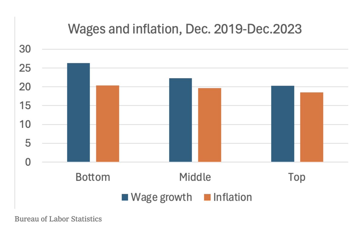
20/33. We should emphasize that wage gains outpaced inflation. This is what it means when we say *real* wages have gone up. Real = adjusted for inflation. This was true for all groups and for the bottom third of wage workers especially.
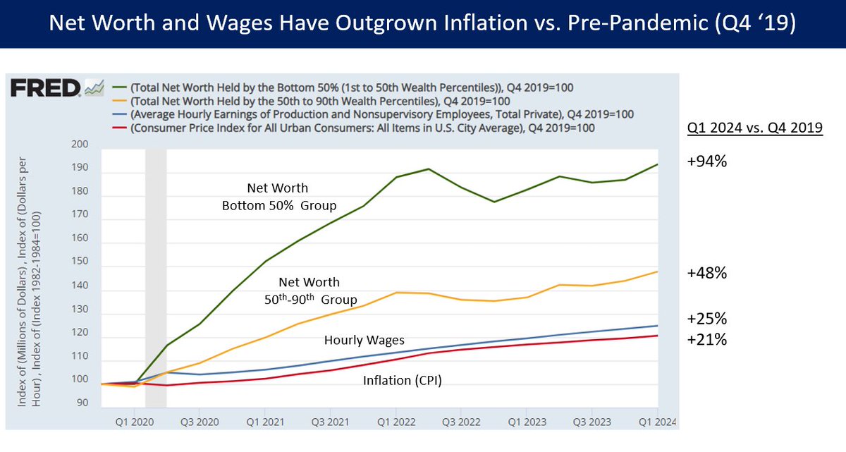
21/33. Compare the Wages and Net Worth of Q4 2019 versus Q1 2024. Net worth for the bottom half of workers (green line) has increased 94% while inflation (CPI) was 21%. That’s quite an increase. Credit to @David_Charts for the chart.
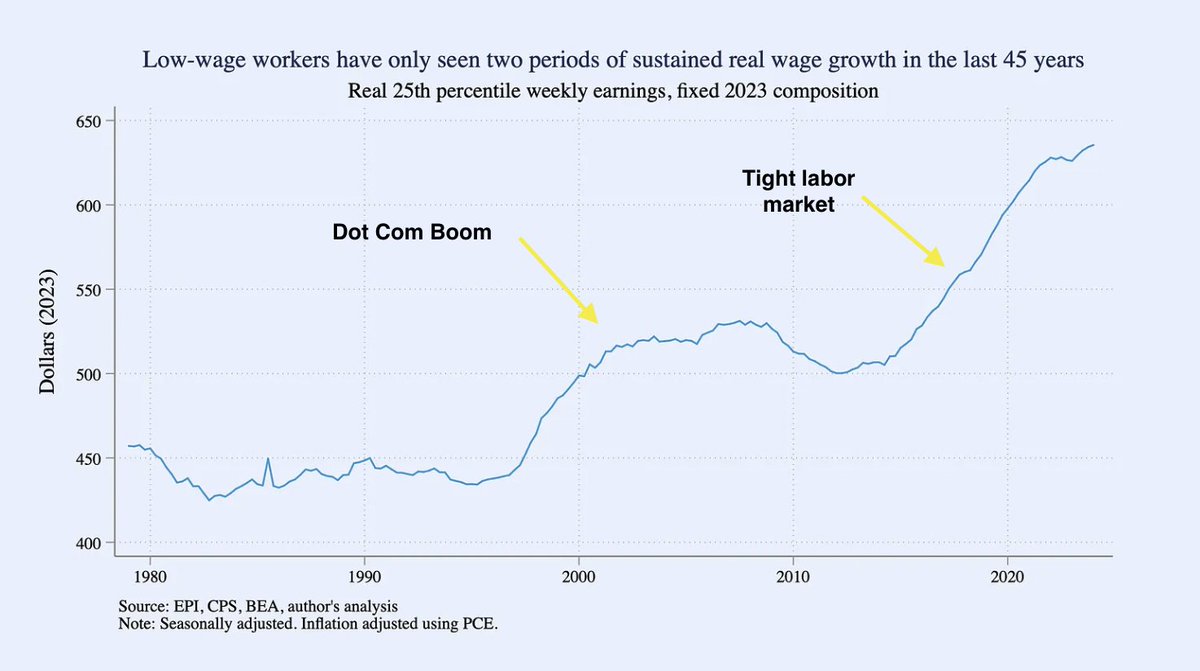
22/33. These wage gains are the result of active unionization and a historically tight labor market. Notice how this graph for low-wage workers spanned the last 3 administrations. From 1979—97, There was no wage growth at all from about 1979—97. Real wages were flat.
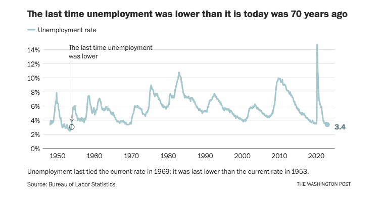
23/33. We reached a record-low unemployment number of 3.4% in 2023. Any number below 5% is good. We’ve had two years below 4%. The last time we reached 3.4% was 70 years ago.
24/33. Access to jobs was widely shared among various demographic groups. It was below 5% at one point for all groups in 2022. Access to jobs was widely shared.
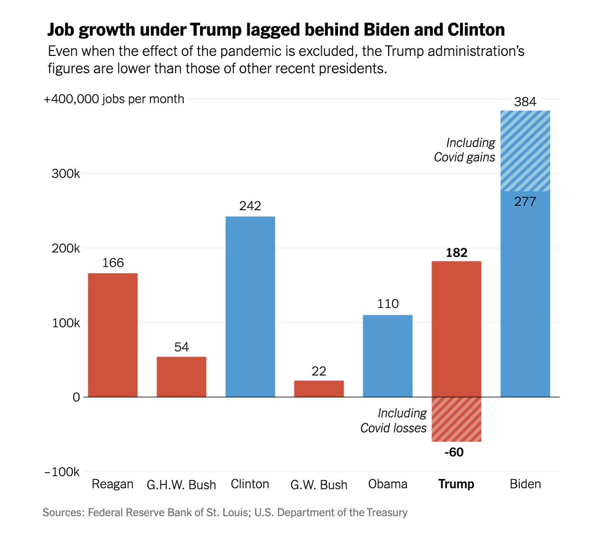
25/33. While reasonable minds can disagree over the extent to which presidents control economic conditions versus int’l factors or random chance, it is a fact that Biden presided over the best job creation (over 300,000 jobs / month) since at least the 1980s and perhaps before.
26/33. Skeptics may wonder if these jobs numbers are manipulated or paint too rosy a picture. Conceivably you could have low unemployment numbers because a lot of people exited the workforce or stopped looking for work.
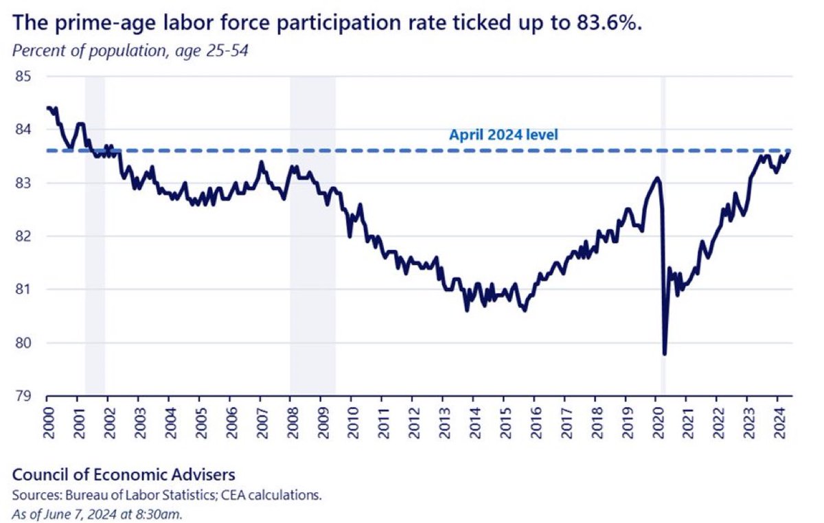
27/33. It turns out we have a graph to measure this: the Labor Force Participation Rate among prime-age workers (those that are 25—54 years old). It is the best rate since 2002.
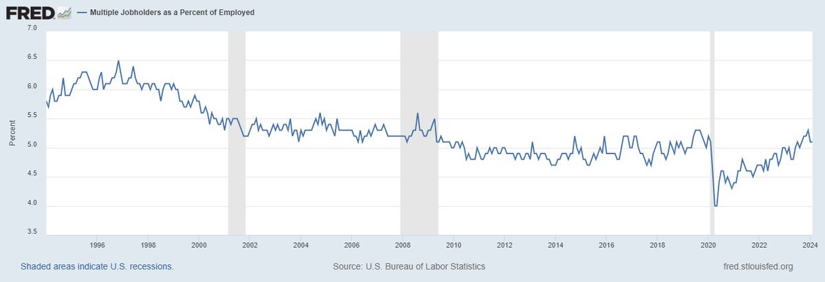
28/33. Do we have good unemployment numbers because lots of people are holding two jobs? Not really. The rate of multiple job holders is not significantly higher than that of the last few decades. It is about 8 million people or maybe 5% of the workforce.
29/33. Avoiding a recession and achieving full employment are policy victories. We may even have a soft landing of taming inflation with higher interest rates without causing a recession. That, too, is a victory of a delicate balancing act, more art form than science.
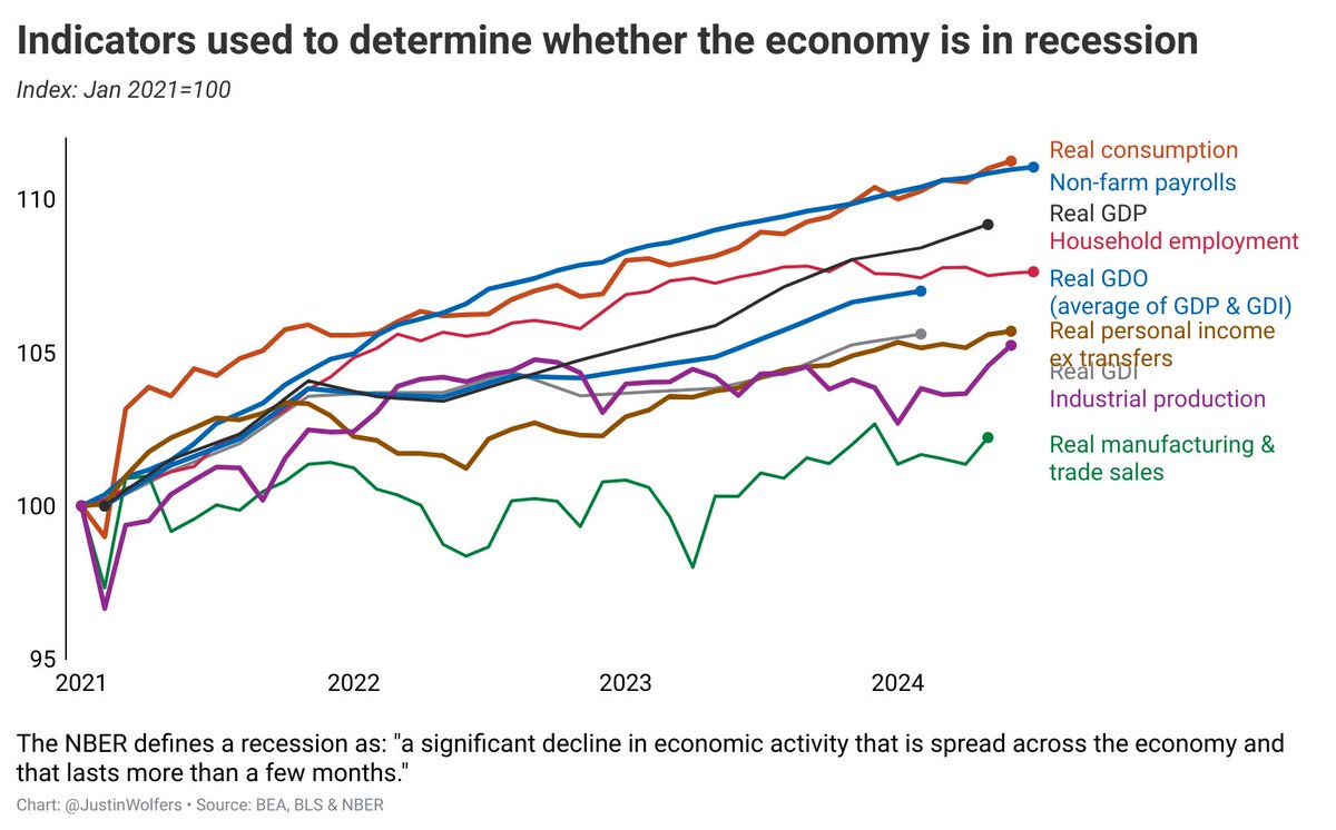
30/33. Economist Justin Wolfers put together a graph of all of these macroeconomic indicators. Personal income, GDP, consumption, employment – all of them are up since 2021. We are not in a recession even if millions of Americans mistakenly believe that we are.
31/33. Objectivity is philosophically impossible in the field of history. Perhaps it is in every subject. We can strive to be as objective as possible while recognizing that it is ultimately elusive. That may not be a bad thing. We are storytellers & storytelling is an art form.
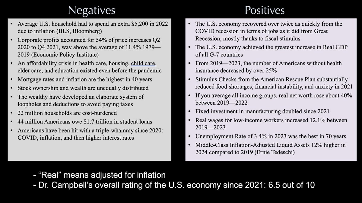
32/33. If I were to rate the economy on a scale of 1-10 with 1 being the worst economy possible (like January 1933) and 10 being the best imaginable, the most objective answer I can give that considers the totality of the evidence I’ve presented is 6.5 out of 10.
33/33. We have significant problems, but it’s not an even push. The economy is above average. Many of the positives have already factored in inflation. If your real net worth goes up 40%, the statisticians have already taken inflation into account. Stay tuned for Part 3.
END.
END.
• • •
Missing some Tweet in this thread? You can try to
force a refresh