
SOMEBODY DID IT!
I've been trying to come up with a GOOD version of the Electoral College map, and I finally figured out a solution...and @FiveThirtyEight did the exact same thing!
1/x

I've been trying to come up with a GOOD version of the Electoral College map, and I finally figured out a solution...and @FiveThirtyEight did the exact same thing!
1/x

Our problem with election maps is that many larger states have fewer voters, and vice-versa. A good electoral college map:
1) should have a cartogram basis (one unit = one electoral vote)
2) should easily demonstrate each state (shape/location)
2/x
1) should have a cartogram basis (one unit = one electoral vote)
2) should easily demonstrate each state (shape/location)
2/x
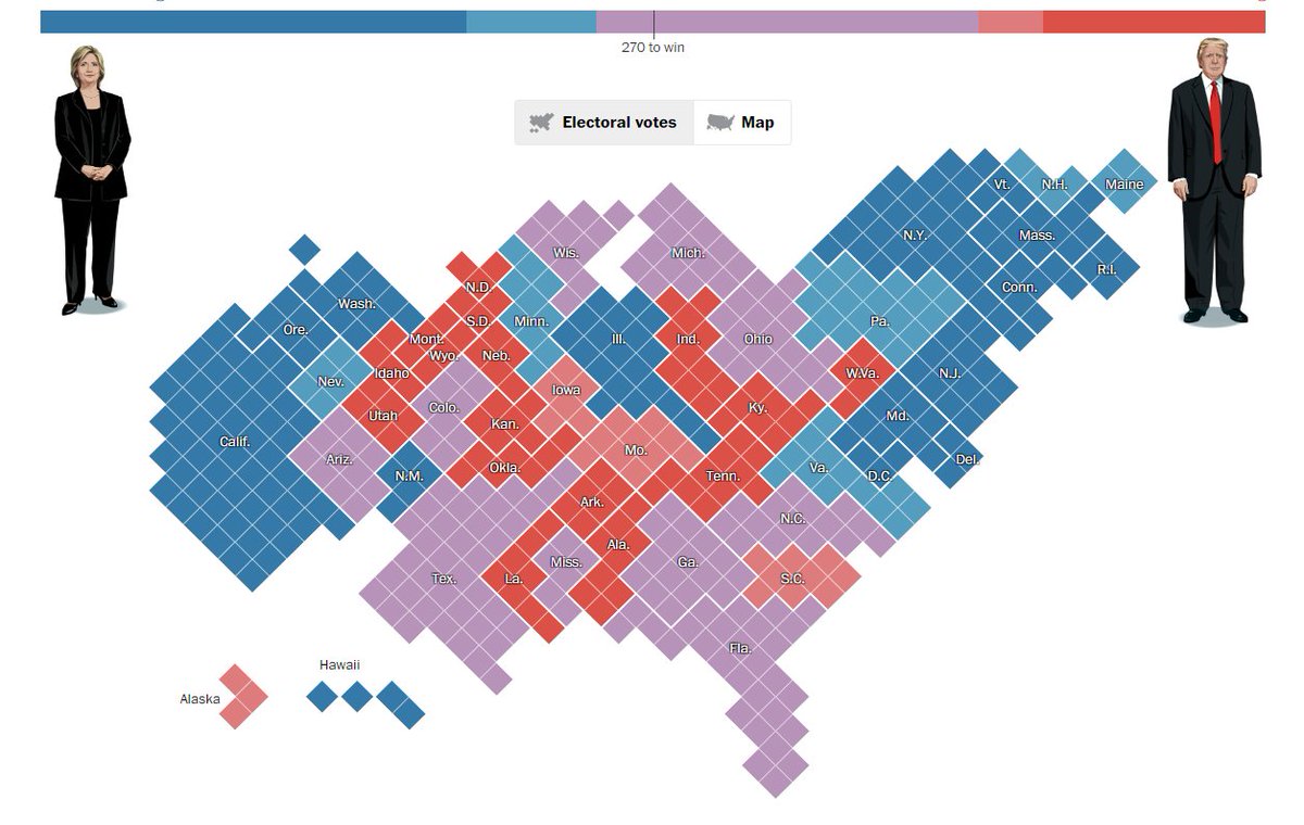
A "pure" electoral cartogram of the US is highly distorted. The upper-west gets shrunk, and the northeast balloons.
3/x
3/x
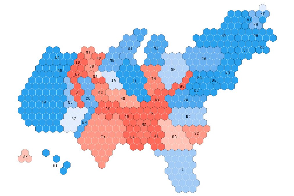
Here was my best attempt at a 2024 cartogram model, using square shapes. If you look at it just right, you can recognize states...but it's not ideal.
Put another way: this is NOT something you would use for live television.
4/x
Put another way: this is NOT something you would use for live television.
4/x

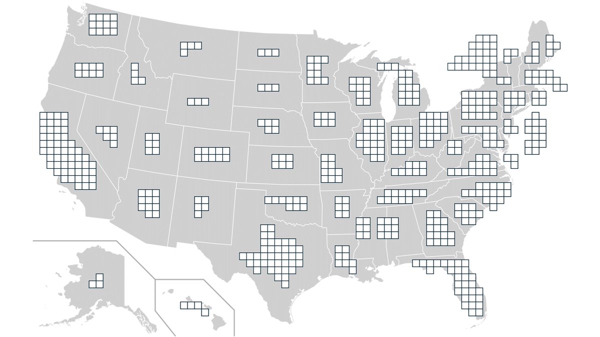
I realized that the best solution was to use the squares (arranged in the shape of each state), but layer them on top of a geographic map.
This way, you instinctively know where to look, but you can also instantly see the "value" of a state.
5/x
This way, you instinctively know where to look, but you can also instantly see the "value" of a state.
5/x
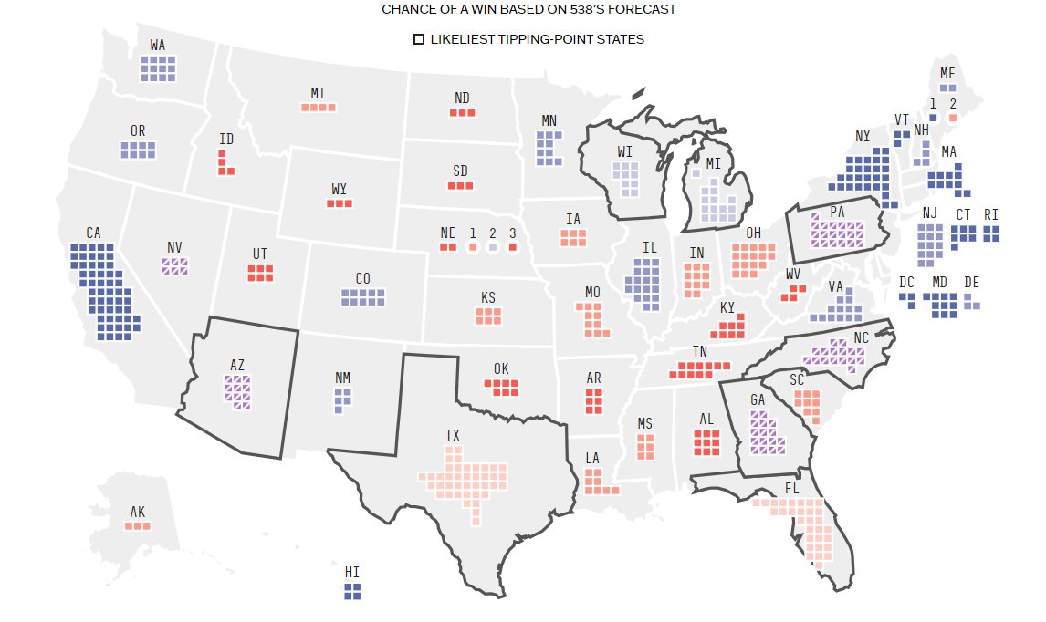
538 had an overhaul of their design...and they had the same idea! They improved it, even, by splitting out individual voting districts within NE and ME.
Will this be the design that ABC will be using on election night???
6/x
Will this be the design that ABC will be using on election night???
6/x

I'm not sure who came up with this idea, but shout-out to @kemarriner, @joeyellis, Amina Brown, and @bycoffe. I'm can't tell you how excited I am to see a GOOD electoral college map on a major news site!!!
7/7
7/7
@kemarriner @joeyellis @bycoffe @ThreadReaderApp unroll pls
• • •
Missing some Tweet in this thread? You can try to
force a refresh


