Every trader can read a TradingView chart
Most traders can read volume on a chart
...very few can read a footprint chart
Today I'm covering footprint charts & what you should know.
...Footprint 🧵↓ (1/9)
Most traders can read volume on a chart
...very few can read a footprint chart
Today I'm covering footprint charts & what you should know.
...Footprint 🧵↓ (1/9)

Here's what's discussed :
• fpbs
• cluster types
• range chart
• volume chart
• delta chart
• text types
• conclusion
(2/9)
• fpbs
• cluster types
• range chart
• volume chart
• delta chart
• text types
• conclusion
(2/9)
FPBS
Foot print bar statistics is a grid layout which shows information on each candle printed.
Statistics include things such as...
- total volume inside
- total delta
- total liquidation volume
- time to form candle
others include..
- highest delta achieved (delta max)
- lowest delta achieved (delta min)
- cumulative delta total
- Tsize
Each can be used for analysing different order flow readings for understanding market sentiment.
...chart layout ↓
(3/9)

Cluster types
This visually explains what's happening inside of each candle.
We separate each candle into different sections of the same size. We do this by the tick size chosen.
Tick sizes are different for different assets. 1 tick represents the smallest amount price can change on a pair.
3 main types of clusters :
Profiles - showing visually different sizes of either volume, delta, bid-ask or open interest at each cluster level. Shading can also be applied if delta profile or open interest profile is applied.
Clusters - Simply show amount of volume or delta at a given cluster group of data. It does so by shading different clusters different colours depending on whether thats for high/low volume, delta etc.
Ladders - similar to profiles but will show for delta and open interest whether they are positive/negative, increasing/decreasing by being placed on different sides to each other.
...here's what this looks like ↓
(4/9)

Range charts
The range of a candle is the price difference between its high and low price ($50,100 low $50,400 high = $300 range).
A range chart uses tick sizes to keep the range of every candle printed constant. A new candle is printed each time a given range value is reached.
Good for isolating candle sizes to compare different order flow metrics such as delta & volume.
...explained below ↓
(5/9)

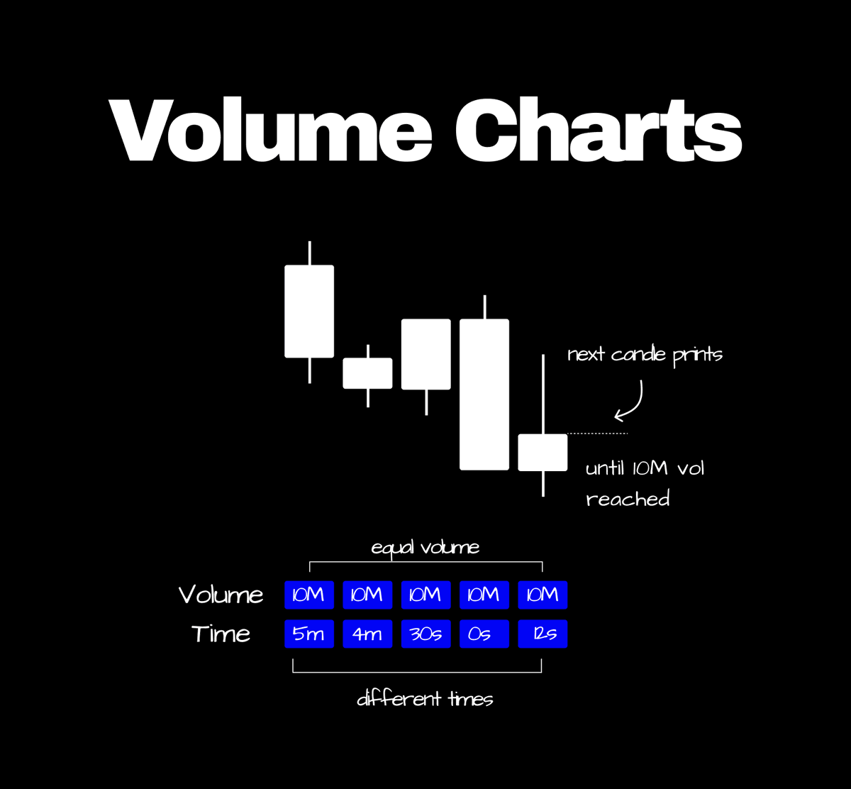
Volume charts
Total candle volume can be calculated by summing the absolute total of all the bids and asks filled at a price level.
A volume chart prints a new candle once a certain volume limit is reached.
This helps keep it as if almost a control variable (constant value) and to better analyse other metrics such as delta or liquidations.
...volume chart ↓
(6/9)
Delta charts
Candle delta can be calculated by the following : asks filled - bids filled.
A delta chart prints a new cnadle every time a chosen delta limit is reached. Helping keep delta as a control variable (constant).
By doing so we can compare other metrics such as volume, max & min delta without interfering with the final candle delta.
...delta chart ↓
(7/9)

Text type
These display numeric values inside of a candles cluster type to represent exact figures of order flow.
...all text types ↓
- bid-ask
- volume
- delta
Open interest:
- removed vs created
- total
- created
- removed
- removed vs created delta
- new shorts vs new longs
- Long exits (sells) vs Short exits (buys)
- Long exit (sells) vs New Longs (buys)
- New shorts (sells) vs Short exits (buys)
- Long exits + New shorts (sells) vs Short exits + new longs
(8/9)
Conclusion
If you all enjoyed this thread covering footprint charts make sure to leave a like for more and a follow (if new).
For those wanting to understand more about order flow make sure to give my order flow thread a read, where I dive deeper into understanding metrics such as volume delta and open interest.
For those new, I post educational content on order flow and technical analysis as a full-time intra-day trader of BTC for others to learn.
Exotick.
(9/9)
orderflow thread ↓
x.com/Exoticktrades/…
• • •
Missing some Tweet in this thread? You can try to
force a refresh