Today I'm looking back at the work of British graphic designer Abram Games!
Abram Games was born in Whitechapel, London in 1914. His father, Joseph, was a photographer who taught him the art of colouring by airbrush.
Games attended Hackney Downs School before dropping out of Saint Martin’s School of Art after two terms. His design skills were mainly self-taught by working as his father’s assistant.
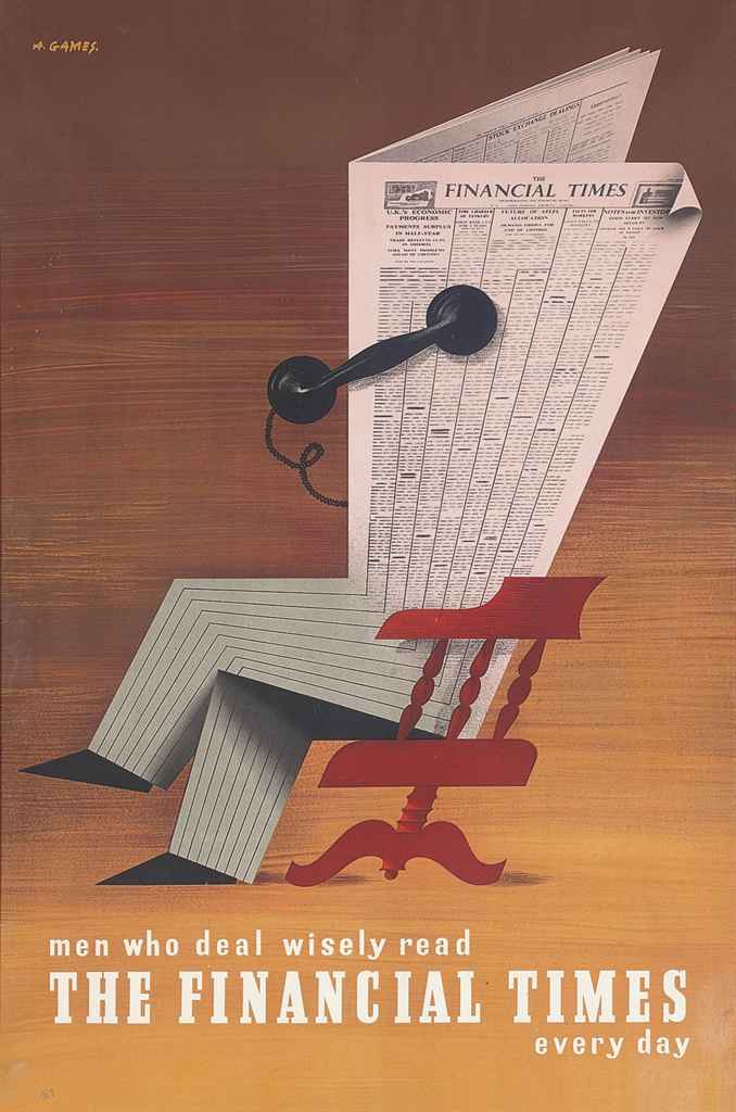
In 1932 Games began working for the commercial art agency Askew Younge, whilst also building up an impressive portfolio of his own clients which eventually included Shell, London Transport, and the Financial Times.
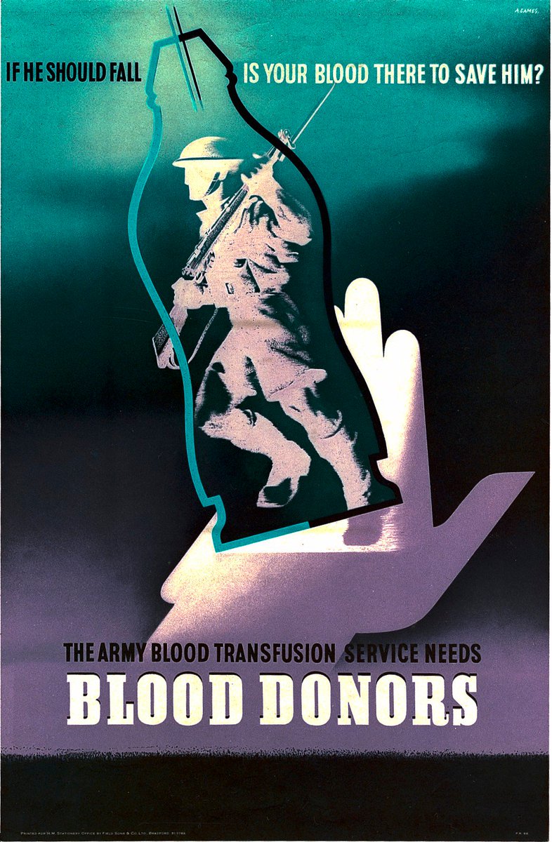
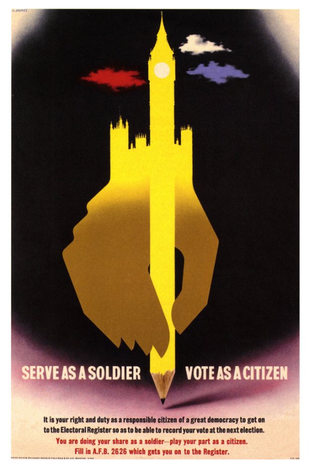
Games joined the infantry in World War 2 but in 1941 he was moved to the Public Relations Department of the War Office to work on recruitment posters. In 1942 he became an Official War Artist for posters.
Game's motto for poster design was 'maximum meaning using minimum means' through a concise and engaging blend of image, colour and text.
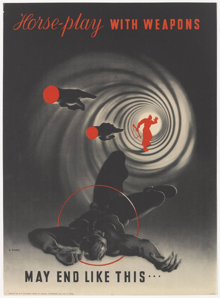
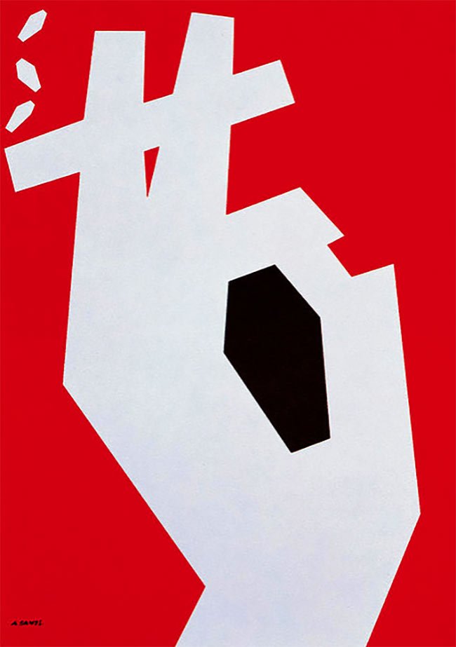
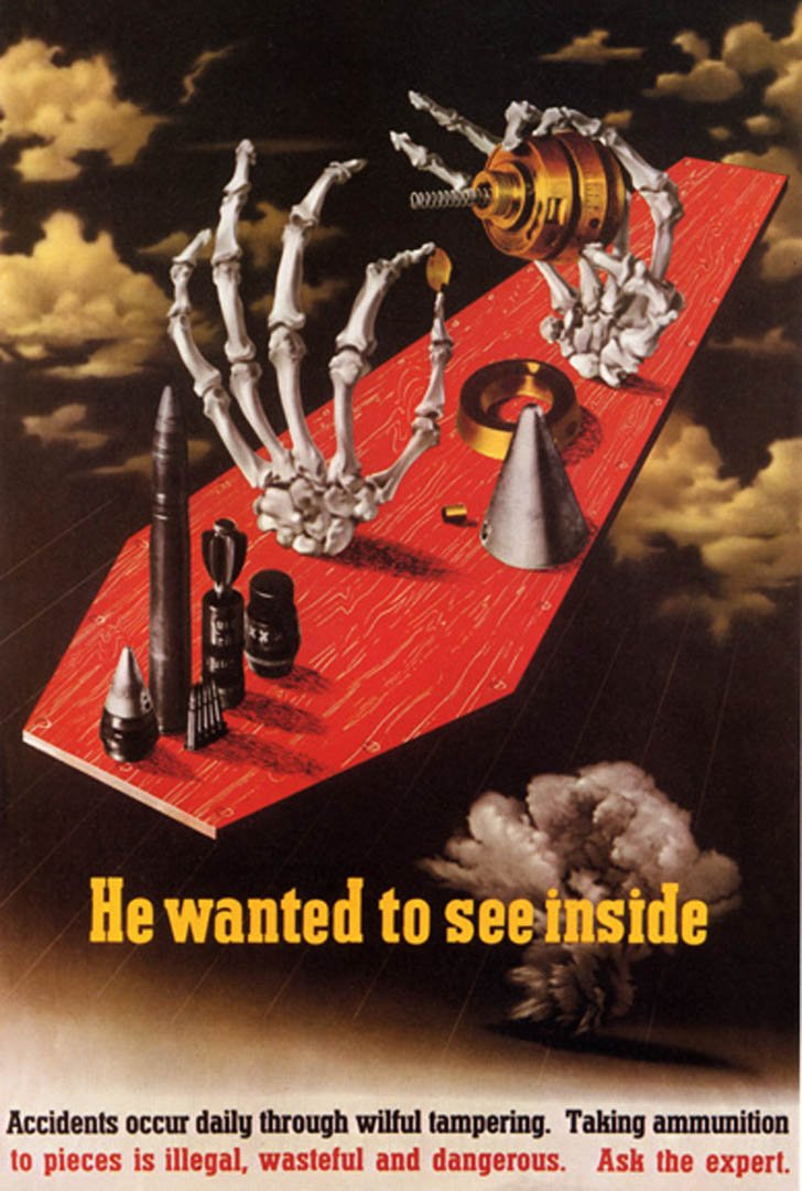
Many of Games' designs are visual puns with multiple layers of meaning. Games believed "A poster with a measure of intrigue engages the mind of the spectator and he looks again."
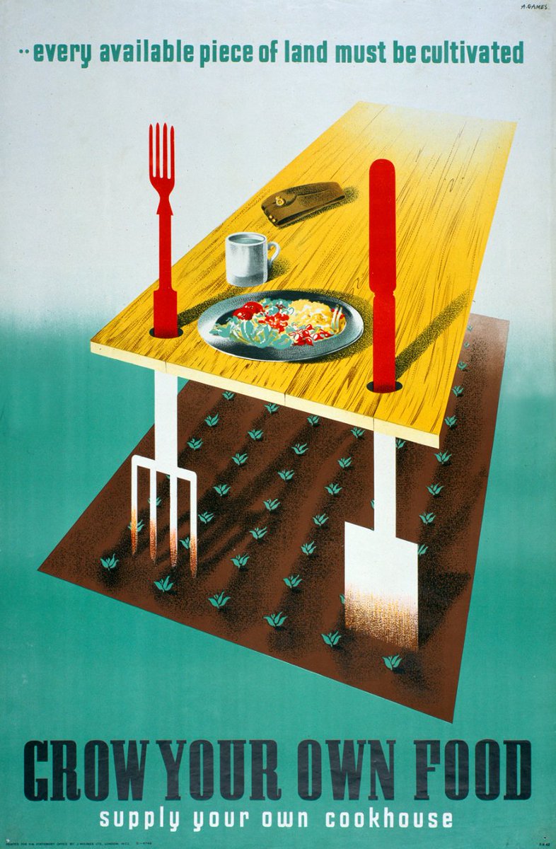
Games had an intuitive ability to edit images and text in ways that would maximize the impact of their message. His work also showed his interest in the ideas and techniques of surrealism as a way to capture attention.
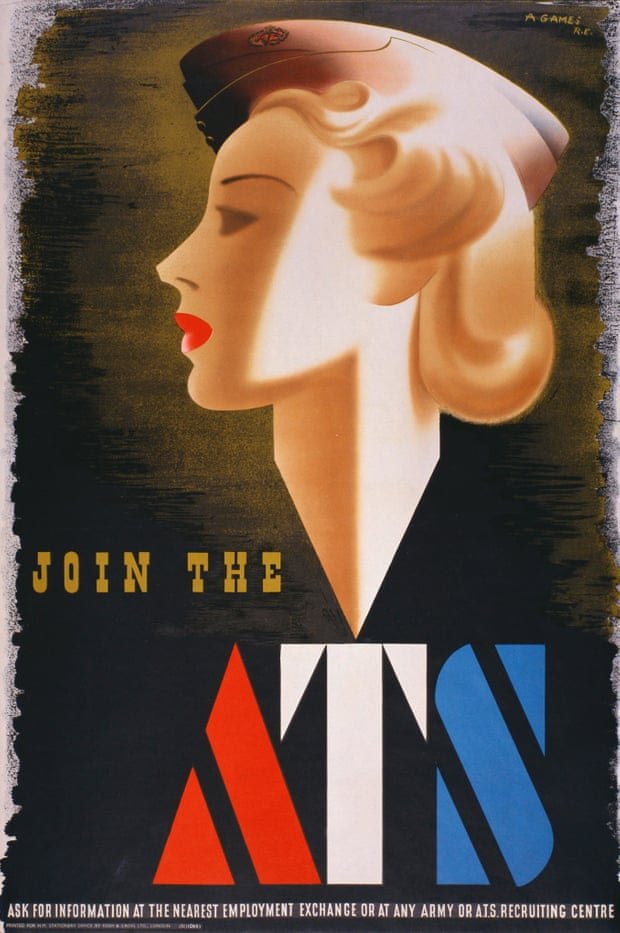
His posters could be controversial: a 1941 recruitment poster for the ATS was debated in parliament and later withdrawn for looking like "A beauty product advertisement."
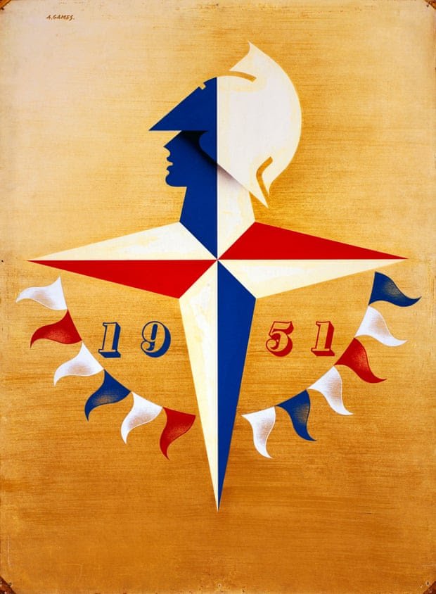
In the post-war period Abram Games designed the London 1948 Olympics stamp and the 1951 emblem for the Festival of Britain. He also conceived the first BBC moving ident in 1953.
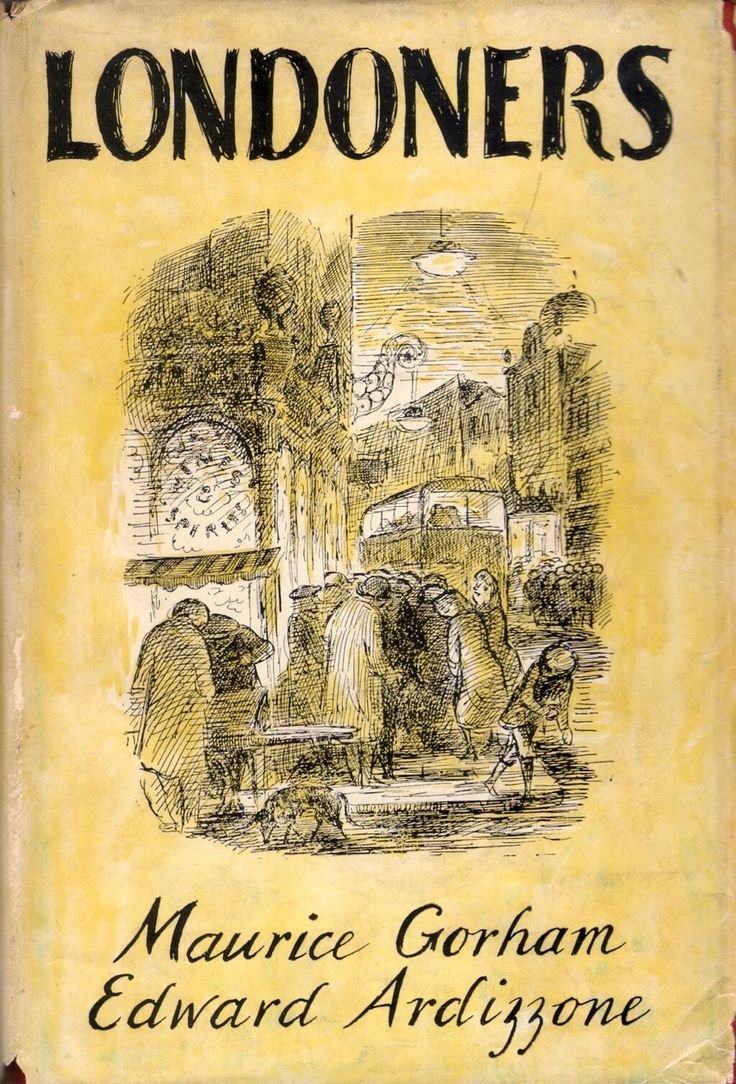
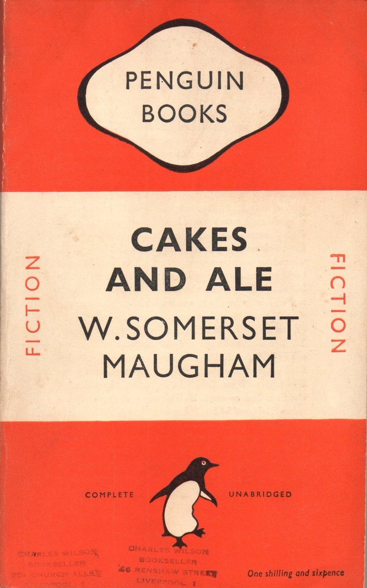
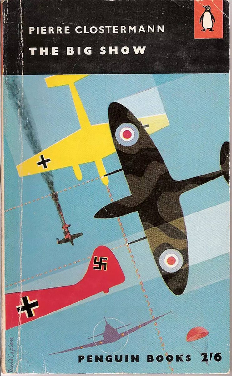
Abram Games was also invited by Allen Lane in 1956 to select and commission colour illustrations for Penguin Books, as part of an experiment with new design ideas for their fiction range.
Games’ hand painted and airbrushed poster are rightly famous as examples of modernist design in practice. “I wanted to create posters with forceful compact design" he once said, "memorable and direct, with a minimum of lettering and text."
Abram Games believed strongly in creative individuality, and his work truly stands the test of time. There are many books available about his work, so do take time to look at a few if you want to know more.
More posters another time...
• • •
Missing some Tweet in this thread? You can try to
force a refresh
Today I'm looking back at the career of English painter, book illustrator and war artist Edward Ardizzone!
Edward Ardizzone was born in Vietnam in 1900 to Anglo-French parents. Aged 5 he moved to England, settling in Suffolk.
Whilst working as an office clerk in London Ardizzone began to take lessons at the Westminster School of Art in his spare time. In 1926 he gave up his office job to concentrate on becoming a professional artist.
Today in pulp I look back at the Witchploitation explosion of the late 1960s: black magic, bare bottoms and terrible, terrible curtains!
Come this way...
Mainstream occult magazines and books had been around since late Victorian times. These were mostly about spiritualism, with perhaps a bit of magic thrown in.
But it was the writings of Aleister Crowley in English and Maria de Naglowska in French and Russian that first popularised the idea of 'sex magick' in the 20th century - the use of sexual energy and ritual to achieve mystical outcomes.
Between 1960 and 1970 Penguin Books underwent several revolutions in cover layout, at a time when public tastes were rapidly changing.
Today in pulp I look back at 10 years that shook the Penguin!
Allen Lane founded Penguin Books in 1935, aiming to bring high-quality paperbacks to the masses for the same price as a packet of cigarettes. Lane began by snapping up publishing rights for inexpensive mid-market novels and packaging them expertly for book lovers.
From the start Penguins were consciously designed; Lane wanted to distinguish his paperbacks from pulp novels. Edward Young created the first cover grid, using three horizontal bands and the new-ish Gill Sans typeface for the text.
Today in pulp: a tale of an unintentionally radical publisher. It only produced 42 books between 1968-9, but it caught the hedonistic, solipsistic, free love mood of the West Coast freakout scene like no other.
This is the story of Essex House...
Essex House was an offshoot of Parliament Press, a California publishing company set up by pulp artist Milton Luros after the market for pulp magazines began to decline. It specialised in stag magazines sold through liquor stores, to skirt around US obscenity publishing laws.
By the 1960s Parliament Press was already selling pornographic novels through its Brandon House imprint, though these were mostly reprints or translations of existing work. Luros was interested in publishing new erotic authors, and set up Essex House to do just that.
Today in pulp... one of my favourite SF authors: Harry Harrison!
Harry Harrison was born Stamford, Connecticut, in 1925. He served in the US Army Air Corps during WWII, but became disheartened with military life. In his spare time he learned Esperanto.
Harrison started his sci-fi career as an illustrator, working with Wally Wood on Weird Fantasy and Weird Science up until 1950. He also wrote for syndicated comic strips, including Flash Gordon and Rick Random.
Today in pulp... Blade Runner! Let's look back at the classic 1982 movie and see how it compares to original novel.
"It's not an easy thing to meet your maker..."
Blade Runner is based on Philip K. Dick's 1968 novel Do Androids Dream Of Electric Sheep? However 'inspired' may be a better word, as the film is very different to the book.
In the novel Deckard is a bounty hunter for the San Francisco police. The year is 1992; Earth has been ravaged by war and humans are moving to off-world colonies to protect their genetic integrity. They are given organic robots to help them, created by the Rosen Association.