
Everybody's wearing a brand new kit now
I know you'll get to like it if you give it a chance now
My little baby sister can do it with ease
It's easier than learning your ABC's
So come on, come on, do the kit rankings with me
It's the League of Ireland 2025 Kit Rankings
I know you'll get to like it if you give it a chance now
My little baby sister can do it with ease
It's easier than learning your ABC's
So come on, come on, do the kit rankings with me
It's the League of Ireland 2025 Kit Rankings
HOUSEKEEPING
We have 45 entries on the docket
I have decided to omit previous years away kits being kept on as third choices (Galway, Pat's, Shels) but brought over home kits (Galway, Derry) and both kits if neither have changed (Bray) will be included
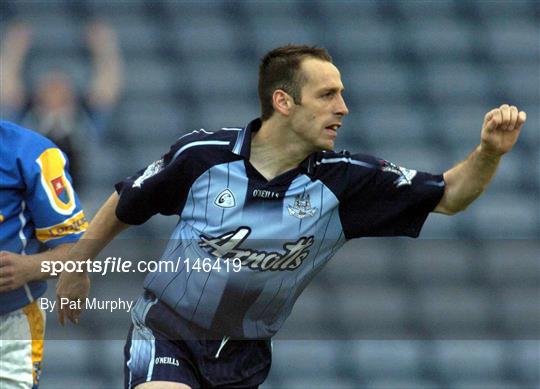
Last 4 winners below
We have 45 entries on the docket
I have decided to omit previous years away kits being kept on as third choices (Galway, Pat's, Shels) but brought over home kits (Galway, Derry) and both kits if neither have changed (Bray) will be included
Last 4 winners below
And with that out of the way
All aboard
All aboard
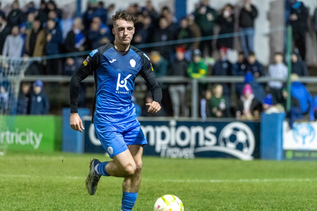
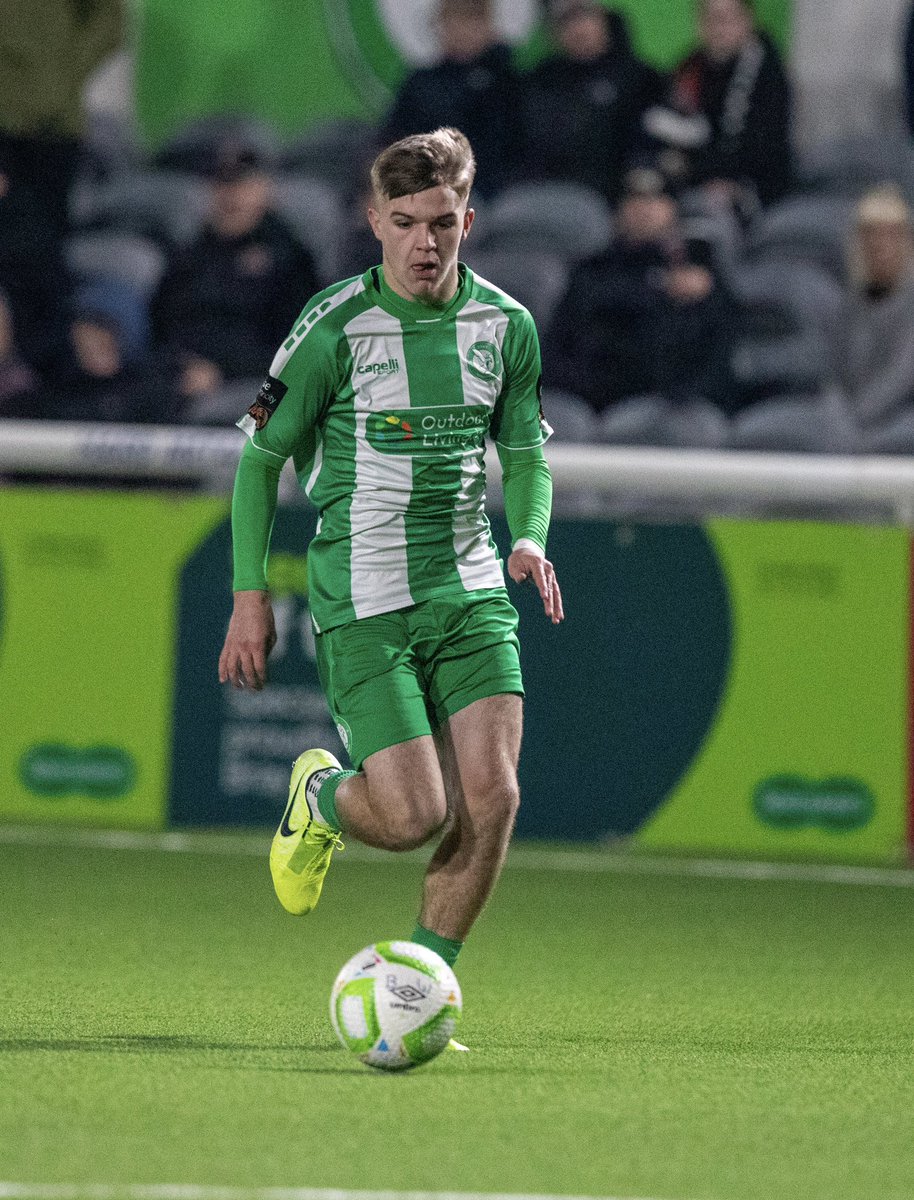
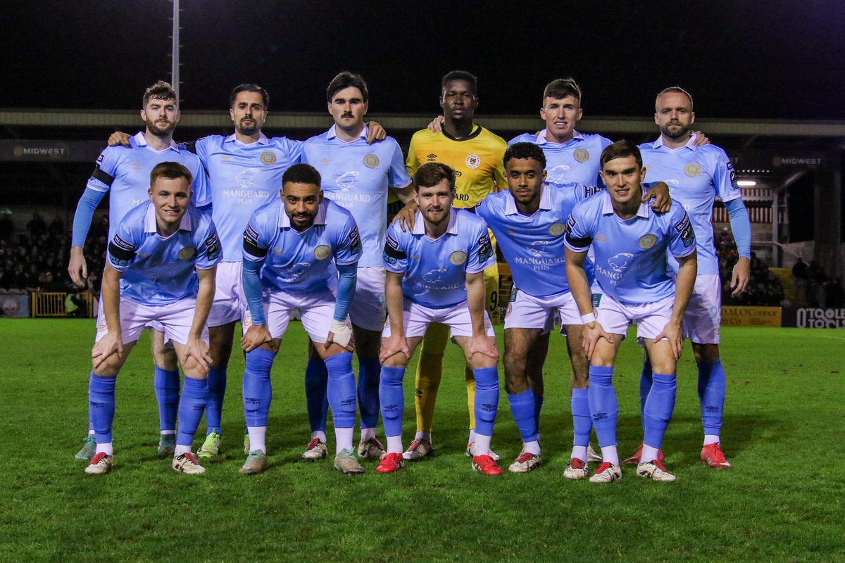
45. Harps (H)
Blue and Black Army?
Trainingwear gussied up in an emergency - simply not a Harps shirt with the amout of black
Back of shirt, shorts, and socks being all blue is fine - but if you can't ID the club if there was no crest, it fails the first test as a home kit
Blue and Black Army?
Trainingwear gussied up in an emergency - simply not a Harps shirt with the amout of black
Back of shirt, shorts, and socks being all blue is fine - but if you can't ID the club if there was no crest, it fails the first test as a home kit
44. Bohs (3rd)
Maybe the most unflattering pair of shorts in the history of Our Great League?
I will not be gaslit into thinking the shirt is nice in isolation either - it's all gaudy, cheap, and shit
11 Lost Marys out on the pitch - fitting given the results
Maybe the most unflattering pair of shorts in the history of Our Great League?
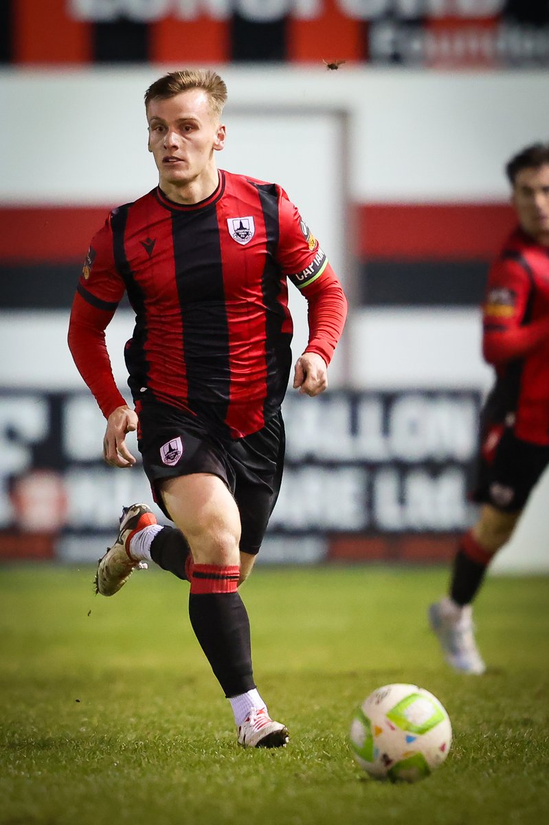
I will not be gaslit into thinking the shirt is nice in isolation either - it's all gaudy, cheap, and shit
11 Lost Marys out on the pitch - fitting given the results
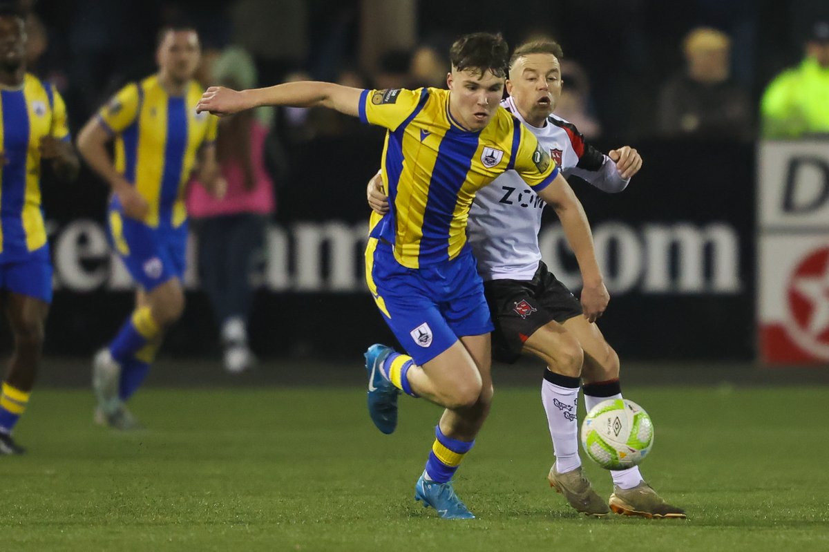
43. Treaty (H)
Far too busy for its own good
The look of a slapdash mishmash of two separate shirts, an ugly sponsor, a main body design that doesn't work visually for me, a weirdly high up crest, and shorts that don't quite match colour wise which is always a personal gripe
Far too busy for its own good
The look of a slapdash mishmash of two separate shirts, an ugly sponsor, a main body design that doesn't work visually for me, a weirdly high up crest, and shorts that don't quite match colour wise which is always a personal gripe
42. Wexford (A)
Pikes design in the body of the shirt looks proper cheap, not vibing with the weird shorts stripe on the right leg
A look that screams National League
Pikes design in the body of the shirt looks proper cheap, not vibing with the weird shorts stripe on the right leg
A look that screams National League
41. Treaty (A)
See #43, it's all just slightly less noticeable on the red
Treaty take home this year's wooden spoon
See #43, it's all just slightly less noticeable on the red
Treaty take home this year's wooden spoon
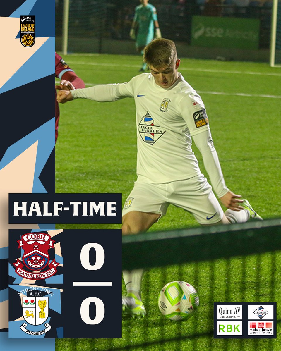
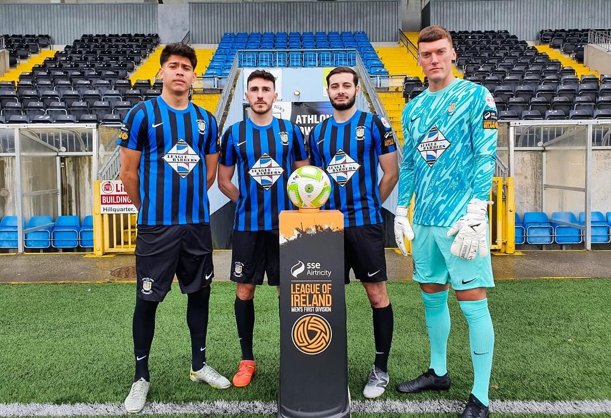
40. Athlone (A)
An absolutely gash sponsor logo on what is otherwise the most generic kit in the country
All white everything can look good in isolation, but it treads a fine line between classy and the first option in the teamwear catalogue
This is the latter
An absolutely gash sponsor logo on what is otherwise the most generic kit in the country
All white everything can look good in isolation, but it treads a fine line between classy and the first option in the teamwear catalogue
This is the latter
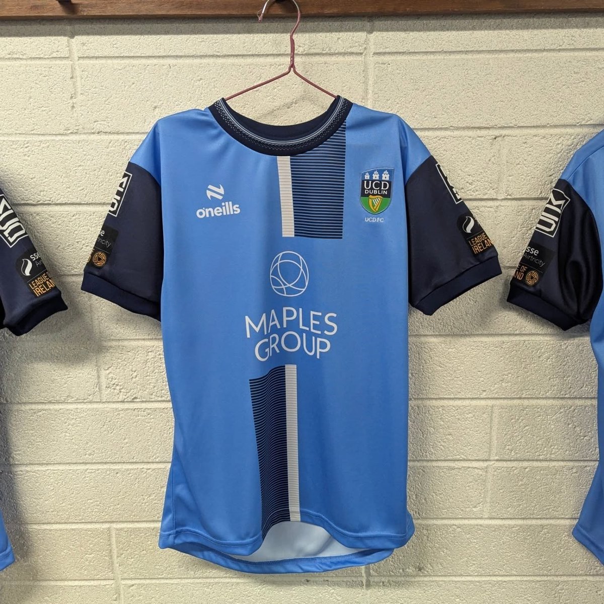
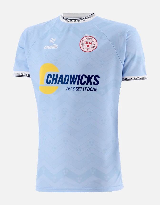
39. UCD (H)
What would happen if Grok tried to generate the 2004 Dublin GAA kit
What would happen if Grok tried to generate the 2004 Dublin GAA kit
38. Wexford (H)
See #42, it's all just slightly less noticeable on the purple
See #42, it's all just slightly less noticeable on the purple
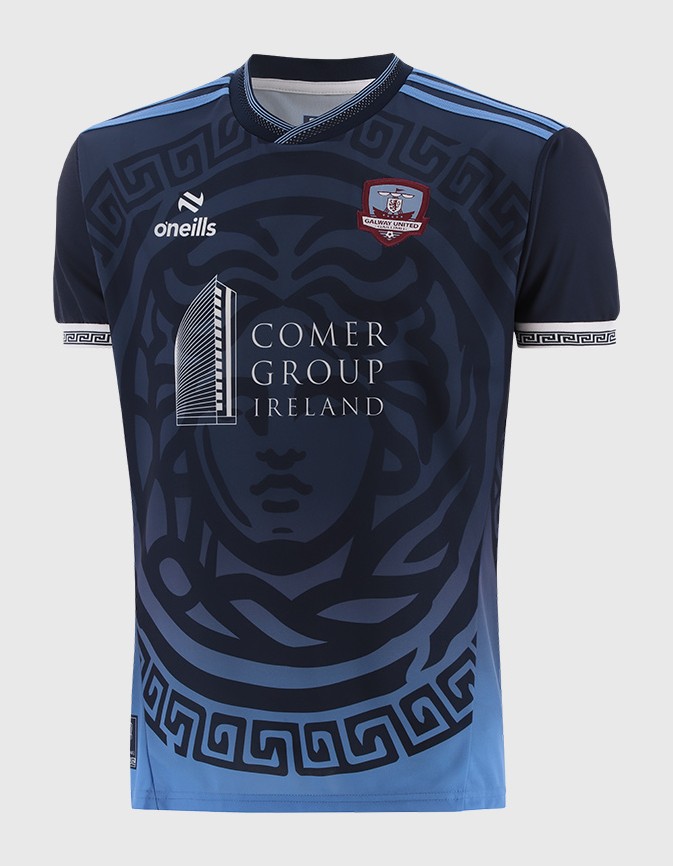
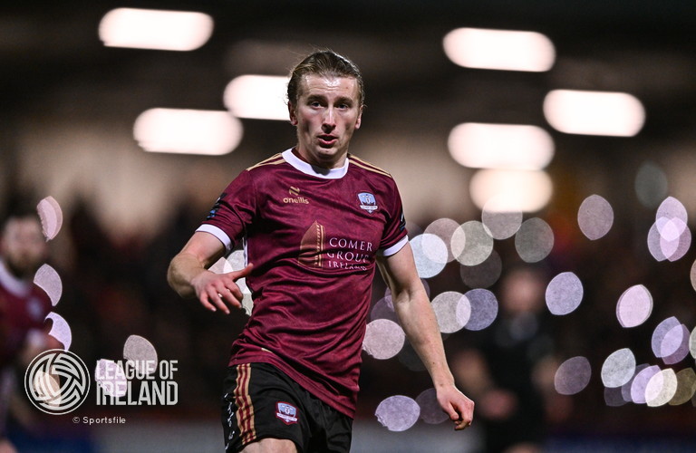
37. Galway (A)
One big superliminal advertisement for the Comers' casino in Greece
One big superliminal advertisement for the Comers' casino in Greece
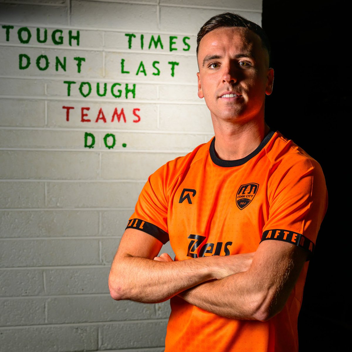
36. Cork (H)
Those of you who have been following these threads for the past 7 years know my thoughts on fades/gradients on a home shirt already so it's no surprise I'm no fan of this one
The RA logo on the socks is also weird looking, like a 4:3 TV image stretched out to 16:9
Those of you who have been following these threads for the past 7 years know my thoughts on fades/gradients on a home shirt already so it's no surprise I'm no fan of this one
The RA logo on the socks is also weird looking, like a 4:3 TV image stretched out to 16:9

35. Drogheda (H)
Wouldn't look out of place riding a Grand National horse, but it has no place on a football field
Reminds me of when your player glitches out on Fifa
Spared being any lower for being so batshit that you can't look away either - and probable future cult status
Wouldn't look out of place riding a Grand National horse, but it has no place on a football field
Reminds me of when your player glitches out on Fifa
Spared being any lower for being so batshit that you can't look away either - and probable future cult status
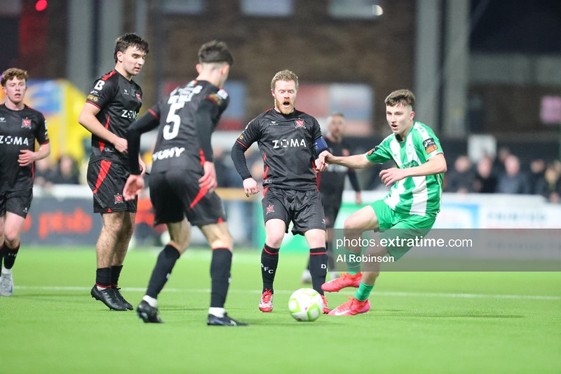
34. Dundalk (H)
The most e-sports a League of Ireland shirt has looked yet - and that's not a compliment
The most e-sports a League of Ireland shirt has looked yet - and that's not a compliment
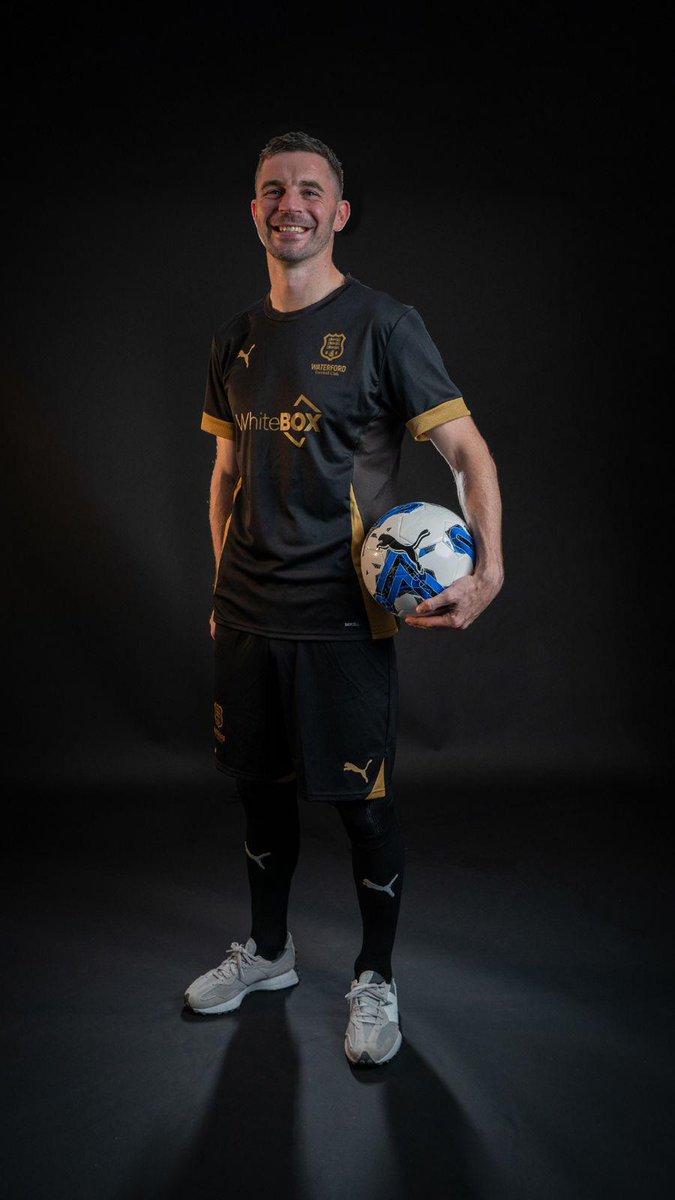
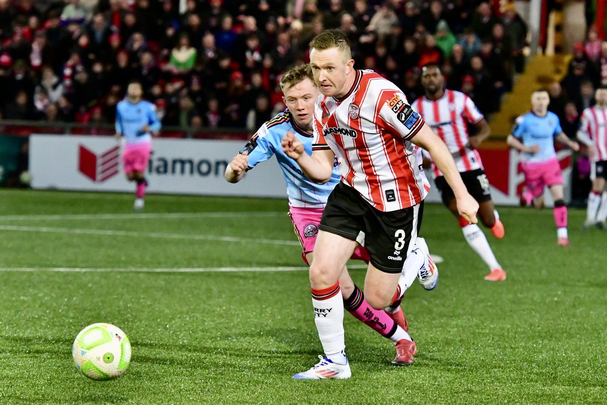
33. Waterford (A)
Puma looking through rejected Drogheda United away kit designs and landing on the worst one they could find
Much like the above, it's all a bit e-sports and a bit kiddy for me - am I so out of touch?
Puma looking through rejected Drogheda United away kit designs and landing on the worst one they could find
Much like the above, it's all a bit e-sports and a bit kiddy for me - am I so out of touch?

32. Shamrock Rovers (A)
It's time to let the purple Rovers away template rest for a while after this one
I'm normally a sucker for retro, but this is easily the gaudiest one yet - which, perhaps, makes it the most faithful?
Points added for the bands on the shorts, rate that
It's time to let the purple Rovers away template rest for a while after this one
I'm normally a sucker for retro, but this is easily the gaudiest one yet - which, perhaps, makes it the most faithful?
Points added for the bands on the shorts, rate that
31. Bray (H)
30. Bray (A)
Something about Capelli that screams 3.Liga Road to Glory
Always nice to have different manufacturers knocking around, but these are two bog standard, inoffensive efforts knocked down by second season syndrome
30. Bray (A)
Something about Capelli that screams 3.Liga Road to Glory
Always nice to have different manufacturers knocking around, but these are two bog standard, inoffensive efforts knocked down by second season syndrome
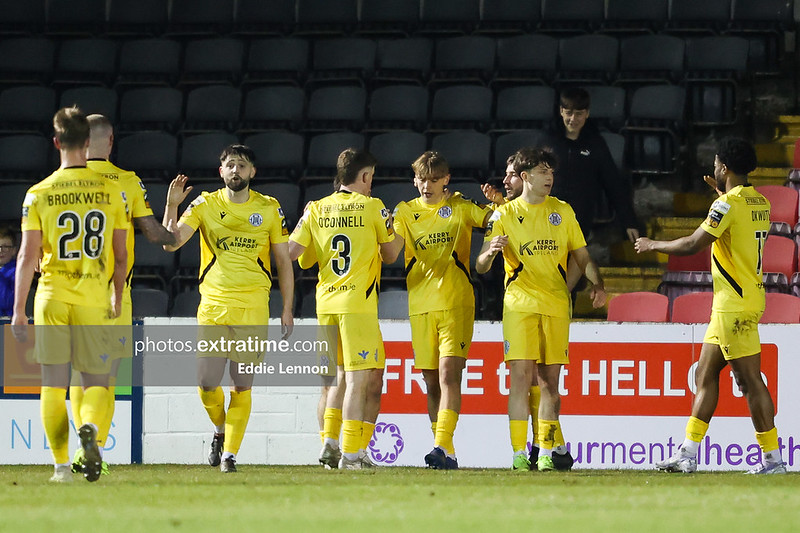
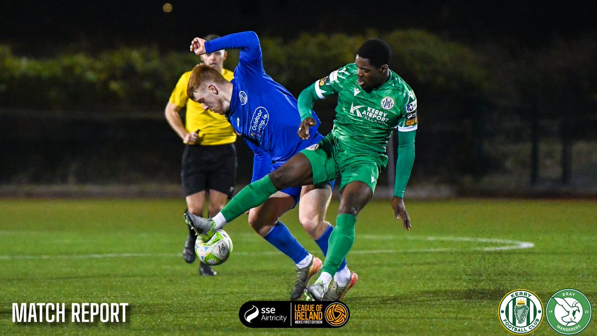
29. Kerry (A)
The Mendoza Line
Darker sides of the shirt cutting in and the black accents instead of green knock this down a few pegs, but we have reached the Gentleman's Three (knocking out a three star effort in your sleep, ht to @MSidgwick for the phrase) stage of the list
The Mendoza Line
Darker sides of the shirt cutting in and the black accents instead of green knock this down a few pegs, but we have reached the Gentleman's Three (knocking out a three star effort in your sleep, ht to @MSidgwick for the phrase) stage of the list
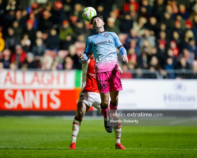
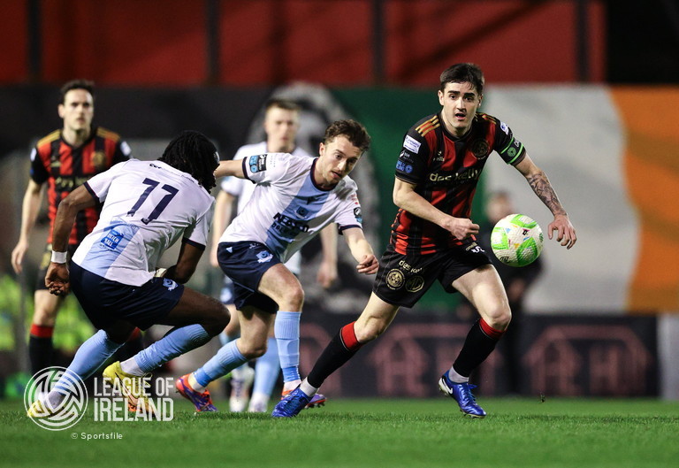
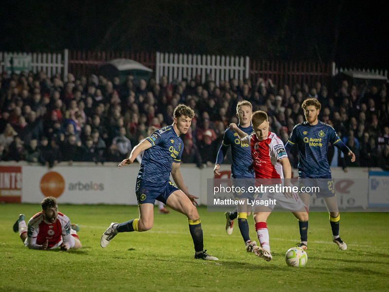
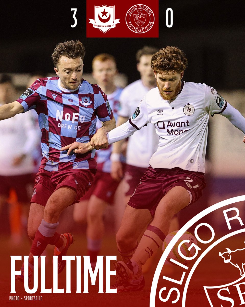
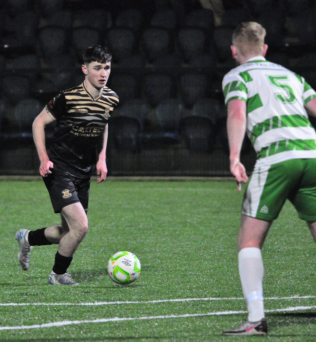
28. Drogheda (A)
Drogs have used this combo of colours better in the past - but they've also done much worse, and given the home kit, we'll take it
Might work better with navy socks, but accept they'd be forced to change them often anyway (eg in the fixture shown)
Drogs have used this combo of colours better in the past - but they've also done much worse, and given the home kit, we'll take it
Might work better with navy socks, but accept they'd be forced to change them often anyway (eg in the fixture shown)
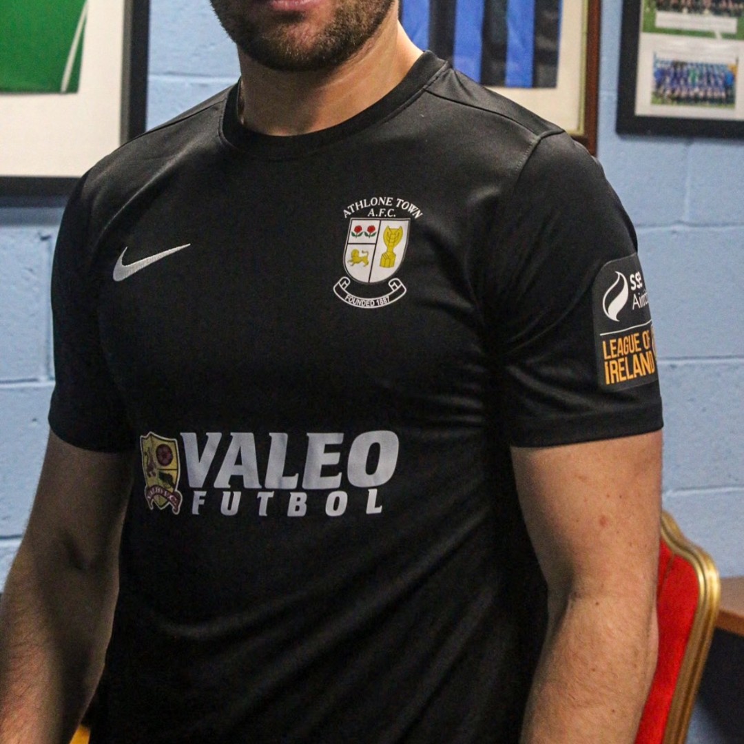
27. Athlone (H)
Every generic teamwear Athlone kit there's even been with a shite sponsor but given as much grace as possible because at least it wasn't last year's strange all-black affair
Every generic teamwear Athlone kit there's even been with a shite sponsor but given as much grace as possible because at least it wasn't last year's strange all-black affair
26. Dundalk (A)
Better than the home - red accents in different places make them less invasive on the shirt, and just works better as an overall package
Really do like those socks too, best part of either kit (thank you Daryl Horgan for showing them all in full)
Better than the home - red accents in different places make them less invasive on the shirt, and just works better as an overall package
Really do like those socks too, best part of either kit (thank you Daryl Horgan for showing them all in full)
25. Cork (A)
If you're going full Bohs, doing it in a subtle way is much preferred
Nice nod to Cork Celtic too with the colour choice - though if Cork start referring to all their old clubs they'll have 27 kits a year
If you're going full Bohs, doing it in a subtle way is much preferred
Nice nod to Cork Celtic too with the colour choice - though if Cork start referring to all their old clubs they'll have 27 kits a year
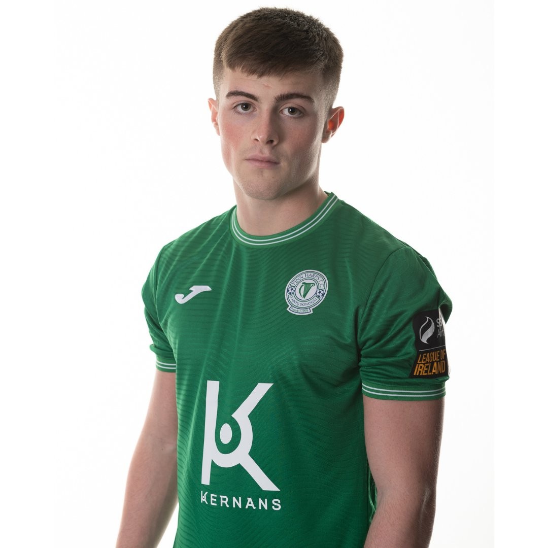
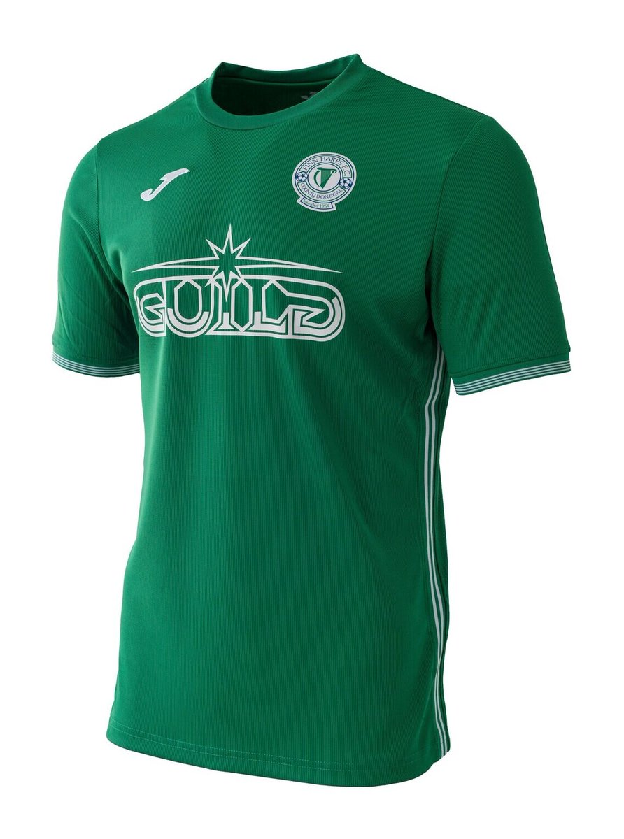
24. Harps (A)
Wait! Don't be fooled!
It's just a 2022 Harps away shirt with a stupid, cheap hat!
It still embodies all the awful football it did before!
Wait! Don't be fooled!
It's just a 2022 Harps away shirt with a stupid, cheap hat!
It still embodies all the awful football it did before!
X (formerly known as Twitter) making me break the thread here, go get a banana and cup of tea before the second half
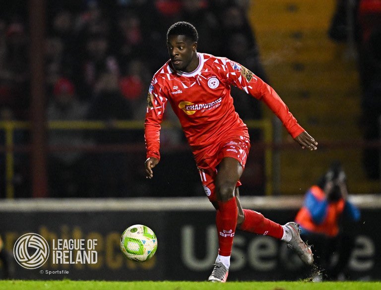
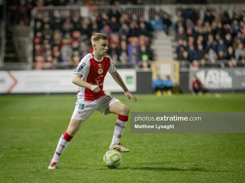
23. Shels (H)
Missed Potential City this one, would much rather a full on Dulux kit redo than this halfway house version
Biggest thing going for it is the shorts
Missed Potential City this one, would much rather a full on Dulux kit redo than this halfway house version
Biggest thing going for it is the shorts
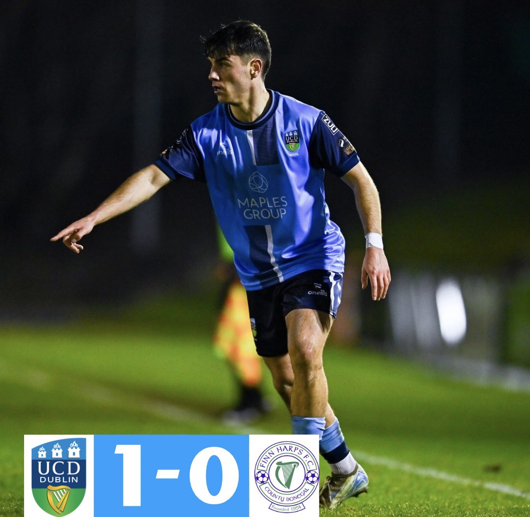
22. UCD (A)
Sleeper hit this one - quite like the black flashes on the collar and the shorts, elevates a fairly generic kit otherwise
Sleeper hit this one - quite like the black flashes on the collar and the shorts, elevates a fairly generic kit otherwise
21. Waterford (3rd)
It's a bog standard teamwear template, but it's a bog standard teamwear template in black and gold so you won't hear me complaining too much
It's a bog standard teamwear template, but it's a bog standard teamwear template in black and gold so you won't hear me complaining too much
20. Sligo (A)
The Roscommon Rovers
Pattern on the shirt which is nice in the release photos doesn't stand out quite as much in person, but it's still quite lovely
The Roscommon Rovers
Pattern on the shirt which is nice in the release photos doesn't stand out quite as much in person, but it's still quite lovely
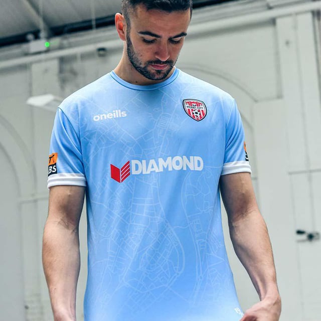
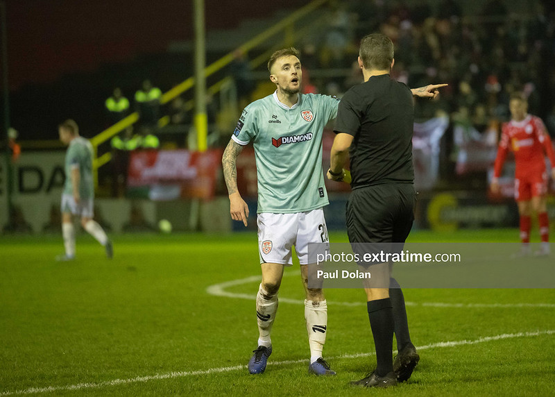
19. Derry (A)
Like the colour, like the collar, Derry have had stronger efforts in the recent past but this one keeps them respectable
Like the colour, like the collar, Derry have had stronger efforts in the recent past but this one keeps them respectable
18. Kerry (H)
I am once again asking Kerry FC to turn their white accents yellow because this would be top if they did
Smart overall, sleeve design strikes the right balance with not being too busy, maybe a few flashes on the shorts or socks could pump it up a bit more too
I am once again asking Kerry FC to turn their white accents yellow because this would be top if they did
Smart overall, sleeve design strikes the right balance with not being too busy, maybe a few flashes on the shorts or socks could pump it up a bit more too
17. St Pat's (A)
Again, a simple colour change - the gold accents and crest to navy (and maybe navy socks) - would send this soaring
As it is, it's very smart - much like Derry, Pat's have had better, but it's by no means bad
Again, a simple colour change - the gold accents and crest to navy (and maybe navy socks) - would send this soaring
As it is, it's very smart - much like Derry, Pat's have had better, but it's by no means bad
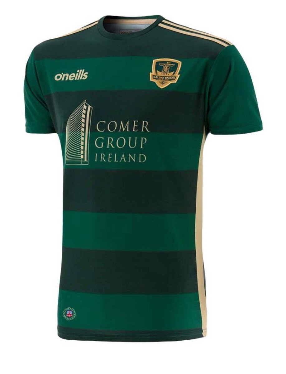
16. Galway (H)
15. Derry (H)
Last year's bronze and silver medals, thrust into action again this year
I must stick to my rules and clear the path for the newcomers - but once more, with feeling, for your viewing pleasure
15. Derry (H)
Last year's bronze and silver medals, thrust into action again this year
I must stick to my rules and clear the path for the newcomers - but once more, with feeling, for your viewing pleasure
14. Drogheda (3rd)
Can they just make this the home kit instead? TIA x
Can they just make this the home kit instead? TIA x

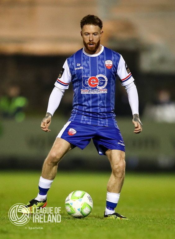
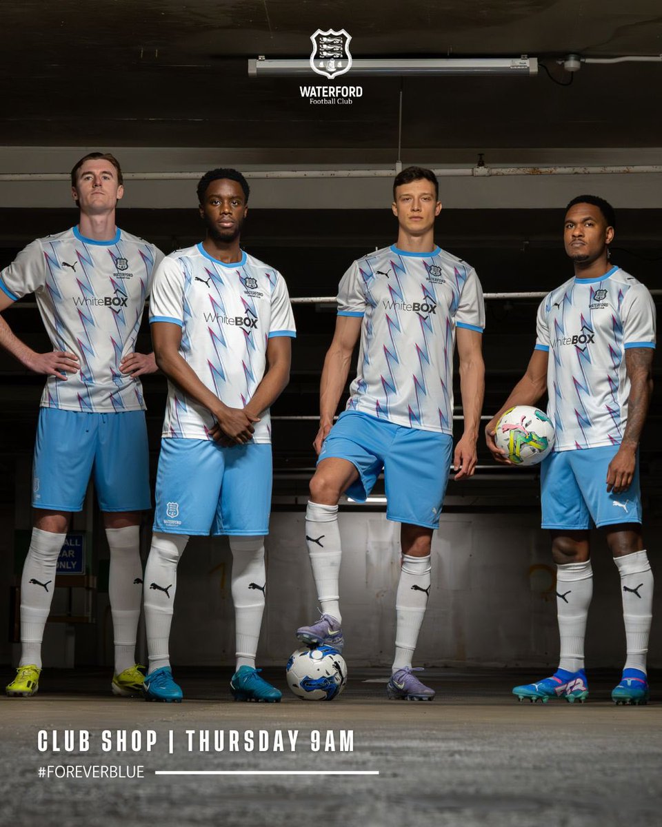
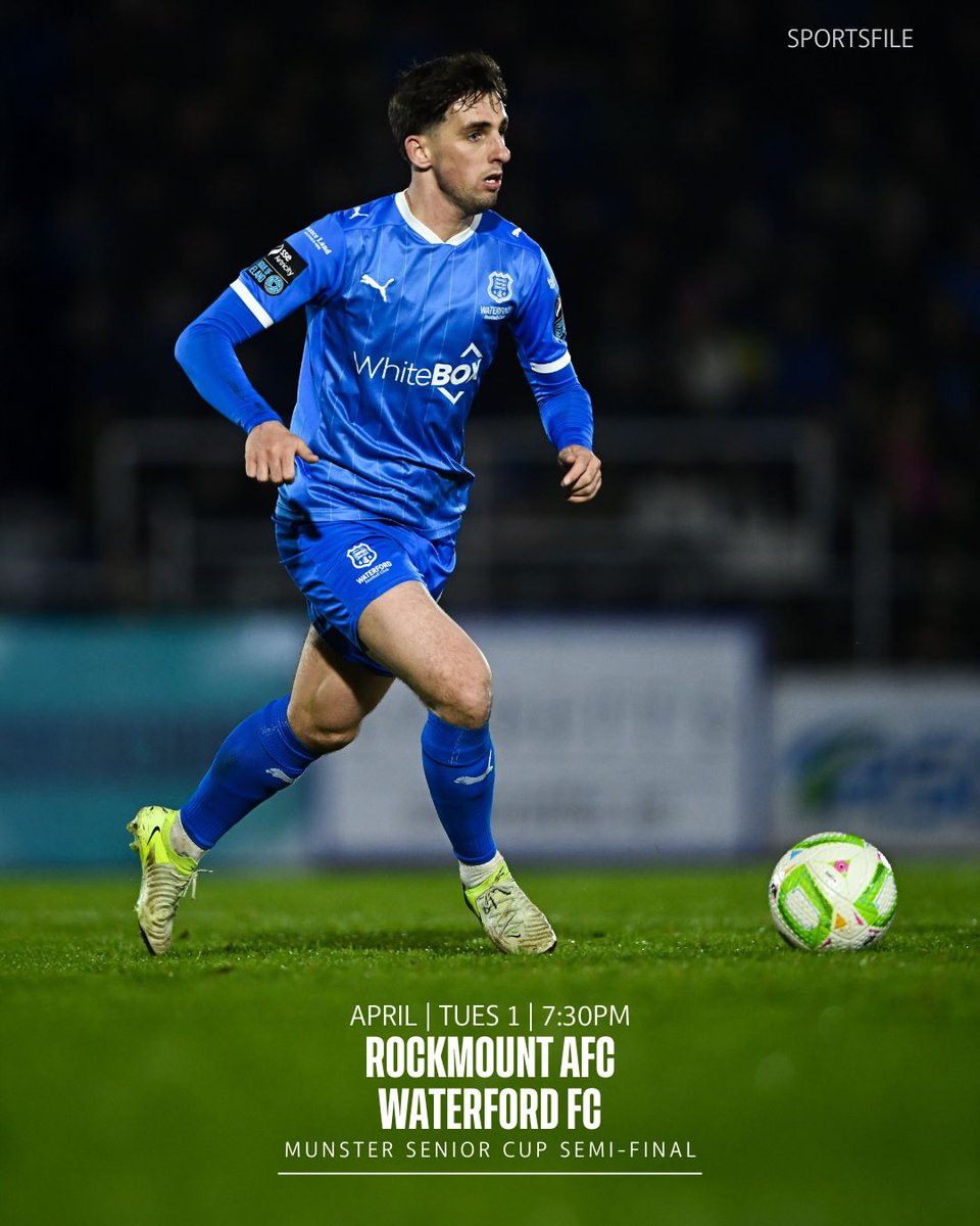
13. Waterford (H)
Like Sligo (A), one that the launch photos does more justice to than real life, but I'm a sucker for a pinstripe at the end of the day
Solid first effort with a new manufacturer, always appreciated
Like Sligo (A), one that the launch photos does more justice to than real life, but I'm a sucker for a pinstripe at the end of the day
Solid first effort with a new manufacturer, always appreciated
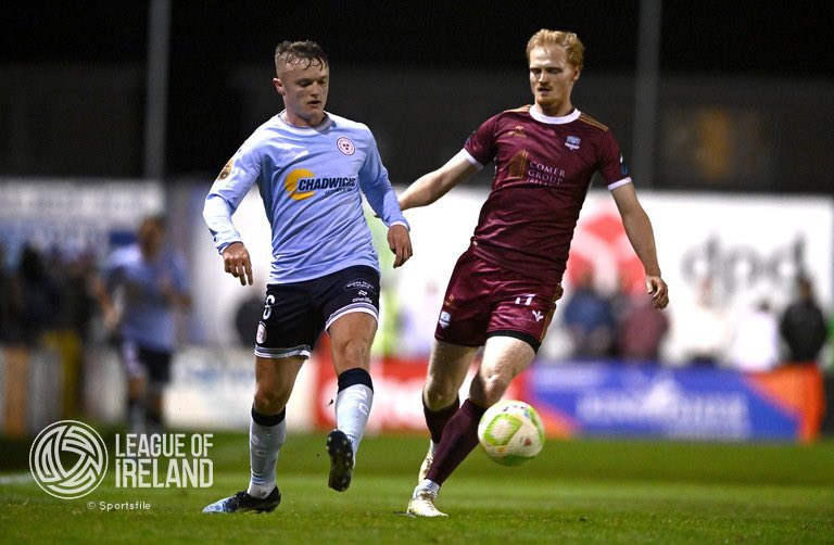
12. Longford (A)
Big thick stripes, nice collar design, proper socks with a big contrasting colour turnover at the top, and sponsorless - no woke nonsense allowed in the midlands
Big thick stripes, nice collar design, proper socks with a big contrasting colour turnover at the top, and sponsorless - no woke nonsense allowed in the midlands
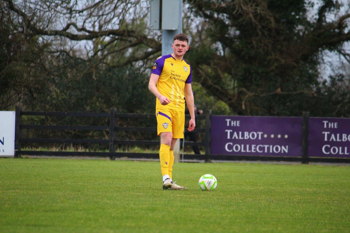
11. Sligo (3rd)
Always something to be said for keeping it simple when you can make it look that nice
Two points of contention - a proper collar would send it soaring, and in all fairness, it is a bit Galway for Sligo
Always something to be said for keeping it simple when you can make it look that nice
Two points of contention - a proper collar would send it soaring, and in all fairness, it is a bit Galway for Sligo
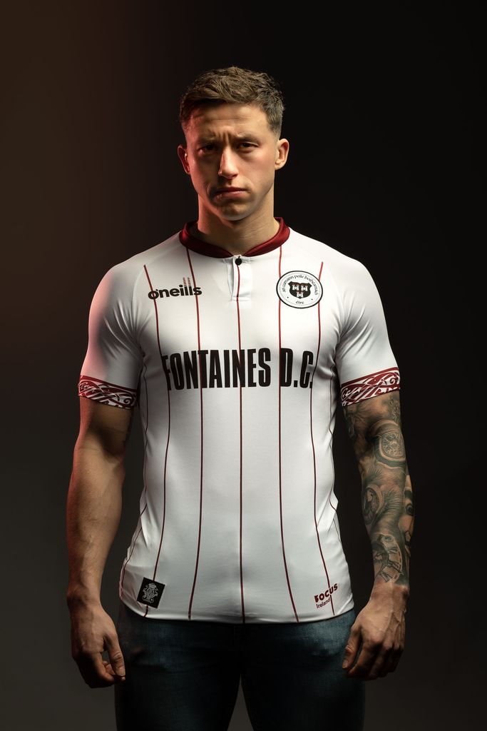
10. Shels (A)
We're into the really good stuff now
A three-colour kit that's balanced throughout, the pattern in the shirt body, the bands on the shorts matching the collar - very little to dislike here
We're into the really good stuff now
A three-colour kit that's balanced throughout, the pattern in the shirt body, the bands on the shorts matching the collar - very little to dislike here
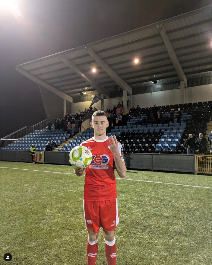
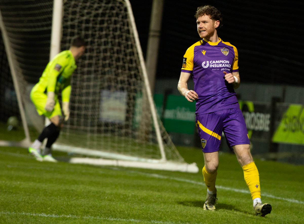
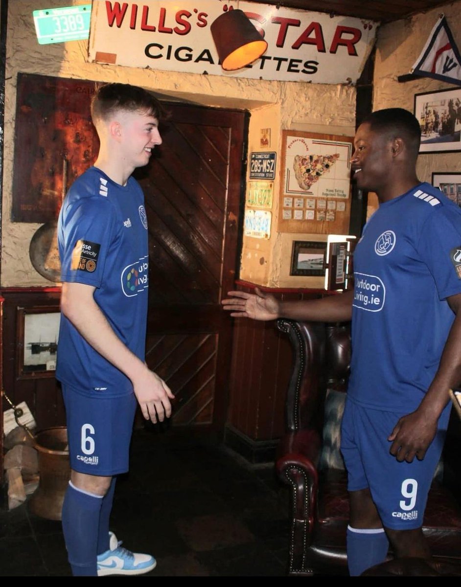
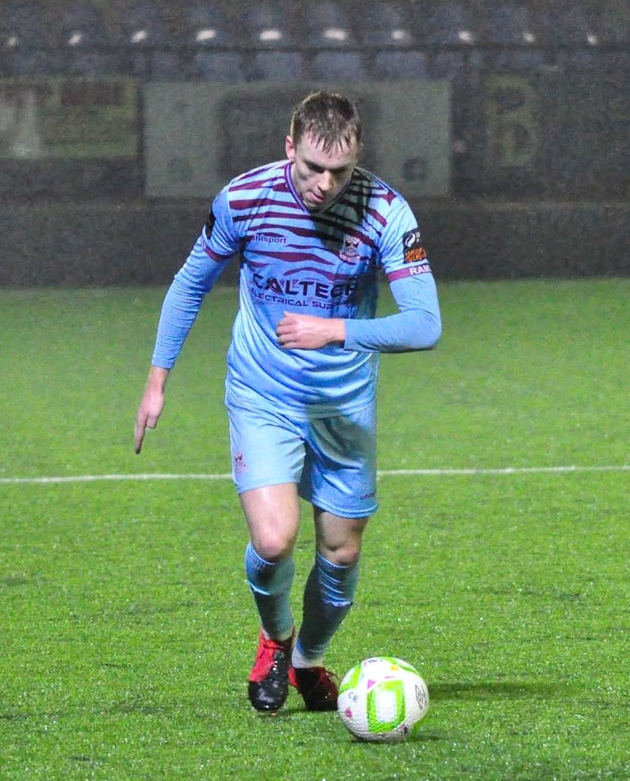
9. Cobh (A)
8. Cobh (H)
Probably will be the two most divisive picks (so far...) I'll admit, but I think these are fucking beautiful shirts - love the design, collar, Rams on the cuffs - and they have perfect interchangeability and that pleases me no end
8. Cobh (H)
Probably will be the two most divisive picks (so far...) I'll admit, but I think these are fucking beautiful shirts - love the design, collar, Rams on the cuffs - and they have perfect interchangeability and that pleases me no end
7. Shamrock Rovers (H)
Bit of a rarity here - a Rovers home kit that I really quite like
Proper collar, little shamrocks sublimated in the green hoops, hooped socks, and those gorgeous bands on the shorts again - timeless look imo
Bit of a rarity here - a Rovers home kit that I really quite like
Proper collar, little shamrocks sublimated in the green hoops, hooped socks, and those gorgeous bands on the shorts again - timeless look imo

6. St Pat's (H)
Been waiting for the Pat's/Ajax modern redo, and I think Umbro have done it very well here
Diamonds in the red , collar white-on-red then red-on-white, central crest, all big thumbs up
Red socks variant seen above is better - but that's not the default it seems
Been waiting for the Pat's/Ajax modern redo, and I think Umbro have done it very well here
Diamonds in the red , collar white-on-red then red-on-white, central crest, all big thumbs up
Red socks variant seen above is better - but that's not the default it seems
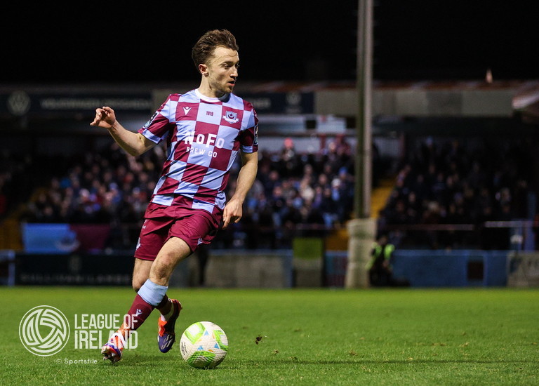
5. Longford (H)
Pure Eircom
Just missing a bit of Flancare on the front
Pure Eircom
Just missing a bit of Flancare on the front
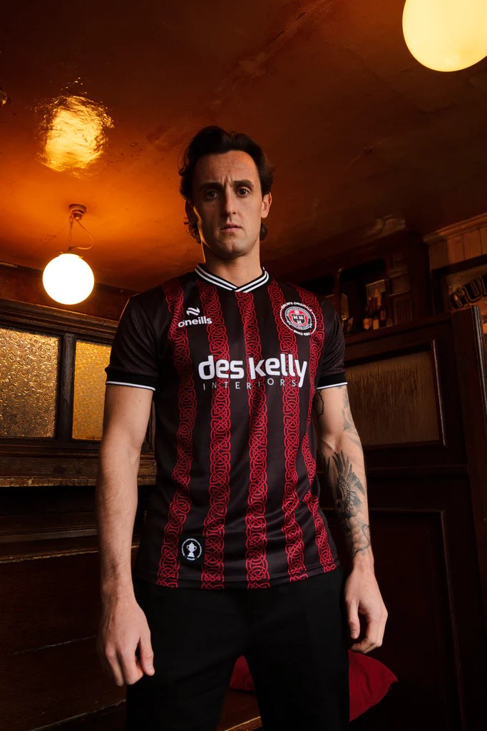
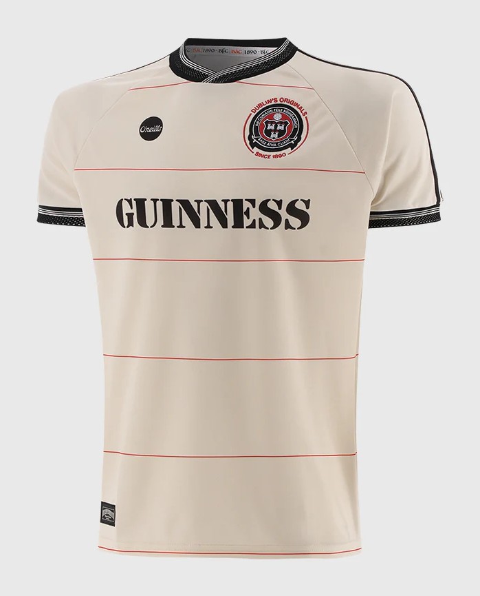
4. Bohs (A)
The worst person you know is pairing this with a Pellador jumper and second-hand Adidas Sambas at every festival this year - but they will, unfrotunately, look good doing it
Should have a retro Bohs crest on it though to match the theme
The worst person you know is pairing this with a Pellador jumper and second-hand Adidas Sambas at every festival this year - but they will, unfrotunately, look good doing it
Should have a retro Bohs crest on it though to match the theme
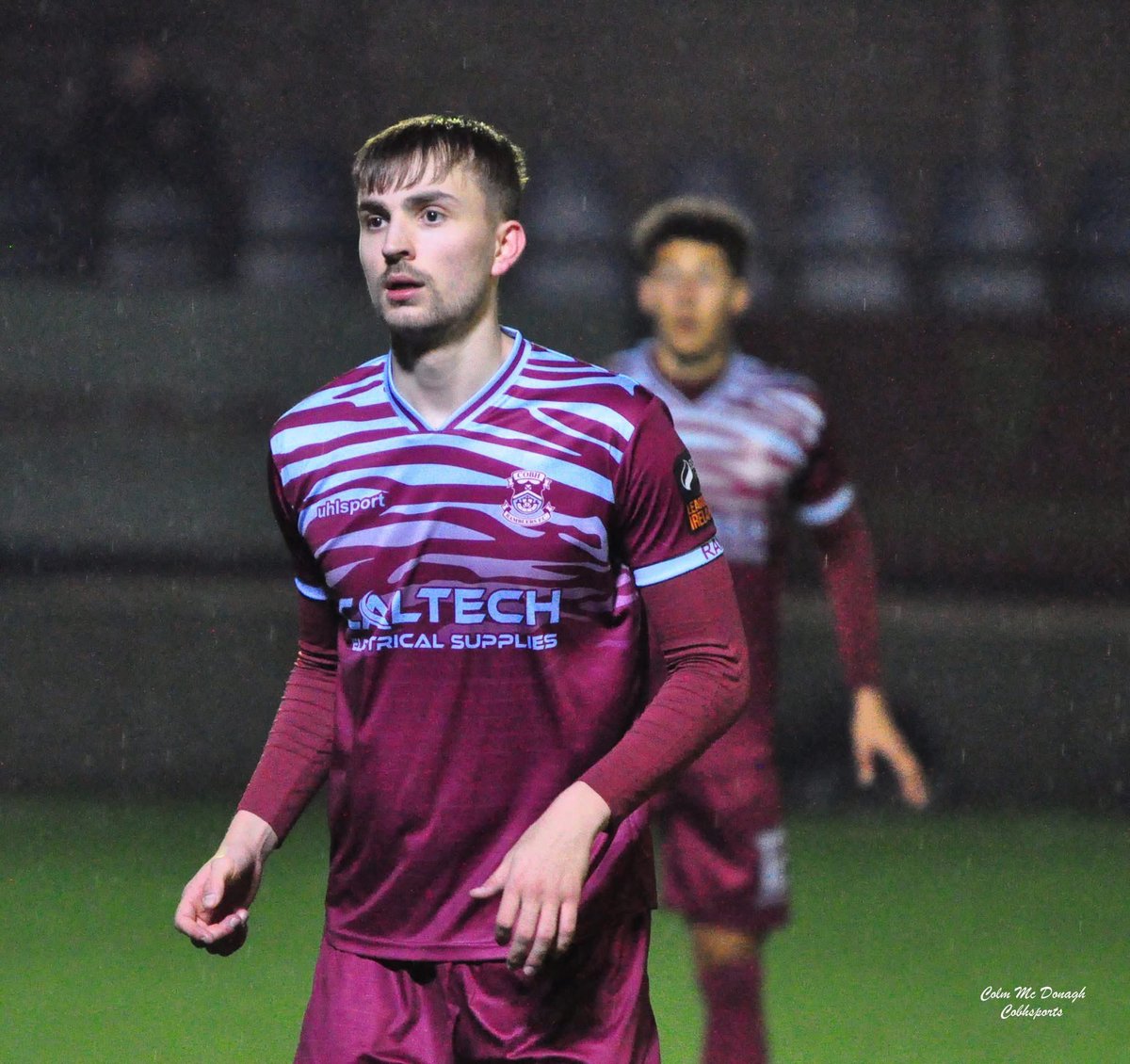
3. Cobh (3rd)
Mauled by the Ramblers, you're getting mauled by the Ramblers
Mauled by the Ramblers, you're getting mauled by the Ramblers
2. Bohs (H)
I came very close to handing a Bohs home jersey the win for a second year in a row - and I actually think this one is nicer than last year with the gold accents, brighter red, proper stripes
It's just a better looking year, and there's one better looking kit
I came very close to handing a Bohs home jersey the win for a second year in a row - and I actually think this one is nicer than last year with the gold accents, brighter red, proper stripes
It's just a better looking year, and there's one better looking kit

1. Sligo (H)
For now, let me say
Without hope or agenda
Just because it's the kit rankings
And in the kit rankings you tell the truth
To me, you are perfect
For now, let me say
Without hope or agenda
Just because it's the kit rankings
And in the kit rankings you tell the truth
To me, you are perfect


STATS (awarded points 5-1 for the top 5 of each year since 2019)
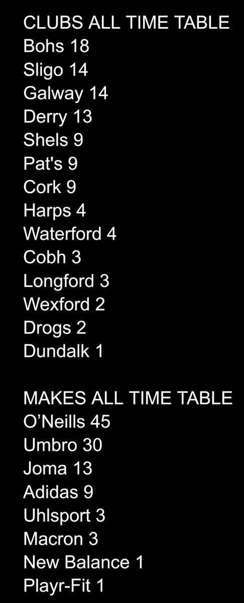
Not much love for Cork this year @museumofjerseys but those of a Cobh persuasion can be happy
If you enjoyed this thread then for the love of god vote Hulk
Don't let the Geordie menace win
Don't let the Geordie menace win
https://x.com/thecultraspod/status/1905244684949004349

• • •
Missing some Tweet in this thread? You can try to
force a refresh


