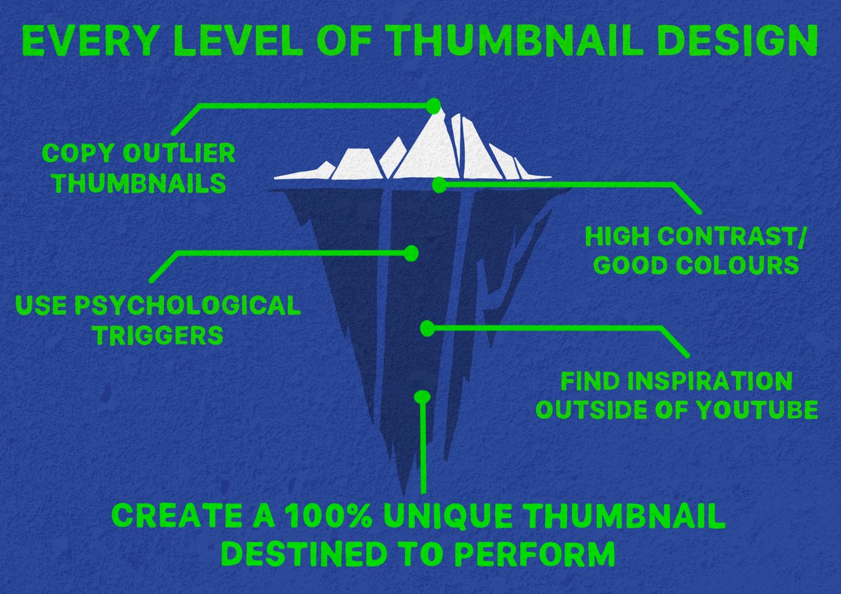
How to master thumbnails in 5 minutes (more technical edition)🧵
If you’ve been on Youtube Twitter long enough, you’ve heard about the “copying outliers” strategy.
Heck, I’ve been one of its biggest fans!
BUT…
2025 Youtube is different.
Heck, I’ve been one of its biggest fans!
BUT…
2025 Youtube is different.
Now, ORIGINALITY is king.
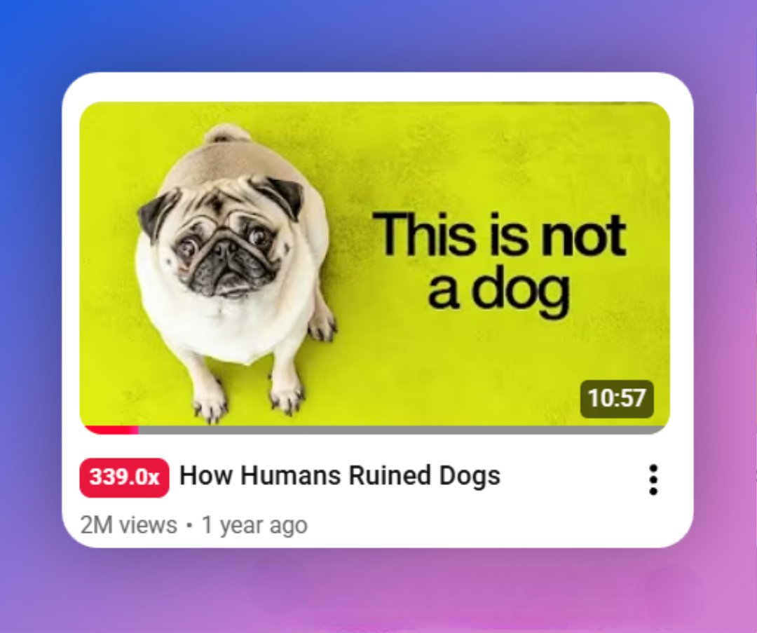
This was an important video for Bryan, my client, as he had been working on it for a long time.
He needed a thumbnail which matched the video's originality and high quality.
This was an important video for Bryan, my client, as he had been working on it for a long time.
He needed a thumbnail which matched the video's originality and high quality.
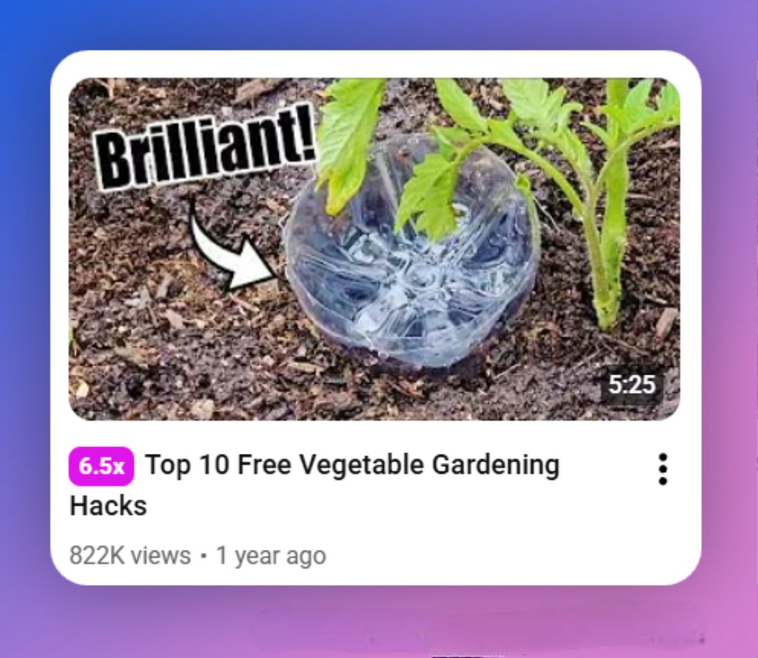
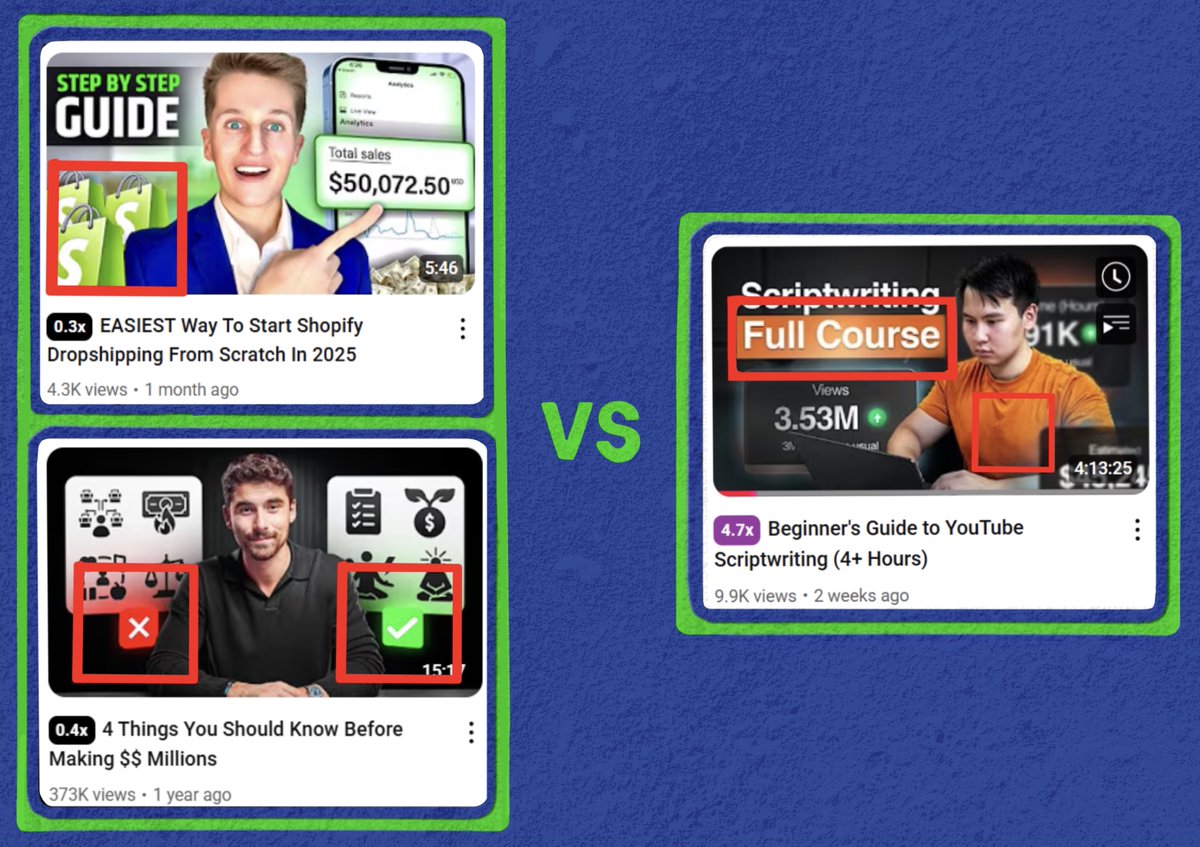
Bryan's in the business niche, so most designers would have made a simple "result in your face"
Something like this...
Something like this...
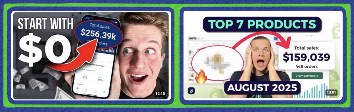
This wouldn't have worked because the format has been used so many times that it now:
- Looks low-effort & cheap
- Does not grab attention
If you're a big business or have a high-ticket offer (like Bryan), you can't afford this.
- Looks low-effort & cheap
- Does not grab attention
If you're a big business or have a high-ticket offer (like Bryan), you can't afford this.
So, don't copy a random thumbnail.
Instead, create a thumbnail which has:
1. Unconventional ideation
2. Unconventional design
3. Both
Some examples of each type:
Instead, create a thumbnail which has:
1. Unconventional ideation
2. Unconventional design
3. Both
Some examples of each type:
For #1:
Scroll through Pinterest & look for cool movie posters (this is my go-to method)
For #2 & 3:
Sit down & think what you can change about an 𝘦𝘹𝘪𝘴𝘵𝘪𝘯𝘨 thumbnail which...
Scroll through Pinterest & look for cool movie posters (this is my go-to method)
For #2 & 3:
Sit down & think what you can change about an 𝘦𝘹𝘪𝘴𝘵𝘪𝘯𝘨 thumbnail which...
𝗣𝗿𝗲𝘀𝗲𝗿𝘃𝗲𝘀 𝘁𝗵𝗲 𝗿𝗲𝗮𝘀𝗼𝗻 𝘄𝗵𝘆 the thumbnail worked, while also looking 𝘂𝗻𝗶𝗾𝘂𝗲
What this looks like in action:
Conventional ideation, unconventional design
What this looks like in action:
Conventional ideation, unconventional design
Result-in-your-face thumbnails worked because big numbers create interest.
Viewers want to know how someone got those numbers.
So, I knew that I had to show results, but in a different way
Viewers want to know how someone got those numbers.
So, I knew that I had to show results, but in a different way
While I was working on this thumbnail, Apple released iOS 26.
As soon as I saw Liquid Glass, I had a solution to the issue.
Adding a glass effect to the result assets made the thumbnail look fresh & interesting, rather than stale & boring
As soon as I saw Liquid Glass, I had a solution to the issue.
Adding a glass effect to the result assets made the thumbnail look fresh & interesting, rather than stale & boring

The concept was great, but for a thumbnail like this, the execution had to be equally good.
Couldn't just dump everything on a Canva file.
It had to look premium, so...
Couldn't just dump everything on a Canva file.
It had to look premium, so...
We:
- Color corrected Bryan's face to reflect the light off the text & laptop
- Made sure the background looked natural
- Subtly worked in Bryan's branding with the orange shirt color
- Color corrected Bryan's face to reflect the light off the text & laptop
- Made sure the background looked natural
- Subtly worked in Bryan's branding with the orange shirt color
A bit about colors on thumbnails...
🔴 & 🟢 are great to show danger & growth.
But, they're overused in the business niche so viewers usually skip such thumbnails
This is why the 🟠 highlight worked so well.
🔴 & 🟢 are great to show danger & growth.
But, they're overused in the business niche so viewers usually skip such thumbnails
This is why the 🟠 highlight worked so well.
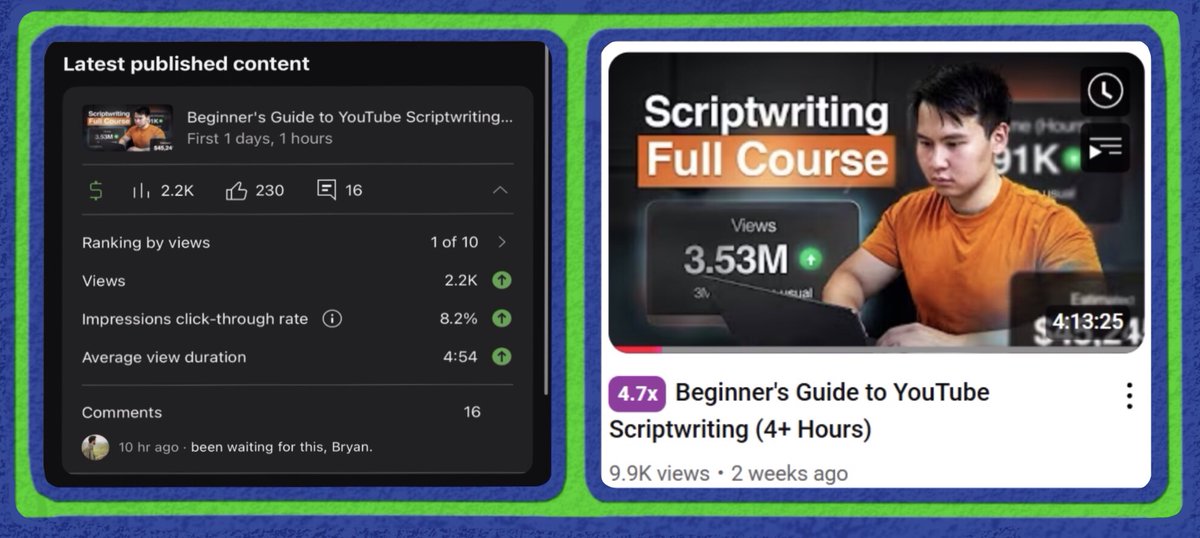
The result:
- 10k views in a tiny niche
- 1of10 video
- A 5x outlier
- Generated 200 newsletter subs for Bryan
But...
- 10k views in a tiny niche
- 1of10 video
- A 5x outlier
- Generated 200 newsletter subs for Bryan
But...
This thread was just the tip of the iceberg.
I can write a million threads, explaining my process, but they can never replace my experience.
I can write a million threads, explaining my process, but they can never replace my experience.
In the past 2 years, I have:
- Designed 1000+ thumbnails, for some of the best creators in the game.
- Gotten 1M+ views for many 𝗻𝗲𝘄 channels
Youtube creators: Is your video a banger, but your thumbnail flops? Send me a DM, and let’s talk!
- Designed 1000+ thumbnails, for some of the best creators in the game.
- Gotten 1M+ views for many 𝗻𝗲𝘄 channels
Youtube creators: Is your video a banger, but your thumbnail flops? Send me a DM, and let’s talk!
• • •
Missing some Tweet in this thread? You can try to
force a refresh