
Ahead of the economic roundtable next week, have to get this off my chest. This graph appeared in the RBA's monetary policy statement this week, showing an alarming comparison of productivity growth over recent years 🧵 
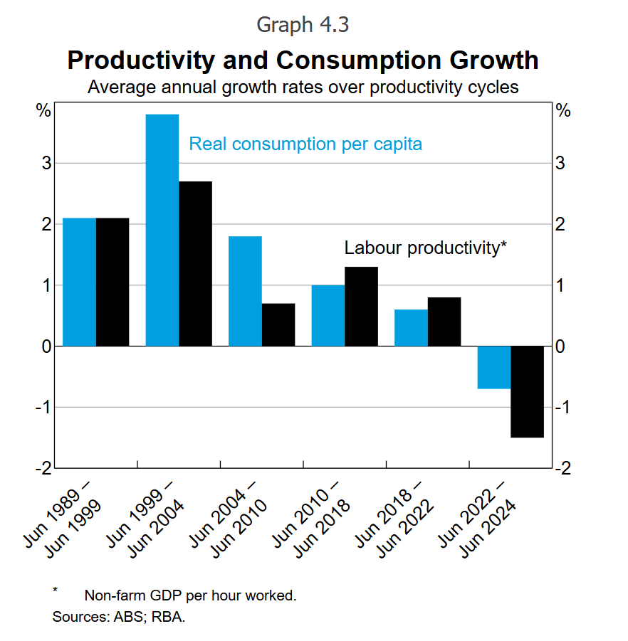
But there's two big problems. Productivity over short periods is notoriously noisey (as the RBA knows). So two years (far right of graph) doesn't mean much. But the biggest problem - check out the time periods across the entire graph...
They track 10 yrs, 5 yrs, 6 yrs, 8 yrs, 4 yrs and then 2 yrs. They are measuring different time periods when you should at least try for comparable periods. For instance, is 18-22 really useful given huge numbers of people stopped working during Covid (and productivity surged)?
Then there was this international comparison graph...
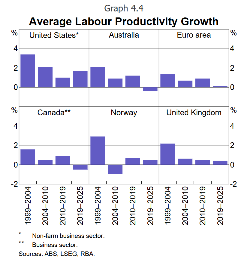
Again, different time periods. But the asterix on the US is doing a lot of work as it doesn't track the entire American economy for productivity while the numbers for almost all (bar Canada) other nations.
Productivity has tumbled everywhere since the GFC (and a little before that), and it is vital to turn it around. But these graphs don't help tell that story.
• • •
Missing some Tweet in this thread? You can try to
force a refresh


