We spend more than 90% of our time inside, so why do we design so many of our interiors like this?
Grey carpets, white walls, harsh lighting.
It's generic, boring, and genuinely bad for our physical and psychological health...
Grey carpets, white walls, harsh lighting.
It's generic, boring, and genuinely bad for our physical and psychological health...

Not all interiors look like this, but too many do, and more all the time.
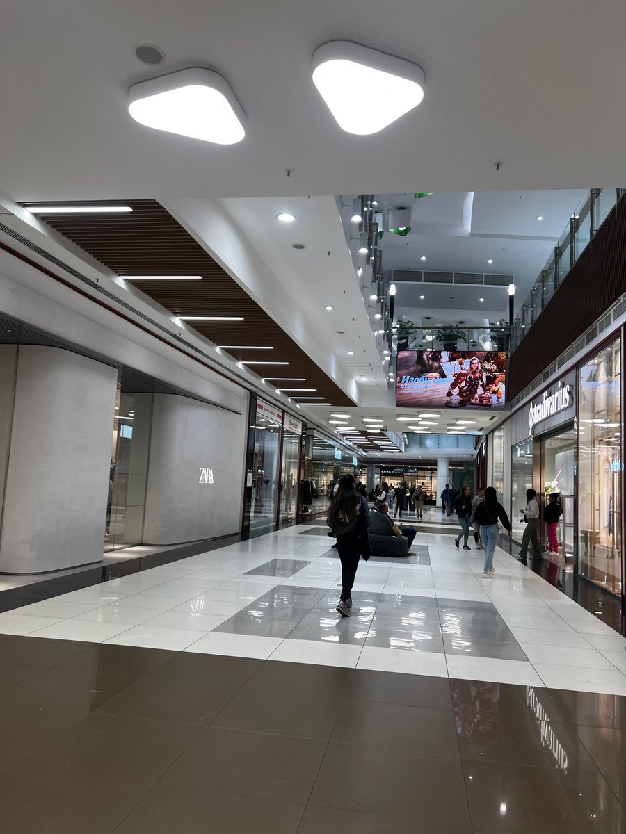
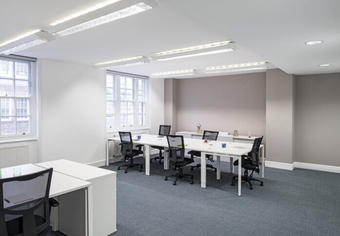
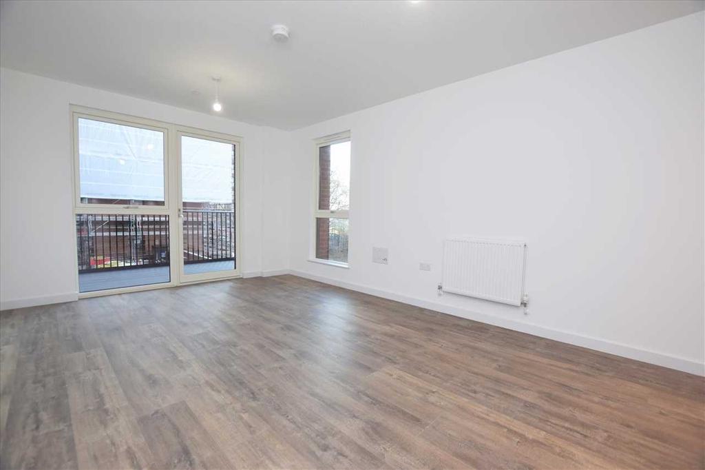
Grey carpets, white walls, harsh lighting, neutral colours for details, everything plastic, shiny, and rectangular.
This has become the standard for new buildings (and refurbishments) around the world.
Grey carpets, white walls, harsh lighting, neutral colours for details, everything plastic, shiny, and rectangular.
This has become the standard for new buildings (and refurbishments) around the world.

A common response is that some people like it, or at least don't mind it.
Maybe, but that's the problem.
The sum of all tastes is no taste at all, and if our aim is simply to make things that people "don't mind" then we end up with blandness.
Maybe, but that's the problem.
The sum of all tastes is no taste at all, and if our aim is simply to make things that people "don't mind" then we end up with blandness.

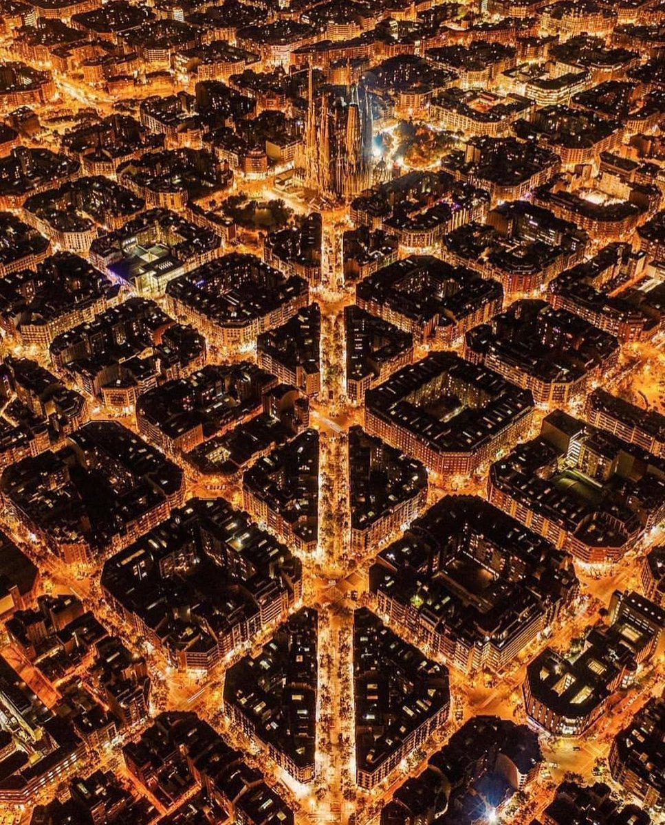
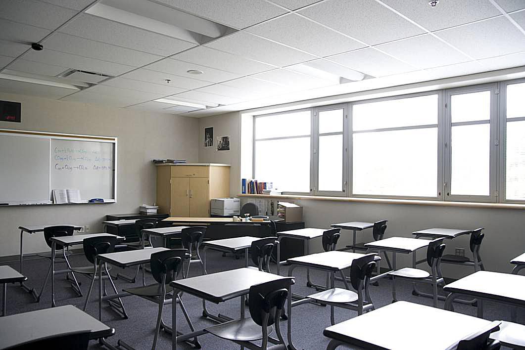
And this goes beyond domestic interiors.
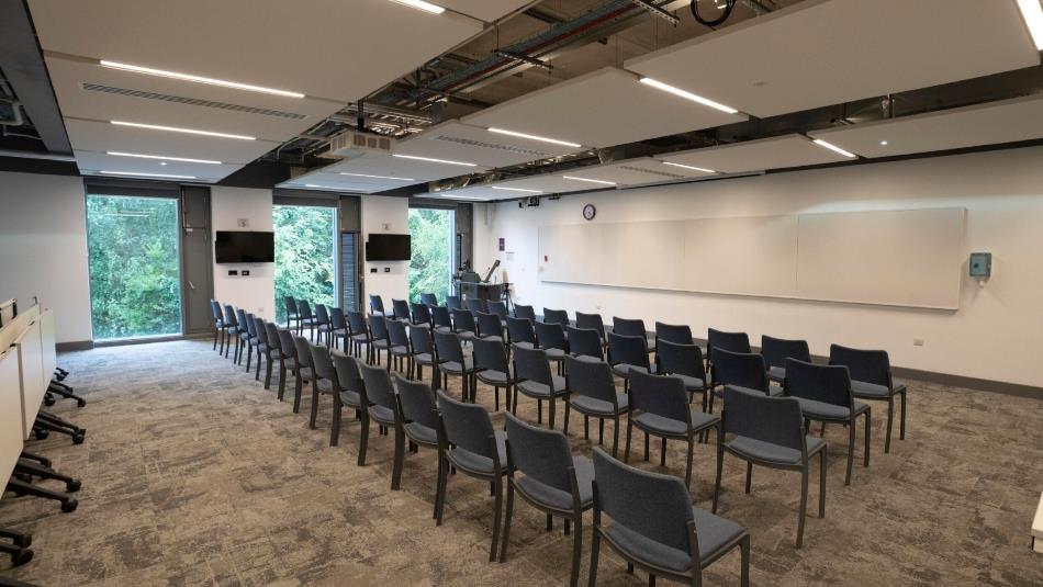
Commercial, civic, transport, and even educational interiors are just the same: boring, interchangeable, and incredibly cold.
Why would students be inspired by this kind of environment?
Commercial, civic, transport, and even educational interiors are just the same: boring, interchangeable, and incredibly cold.
Why would students be inspired by this kind of environment?
There are different reasons for why this has happened.
It's partly fashion: we are living in an age where minimalism is trendy.
But the main force is surely economic: capitalist consumerism forces us down to the lowest, most convenient, most generic common denominator.
It's partly fashion: we are living in an age where minimalism is trendy.
But the main force is surely economic: capitalist consumerism forces us down to the lowest, most convenient, most generic common denominator.
What's so bad about this kind of design? Three things.
First, the lack of colour.
It's unnatural and unpleasant to live or work in environments devoid of real colour, and yet most modern interiors are exclusively in greyscale.
Aggressively artificial.
First, the lack of colour.
It's unnatural and unpleasant to live or work in environments devoid of real colour, and yet most modern interiors are exclusively in greyscale.
Aggressively artificial.
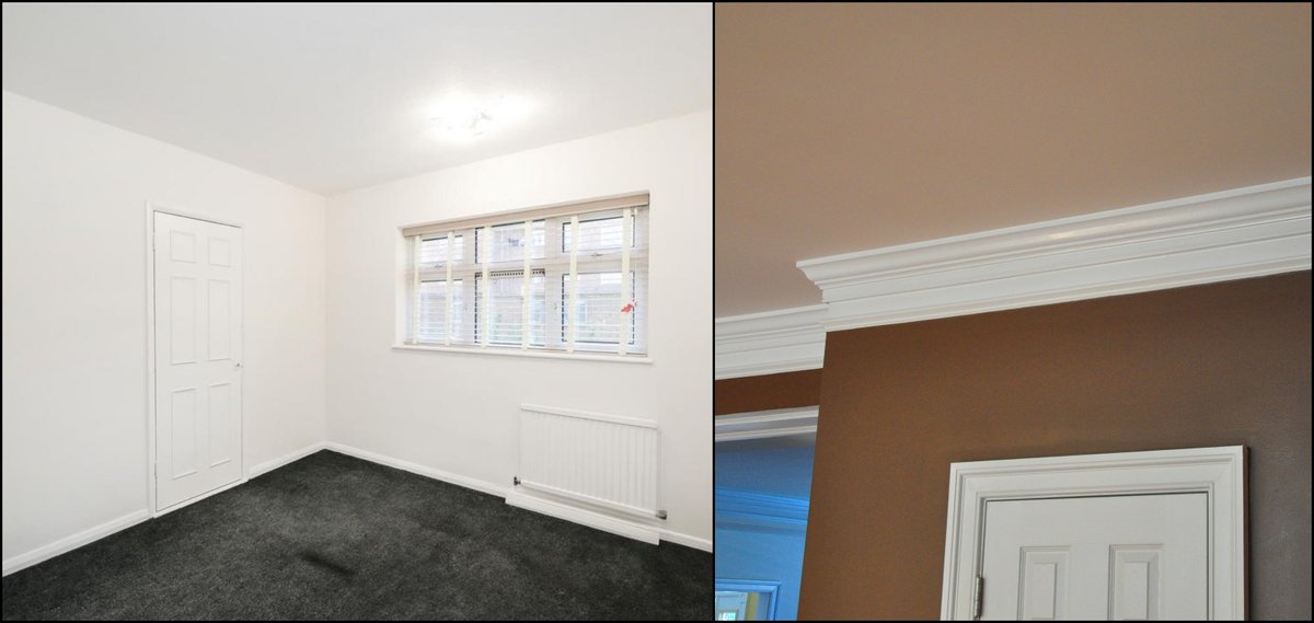
Second, the lack of meaningful detail: there's nothing to these spaces other than what "needs" to be there.
The details that defined historical interiors around the world — cornices, ceiling roses, wainscotting, even just ornamented doorhandles — have gone.
Rooms as boxes.
The details that defined historical interiors around the world — cornices, ceiling roses, wainscotting, even just ornamented doorhandles — have gone.
Rooms as boxes.
Sometimes all you need is a cornice (the moulding at the top of the wall) to transform a room from a mere box into a space for thinking, feeling beings.
Because humans aren't just creatures of convenience, and details aren't just "pretty" — they change how we feel and behave.
Because humans aren't just creatures of convenience, and details aren't just "pretty" — they change how we feel and behave.
Third, it all looks the same.
Every person has their own identity and character, but our interiors now look identical, everywhere.
This creates a weird dissonance between the world as we know it to be and the world as we have designed it.
Greyness triumphant.
Every person has their own identity and character, but our interiors now look identical, everywhere.
This creates a weird dissonance between the world as we know it to be and the world as we have designed it.
Greyness triumphant.

None of these things are good for us.
Studies have proven that blank, undetailed, generic, greyscale spaces make us more stressed, more anxious, and less productive.
That's why prisons look the way they do, after all.
Studies have proven that blank, undetailed, generic, greyscale spaces make us more stressed, more anxious, and less productive.
That's why prisons look the way they do, after all.

Strange, then, that we design our interiors — even schools — with same aesthetic as prisons!
We spend at least 90% of our time inside, and thus we are increasingly made to pass the majority of our brief lives in places that are unhealthy, boring, characterless, and standardised.
We spend at least 90% of our time inside, and thus we are increasingly made to pass the majority of our brief lives in places that are unhealthy, boring, characterless, and standardised.
Just look at the natural world: colour, detail, and variation are its laws.
No two leaves in the history of the world have ever been identical.
Although you don't always notice it consciously, natural varation of shape, form, and colour makes a huge psychological difference.
No two leaves in the history of the world have ever been identical.
Although you don't always notice it consciously, natural varation of shape, form, and colour makes a huge psychological difference.

The sky seems like it doesn't change much.
But, pay attention, and you realise the sky is ceaselessly evolving: its blueness deepening or brightening, clouds moving and changing shape, sunlight refracting through haze.
Good design embodies, even abstractly, natural principles.
But, pay attention, and you realise the sky is ceaselessly evolving: its blueness deepening or brightening, clouds moving and changing shape, sunlight refracting through haze.
Good design embodies, even abstractly, natural principles.

No two environments are the same: even the humblest woodland stream represents thousands of details combining to create a rich tapestry of colour, texture, and variation.
Too much going on distracts us, but nothing going on also distracts (and actively harms) us.
Too much going on distracts us, but nothing going on also distracts (and actively harms) us.

Some natural environments are less varied or colourful than others... and those are the ones we're least drawn to!
Think of a salt pan, barren hillside, or arid plain.
There is grandeur to such environments; but we never feel at home there, never quite safe or relaxed.
Think of a salt pan, barren hillside, or arid plain.
There is grandeur to such environments; but we never feel at home there, never quite safe or relaxed.

Humans are biologically wired to prefer environments that possess variation, detail, and colour.
And this isn't "preference" in the consumerist sense, but on a fundamental level.
When interior design doesn't account for this need, it makes us feel strange in a primordial way.
And this isn't "preference" in the consumerist sense, but on a fundamental level.
When interior design doesn't account for this need, it makes us feel strange in a primordial way.

And interior lighting only makes this worse: harsh white light is ugly, unnatural, and genuinely harmful to our physical and psychological health.
We evolved according to very specific temperatures and intensities of light, but totally ignore these facts with our cold interiors.
We evolved according to very specific temperatures and intensities of light, but totally ignore these facts with our cold interiors.

And history gives us countless examples of how to make interiors interesting, from all around the world.
Wallpaper, hangings, mouldings, ornament, mosaics, patterns, or (quite simply) natural rather than synthetic materials.
Consider metro stations:
Wallpaper, hangings, mouldings, ornament, mosaics, patterns, or (quite simply) natural rather than synthetic materials.
Consider metro stations:

But we have chosen a sterile, standardised world of harsh LEDS, greyscale tiles, and white walls instead.
And yet decoration — by which I mean any element of a thing that goes beyond mere physical function — isn't just a bonus; it is human nature to create and expect decoration.
And yet decoration — by which I mean any element of a thing that goes beyond mere physical function — isn't just a bonus; it is human nature to create and expect decoration.

Not everybody likes wallpaper, colourful carpets, or ornamentation, but that isn't a wholesale argument against them.
Gaudiness and tacky decoration are bad; minimalism can be, and often is, beautiful.
And it's more important to have boring schools, say, than no schools at all.
Gaudiness and tacky decoration are bad; minimalism can be, and often is, beautiful.
And it's more important to have boring schools, say, than no schools at all.
But people deserve better.
No wonder we're living in an Anxious Age when we've designed our interiors without regard to the aesthetics of human need.
It costs more, short term, to make them less boring; the long term cost, economically and of human happiness, is far greater.
No wonder we're living in an Anxious Age when we've designed our interiors without regard to the aesthetics of human need.
It costs more, short term, to make them less boring; the long term cost, economically and of human happiness, is far greater.

If you liked this, you'll enjoy my new book.
It's an introduction to culture — art, architecture, history, poetry — framed as an alternative to the 24 hour content cycle.
You can pre-order at the link in my bio.
(And get 25% off with Waterstones using the code 'CULTURAL25'!)
It's an introduction to culture — art, architecture, history, poetry — framed as an alternative to the 24 hour content cycle.
You can pre-order at the link in my bio.
(And get 25% off with Waterstones using the code 'CULTURAL25'!)

• • •
Missing some Tweet in this thread? You can try to
force a refresh