
hey wanna see something kinda interesting? this was the entire fix to the iPhone Antennagate in 2010. 20 bytes. 

For context, back in 2010 when the iPhone 4 came out, people noticed you could grip the phone in a certain way and the signal bars would plummet from 5 to, like, 2.
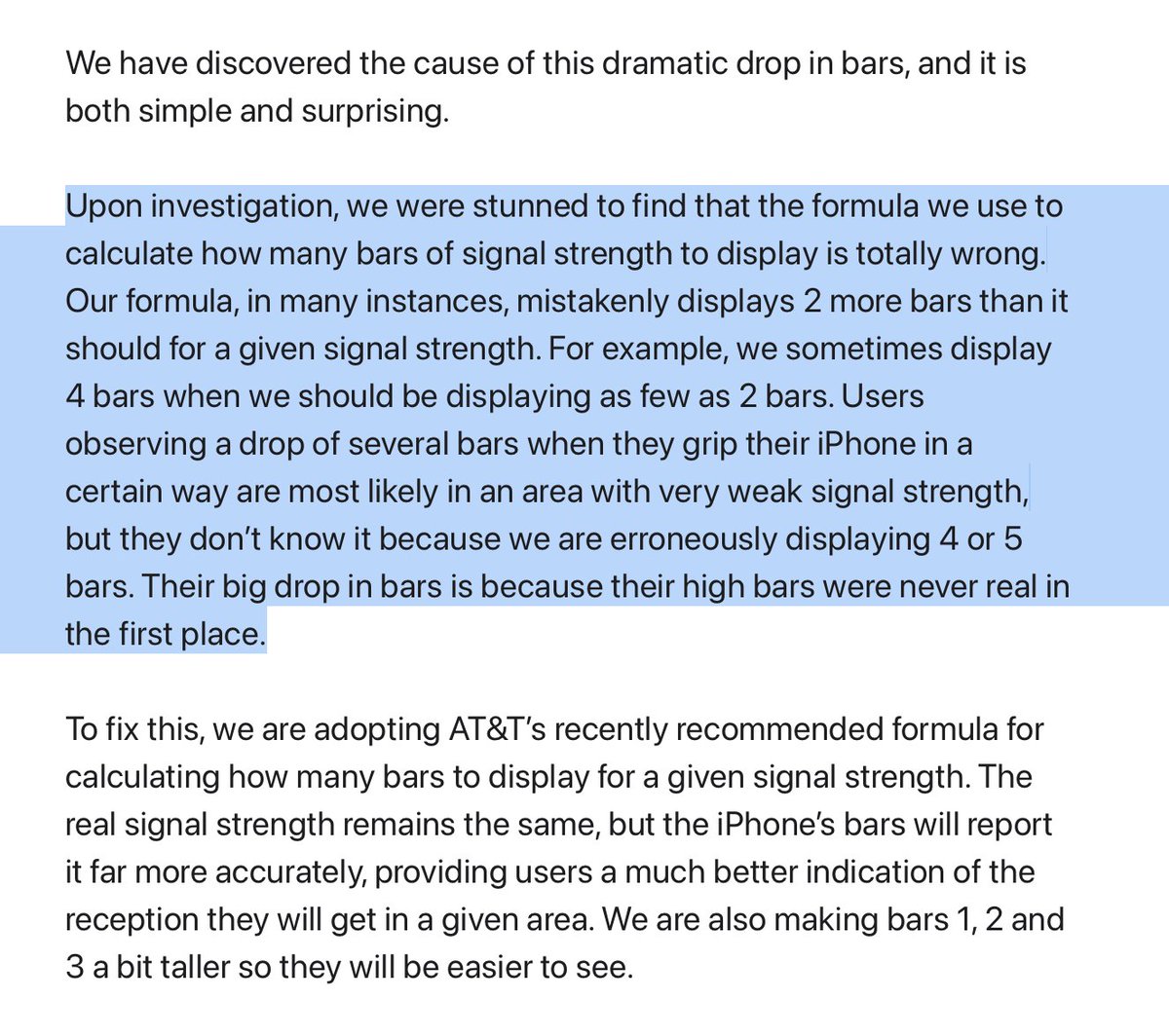
A few weeks later, they published a letter admitting fault, blaming a bad formula. apple.com/newsroom/2010/…
A few weeks later, they published a letter admitting fault, blaming a bad formula. apple.com/newsroom/2010/…
The letter was shared around and clowned upon () but nobody really looked into what the formula between 4.0 and the patch in 4.0.1
I was a stupid eight-year-old at the time, but now I’m a stupid adult with access to a disassembler.daringfireball.net/2010/07/transl…
I was a stupid eight-year-old at the time, but now I’m a stupid adult with access to a disassembler.daringfireball.net/2010/07/transl…
I downloaded both firmwares and started poking around. In the CoreTelephony framework, I found a promising looking binary: CommCenter. Looking at the strings gave me a pretty good sense that this is where the bar formula was.

The actual calculation is dead simple. When converting signal strength to bars, CommCenter loads each threshold from memory and compares until it finds the right range.
This code is not the problem...
This code is not the problem...
![; Table lookup loop loc_3434e: 0003434e ldr.w r3, [r2, r4, lsl #2] ; Load threshold[bar_count] 00034352 cmp r5, r3 ; Compare RSSI to threshold 00034354 ble loc_3435c ; If RSSI <= threshold, stop 00034356 adds r4, #0x1 ; bar_count++ 00034358 cmp r4, #0x5 ; Check if reached 5 bars 0003435a bne loc_3434e ; Loop](https://pbs.twimg.com/media/G2nfjN9XYAA9UYa.png)
...this is. This is the lookup table. When you convert the bytes to actual dBm values, you get:
-115, -111, -107, -103, and -99
(the closer to zero, the better the signal)
For example, here you need -107 or better signal to see 3 bars.
-115, -111, -107, -103, and -99
(the closer to zero, the better the signal)
For example, here you need -107 or better signal to see 3 bars.


When you plot this onto a chart, you can see how the values are kinda screwed up since the values are really optimistic. Most of the time, you would see 4-5 bars. But when you gripped it, since the falloff is so sharp, you’d see a catastrophic drop from 5 to 2 bars.

In 4.0.1, they changed these values to be way smoother.


Mapped onto a chart, you can see that it takes a lot to drop from 5 to 0 bars. It’s harder to see 5 bars, but it’s harder to plummet bars.

So there ya go. 20 bytes.
This has concluded a Tech Thread. Back to shitposting.
This has concluded a Tech Thread. Back to shitposting.
oh also in 4.0.1 they changed the height of the lower bars to be taller lmao
• • •
Missing some Tweet in this thread? You can try to
force a refresh


