Greenland - As viewed from a proper map
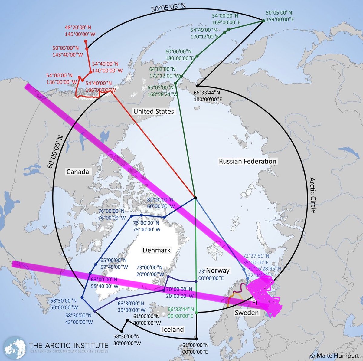
Why Greenland? Well because Moscow bases almost all of their strategic military assets on the Kola Peninsula next to Finland. This is where the Russian ICBM silos, submarine bases, and their strategic bombers are.
If you look at the flight path (ballistic or powered) from Kola to anywhere on the lower 48, then everything goes over Greenland.
Greenland is the theatre where any strategic exchange between Washington and Moscow is contested.
If you want to intercept a ballistic missile, the best point to do so is at the apogee, at the top of the flight path. The shortest route for an interceptor to get to an apogee is from directly below the apogee.
That’s where Greenland is.
So, without stating what should happen here, this is **why** the Trump administration says they **need** Greenland for national security.
The other thing that is happening is that the Northern Passage through the Arctic is opening up, and soon there will be Chinese cargo ships sailing through the Arctic to Rotterdam. It’s faster than the Suez and the ships aren’t limited to Suezmax size so China and EU trade is going to accelerate a lot.
This means Chinese submarines will also be venturing under the Arctic into the Northern Atlantic, IF THEY AREN’T ALREADY DOING SO.
Hence, the North East coast of Greenland serves not 1 but 2 critical strategic security objectives of US national security.
If this wasn’t clear to you, please understand that the Mercator global map projection is for children and journalists only. It is not a useful guide to where any countries or territories actually are in the real world that we live in.
No self respecting adult should be using Mercator for their worldview. Anyone saying “there must be some other secret reason for Trump being interested in Greenland” is a certified ignoramus.
• • •
Missing some Tweet in this thread? You can try to
force a refresh