Is modern SpongeBob's art style truly as crazy as people think it is?
An analysis of new SpongeBob's art direction...🧵
An analysis of new SpongeBob's art direction...🧵
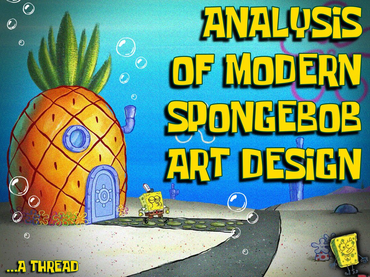
If you ask someone to describe 'new SpongeBob', they'll likely talk about exaggerated animation first and foremost. But, is that really true?
What most people consider 'new SpongeBob' is actually fairly old at this point. Season 12 started airing in 2018, nearly 10 years ago!
What most people consider 'new SpongeBob' is actually fairly old at this point. Season 12 started airing in 2018, nearly 10 years ago!

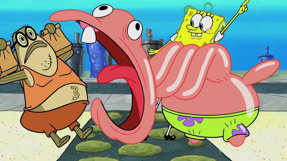

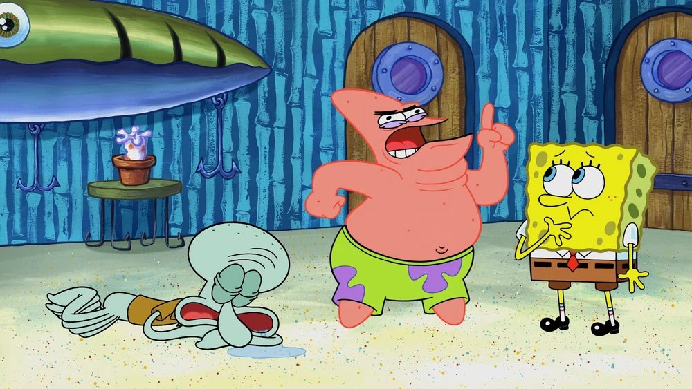
Seasons 11 and 12 are still what most people think of as 'New SpongeBob,' similar to how anything post first movie will always be "modern SpongeBob" to some people.
Truly NEW SpongeBob (seasons 15-17) are actually much more visually subdued than people think.
Truly NEW SpongeBob (seasons 15-17) are actually much more visually subdued than people think.


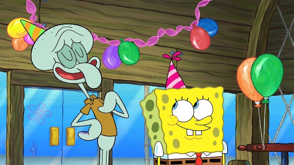

Individual artist's style are way more important to the show than most people think. Most people just think it's about the almighty model sheet. But in truth, the model sheet is secondary to the storyboard drawings!
Does SpongeBob look like this in season 2 all the time? Nope!
Does SpongeBob look like this in season 2 all the time? Nope!
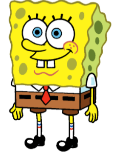
Something seasons 1-3 excelled at that you may not even be aware of is the adherence to a board artist's style. It feels more like a board artist's take on the character. You can see Greenblatt or Aaron Springer or Bill Reiss in the episode!


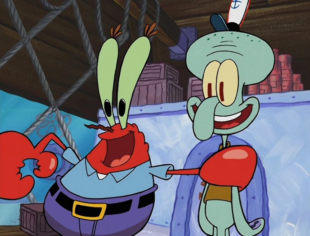
This is something the new episodes have been doing a great job with as well, but I can only spot these artists by name because they're the only ones who still post their boards on social media. Jim Soper isn't on the show anymore!


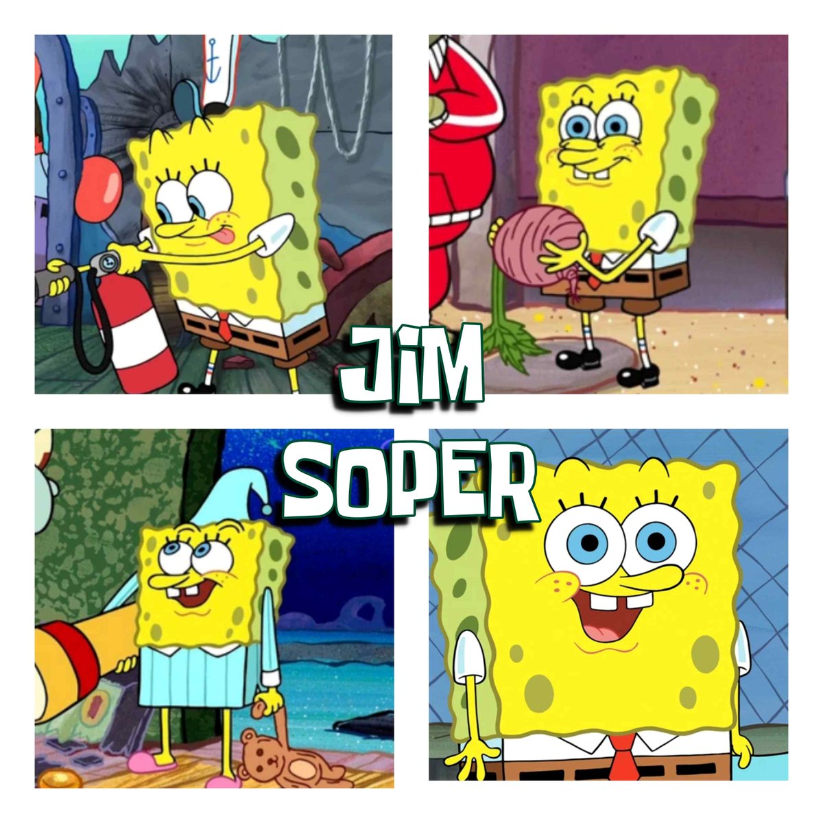
That's an interesting difference between 'classic' SpongeBob and the new episodes. The ROUGH board artists are still the only ones listed in the opening credits. In premovie, the artists who did the rough storyboard often cleaned up their own drawings for the final storyboard. So, if you saw Aaron Springer's name in the title card, you knew you'd be seeing some Springer drawings. Now, sometimes you won't see any of the rough artist's drawings actually on screen, even though they're credited up front. The look of the episode is much more dependent on the supervising director and their team of plussers, now.
For example, at least 75% of the drawings I can spot in Dave Cunningham's episodes recently are by Nick Lauer, Benjamin Arcand, or Simon Edwards.
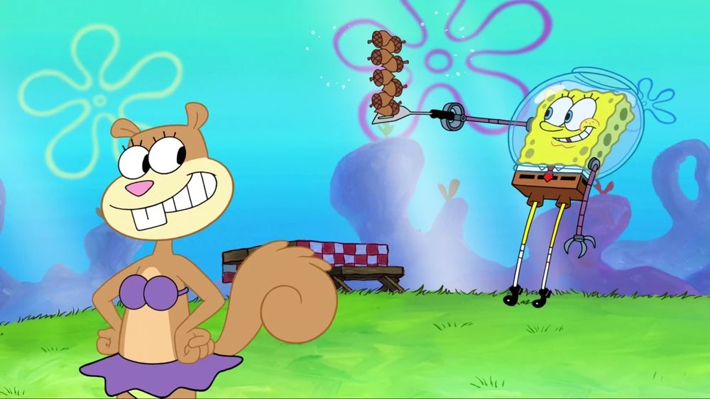
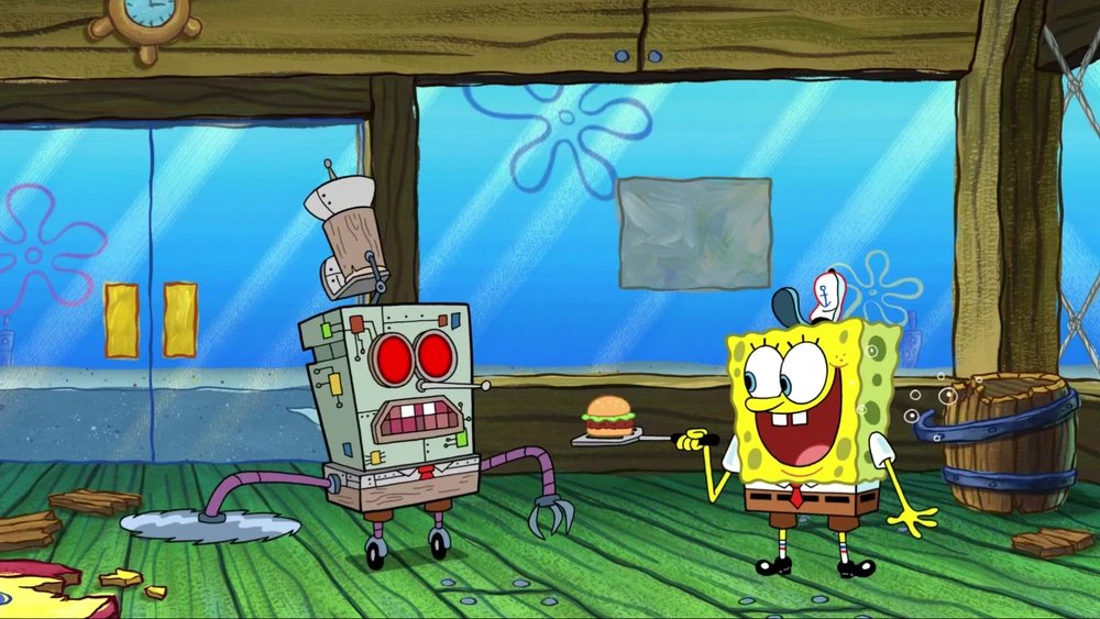
THE POINT THOUGH! Storyboarder's distinctive styles shining through to the final episode is very reminiscent of classic SpongeBob (though technically different, since it's plussers and not rough artists).
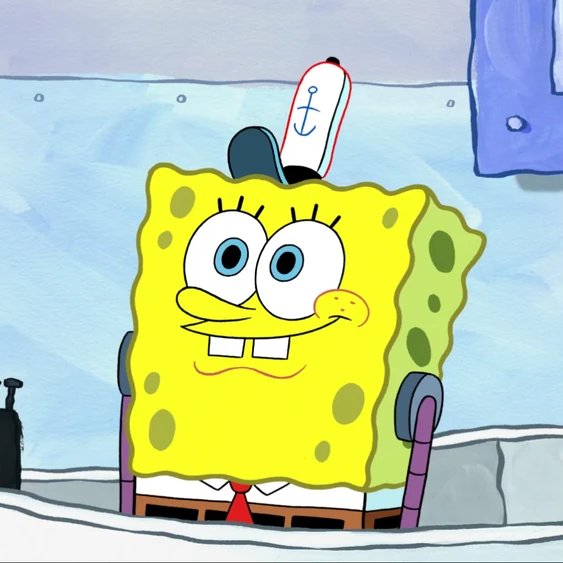
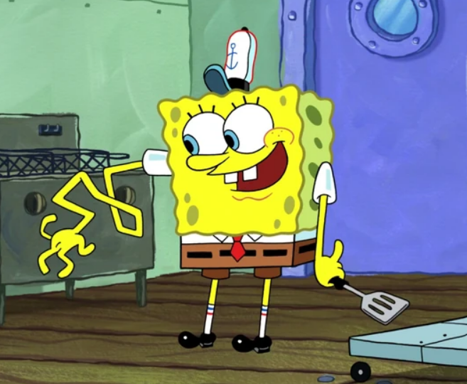

Similarly, I think the supervising directors all have their own flavor too. Sherm Cohen's episodes often have a lot of the rough storyboard artist's drawings left in. They're probably the closest in style to seasons 11 and 12.


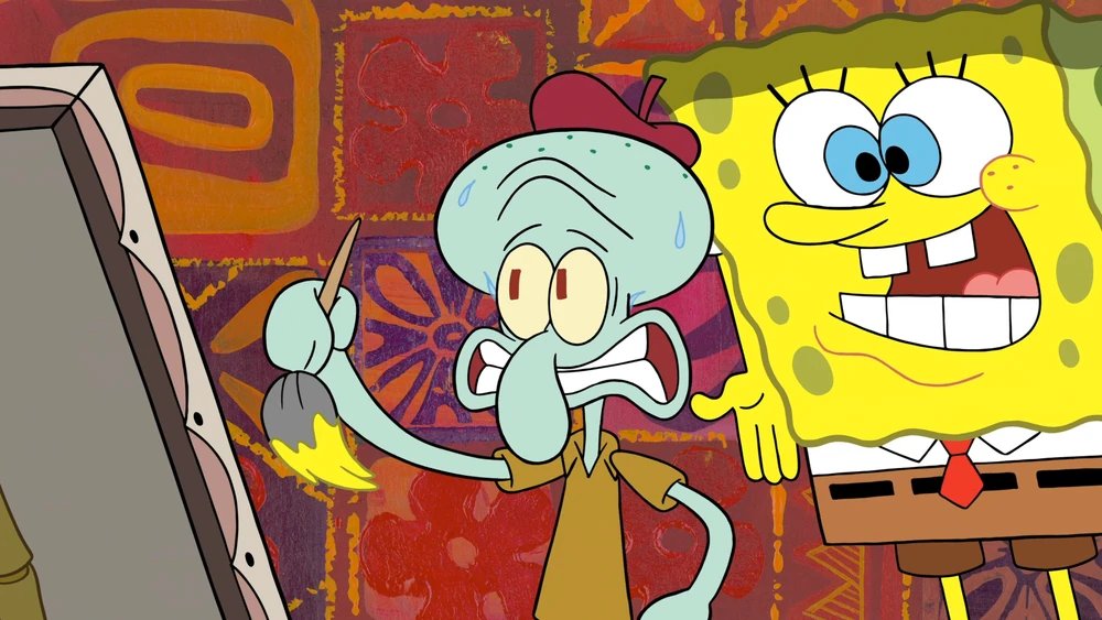

Dave Cunningham's episodes generally have fewer rough drawings in the final episode, but the plusser's styles get to shine through a lot more in my opinion.
Nick Lauer and Benjamin Arcand are the main ones that stick out to me, but again that's just because they still post on social media so I can actually ID them.
The actual drawings are often pretty close to the 'classic SpongeBob' style.
Nick Lauer and Benjamin Arcand are the main ones that stick out to me, but again that's just because they still post on social media so I can actually ID them.
The actual drawings are often pretty close to the 'classic SpongeBob' style.
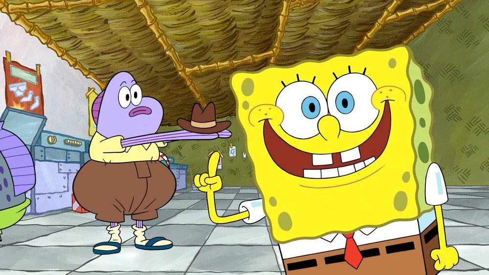
I always see people who don't even watch the show complaining about SpongeBob's rounder cheek in post movie and post sequel SpongeBob. You know, how his cheeks went from this to this?
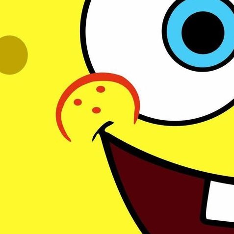
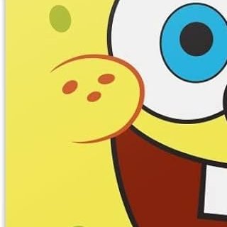
Well, Dave's episodes are chock full of them! Drink and be merry!

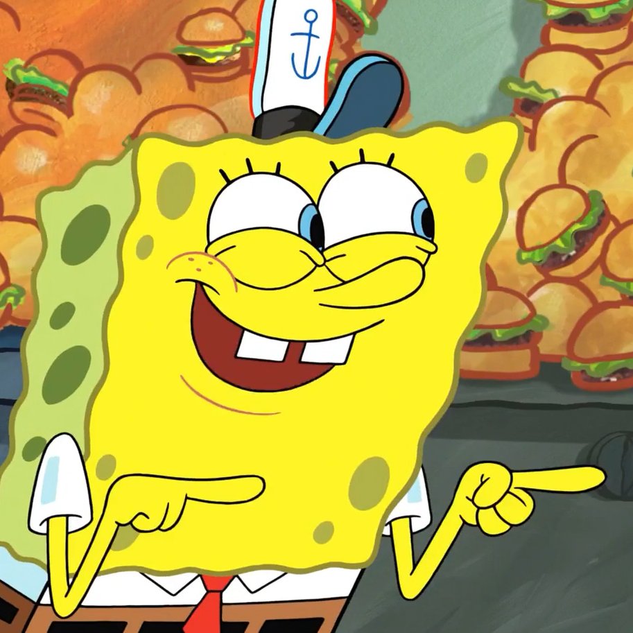
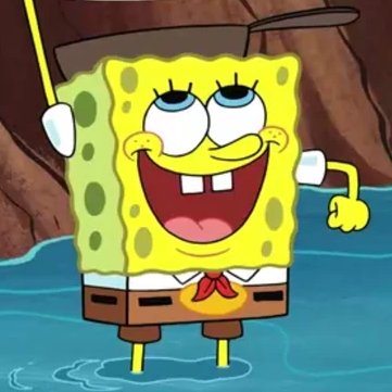

Also very common in Dave's episodes are these special character designs with super thick and varied line art. They're kind of like animated versions of the more detailed closeup paintings!


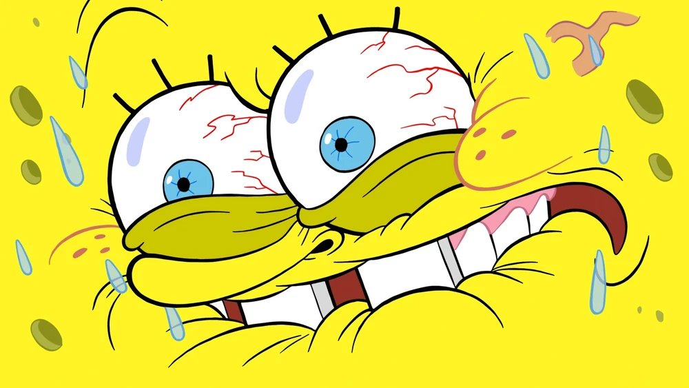

Ian V's episodes are a toss up. They're definitely the most "modern" feeling. Sometimes they look like the roughs and sometimes they don't! Definitely the wildest looking episodes. They always look very ambitious.
Not uncommon to see the old cheek here either!
Not uncommon to see the old cheek here either!

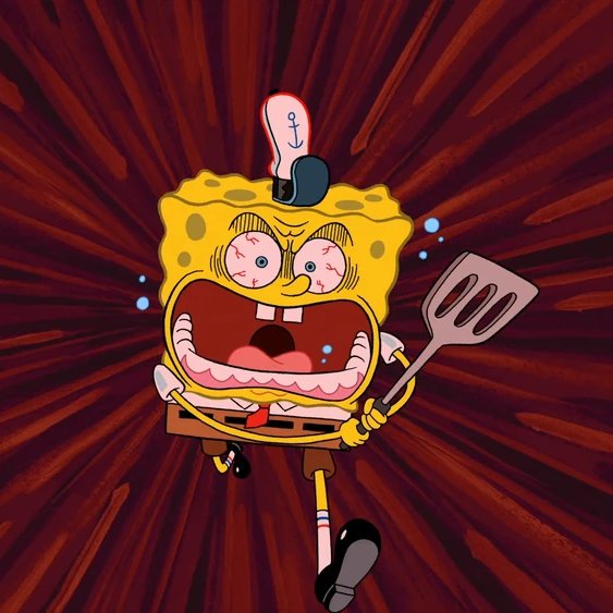
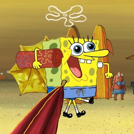

Perhaps the most overt and intentional pivot back to SpongeBob's original art design is the return of the squiggly, loose paintings from season 1!
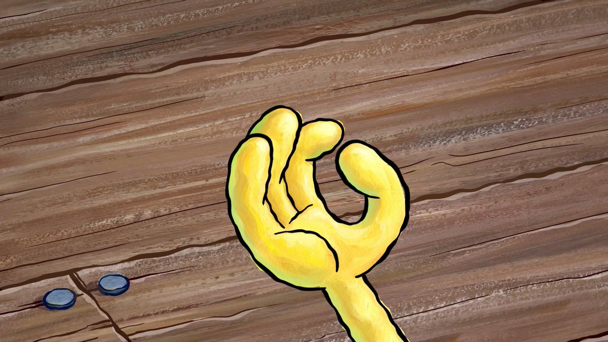

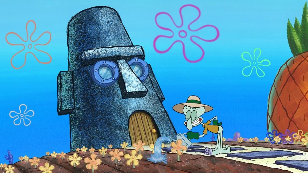

The further you get from season 1, the cleaner the lineart and painting becomes in the backgrounds. Starting sometime around season 14, they brought the squiggly back!
Take a look at the houses, before and after the change in direction! Many more white streaks and paint outside the outlines.
Take a look at the houses, before and after the change in direction! Many more white streaks and paint outside the outlines.

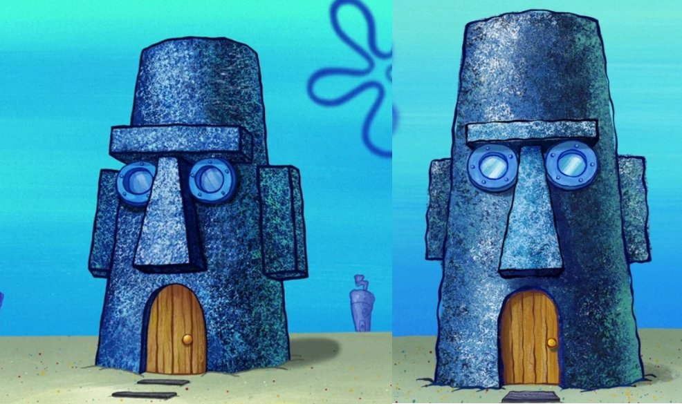

A few more comparisons:
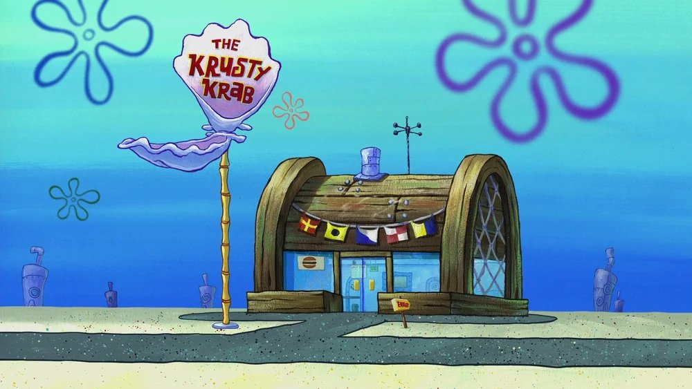

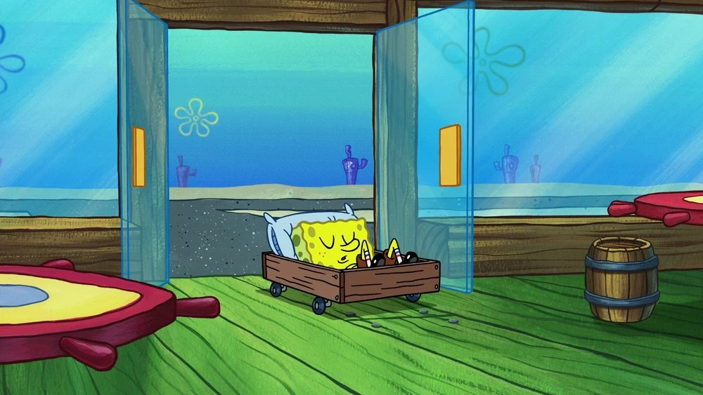

In short, new SpongeBob's art direction is actually closer to 'classic SpongeBob' than it has been in a long time! This is because of: strong adherence to board artist's styles even outside of special poses, loose background art, and a more subdued style compared to s11-12.
Thanks for reading!
@threadreaderapp unroll
• • •
Missing some Tweet in this thread? You can try to
force a refresh