
While Microsoft officially stopped putting "easter eggs" into their software around the year 2000, harmless little eggs still made their way into Microsoft Office.
Some of these were intentional, and some were not.
Here are 3 of the eggs that I know about in Microsoft Office:
Some of these were intentional, and some were not.
Here are 3 of the eggs that I know about in Microsoft Office:
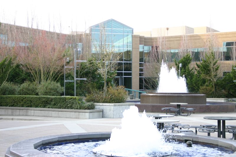
1) The fountain in the Insert Caption tooltip in Microsoft Word.
In Office 2007, we added what we called "Super Tooltips", basically extra informative descriptions of the feature that could include an illustration.
We were excited about this, but hadn't planned it end-to-end.
In Office 2007, we added what we called "Super Tooltips", basically extra informative descriptions of the feature that could include an illustration.
We were excited about this, but hadn't planned it end-to-end.

When I asked the UA team (in charge of UI text) to write all of these descriptions, they came back and said they only "had budget" to write about 12 of them across the entire Microsoft Office suite.
We had a set of incredulous meetings but it became clear they weren't budging.
We had a set of incredulous meetings but it became clear they weren't budging.
So, I decided I would write them all myself. Almost a thousand of them. Months of horrible weekends ensued as I wrestled with all of this text.
I also had to make illustrations for tooltips that we thought would be useful since there weren't resources to create those either.
I also had to make illustrations for tooltips that we thought would be useful since there weren't resources to create those either.
When the time came to design the illustration for Insert Caption in Word, I set out one sunny Saturday afternoon to take a picture of the fountain in front of the Building 17 cafe at Microsoft.
photos1.blogger.com/blogger/7376/2…
This fountain is historically important to the Office team.
photos1.blogger.com/blogger/7376/2…
This fountain is historically important to the Office team.
In those days, when a new version of Office was finished (~every 3 years), the entire team would gather in front of that fountain, @stevesi would bring out the "golden master" CDs and sound an air raid siren to signify that the software was being released to manufacturing. 🎉📀
Then, in a cross between a weird hazing ritual and what I imagine Stravinsky envisioned in The Rite of Spring, employees would proceed to jump into the fountain while being sprayed with champagne.
Yes, it was absolutely as weird of a tradition as it sounds.
Yes, it was absolutely as weird of a tradition as it sounds.
So, I decided to embed the fountain as a kind of minor easter egg tribute to the fountain which had such significance for the Office team as representing finishing the software.
I’m not sure if anyone on the team ever looked close enough to the tooltip to notice what it was!
I’m not sure if anyone on the team ever looked close enough to the tooltip to notice what it was!
2) List of troublemakers in a PowerPoint slide.
This is one I am less proud of. When we created the new Ribbon user interface for Office 2007, there were a lot of people internally in the Office team who were... let's say... disbelievers.
This is one I am less proud of. When we created the new Ribbon user interface for Office 2007, there were a lot of people internally in the Office team who were... let's say... disbelievers.
While many people offered reasonable and helpful criticism that improved our designs, a few others just seemed to constantly put up blockades, drag their feet, or poison the well behind-the-scenes to make it much harder for us to succeed at the UI change.
So when @claysatt and I were at work one weekend working on yet more tooltip content, we got to an illustration we wanted to make for "Use Presenter View" in PowerPoint.
It needed a big slide and then a set of small slide thumbnails at the bottom.
It needed a big slide and then a set of small slide thumbnails at the bottom.

Clay made the main, big slide but we also needed to create the little tiny slides for the bottom of the Presenter View part of the picture.
This required making more fake slide content, and we knew that these would be so small once shrunk down that no one could read them.
This required making more fake slide content, and we knew that these would be so small once shrunk down that no one could read them.
So, we typed the name of many of the people who had made our lives so hard for the last two years on the slide, and titled it something that got across the concept "Gosh, heck, we wish you would have helped make this easier for us through collaboration and better teamwork.”
Perhaps with today's CSI skills you can blow up the slide and figure out the exact wording we used but, we were always happy to have had that little symbolic gesture incorporated into the product as a reminder of all the pain it took to get such a big, difficult thing shipped.
3) My name in the Outlook reminder sound.
Ok, this one was totally inadvertent. We wanted a new Reminder sound for Outlook 2003, but again, the team who would have made such a sound "didn't have budget."
Ok, this one was totally inadvertent. We wanted a new Reminder sound for Outlook 2003, but again, the team who would have made such a sound "didn't have budget."
So, I created a sound. The team liked it, and so we checked it in. The new Outlook reminder sound was born! 🔉🎵
clyp.it/ivdw4oal
clyp.it/ivdw4oal
Fast forward to the weeks before shipping Office 2003, and the security team responsible for making sure that nothing unintentional ended up on the golden master CD suddenly called me into an urgent meeting.
Did I know my name was embedded in Microsoft Office? 😨 I was worried.
Did I know my name was embedded in Microsoft Office? 😨 I was worried.
The reason MS stopped putting Easter Eggs into their software in 2000 was pragmatic: Customers were worried that if developers were "sneaking in" fun games, from a security POV who knows what else they might sneak in.
So an embedded name looked a lot like a security breach.
So an embedded name looked a lot like a security breach.
Well when we got to the meeting we figured out what had happened. The sound editor I used, Cool Edit Pro, had used my "registered name" and put it in the sound metadata. Thus my name ended up in the .WAV file that became part of the Office product. Whoops!
I produced a new version of the file with the metadata stripped, but by then it was late enough in the release that replacing a file was riskier than just leaving it alone, so the security team elected to leave it, and my name remained embedded in Office for a decade of releases.
As a result, if you go find REMINDER.WAV on your hard drive for at least Office 2003, 2007, 2010 (and maybe beyond) and look at the properties, you will see the ignominious name. Sorry about that!

Anyway, just a small piece of Microsoft Office historical minutia.
In today's world, of course, easter eggs are in vogue again, from April Fools software pranks that are all the rage to "404 Not Found" games and similar embedded funlys.
Human creativity always finds a way out!
In today's world, of course, easter eggs are in vogue again, from April Fools software pranks that are all the rage to "404 Not Found" games and similar embedded funlys.
Human creativity always finds a way out!
• • •
Missing some Tweet in this thread? You can try to
force a refresh


