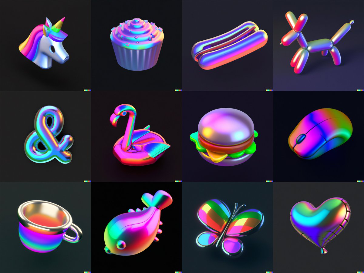
I generated this set of icons in 3D style using DALL-E 2 by @OpenAI. 🤖
(or, did an AI generate this set of icons using text prompts by Charlota?🤔)
#dalle2
(or, did an AI generate this set of icons using text prompts by Charlota?🤔)
#dalle2

@OpenAI anyway, I wanted to try to replicate a visual style you can find around the internet a lot recently:
rendered 3D objects levitating on the page softly illimunated with some kind of gradient.
rendered 3D objects levitating on the page softly illimunated with some kind of gradient.


This was the text prompt I used:
an icon of a paper plane in light blue metallic iridescent material, 3D render isometric perspective on dark background
an icon of a paper plane in light blue metallic iridescent material, 3D render isometric perspective on dark background

Let's decompose the text prompt a bit!
icon - makes sure the object has reduced detail
light blue metallic iridescent material - specifies the finish, you can go wild here
3D render - especially with 'icon' in the prompt, this makes sure you don't get a 2D extruded icon
icon - makes sure the object has reduced detail
light blue metallic iridescent material - specifies the finish, you can go wild here
3D render - especially with 'icon' in the prompt, this makes sure you don't get a 2D extruded icon

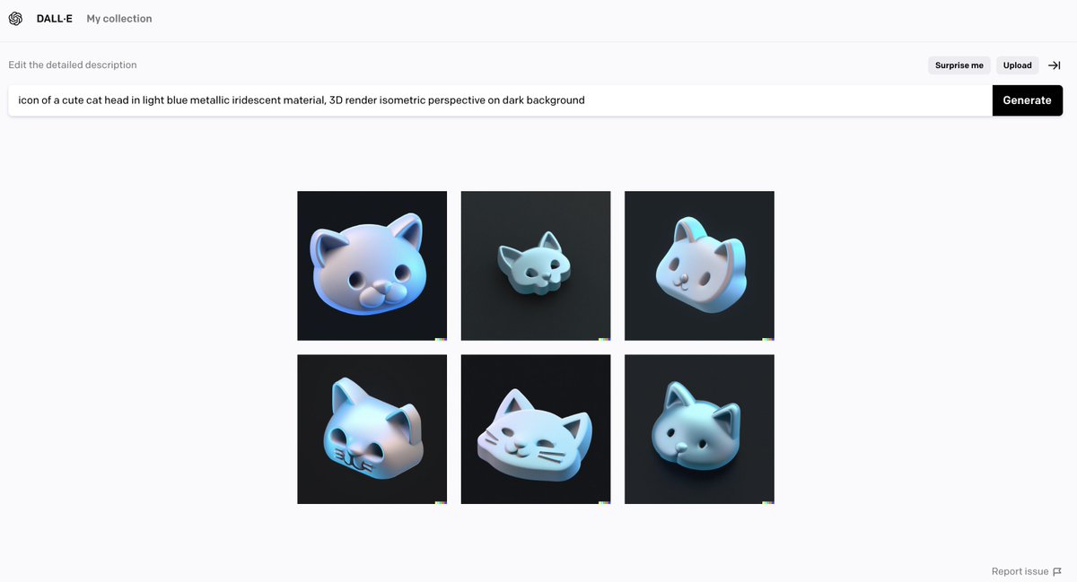
isometric - this helped so-so to get everything in a similar perspective, otherwise, it would be very random
dark background - made it easier to erase background in post-production, as DALL-E can't export images with transparent background (yet?)
dark background - made it easier to erase background in post-production, as DALL-E can't export images with transparent background (yet?)


With some light retouching and colour correction, I can imagine using these immediately.
The caveat is DALL-E only exports in 1024x1024px, which isn't a great resolution.
But for small icons on a website, it would work fine.
The caveat is DALL-E only exports in 1024x1024px, which isn't a great resolution.
But for small icons on a website, it would work fine.

What does it mean for designers?
Hard to say.
I can't do detailed 3D modelling.
DALL-E enabled me to find a workaround.
You ofc don't have precise control of details, tweaks and image quality.
But I think this will inevitably come in the future.
Hard to say.
I can't do detailed 3D modelling.
DALL-E enabled me to find a workaround.
You ofc don't have precise control of details, tweaks and image quality.
But I think this will inevitably come in the future.
It took me around 80 mins to iterate the text prompt, generate images, remove the background and put them into a grid.
These icons aren't perfect, but I could definitely imagine using them for art direction, mood boarding or quick exploration, i.e. in a website mockup.
These icons aren't perfect, but I could definitely imagine using them for art direction, mood boarding or quick exploration, i.e. in a website mockup.
Thanks for the overwhelming response! I tried another take with a more rainbow metallic finish:
prompt:
icon of a <cute unicorn head> in metallic rainbow iridescent material, 3D render isometric perspective rendered in Cinema 4D on dark background
prompt:
icon of a <cute unicorn head> in metallic rainbow iridescent material, 3D render isometric perspective rendered in Cinema 4D on dark background

including 'rendered in Cinema 4D' in the prompt somehow adds more definition and sharpness to the object - and also reflections and ground shadows.
adding words like 'cute', 'simple' or 'tiny' removes details and complexity of an object.
(though these are mostly hit or miss)
adding words like 'cute', 'simple' or 'tiny' removes details and complexity of an object.
(though these are mostly hit or miss)


here's a work-in-progress pic of all the images generated by DALL-E before I removed the background and slightly resized them.
I haven't done any colour correction or retouching.
#dalle2
I haven't done any colour correction or retouching.
#dalle2
• • •
Missing some Tweet in this thread? You can try to
force a refresh