1/ You all helped so much sort through the design options for the @Heart_of_Agile logo. Some have asked for the design story. It is long, but I am happy to tell it.
You might need a beer or threee while you read it. :)
You might need a beer or threee while you read it. :)
2/ In Feb 2015, Craig Brown told me to get off my ass. “Your needs a logo, a phrase, and a certification program.” Craig is remarkably correct on many things.
3/ In my next Advanced Agile class, I sketched this on the board:. Why a diamond? Because I wanted a shape that wasn’t taken. Circles and triangles are trite, squares are nothing, pentagons and heptagons are too hard to draw 

4/ and I already have a hexagon ☺
5/ so a diamond.
Lines diagonally because it looks stronger than with a cross to the corners, and I wanted to write words in there. This was the first 30 seconds of the design.
Design decision #1: Diamond w diagonal lines.
Lines diagonally because it looks stronger than with a cross to the corners, and I wanted to write words in there. This was the first 30 seconds of the design.
Design decision #1: Diamond w diagonal lines.
6/ Then the words. Collaborate, sure. Deliver, sure. Those are core to Crystal, Scrum, agile. But “Reflective Improvement” is 6 syllables and 2 concepts. Too complicated. “Inspect & Adapt” has same problem. 5 syllables, 2 concepts.
7/ So I put Reflect separate from Improve. Tricky choice. I’m not sure how to separate the two really, but people don’t generally stop to reflect, and more inspect & adapt sessions frankly suck. So emphasize the Reflect.
Design decision #2: Separate Reflect and Improve
Design decision #2: Separate Reflect and Improve
8/ Drawing on the board after maybe a minute or two:

9/ I taught the class and touched the diagram as often as I could, to see if my class concepts fit the diagram. Seemed to.
10/ Got home, opened up my stone age tools, “obsidian” I call them: PowerPoint and Paint ☺, dropped in the diagram. I’m not an artist, but I was told most programmers overdo the saturated colors, so I chose light pastels:

11/ not being an artist, I don’t hope for any better than this. Mostly it serves. You can read the text, there’s a heart, I’m done.
12/ I chose a heart because of “kokoro” (heartofagile.com/rediscovering-…). I was choosing between center, essence and heart, since kokoro means heart, or essence, I chose heart.
Decision #3: Say "heart" instead of center or essence.
Decision #3: Say "heart" instead of center or essence.
13/ For the next year, I tested out the concepts in different workshops to see what DIDN’T fit into the 4 words. I didn’t want to find out in a few years that something major was missing. Surprisingly, it seemed to hold.
14/ I learned over time that pretty much everything fits in here. You can’t mind-map the thing, because it covers the whole world. We tried, and finally stopped. Now I just find the path from the topic to the heart.
15/ Basically, nobody liked my design. It hold the words well. It’s got nothing to offer but the words, and that suits me fine. It didn’t suit my business partners, colleagues and clients. They wanted something more professional.
16/ So I went back to my obsidian tool kit and produced these, which I rather liked, but no one else did. Friends kept sending contact info for their favorite designers.


17/ James Gifford @scrummando , organizing the first HoA conference in Philadelphia, chose this logo for the conference – a different heart. Others made their own versions. I was jealous of all of them. I can’t draw.


19/ Someone in Germany did this


22/ Someone paid their designer to do a design and offered this for free:


24/ @MariaMatarelli gave a talk at a conference of DJs, so she did this simple version.
(Note how she included my personal logo at the bottom! :)
(Note how she included my personal logo at the bottom! :)

25/ This is cool
Choose your favorite. ☺
Choose your favorite. ☺
26/ One day, I want a clan gathering of all the Heart of Agile designer, each with a banner with their own design. That will be super fun.
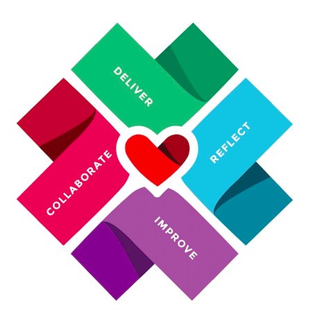
27/ However, my various business partners were asking more & more for an improved central logo. Over 6-months, we tried various designers, all remote workers (which you may know I detest), and nothing good came out.
28/ Settled in St Pete, Florida for a bit, I found a local!, professional designer. Soledad Pinter flew in from Argentina, Djordje Babic from Serbia, the 4 of us SAT TOGETHER!! for a half hour to select colors.
29/ Together, we settled on the diamond as the base shape and chose new colors. Given the trouble in getting designs and heads together, we now consider these two design decisions locked

30/ Design decision 1 revisited: still diamond with heart
Design decision 4: flat design, these colors
(yeah, I lost that lovely 3D heart. sob)
Design decision 4: flat design, these colors
(yeah, I lost that lovely 3D heart. sob)
31/ For the banner for the web site, Adriana, the designer, did this, which we all liked:

32/ But now a difficulty – with those colors we can’t use black text. Or white text. What comes next was difficult, Thank you people on Twitter and FB for helping out!
33/ Soledad Pinter gave a talk in which she chose these colors:


34/ We both liked the magenta on the tan, but the designer said it didn’t have enough contrast for most people, and especially those with visual difficulties. We were stuck.
35/ So I asked you guys! And you all helped! Thank you very much.
and the first thing you all said was: We start reading at the top, and see Deliver as the first element
and the first thing you all said was: We start reading at the top, and see Deliver as the first element

36/ Eeek! That is a misread, and misreads trump all other design decisions. I want people to start with the word Collaborate. It is not a process, they are just words, but I still want to start with Collaborate.
37/ So I asked you: Should I move Collaborate to the top?
79 people replied on Twitter, and more on FB, mostly saying “Yes (if you want us to say Collaborate first)”. A few not. But the vote was in, and clear.
79 people replied on Twitter, and more on FB, mostly saying “Yes (if you want us to say Collaborate first)”. A few not. But the vote was in, and clear.

38/ Design decision #5: Collaborate at the top.
39/ Next the colors. White on the dark colors obviously, but what color the top one. The designer suggested dark blue, but I nixed that for 2 reasons: it’s a 6th, unrelated color, and it then dominates the whole diamond.
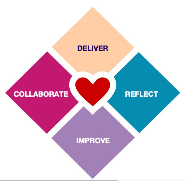
40/ I asked you, magenta or a darker teal (borrowing from the right side color). Vote was split, but more preferred the teal. More importantly, those with visual difficulties made it clear that the teal was better.

41/ One alert individual pointed out that we had shifted from Mixed Case to ALL CAPS, which is harder to read. Oops. I hadn’t seen that. Checked with Twitter: Yep, better

42/ Design decision #6: Mixed Case words
43/ At this point someone said that the magenta pops forward. I was seeing the “Improve” come out too strong, and “Reflect” getting forgotten. Some people read it counterclockwise. So I asked you this:

44/ Split decision, some liked Reflect on the left where it was read 3rd, most didn’t, read clockwise.
45/ I ran this test twice, and you all finally unified on clockwise reading, with a few outliers.
Decision #5: clockwise, Reflect on bottom.
Decision #5: clockwise, Reflect on bottom.
46/ Someone sent me a link to a contrast checker. AAA (good) rating is 5.4 : 1 when big letters. All quadrants passed that except the gray-purple on the bottom. So I added drop shadows.

47/ By and large, all of Twitter and FB liked it, for improved readability. But the designer didn’t. Cluttered, not clean. This was a tough choice.
48/ Finally, I agreed with the designer. Readability is great everywhere but on the purple, where it is adequate. Design is clean. We can add a drop shadow if it fails badly in the future, and leave it simple for now.
49/ Design decision #6: no drop shadow.
50/ Several good suggestions were made late on, which would have forced us far back up the decision path and restarted discussions among my team, who were now all over the globe, and with the designer.
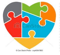
51/ The most interesting was to build off of the HoA Conference logo which is a heart puzzle. I loved this idea. It is very natural, the words go in there well …

52/ The designer and her colleagues vetoed this fast. It seems the heart puzzle with colors is too closely tied to autism. We would be just asking for trouble. So this nice idea died instantly.


53/ Here’s where we are now. I asked you for more reactions and thought, and nothing new came up. So we are about to go to press.


54/ Thank you all for contributing to the discussion. It has been quite the experience.
Alistair & team
Alistair & team
• • •
Missing some Tweet in this thread? You can try to
force a refresh