Eric Basmajian Profile picture
Jul 31, 2019 4 tweets 2 min read Read on X
While the headline ADP number "beat", hardly anyone will point out that the growth rate decelerated to a 21 month low. #RateofChange Image
The growth rate in "goods" employment, according to ADP, has decelerated to a 27 month low. Image
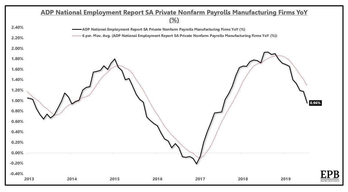
The growth rate in "manufacturing" employment, according to ADP, has decelerated to a 24 month low. Image
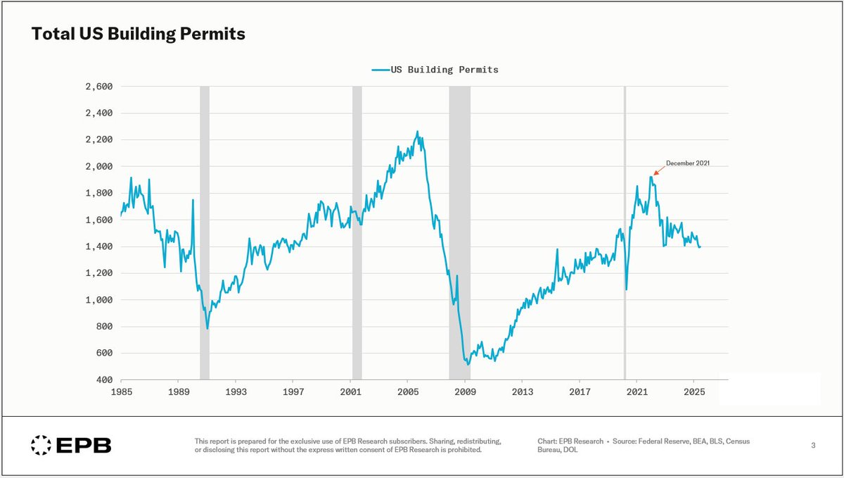
The growth rate in "construction" employment, according to ADP, has decelerated to a 79 month low. Image

• • •

Missing some Tweet in this thread? You can try to force a refresh
 

Keep Current with Eric Basmajian

Eric Basmajian Profile picture

Stay in touch and get notified when new unrolls are available from this author!

Read all threads

This Thread may be Removed Anytime!

PDF

Twitter may remove this content at anytime! Save it as PDF for later use!

Try unrolling a thread yourself!

how to unroll video
  1. Follow @ThreadReaderApp to mention us!

  2. From a Twitter thread mention us with a keyword "unroll"
@threadreaderapp unroll

Practice here first or read more on our help page!

More from @EPBResearch

Jul 16
A visualization of the US debt situation:

Where does all the debt sit?

Where are the problem areas?

Let's break down the sectors with the largest and fastest-growing debt burdens 👇.

1/16 Image
At the top of the stack, we have total debt, which includes all public and private sources.

Total debt is 351% of GDP.

In 2007, total debt averaged 351% of GDP so there's been no aggregate deleveraging at all.

2/16 Image
While there's been no aggregate deleveraging, there's been a shift from private to public.

Private debt is equal to 233% of GDP, down from 290% in 2007.

Public debt is 117% of GDP, up from 61% in 2007.

3/16 Image
Read 17 tweets
Jul 7
Existing home inventory: near record low.

New home inventory: near record high.

What's the real story?

Let's explore the true US housing inventory situation and what it means for the construction sector and the broader economy going forward 👇

1/x Image
In order to get the most accurate reading on the US housing market inventory situation, we need to consider both supply and demand.

Supply, in this case, is the level of inventory for sale, and demand is the current pace of sales volume.

2/x
If we start with sales volume, we can see that the existing home market sells roughly 3.7 million homes per year while the new home market sells 619,000 homes per year.

3/x Image
Read 34 tweets
Mar 25
Are new home prices declining, or is the size of a new home just getting smaller?

A bit of both.

Here's some data.

1/5
The median sq ft of a new single-family housing start has declined in recent years, falling from 2,335 sq ft in 2022 to 2,156 sq ft in Q4 2023.

The median sales price of a new single-family home has been declining since Q3 2022, falling from ~$480,000 to $422,000.

2/5 Image
This is a back-of-the-envelope method, but if we divide the median sales price of a new single-family home by the median sq ft of a new SF home start, we get a proxy for the price per sq ft of a median new home sale.

There's been a ~10% reduction in price per sq ft.

3/5 Image
Read 5 tweets
Mar 7
Is the quality of the BLS jobs data worsening?

Let's talk about the response rate to the BLS data and some ways we can get a more complete answer on the labor market.

A quick thread:

1/ Image
The BLS Employment Situation report has two major surveys: the Household and the Establishment.

2/
The Household Survey is the lesser-used measure of employment, although it contains critical measures like the unemployment rate.

The overall response rate for this survey has declined from 90% to 70%.

3/ Image
Read 15 tweets
Mar 3
Historically, when nominal growth is lower than overnight policy rates, capital is sucked out of the real economy and into short-term government securities (crowding out), which starves the real economy of resources and furthers the deceleration in nominal growth.

1/4 Image
We see this dynamic unfolding in real-time as real bank loan growth has contracted since August 2023.

2/4 Image
There are many competing theories for why the US economy has been able to continue expanding while lending has been shut off at commercial banks.

On an inflation-adjusted basis, M4 remains slightly above the pre-pandemic trendline, before the large money mountain was created.

3/4Image
Read 4 tweets
Mar 2
How does this Business Cycle compare to cycles of the past?

That depends on what part of the Business Cycle Sequence you are looking at.

The following charts map the performance of Leading, Cyclical, and Aggregate Indicators compared to past Business Cycles 👇

1/
Traditional Leading Indicators continue to perform poorly, worse than the average of past cycles.

This chart maps the cumulative monthly performance of the Leading Economic Index after the 10YR3M spread initially inverted.

2/ Image
The Cyclical Economy has contracted over the last 14 months, but fractionally so.

The Cyclical Economy is performing better than the average cycle and is on par with the 2001 Business Cycle.

3/ Image
Read 8 tweets

Did Thread Reader help you today?

Support us! We are indie developers!


This site is made by just two indie developers on a laptop doing marketing, support and development! Read more about the story.

Become a Premium Member ($3/month or $30/year) and get exclusive features!

Become Premium

Don't want to be a Premium member but still want to support us?

Make a small donation by buying us coffee ($5) or help with server cost ($10)

Donate via Paypal

Or Donate anonymously using crypto!

Ethereum

0xfe58350B80634f60Fa6Dc149a72b4DFbc17D341E copy

Bitcoin

3ATGMxNzCUFzxpMCHL5sWSt4DVtS8UqXpi copy

Thank you for your support!

Follow Us!

:(