1. Does the continued use of RCP8.5 in climate research represent "something of a breakdown in communication between energy systems modellers & the climate modelling community"?
Essential explainer of RCP8.5 by @hausfath @CarbonBrief
carbonbrief.org/explainer-the-…
Essential explainer of RCP8.5 by @hausfath @CarbonBrief
carbonbrief.org/explainer-the-…
2. Why do we have Representative Concentration Pathways (RCPs)?
It all started as a pragmatic solution to get new scenarios into AR5, which meant climate & energy system modellers worked in parallel.
It all started as a pragmatic solution to get new scenarios into AR5, which meant climate & energy system modellers worked in parallel.
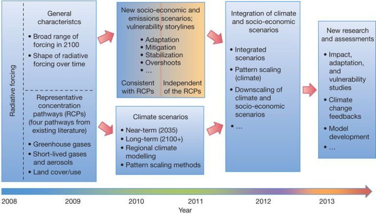
3. The RCPs were essentially stripped of their socio-economics, deliberately, as in the "integration" phase would bring it all back together.
link.springer.com/article/10.100…
link.springer.com/article/10.100…

4. If I freelance a little...
I recall energy & climate modellers trying to find the socioeconomics of the RCPs: what population, how much BECCS, etc. And would essentially try & read numbers direct of figures, etc.
I recall energy & climate modellers trying to find the socioeconomics of the RCPs: what population, how much BECCS, etc. And would essentially try & read numbers direct of figures, etc.
5. The intention was that the RCPs were essentially naked, with the clothes returned via the integration phase.
The problem is that the RCPs are not comparable, they are from different models & socioeconomics. That message never really got out...
The problem is that the RCPs are not comparable, they are from different models & socioeconomics. That message never really got out...
6. “RCP8.5 cannot be used as a no-climate-policy reference scenario for the other RCPs because RCP8.5’s socioeconomic, technology and biophysical assumptions differ from those of the other RCPs.”
A critical point in Moss et al: nature.com/articles/natur…
A critical point in Moss et al: nature.com/articles/natur…
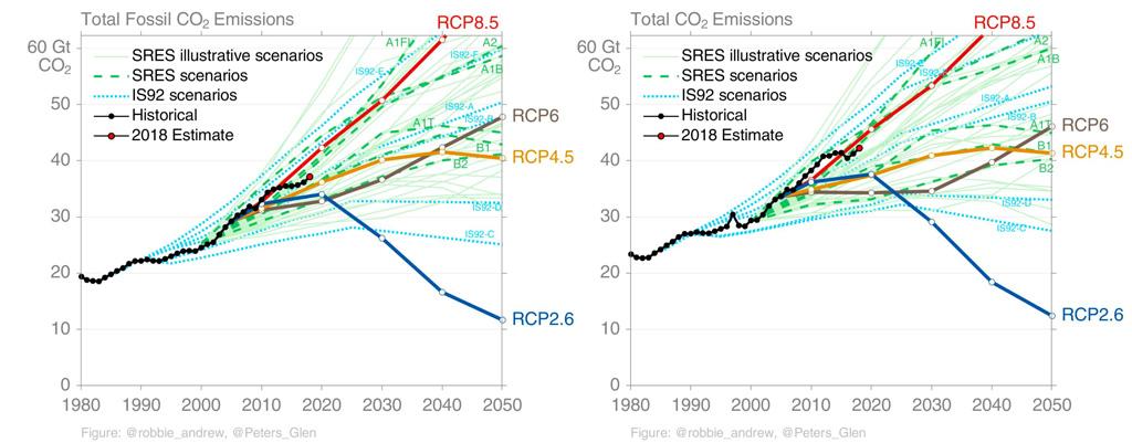
7. AR5 is full of figures that compare RCP8.5 & RCP2.6, though the text is a little more nuanced.
These figures will obviously take people down the path that RCP8.5 is no policy & RCP2.6 is strong policy.
Comparing 4.5 & 6.0 will imply policy has little or no effect!
These figures will obviously take people down the path that RCP8.5 is no policy & RCP2.6 is strong policy.
Comparing 4.5 & 6.0 will imply policy has little or no effect!

8. “RCP8.5 is, because of its assumptions of high population & slow technological progress, on the higher end of the range of possible baseline scenarios…I wished I would have been clearer with what I meant by business as usual in that paragraph.”

9. The new Shared Socioeconomic Pathway (SSP) framework is more explicit that there are a range of baselines (grey region), depending on socioeconomics (& IAM). Some baselines have declining emissions...

10. The energy system of each baseline is very different across SSPs, but also across IAM. In my view, the variation across IAM should receive as much attention as variation across SSPs...

11. Some baselines have pretty crazy coal use, something @jritch & others have argued is based on bad modelling assumptions.
Today, even without climate policy, it is likely solar & wind will out-compete coal in the future.
Today, even without climate policy, it is likely solar & wind will out-compete coal in the future.

12. A fundamental issue, in my view, is that there is no longer a no policy world. We have climate policy, albeit weak, and that should be embedded in the baseline.
(Weak) climate policy may have already avoided ~1°C of future warming... nature.com/articles/natur…
(Weak) climate policy may have already avoided ~1°C of future warming... nature.com/articles/natur…

13. For balance, climate modellers like RCP8.5 for continuity with previous modelling, signal-to-noise, illustrate potential avoided impacts, potentially capturing unrepresented feedbacks, etc.
Sure, but eventually you have to let go of the past...
Sure, but eventually you have to let go of the past...
14. There is also a view that we are following high-end pathways. I wrote a paper on it (whoops) rdcu.be/brDGx.
Though, things have changed somewhat in the last 5 years...
Though, things have changed somewhat in the last 5 years...
15. Scenarios are often reported with 10 year time steps, scenarios are updated regularly, & in a sense, we are always on track...
This figure shows the latest SSPs (with the CMIP6 markers in bold)
This figure shows the latest SSPs (with the CMIP6 markers in bold)

16. It is best to look at progress relative to the underlying energy system.
This figure comparing across AR5 scenarios...
rdcu.be/bPgJr
This figure comparing across AR5 scenarios...
rdcu.be/bPgJr

17. Why is this all a problem?
In my view, if you push up baselines, imply lack of progress, then it makes 1.5°C or 2°C look harder. We should truly reflect how we are going, & how easy some gains are (even if 1.5°C or 2°C is out of reach)
In my view, if you push up baselines, imply lack of progress, then it makes 1.5°C or 2°C look harder. We should truly reflect how we are going, & how easy some gains are (even if 1.5°C or 2°C is out of reach)
18. A key challenge is that it takes decades for climate signals to emerge if two scenarios are close (bottom), even though, the mitigation pathways can be dramatically different (top).
Maybe that means we will forever have tensions between mitigation & impact research?
/END
Maybe that means we will forever have tensions between mitigation & impact research?
/END

• • •
Missing some Tweet in this thread? You can try to
force a refresh