I just pulled down from CapitalIQ a data set of every private equity deal from 2017-2019 with EV>$1B. Average EBITDA multiple was 17.3x and of those with a credit rating 35% rated B-.
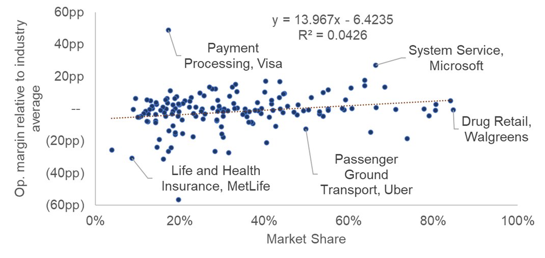
There is no empirical evidence that a company's market share predicts its profitability. But that hasn't stopped academics, business school curricula, and management consulting firms from promulgating the idea for decades. The below chart shows industry leaders vs. industry median margins:
market share is not a consistent indicator of firm performance. And this finding holds true across industries, with many illustrating a negative relationship between market share and profitability - like retail:
Lina Khan might find this to be an "antitrust paradox,” but it’s actually firm strategy operating exactly as her Chicago School opponents would envision. Consumers choose Amazon because of the low prices, driving Amazon’s market share, and allowing Amazon to invest more in lowering prices and improving service.
Is the private equity model of running companies materially different from public companies? Can we see that difference in the financials? We built a database of 993 deals that had public debt and public financials to answer this question.
We first looked at revenue growth. The graph below shows the median difference between year-over-year growth in overall sales for the companies that were acquired by private equity firms and the benchmark.
We then looked at EBITDA margins. The graph below shows the median difference in EBITDA as a percentage of sales between the LBO companies and the benchmark.
If you're not already following the high-yield spread (fred.stlouisfed.org/series/BAMLH0A…) as a macro indicator, you should be. The level and trend of the spread have strong ability to predict the next month’s change in GDP and inflation - and thus business cycles
The level and direction of spread also predict returns across the full range of asset classes most investors trade. (Note the remarkable outperformance of small value equities (+39.3% annualized return!) in the recovery phase, when spreads are wide and falling (quadrant 1)
Investors could easily rely on the relative level and direction of high-yield spreads to support their asset allocation decisions. The chart below provides a visualization of the business cycle, the high-yield spread signals, and suggested assets to own in each cycle
The 2010s were the best decade for the 60/40 portfolio in 60 years in terms of Sharpe Ratio. Stable growth and stable inflation rewarded stocks and bonds and punished efforts to hedge or diversify. mailchi.mp/verdadcap/deat…?
But growth has not always been so stable nor inflation so tame. And when those key economic drivers have behaved differently, results have been very different. Building on work by @RayDalio and @KeithMcCullough we can think of four quadrants of economic conditions.
And we see how these different economic conditions have predominated at different times in recent US history. During the 60s and 70s for example, we saw choppy real GDP growth and significant inflation, with quadrant 3 (falling growth, rising inflation) being the most prevalent.