
1/ I’ve lived w/the Apple Card for over a month now, which allows me to take a step back & comment objectively <I hope> on the experience, from onboarding within the Wallet app to making payments to the behaviors Apple and Goldman Sachs are incenting. It’s a fascinating product. 

2/ Observation 1 is that Apple has a huge advantage over other credit card issuers when it comes to *customer acquisition cost.*
On Day 1, is able to reach 100M+ iPhone users and invite them to apply through the Wallet app for free. Other card issuers rely on mail & USPS ($)
On Day 1, is able to reach 100M+ iPhone users and invite them to apply through the Wallet app for free. Other card issuers rely on mail & USPS ($)

3/ Next point is that Apple truly is rolling this product out with a *mobile first* mentality.
It’s 100% true that you can “Start using Apple Card in minutes.”
So much friction is taken out of an entirely mobile application process
Note the time stamps in my screen shots 👀
It’s 100% true that you can “Start using Apple Card in minutes.”
So much friction is taken out of an entirely mobile application process
Note the time stamps in my screen shots 👀

4/ Apple only needs limited information for the application to be gathered from the consumer.
You can see that I only need to key in my date of birth.
Apple already has my email, name and mobile phone (used for fraud prevention and SMS follow-ups).
You can see that I only need to key in my date of birth.
Apple already has my email, name and mobile phone (used for fraud prevention and SMS follow-ups).

5/ Unlike other card applications I’m not keying in my address on this last screen, I’m just verifying the correct information.
Super fast. Super easy.
I’ve taken 3 minutes but for those keeping score on my time at home, I’m also clicking/screenshotting all of the fine print 😜
Super fast. Super easy.
I’ve taken 3 minutes but for those keeping score on my time at home, I’m also clicking/screenshotting all of the fine print 😜

6/ Debt-to-income ratio is a critical metric for credit card approvals, so don’t make a typo here.
I sat down w/a President of a fintech who got declined for Card b/c he made a typo on this screen.
Much ado has been made about approving everyone but declines do happen.
I sat down w/a President of a fintech who got declined for Card b/c he made a typo on this screen.
Much ado has been made about approving everyone but declines do happen.

7/ Now Apple is gathering the last 4 of my social security number to allow Goldman Sachs to pull my credit report in the background.
Note that that Apple has only asked me to data enter *3 fields* for the entire application flow: DOB, Income, L4 of SSN.
Note that that Apple has only asked me to data enter *3 fields* for the entire application flow: DOB, Income, L4 of SSN.

8/ Brief aside - an increasing number of us have freezes on our credit report, or have locked them. If your credit report is locked or frozen you will see this error message in the onboarding flow.

9/ Inside fintech ⚾️ : once submitted, the consumer has the option to “Accept” card, placing a hard inquiry to your credit report.
Implication here is any credit check used to this point has been a “soft pull.”
Unlike most Fintechs, makes no mention of credit in the flow.
Implication here is any credit check used to this point has been a “soft pull.”
Unlike most Fintechs, makes no mention of credit in the flow.

10/ Once accepted, note the card is *instantly* available on the 📱.
makes its case to be “top of wallet” (e.g. the default card used by Wallet).
You can see default UX suggestion is to make Card the Default Card (more on this later). 🤓 Obviously strategic for .
makes its case to be “top of wallet” (e.g. the default card used by Wallet).
You can see default UX suggestion is to make Card the Default Card (more on this later). 🤓 Obviously strategic for .

11/ The final two slides are the clearest visual metaphor for how Apple Card is thinking about a mobile first experience - receiving a physical titanium card is presented as *optional*, and is the *last* step of the onboarding flow.

12/ So now you’ve got a virtual Apple Card in your wallet. The card is pristine white without any transactions.
But, let’s talk transition to talking about the user experience of actually using the Card.
Once I start to use the card, new colors appear...what of that?
But, let’s talk transition to talking about the user experience of actually using the Card.
Once I start to use the card, new colors appear...what of that?


13/ Here, I’ve spent some money on dry cleaning (Purple - Services) and Philz Coffee (Orange - Food & Drink).
The card reflects this spend by category in a gorgeous visualization.
But you can see how the colors can educate a user over time about where and how they spend $.
The card reflects this spend by category in a gorgeous visualization.
But you can see how the colors can educate a user over time about where and how they spend $.


14/ Remember the physical card? It comes via the mail and has a fun unboxing experience.
I’d wager it probably is the *only* credit card that has ever merited an unboxing experience.
And b/c of ‘s strong privacy controls, we can share photos&screenshots freely on twitter
I’d wager it probably is the *only* credit card that has ever merited an unboxing experience.
And b/c of ‘s strong privacy controls, we can share photos&screenshots freely on twitter

15/ A typical part of the traditional credit card experience is *activating* the card. This normally is that sticker you have to take off the card follow by a phone call or website visit.
Here’s Apple’s mobile-first approach. You bring your iPhone next to the package and voila:
Here’s Apple’s mobile-first approach. You bring your iPhone next to the package and voila:

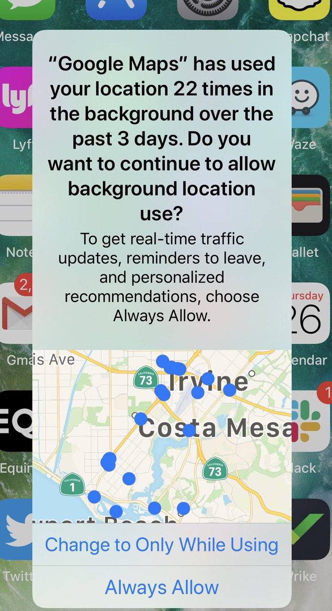
16/ Speaking of privacy, Apple Wallet is explicit in its UX about why it wants to access your location data, specifically to improve transaction details when using the physical Apple Card.
In iOS 13, you can see how 3rd party apps with “Always Allow” access get flagged.
In iOS 13, you can see how 3rd party apps with “Always Allow” access get flagged.

17/ Another clever feature of the Card is the mechanic behind Daily Cash.
Every txn triggers a push notification to your phone that reminds you of the cash value of each txn.
Apple rewards Pay payments at 2%, physical card at 1%, so of course I choose Pay where I can.
Every txn triggers a push notification to your phone that reminds you of the cash value of each txn.
Apple rewards Pay payments at 2%, physical card at 1%, so of course I choose Pay where I can.


18/ Key strategy point:
Card Daily Cash starts up a flywheel where my Cash card will finally start getting funded (note my $0 balance when I first applied for Card).
Now, I have available Cash for purchases or p2p payments (look out Venmo/Zelle et al).
Card Daily Cash starts up a flywheel where my Cash card will finally start getting funded (note my $0 balance when I first applied for Card).
Now, I have available Cash for purchases or p2p payments (look out Venmo/Zelle et al).


19/ Here’s another clever thing Apple can do...displace “top of Wallet” cards like my Chase Sapphire Reserve by reminding me that I have a $11.64 balance on my Apple Cash card.
Very slick. And something only Apple can do since it controls the platform.
Very slick. And something only Apple can do since it controls the platform.


20/ Before I even got the card, I’d written a bit about how I felt Apple Card would bootstrap Apple Cash and give Apple a stronger wedge into P2P payments and daily financial services habits...I didn’t anticipate 19/ above.
https://twitter.com/aaronsuplizio/status/1159287676752650241?s=21
21/ & Goldman are doing some great things for consumers when it comes to motivating the *right* credit card repayment behavior.
Minimum payments are RED = BAD.
Larger payments are based on personalized spend habits.
Full payments are GREEN = GOOD.
Minimum payments are RED = BAD.
Larger payments are based on personalized spend habits.
Full payments are GREEN = GOOD.
https://twitter.com/aaronsuplizio/status/1170808708919480320?s=21
22/ I’ve noticed a few other quirks with the physical Card.
First, the chip is on the opposite side of most other cards. Because of this design choice, the back of the Card is not what I expect if I’m swiping a card.
But, knows swiping is going the way of the Dodo.
First, the chip is on the opposite side of most other cards. Because of this design choice, the back of the Card is not what I expect if I’m swiping a card.
But, knows swiping is going the way of the Dodo.

23/ What this means is that the mag strip placement on the back is on the bottom, while traditional cards are at the top. This has tripped me up more than once.
We all know there are no numbers on the card, which again makes it lower friction to share photos online (clever).
We all know there are no numbers on the card, which again makes it lower friction to share photos online (clever).

24/ Another quirk are consequences of using Titanium. It’s definitely a beautiful card, is more substantial than a typical plastic card yet lighter than a coated metal card like my black CSR
But I’d bet the sound of dropping your Card would not have been Steve Jobs approved.
But I’d bet the sound of dropping your Card would not have been Steve Jobs approved.
25/ In summary, at least for today:
1/ Card is a truly innovative mobile&consumer-first credit card
2/Typical reimagination of the application process
3/Clever strategic choices: mini dopamine hits w/Daily Cash, bootstrapping Cash, incenting max repayments
4/💯 Design
1/ Card is a truly innovative mobile&consumer-first credit card
2/Typical reimagination of the application process
3/Clever strategic choices: mini dopamine hits w/Daily Cash, bootstrapping Cash, incenting max repayments
4/💯 Design
26/ Things that still can be improved:
1/ Rewards structure could be more competitive - can be addressed post-launch by adding higher rewards with chosen partners (e.g. Uber)
2/ Physical card is beautiful, but has some odd unintended consequences from design choices
1/ Rewards structure could be more competitive - can be addressed post-launch by adding higher rewards with chosen partners (e.g. Uber)
2/ Physical card is beautiful, but has some odd unintended consequences from design choices
• • •
Missing some Tweet in this thread? You can try to
force a refresh


