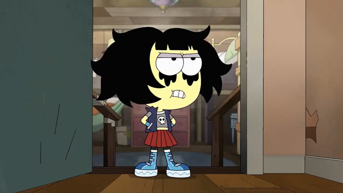
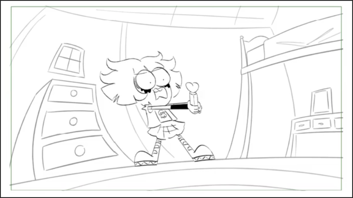
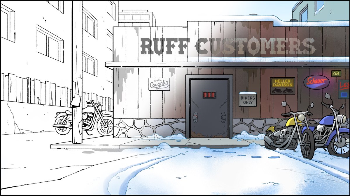
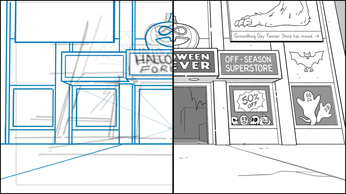
More storyboard to final shot comparisons.
#LegendoftheThreeCaballeros #DisneyPlus
The animator's job is to capture the essence of the storyboards, yet improve upon it. I think they've done a solid job giving Donald his domestic charm.


#LegendoftheThreeCaballeros #DisneyPlus
The animator's job is to capture the essence of the storyboards, yet improve upon it. I think they've done a solid job giving Donald his domestic charm.


@disneyplus I remember having a discussion about how to draw Donald's tongue when his mouth is open so wide. Turns out they didn't do that in the final animation. I was going for him looking like he was about to devour his breakfast just as the phone rang.
@disneyplus Here it is, Mickey Mouse's birthday, and I'm posting Donald Duck art. Make of it what you will.
@disneyplus I drew an 80s style wall phone. Ha! It makes more sense that the designers made it into a style indicative of the 40s/50s classic cartoons we were inspired by.
• • •
Missing some Tweet in this thread? You can try to
force a refresh


