Giving out inspiration. Art Director at Disney TV Animation on #BigCityGreens. Cartoonist. Emmy winner. Dad. Runner. Classic car driver. Minimalist.
Mar 15, 2022 • 13 tweets • 5 min read
Let's discuss pushing the boundaries of distortion and style for cinematic and emotional impact.
An environment design thread:
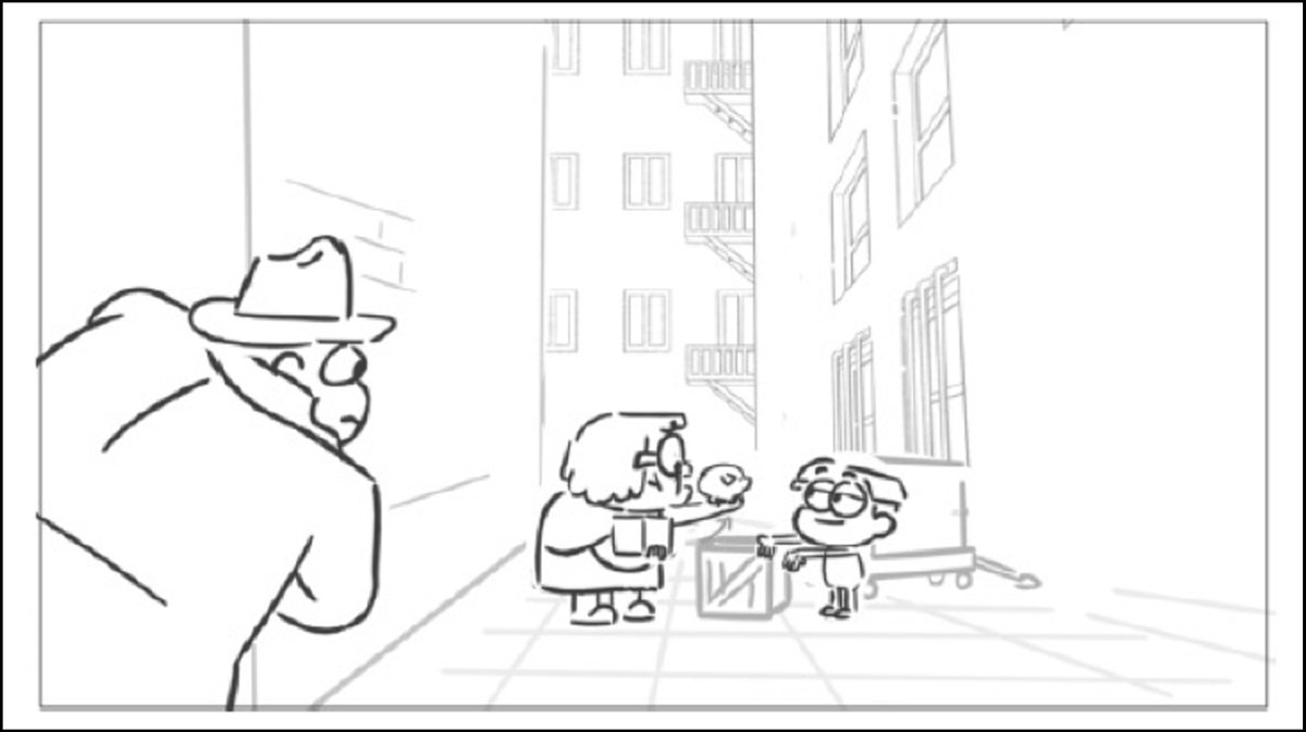
Spoiler alert. We have this #BigCityGreens episode called Big Trouble where Tilly "goes bad" and wrestles with her internal demons.
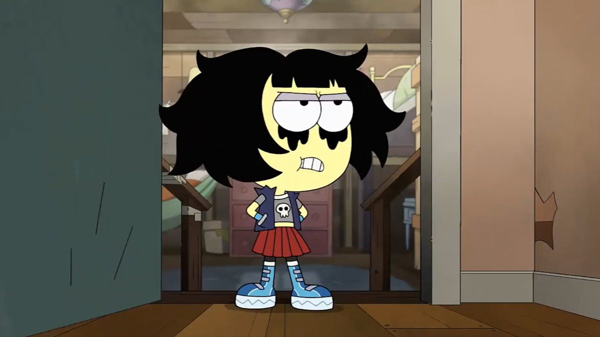
That emotional conflict is what this thread is about.
Mar 9, 2022 • 14 tweets • 5 min read
Designing a TV animation background of a biker bar, and how to add snow.
A step-by-step thread:
Here I start with the storyboard panel. It's quite rough and basic, a simple box building with a funny name.
This allows for a lot of creative freedom but I like that it's somewhat plain and windowless.
Oct 13, 2020 • 11 tweets • 5 min read
From storyboard to background design.
Drawing a pirate ship dinner theater. Heck yeah!
A TV animation step-by-step thread:
First, define perspective.
I lay some pre-made grids over the storyboard panel and adjust them with Photoshop's perspective tool. I eyeball it this time instead of using vanishing points.
The horizon line (dark blue) is near the top of the frame so we look down into the room.
Oct 1, 2020 • 15 tweets • 5 min read
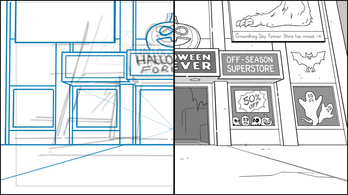
Let's combine 2 drawing tricks I recently covered:
- Drawing half a scene for symmetrical design.
- Applying dynamic perspective in Photoshop.
Another step-by-step thread:
Since it's October, I chose this shot of a Halloween superstore from #BigCityGreens.
I drew a vertical line through the exact center of the canvas as a guide.
Placing my vanishing point low in the scene will create the perspective of looking upward.
Sep 29, 2020 • 13 tweets • 4 min read
Let's study this masterful scene from Bambi to learn about framing characters using foreground elements.
What looks like random branches is carefully planned out to work for multiple character actions.
A breakdown thread:
The scene opens with Bambi's mother fully in frame behind some foliage.
A character's face is the most important feature audiences connect with.
So even in this brief action of a single step forward, her eyes and nose are visible, framed by branches.
Sep 28, 2020 • 9 tweets • 3 min read
My rule of thumb for #CharacterDesign is that you should be able to recognize your characters by their silhouettes.
This boils down to shape.
For human characters, hair is a defining facet of shape.
A step-by-step thread of how I use shape:
I start out with bald heads.
In this case, it's my own character. In the story, there's a reason for her to have several different hairstyles.
Her bald head is like a blank canvas, a template to draw upon.
Sep 25, 2020 • 12 tweets • 5 min read
How I drew this library with its curved, scalloped ceiling using 1-point perspective.
A TV animation background design step-by-step thread:
I start by planning my perspective over the storyboard panel here.
See my vanishing point in blue?
Placing it behind a shelf simplifies the amount of work. I only need to draw one row of shelving units receding in space. (A library is tedious to draw as it is.)
Sep 24, 2020 • 12 tweets • 4 min read
How to draw natural symmetrical architecture.
Yes, it's as simple as you think.
A step-by-step thread:
Start with your rough.
In this case, it's a storyboard panel from #BigCityGreens episode, Quiet Please.
The point is to quickly lay out your symmetrical composition.
I pulled all these spoof titles from past episodes but drew all the covers.
Closeups in the thread:
The Affiliates = The Avengers
America Rat = Captain America
Henry Cauldron = Harry Potter
I put a lot of care into the Henry Cauldron typestyle.
Sep 15, 2020 • 13 tweets • 5 min read
How to draw dynamic perspective with a simple Photoshop trick.
Plus tips on drawing buildings.
An environment design step-by-step thread:
As usual, my context is TV animation but these concepts apply to other art forms.
I start by taking the storyboard panel showing a character swinging directly away from camera.
The story cue is simple: action scene flying over an urban streetscape.
Sep 9, 2020 • 12 tweets • 5 min read
More tips about using perspective to reimagine the impact of a scene in animation environment design.
A step-by-step thread:
(Twitter aggressively crops these tall pans so click on them to see all.)
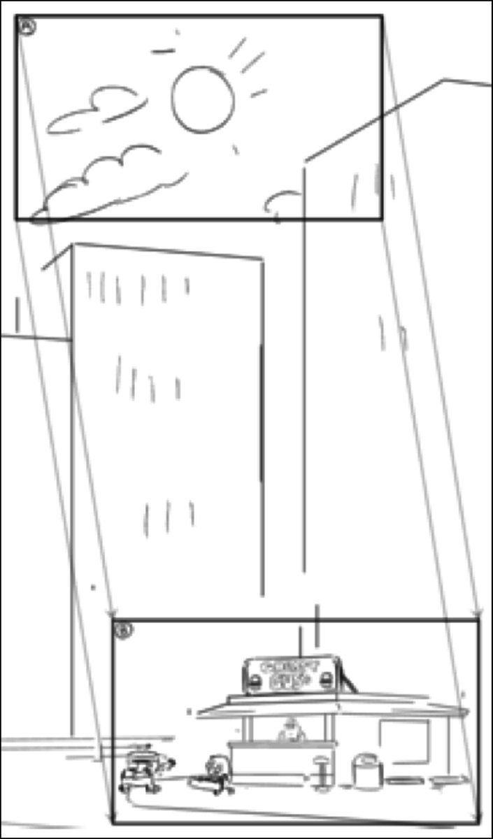
First, the story of this storyboard panel is we start on a midday sun and pan down to a little burger shack surrounded by skyscrapers.
Always ask yourself how you can tell the story better with design.
Sep 1, 2020 • 12 tweets • 4 min read
How to use a camera movement to reimagine a scene in animation background design.
A step-by-step thread:
What the storyboard intended was to move the camera from the top of a skyscraper to street level with a short diagonal pan.
But the scale of the buildings doesn't work well in the storyboard.
To fix this...
Sep 1, 2020 • 4 tweets • 1 min read
Here’s the process video of me drawing my 41 year old #Mercedes.
Watch me draw:
My inspiration. My muse. My heap.
Aug 18, 2020 • 11 tweets • 4 min read
How to improve composition in environment design.
Here we have the final shot and a storyboard panel. Let's look at how it went from one to the other.
A thread:
My context is television animation but this applies to illustration, comics, etc. if you look at this storyboard panel as simply a rough concept regarding the environment.
It's the initial idea before the deeper thought or research but it gets the broad strokes down efficiently.
Aug 14, 2020 • 5 tweets • 2 min read
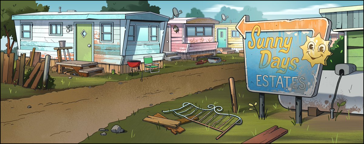
Let's look closely at another trailer park background from #BigCityGreens designed by me, painted by @spookybri.
A process thread:
Again, starting with the storyboard.
This panel is about staging the action for the characters and giving a basic composition.
Aug 13, 2020 • 5 tweets • 2 min read
Finished painting.
It’s my back patio.
Done in @Procreate.
This isn't an exact replication of our patio. Artistic liberties were taken:
The door doesn't have a window.
The succulents are rearranged.
We don't have that swanky patio furniture.
Etc.
Aug 12, 2020 • 15 tweets • 5 min read
How to give story to a location through details.
Let's look closer at this background from #BigCityGreens.
A thread:
As a base, let's look at the storyboard. What are the broad story strokes?
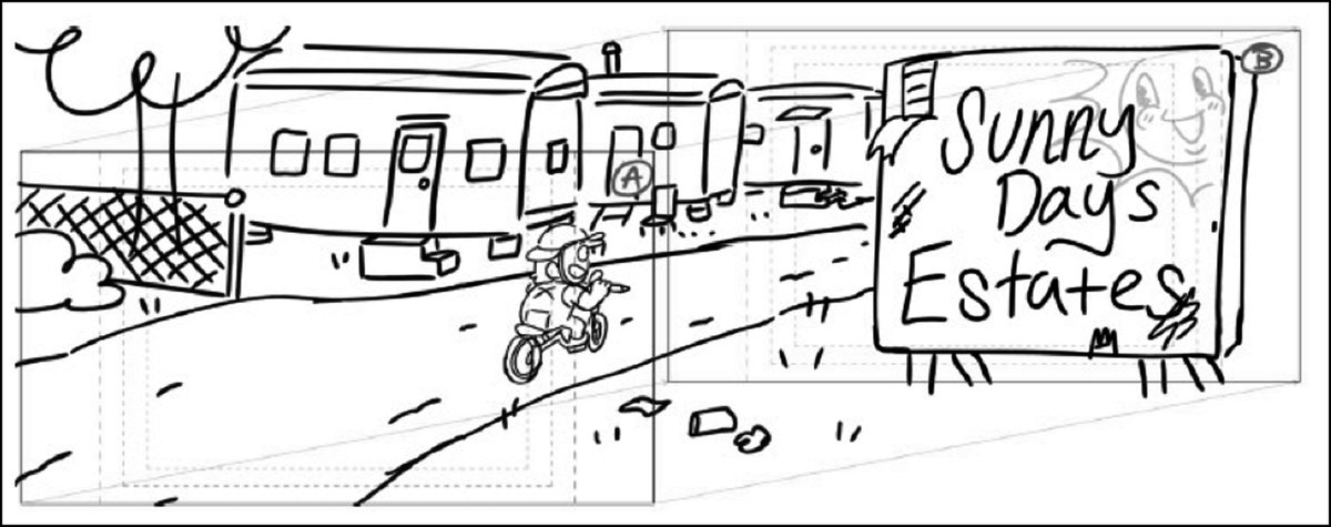
A lil thread:
Let's start with the storyboard which gave me very little to work from, but I understood the path the car needed to make.
That's the important action of which I designed around.
Jul 19, 2020 • 5 tweets • 2 min read
Packing to move, I just came across this old box of my first animation job.
It has copies of nearly every background, storyboard, and prop that I drew for #HeyArnold in the 1990s.
And early 2000s. I was on Arnold until the very end of production. I think that was December 2001.