Storyboards for my original bus station gag in #LegendoftheThreeCaballeros:
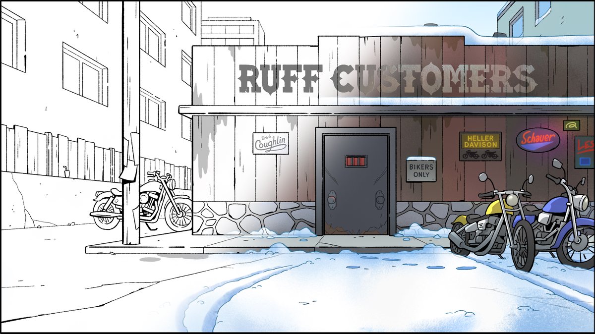
When Daisy first calls Donald, the station looks nice. When she calls again later, it's turned rough.
This final shot is from the first call. Making it rough raises the stakes when Donald forgets her.


When Daisy first calls Donald, the station looks nice. When she calls again later, it's turned rough.
This final shot is from the first call. Making it rough raises the stakes when Donald forgets her.


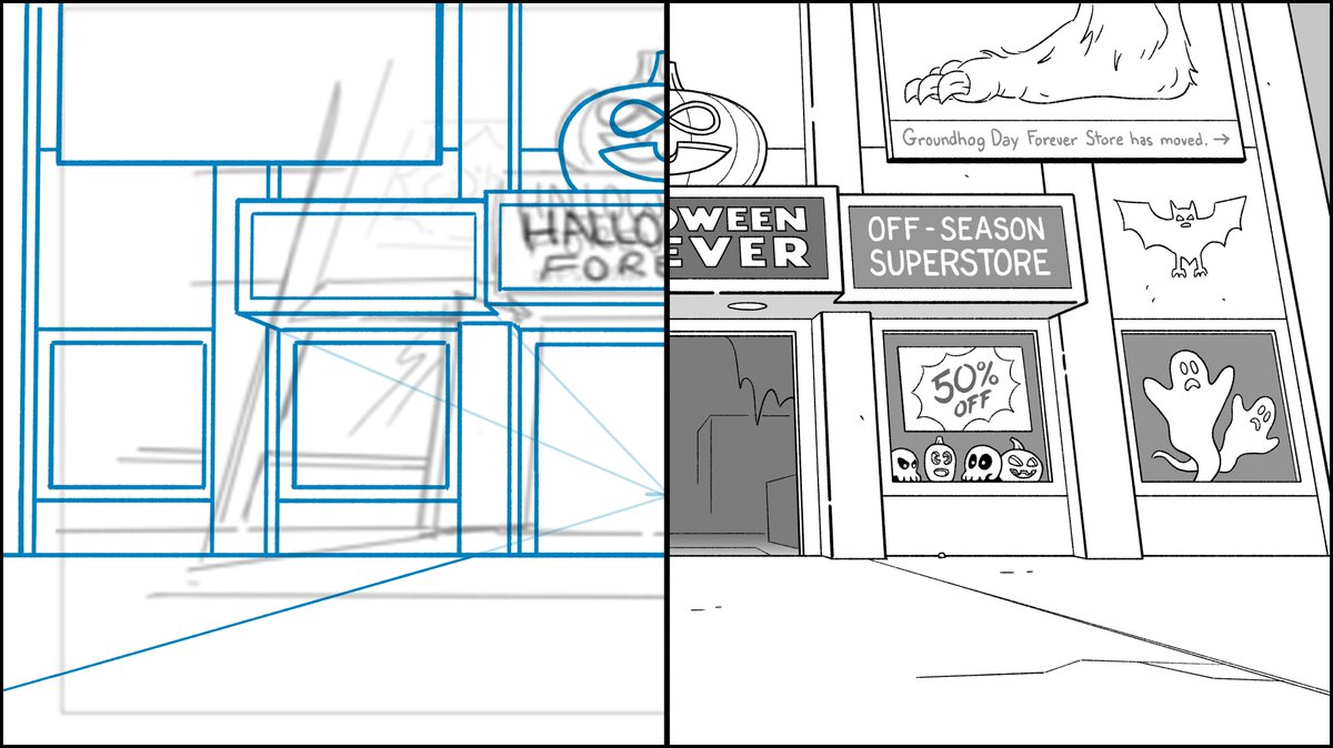
It's no longer a location gag, which is fine. It serves the story better to have the bus station look rough from the start.
Another thing. I believe Disney wasn't on board with the vagrant characters and just wanted them out. I get that regarding the Disney brand in this show.
That said, I like the way I designed those characters. I got to make up Disney vagrants. 😀
That said, I like the way I designed those characters. I got to make up Disney vagrants. 😀
• • •
Missing some Tweet in this thread? You can try to
force a refresh


