Donald chops his stove in half. Temper, temper.
#LegendoftheThreeCaballeros #DisneyPlus
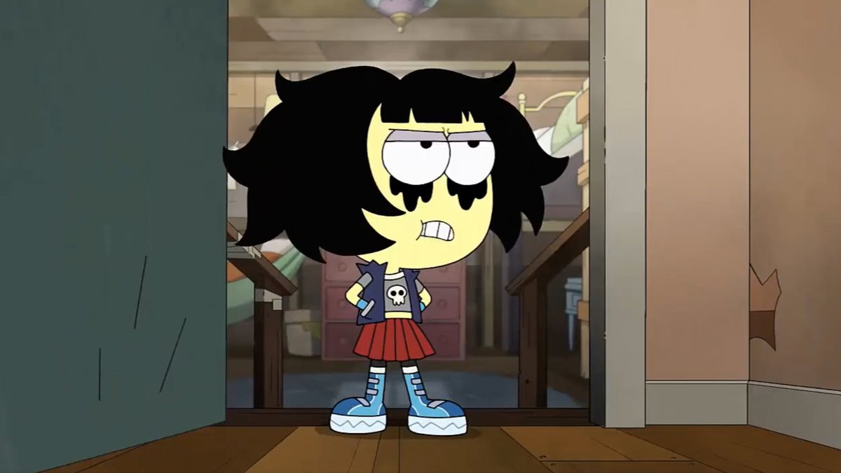
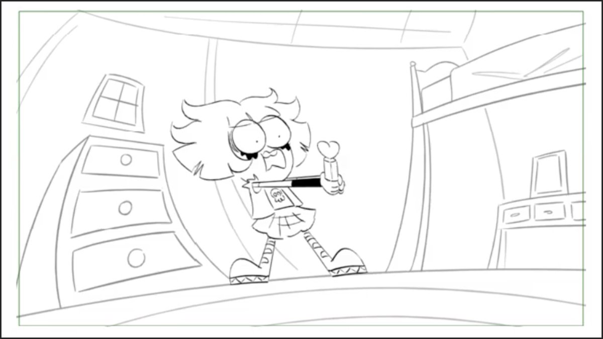
This is one of those times I think the final animation didn't quite live up to the storyboard poses. But the action happens fast and the story still progresses. That's TV animation for you.

#LegendoftheThreeCaballeros #DisneyPlus
This is one of those times I think the final animation didn't quite live up to the storyboard poses. But the action happens fast and the story still progresses. That's TV animation for you.


Here's why the animation didn't match my storyboard:
The animation is not hand drawn.
It is rigged, meaning the character models are digitally "built" in a 2D structure and then manipulated into the poses. That's a simplistic way of understanding it.
Therefore...
The animation is not hand drawn.
It is rigged, meaning the character models are digitally "built" in a 2D structure and then manipulated into the poses. That's a simplistic way of understanding it.
Therefore...
These more extreme poses are harder to achieve from the neutral poses of the character rigs. Sometimes the animators pull it off. Sometimes not.
Animating is hard.
TV animation just doesn't have the time or budget to revise every shot that isn't its best. That's the reality.
Animating is hard.
TV animation just doesn't have the time or budget to revise every shot that isn't its best. That's the reality.
I drew the detail of the kettle being chopped in half, since it's the subject of his rage.
But the cost of animating that prop in the chaos of the chopping action likely wasn't worth it.
Sometimes a single shot doesn't get full attention. But then it's over and onto the next.
But the cost of animating that prop in the chaos of the chopping action likely wasn't worth it.
Sometimes a single shot doesn't get full attention. But then it's over and onto the next.
• • •
Missing some Tweet in this thread? You can try to
force a refresh


