1 like on this tweet = 1 ecommerce tip.
(I expect this will be quite niche for some followers, but hopefully interesting or useful anyway. do feel free to RT this / any of the tips if so. Depending on number of likes, it might take a while).
(I expect this will be quite niche for some followers, but hopefully interesting or useful anyway. do feel free to RT this / any of the tips if so. Depending on number of likes, it might take a while).
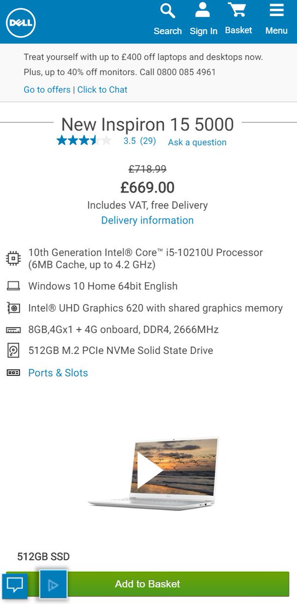
1. Online returns: If you want to return a product because the price dropped after you bought it, lots of retailers will just refund the difference if you call them.
It costs less to refund the difference than to ship back, handle it, & ship out a replacement at the lower price.
It costs less to refund the difference than to ship back, handle it, & ship out a replacement at the lower price.
2. Competitor analysis: Most ecommerce platforms use 'sequential invoicing' (ie, order #s go 001, 002, 003...)
Place a test order once a month on a site, you can tell how many orders they had.
Do it for a year & you know how fast they grew, when their peaks & troughs were, etc.
Place a test order once a month on a site, you can tell how many orders they had.
Do it for a year & you know how fast they grew, when their peaks & troughs were, etc.
3. Paid Search: If you sell multiple categories, & a competitor sells just one category, brand bidding on them is better for you than it is for them: They can only serve a % of your market, while you can serve all of their market and those customers may buy your other categories.
(nb: 'brand bidding' = paying for google ads on searches for your competitors' names. this is a fairly standard tactic, albeit some view it as cheeky. Even if you're the smaller competitor, the tip is worth knowing, as you can often get a loose agreement not to bid on each other)
4. The 'channels' delivering most sales to an 'average' ecommerce site usually goes *very roughly* like this order (most->least):
email.
direct site visits.
google organic.
google ads.
retargeting.
social ads.
referrals/social organic.
affiliate.
influencers/partners.
email.
direct site visits.
google organic.
google ads.
retargeting.
social ads.
referrals/social organic.
affiliate.
influencers/partners.
nb: this is a real generalisation and differs a lot from site to site. if you have a young audience / you're a new-style 'dtc', social & influencers much higher, etc.
also nb: nb: there are lots of other channels like tv, radio, billboards, marketplaces, comparison shopping, and some of the above can be split out ('brand ppc' vs 'generic ppc' vs 'google shopping'). Patterns across those differ much more than the above even.
5. TV advertising:
If you tell people to visit your site in TV ads, a much higher proportion do. They usually visit via:
a) google brand ads.
b) directly typing in your homepage url.
c) google organic homepage visits.
Lots of tools exist to measure visits from TV->site.
If you tell people to visit your site in TV ads, a much higher proportion do. They usually visit via:
a) google brand ads.
b) directly typing in your homepage url.
c) google organic homepage visits.
Lots of tools exist to measure visits from TV->site.
6. TV advertising:
Measuring the rough # visits/revenue following TV ads lets you optimise:
- which channels you advertise on.
- which ads you use (& length of ads - I've tested 30 second vs 20 second vs 10 second before & saved a lot of money)
- when you advertise.
Measuring the rough # visits/revenue following TV ads lets you optimise:
- which channels you advertise on.
- which ads you use (& length of ads - I've tested 30 second vs 20 second vs 10 second before & saved a lot of money)
- when you advertise.
7. TV advertising:
TVSquared, Spoteffects, Medialytics are all tools that roughly calculate the # visits / revenue to an ecommerce site from an individual tv ad (usually calculating visits above your benchmark within a 5-7 minute window, and resulting sales in the trailing week)
TVSquared, Spoteffects, Medialytics are all tools that roughly calculate the # visits / revenue to an ecommerce site from an individual tv ad (usually calculating visits above your benchmark within a 5-7 minute window, and resulting sales in the trailing week)
(nb: that's probably enough TV ad tips for now. Technically I've spent millions on TV ads over the last few years, if this area is interesting do feel free to ask for more tips).
8. Conversion Rate Optimisation:
Increasing conversion rate is not always good. If you lose 80% of your traffic & keep 50% of your sales,conversion rate will have gone up, but your overall sales down.
To achieve growth often your conversion rate will go *down*.
Increasing conversion rate is not always good. If you lose 80% of your traffic & keep 50% of your sales,conversion rate will have gone up, but your overall sales down.
To achieve growth often your conversion rate will go *down*.
9. Customer Satisfaction:
If 5% of an ecommerce site's orders go wrong, that may seem ok (95% success), but if your 'best' customers buy once a month, that's 5% chance *every month*.
Some fix that by giving preferential treatment to loyal orders (+obv trying to fix % overall)
If 5% of an ecommerce site's orders go wrong, that may seem ok (95% success), but if your 'best' customers buy once a month, that's 5% chance *every month*.
Some fix that by giving preferential treatment to loyal orders (+obv trying to fix % overall)
10. Customer Satisfaction:
There's a phenomenon called 'Service Recovery Paradox': If a customer experiences an issue, fixing this in a way that they are happy sometimes leaves them *more* satisfied & likely to recommend you than if there had never been an issue at all.
There's a phenomenon called 'Service Recovery Paradox': If a customer experiences an issue, fixing this in a way that they are happy sometimes leaves them *more* satisfied & likely to recommend you than if there had never been an issue at all.
11. Shipping Fees.
It feels common sense that ecommerce sites should offer free next day delivery.
Sometimes sites do better if they charge for it (£3 feels a lot on a £20 order, but if product cost is £10, £3 delivery would mean they'd have to get ~30% more orders to make up).
It feels common sense that ecommerce sites should offer free next day delivery.
Sometimes sites do better if they charge for it (£3 feels a lot on a £20 order, but if product cost is £10, £3 delivery would mean they'd have to get ~30% more orders to make up).
(Nb: there are also secondary effects here both ways. If a customer pays for shipping, sometimes they are less likely to return the product. If they have to pay shipping every time, there is the possibility of a 'wearing' effect whereby in the long run they order less)
12. UX: Here's how some customers browse medium/large ecommerce sites. I refer to it as 'The Loop':
1. Enter a category/search results page.
2. Click into an interesting looking product page.
3. Qualify if they want that product.
4. Loop through 1-3 till they add to bag / exit.
1. Enter a category/search results page.
2. Click into an interesting looking product page.
3. Qualify if they want that product.
4. Loop through 1-3 till they add to bag / exit.
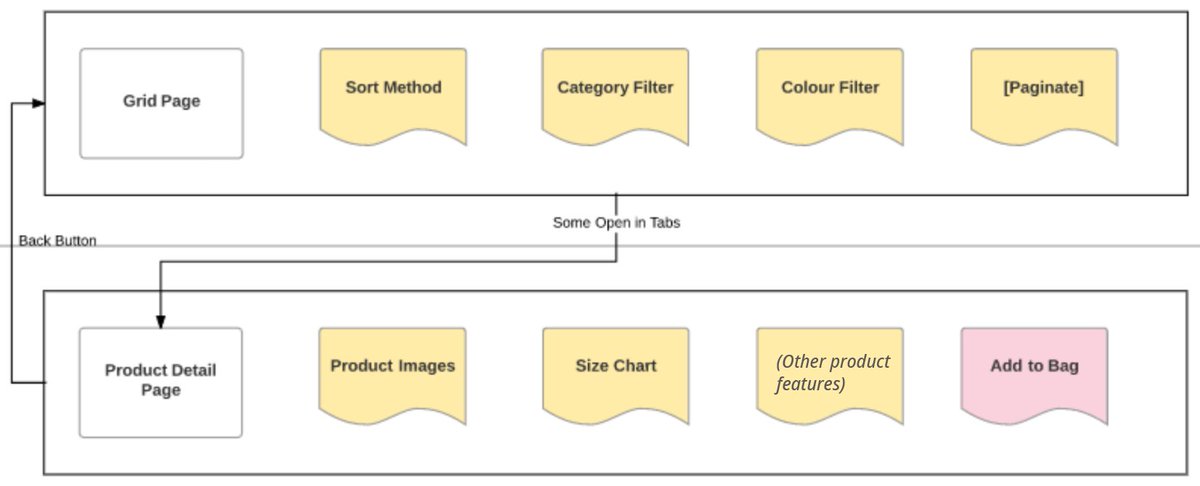
nb:
category/subcategory/search results pages are usually known as 'PLPs' (product listing pages) or 'Grid Pages' (as they're often grids) in the ecommerce industry.
individual product pages are usually known as 'PDPs' (product detail pages) or simply 'product pages'.
category/subcategory/search results pages are usually known as 'PLPs' (product listing pages) or 'Grid Pages' (as they're often grids) in the ecommerce industry.
individual product pages are usually known as 'PDPs' (product detail pages) or simply 'product pages'.
also nb: This is of course a generalisation, but it's useful to know as this browsing/buying pattern (& variants) exist on most medium/large ecommerce sites.
Making changes to key features in 'the loop' can have a big impact on results.
Making changes to key features in 'the loop' can have a big impact on results.
13. UX: Ecommerce homepages 'feel' like the entrance area in a shop, but they're not.
In a physical shop, 100% of visitors enter through designated entry points.
On an ecommerce site, usually roughly only 1/3 of visits will enter via the homepage.
In a physical shop, 100% of visitors enter through designated entry points.
On an ecommerce site, usually roughly only 1/3 of visits will enter via the homepage.
Particularly if you're a small brand - people landing on individual product pages or listing pages may never have heard of you before.
Including some of the kinds of content you'd want people to see as they first enter on pages *other* than your homepage.
Including some of the kinds of content you'd want people to see as they first enter on pages *other* than your homepage.
That content may be things like:
a) Reasons to buy from you.
b) Info about your brand.
c) Opening hours/customer service hours.
d) Any particularly compelling offers you have on at the time.
e) Email signup prompt.
f) Indicators on your scale/trustworthiness.
a) Reasons to buy from you.
b) Info about your brand.
c) Opening hours/customer service hours.
d) Any particularly compelling offers you have on at the time.
e) Email signup prompt.
f) Indicators on your scale/trustworthiness.
14. Conversion Rate Optimisation:
'New' visitors to any ecommerce site are usually muuuuch less likely to buy than returning visitors.
Tracking 'new customer conversion rate' (% of new visits resulting in a 1st time purchase) vs 'repeat visitor conversion rate' can be v useful.
'New' visitors to any ecommerce site are usually muuuuch less likely to buy than returning visitors.
Tracking 'new customer conversion rate' (% of new visits resulting in a 1st time purchase) vs 'repeat visitor conversion rate' can be v useful.
It's flawed, but helps. Returning visitors are often have a relationship & history with you. A 1st time visit, it is often the site itself that shapes their impression of you/likelihood to buy. Monitoring 'NCCVR' after new site features can help fix otherwise invisible mistakes.
15. SEO:
It's an absolute basic, but missed by many. If your SEO team is reporting on increases in overall organic traffic to your website, they may be claiming credit for TV/offline/word of mouth traffic too + the investment in your brand over your entire company history, etc.
It's an absolute basic, but missed by many. If your SEO team is reporting on increases in overall organic traffic to your website, they may be claiming credit for TV/offline/word of mouth traffic too + the investment in your brand over your entire company history, etc.
Splitting out brand traffic vs non-brand traffic is a starter fix for this. 'seo homepage vs seo non-homepage' is one extremely basic 80/20 way. The more granular you get in isolating *actual* results of any SEO investment, vs just 'overall organic traffic' = usually the better.
16. The channel data in Google Analytics is all 'wrong'.
If a visitor comes to your site through email today, and then comes back tomorrow directly typing in the address into the browser, *tomorrow's* visit will also show in most Google Analytics reports as being from email.
If a visitor comes to your site through email today, and then comes back tomorrow directly typing in the address into the browser, *tomorrow's* visit will also show in most Google Analytics reports as being from email.
That's useful in some ways, but it's very unuseful in others: It can make you believe that you have much more ppc/email/seo (etc) traffic than you do.
The 'multi-channel funnel' reports can help to show you what's actually happening, but even just knowing this info helps.
The 'multi-channel funnel' reports can help to show you what's actually happening, but even just knowing this info helps.
17. Site Speed/Analytics.
The general 'avg page load time' in Google Analytics is flawed. It's a mean' average based on a very small sample.
The most useful site speed report in Google Analytics can be found here. From this you can find '% pages loaded in less than [x] seconds'
The general 'avg page load time' in Google Analytics is flawed. It's a mean' average based on a very small sample.
The most useful site speed report in Google Analytics can be found here. From this you can find '% pages loaded in less than [x] seconds'
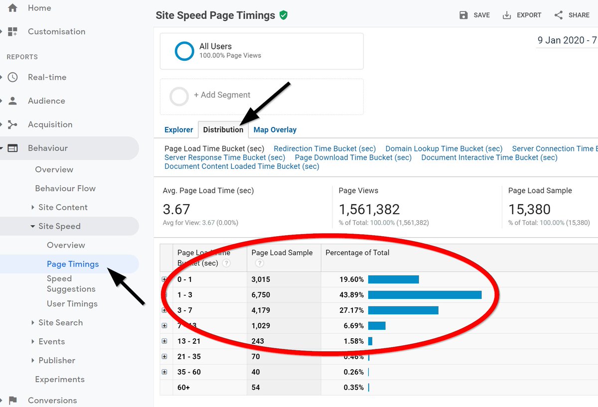
A couple of nice enhancements to that:
a) Note in the screengrab above that the site had 1.5m pageviews, but it's only gathered page load speed data for 15,380 of them. You can increase that % using something called '_setSiteSpeedSampleRate()' (google it).
...
a) Note in the screengrab above that the site had 1.5m pageviews, but it's only gathered page load speed data for 15,380 of them. You can increase that % using something called '_setSiteSpeedSampleRate()' (google it).
...
b) If your ecommerce site mainly sells only in (say) the UK, but you get lots of traffic from (say) Australia. Your site speed metrics will be dragged down by those Australian visitors. Using a KPI like '% of pages loaded in the UK in <3 seconds' = more meaningful than overall.
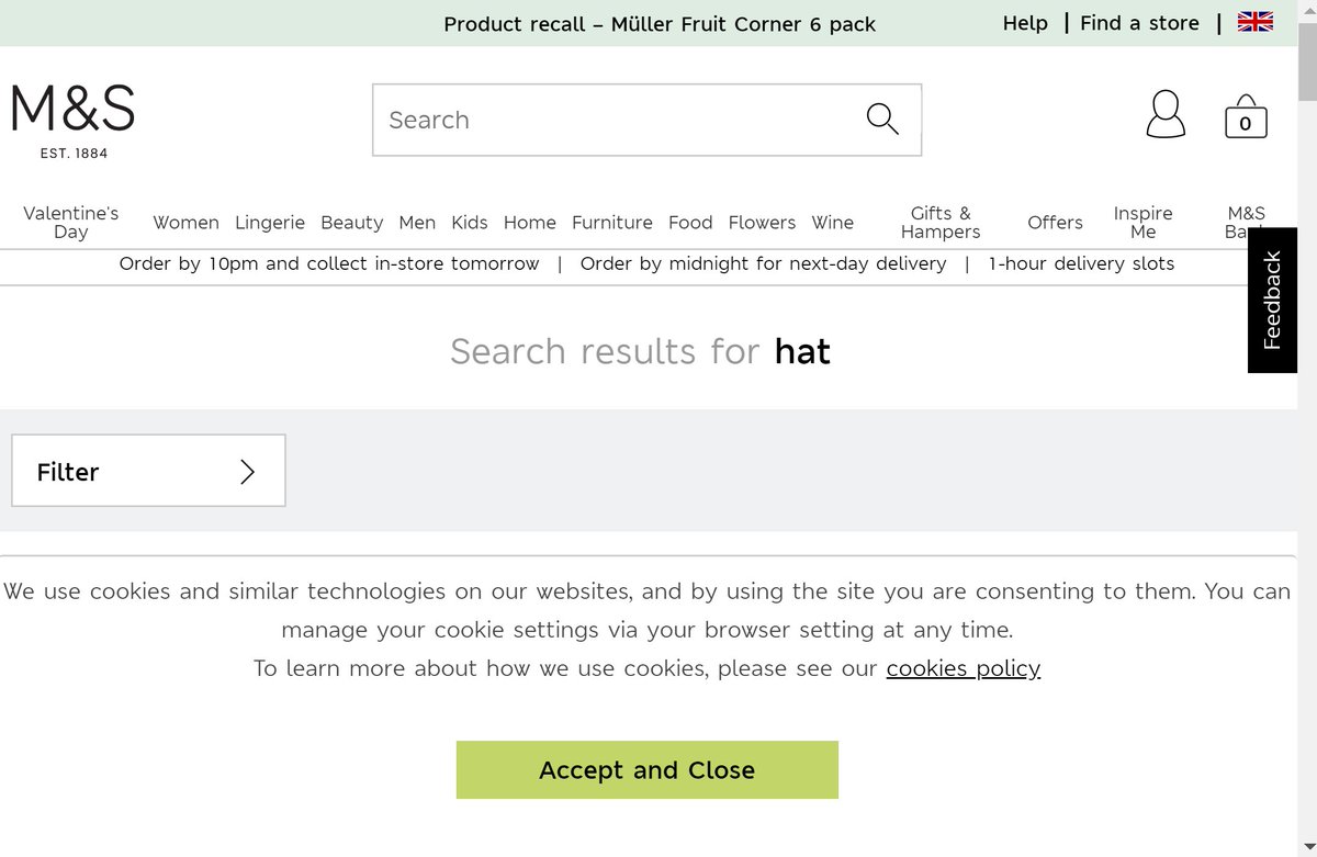
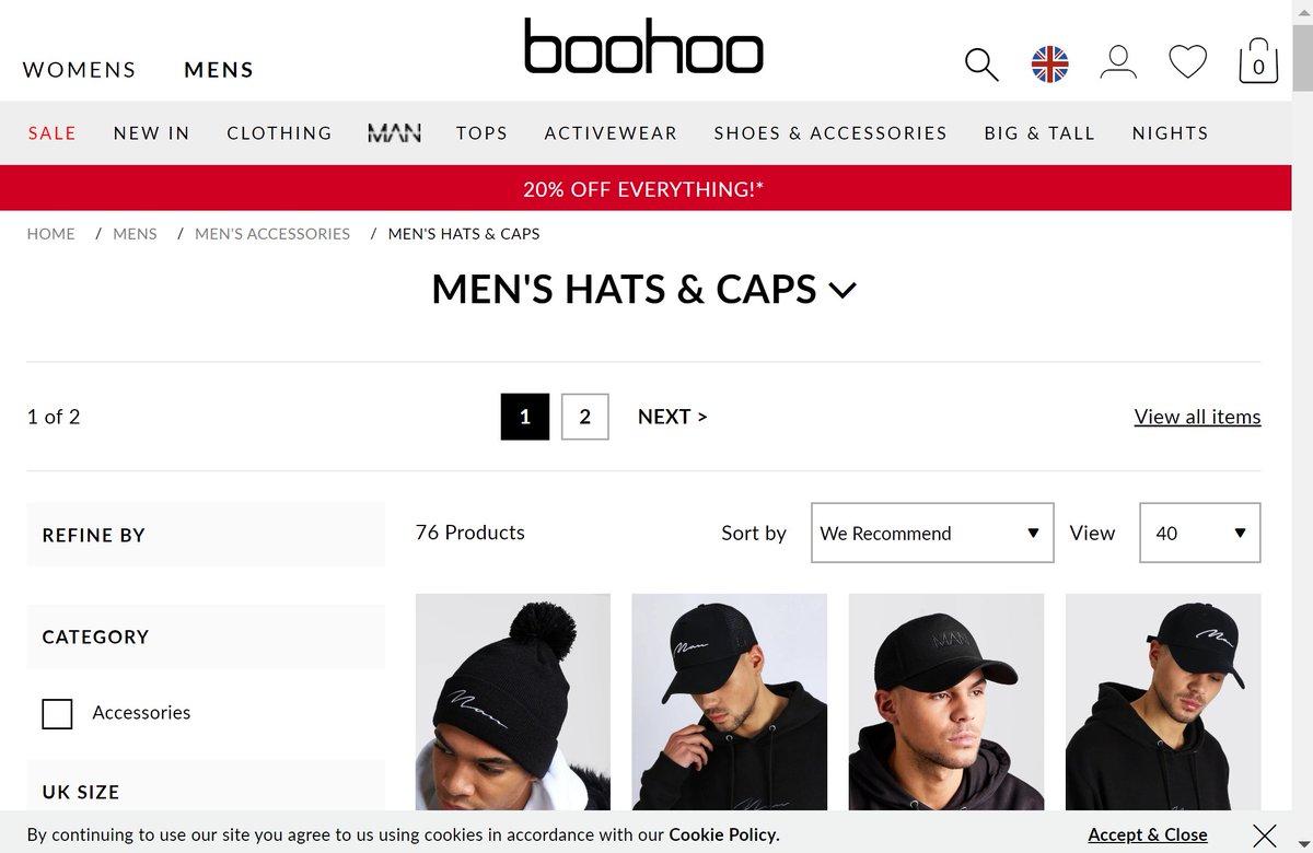
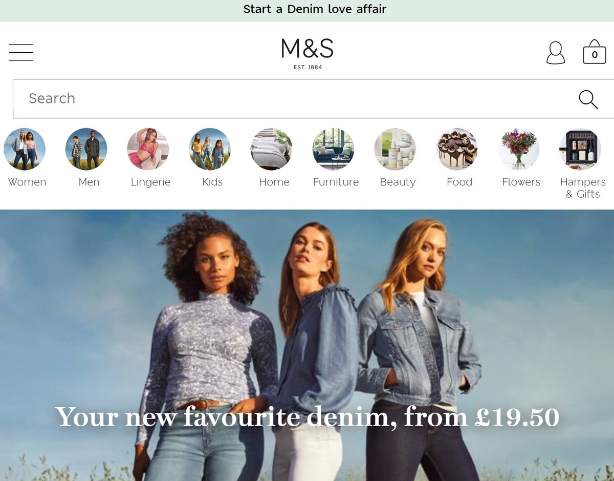
18. UX: Compliance with laws is essential, but fit it to your risk profile.
A good example of this is the cookie law. Here's Amazon vs M&S vs Boohoo.
Amazon = you can browse everything.
M&S = massive cookie strip covering half the page.
Boohoo = small notice, not in the way.
A good example of this is the cookie law. Here's Amazon vs M&S vs Boohoo.
Amazon = you can browse everything.
M&S = massive cookie strip covering half the page.
Boohoo = small notice, not in the way.
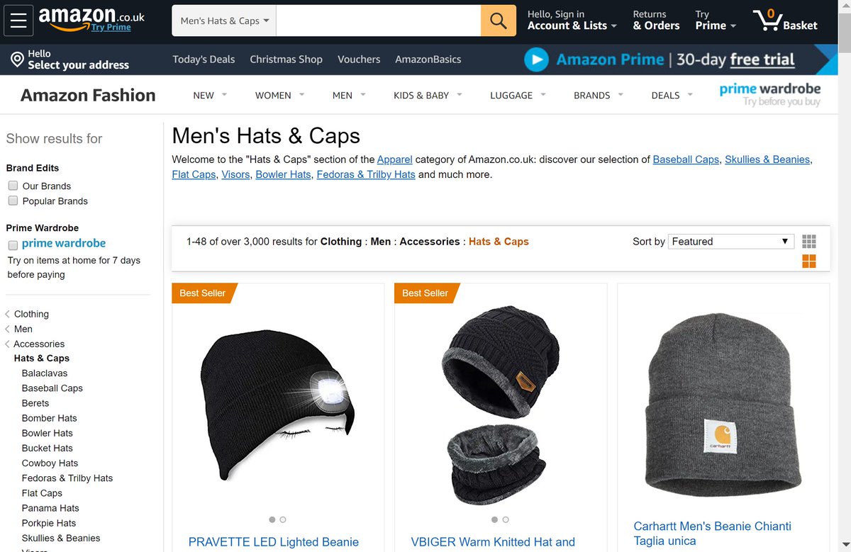
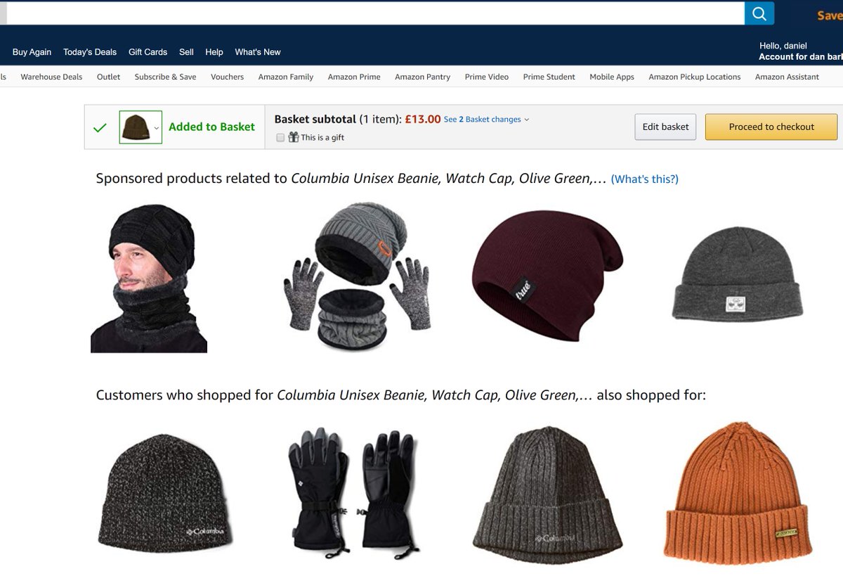
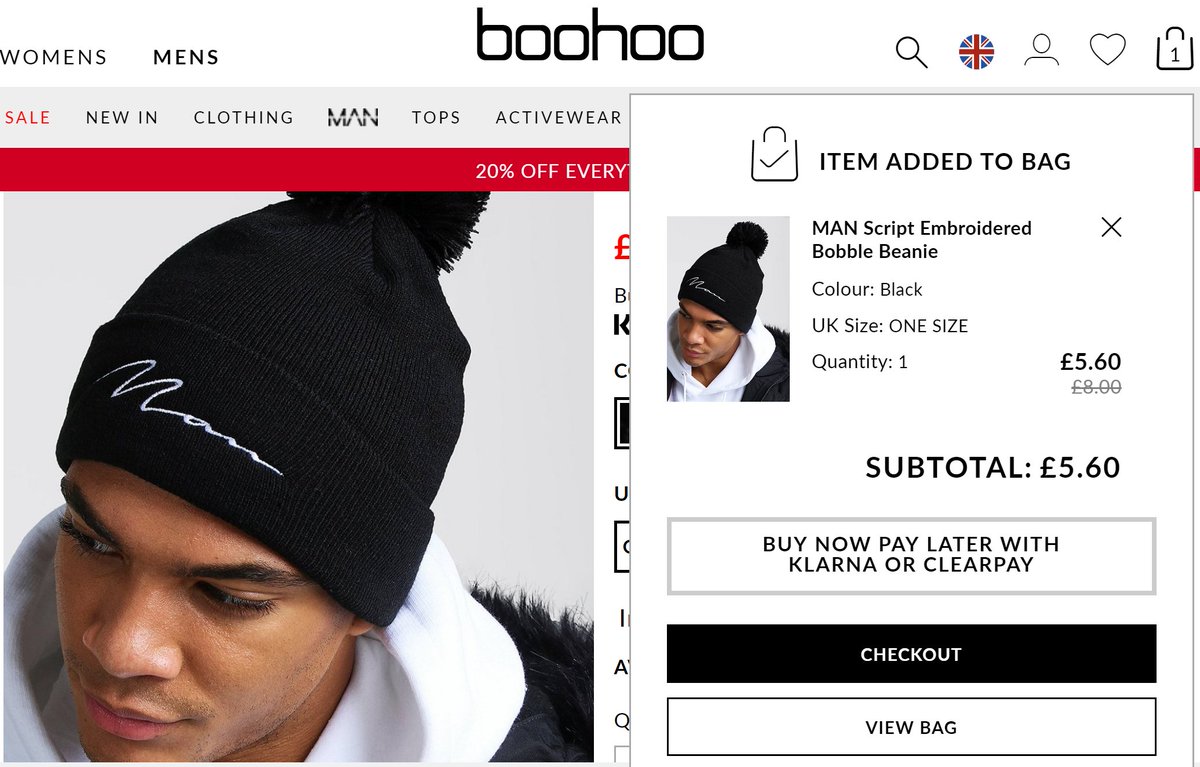
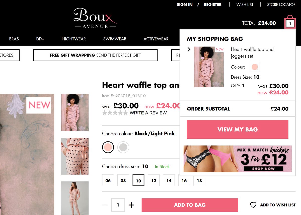
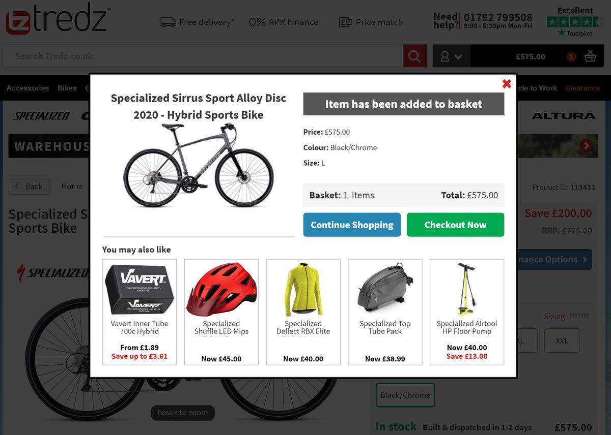
19. UX: There are 4 basic patterns most sites use when you 'add to bag':
a) Separate page/flow to sell other items (amazon).
b) 'Mini bag'. (stay on page, bag appears top right).
c) Overlay.
d) Straight to checkout.
Usually, prompting 'cross sells' at this step= higher revenue.
a) Separate page/flow to sell other items (amazon).
b) 'Mini bag'. (stay on page, bag appears top right).
c) Overlay.
d) Straight to checkout.
Usually, prompting 'cross sells' at this step= higher revenue.

20. Email marketing: It's useful practice to subscribe to your competitors' emails. That way you can see which other offers/promotions/communications customers purchasing in your general market are seeing.
Subscribe to them all from one inbox & you have an automated archive.
Subscribe to them all from one inbox & you have an automated archive.
21. Email Marketing: If a very direct competitor has a regular pattern of sending emails en masse to their list at particular dates:times, sending ahead of that can give you a bit of advantage if your email list overlaps with theirs.
22. Email Marketing: Going through what competitors did 'next month last year' can help you figure out what they're likely to do next month this year.
Milled.com is a great resource with email archives for lots of ecommerce sites. eg: milled.com/marks-and-spen…
Milled.com is a great resource with email archives for lots of ecommerce sites. eg: milled.com/marks-and-spen…
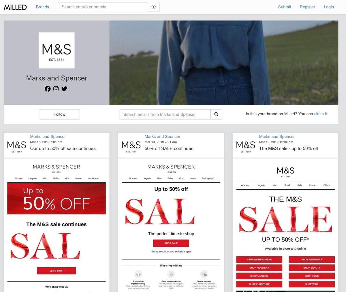
(nb: note from that last link, you can figure out M&S began their sale last year at around March 12th. They ran a preview on March 8th, again on the 9th, had a 'VIP access' step on the 9th. They started at 40% off. Lots of info just from a few emails)
23. Trading. Google Trends is quite basic, but it's so useful for all sorts of things. Eg, here's the search trend for 'summer dresses' in the UK in 2019.
If you have an ecommerce site selling dresses, that gives you a decent idea exactly when to start featuring summer dresses.
If you have an ecommerce site selling dresses, that gives you a decent idea exactly when to start featuring summer dresses.
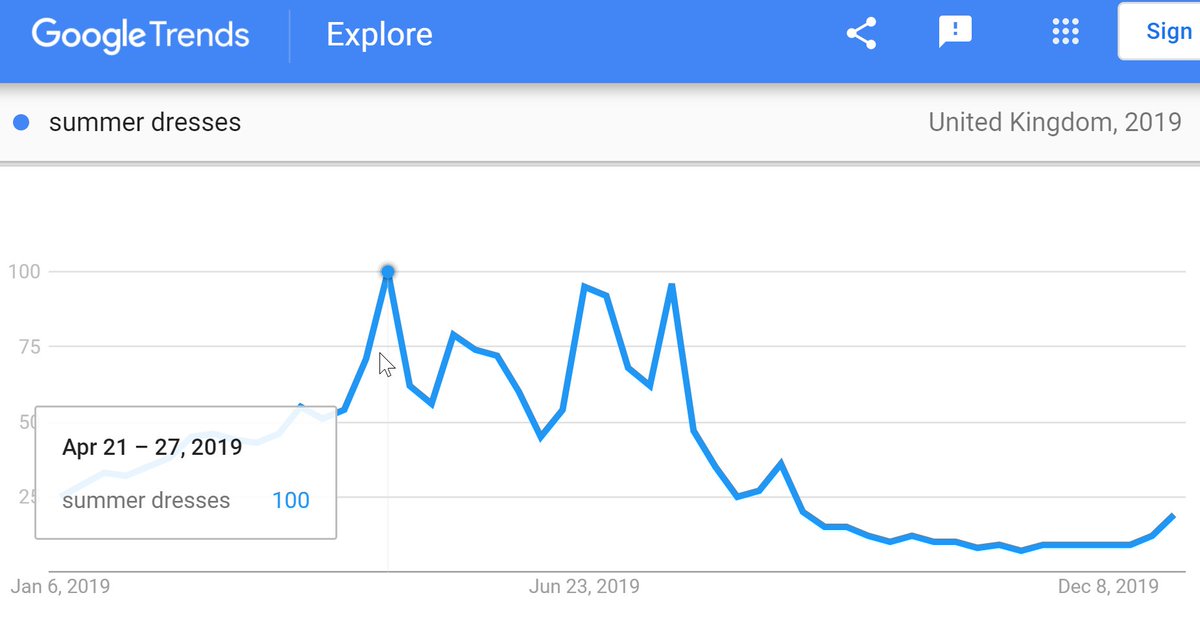
(nb: in the chart above, ideally you'd want to start featuring them prior to the small bump left of the highlighted peak; you'd want to be 'sold through' most stock before the last big peak. Anything after that= you'd likely have to sell deep discount/pack away till next year.)
(caveat to the above is if you have multiple regions. Some retailers deliberately sell in (eg) the UK and Australia, so that after one season has ended, there is a chance to sell remaining stock at a higher price elsewhere. Same for fashion, homeware, sports equipment, etc).
24. Email. It's basic, but have at least 2x email welcome programs-
a) one for 'new customers'.
b) one for 'new subscribers not yet customers'.
These are automated email programs, that send the recipient an email over the initial period after they become a customer/subscriber.
a) one for 'new customers'.
b) one for 'new subscribers not yet customers'.
These are automated email programs, that send the recipient an email over the initial period after they become a customer/subscriber.
25. Email. A typical 'customer' email welcome program might be something like:
a) welcome message from the brand.
b) info about what you sell.
c) info about why customers love you.
d) email covering best sellers from each of your categories.
e) *possibly* some sort of offer.
a) welcome message from the brand.
b) info about what you sell.
c) info about why customers love you.
d) email covering best sellers from each of your categories.
e) *possibly* some sort of offer.
26. Email. A typical 'subscriber' email welcome program might be:
a) some sort of 'welcome' offer.
b) info about a product/category you've deduced they're interested in.
c) why customers love you.
d) best sellers from other categories.
e) offer follow up.
a) some sort of 'welcome' offer.
b) info about a product/category you've deduced they're interested in.
c) why customers love you.
d) best sellers from other categories.
e) offer follow up.
27. Metrics. Some ecommerce companies have a 'first to second order rate' metric. (eg, '% of customers who buy for the 2nd time within 2 months of first purchase).
These are useful as a way of judging email welcome programs/the general 'onboarding journey'.
These are useful as a way of judging email welcome programs/the general 'onboarding journey'.
(nb: that last tip seems unimportant at first, but if you think about it:
if it costs you $50 to acquire a new customer. and you make an average $50 profit per order. taking a customer to their 2nd purchase is one of the single biggest things you can do to increase your profit)
if it costs you $50 to acquire a new customer. and you make an average $50 profit per order. taking a customer to their 2nd purchase is one of the single biggest things you can do to increase your profit)
28. Email. Following a welcome program, usually an ecommerce company would add the subscriber to a general email newsletter list.
In general, consistent email programs that follow a fairly set format with regular testing are best. In Europe, most email programs go 2-5x per week.
In general, consistent email programs that follow a fairly set format with regular testing are best. In Europe, most email programs go 2-5x per week.
(nb: some are more/some less. In the UK generally more is accepted; in Germany some would feel 4 per week is a lot)
29. Email. Usually a retailer would plan out email campaigns weeks/months in advance, covering:
- General trend topics.
- Seasonal topics.
- Promotional topics.
- Inspiration content.
- Brand content.
- Mid/End season sales.
- General trend topics.
- Seasonal topics.
- Promotional topics.
- Inspiration content.
- Brand content.
- Mid/End season sales.
30. Email. Some ecommerce companies would have multiple of those running per email, and have their email template arranged into blocks.
Some customers might therefore *not* receive promotional content, while some *not* inspiration content.
Some customers might therefore *not* receive promotional content, while some *not* inspiration content.
31. Email. It's common to include product recommendations in emails. From 'easy' to 'hard':
- Random selection.
- Best sellers.
- Best sellers in most relevant categories.
- Personalised on browsing behaviour.
- Personalised on buying behaviour.
- Personalised + highest profit.
- Random selection.
- Best sellers.
- Best sellers in most relevant categories.
- Personalised on browsing behaviour.
- Personalised on buying behaviour.
- Personalised + highest profit.
32. Email. Most ecommerce sites run on categories. You can sometimes 'cheat' personalised products on that basis.
Eg, simple rules:
if customer bought [brand x] printer; email best sellers from [brand x] printer ink.
if bought [price tier 2] jacket; email [price tier 2] tops.
Eg, simple rules:
if customer bought [brand x] printer; email best sellers from [brand x] printer ink.
if bought [price tier 2] jacket; email [price tier 2] tops.
33. Email. On top of a general newsletters, lots of ecommerce sites run CRM programs (customer relationship management).
Those are often triggered by subscribers reaching 'journey points', eg:
- not bought for 60/90/180 days.
- anniversary of first purchase.
- actual birthday.
Those are often triggered by subscribers reaching 'journey points', eg:
- not bought for 60/90/180 days.
- anniversary of first purchase.
- actual birthday.
nb: usually CRM emails replace regular newsletters. Ie, if there's an email newsletter scheduled for Tuesday, but the customer matches the criteria for a CRM mail, they'll receive the CRM mail either:
a) in favour of the newsletter.
b) embedded in the newsletter.
a) in favour of the newsletter.
b) embedded in the newsletter.
34. Email. Often you won't realise CRM emails from companies are triggered like this. Newsletters are *usually* graphical, CRM emails are *often* text emails, written as if they're personal emails from a customer service person/the CEO/etc.
35. Email. There are various plays on CRM emails:
- 'sorry' email - something has gone wrong, and the brand offers you x% off to apologise. (often very lucrative)
- 'survey' email- designed to gather info from subscribers, but also to reward with a % off & generate a sale.
etc.
- 'sorry' email - something has gone wrong, and the brand offers you x% off to apologise. (often very lucrative)
- 'survey' email- designed to gather info from subscribers, but also to reward with a % off & generate a sale.
etc.
36. Email. Generally the most important 'points' in an email are:
- Subject line (& 'pre-header' (the preview text most email browsers show you))
- Call to action (the element(s) that ask you to click through to the website)
- Unsubscribe button (a negative action)
- Subject line (& 'pre-header' (the preview text most email browsers show you))
- Call to action (the element(s) that ask you to click through to the website)
- Unsubscribe button (a negative action)
37. Email. Metrics of importance to ecommerce sites are usually.
- Bounce rates ('soft'/'hard' bounces)
- Deliberability rates.
- Open rates.
- Clickthrough rates.
- Transactions/new customers/revenue/margin.
- Unsubscribe rates/absolute unsubscribe numbers.
- Bounce rates ('soft'/'hard' bounces)
- Deliberability rates.
- Open rates.
- Clickthrough rates.
- Transactions/new customers/revenue/margin.
- Unsubscribe rates/absolute unsubscribe numbers.
38. Email. Some ecommerce companies also track things like-
- Active email subscriber base/growth/churn rates.
- Unique opens/visits from email. (ie, if the same subscriber opens 4 emails in a week = '4 opens' but '1 unique open')
- Spam rates. (those who click the 'spam' button)
- Active email subscriber base/growth/churn rates.
- Unique opens/visits from email. (ie, if the same subscriber opens 4 emails in a week = '4 opens' but '1 unique open')
- Spam rates. (those who click the 'spam' button)
39. Email. Unsubscription is seen as a negative, but it's better for someone to have unsubscribed than hit a 'spam' button - if you receive too many spam complaints it lessens the chances of your emails reaching inboxes.
40. Email. Some ecommerce sites run a 'preference centre'. When you click 'unsubscribe', you're taken to a page which - instead of unsubscribing, offers you the option to *only* receive emails re certain topics/limit the # you get per week.
This can reduce total unsubscription.
This can reduce total unsubscription.
41. Email. Ahead of mother's day/valentine's day/christmas, it can be useful to email all subscribers offering them the chance to temporarily opt out of email over those periods.
It's a nice thing to do when those may be sensitive topics.
(@arenaflowers do this)
It's a nice thing to do when those may be sensitive topics.
(@arenaflowers do this)
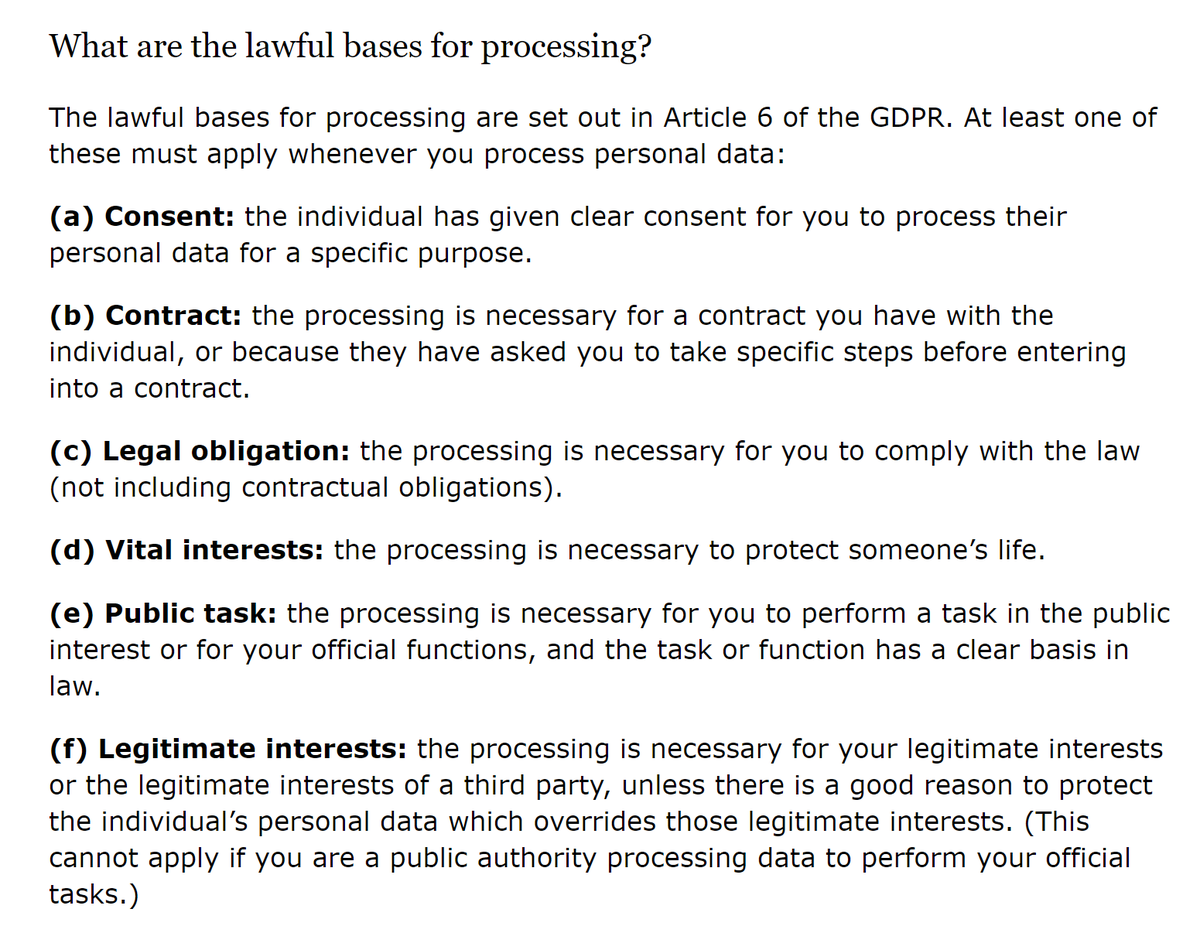
42. Email. If people have unsubscribed, there are still times when you can email. Eg: transactional emails (your order is on its way), legal emails (our Ts &Cs have changed).
Even under GDPR, the 'processing' of personal data is often without consent. (note 'at least one' below)
Even under GDPR, the 'processing' of personal data is often without consent. (note 'at least one' below)
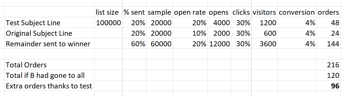
43. Email. For A/B testing, email is about the easiest place to do this. A very common pattern is:
a) email 20% of your list with one subject line.
b) email 20% with a different subject line.
Wait a few hours, send the remainder to the one with the highest open rate.
a) email 20% of your list with one subject line.
b) email 20% with a different subject line.
Wait a few hours, send the remainder to the one with the highest open rate.
In the above example, here's a 'back of an envelope' calculation to show how this can help you.
If an 'alternate' subject line results in 20% open rate, vs a 10% open rate on the 'original' subject line, and all other metrics stay the same.
(nb: do check my maths - it's late!)
If an 'alternate' subject line results in 20% open rate, vs a 10% open rate on the 'original' subject line, and all other metrics stay the same.
(nb: do check my maths - it's late!)
44. Email. Often retailers use segments to target different messages in emails. Basic examples of segments =
Demographics. (age/gender/life stage)
Customer lifecycle status.
Value. VIP/core customer/net negative high returner.
Propensity bucket. Highly likely to buy->not at all.
Demographics. (age/gender/life stage)
Customer lifecycle status.
Value. VIP/core customer/net negative high returner.
Propensity bucket. Highly likely to buy->not at all.
You can also send emails triggered based on changes there:
- if someone was 'highly likely to buy' in a given month & did not.
- if someone moved from 'Ultra VIP' down to 'VIP'.
- if your defined 'life stage' bucket moved from 'expectant parent' to 'new parent'.
- if someone was 'highly likely to buy' in a given month & did not.
- if someone moved from 'Ultra VIP' down to 'VIP'.
- if your defined 'life stage' bucket moved from 'expectant parent' to 'new parent'.
^ on the above, some will target manually, some may fully automate everything with messages & triggers set per segment, and a hierarchy of importance to define which message(s) someone going from 'expectant parent' to 'new parent' & switching from 'ultra vip' to 'vip' would get.
That might mean every day 10000s of emails are going out based on 100s of criteria triggers, rather than standard newsletters. Testing & optimisation then happens on the basis of creative, or triggers over time, similar to adwords testing/optimisation.
45. Email. Basic email list growth tactics:
- call to action on website.
- call to action in package sent to customer.
- auto opt in on purchase (with option to opt out).
- competitions on site/social.
- competitions with non-competing retailers. (some do very well from these)
- call to action on website.
- call to action in package sent to customer.
- auto opt in on purchase (with option to opt out).
- competitions on site/social.
- competitions with non-competing retailers. (some do very well from these)
46. Email. Email service platforms:
oracle bronto, eloqua, marketo, oracle marketing cloud, salesforce marketing cloud, dotmailer, sendgrid, campaign monitor, cheetahmail, emarsys, mailchimp, adestra, emailoctopus.
All let you send emails, mostly focused on manual campaigns.
oracle bronto, eloqua, marketo, oracle marketing cloud, salesforce marketing cloud, dotmailer, sendgrid, campaign monitor, cheetahmail, emarsys, mailchimp, adestra, emailoctopus.
All let you send emails, mostly focused on manual campaigns.
47. Email. More interesting email marketing platforms:
Sailthru, Klaviyo, Optimove, Exponea, Ometria, AgilOne, Intercom.
Most these focus more toward 'marketing automation', usually centred around a 'customer data platform' triggering emails/on-site messaging/other marketing.
Sailthru, Klaviyo, Optimove, Exponea, Ometria, AgilOne, Intercom.
Most these focus more toward 'marketing automation', usually centred around a 'customer data platform' triggering emails/on-site messaging/other marketing.
That's probably enough *email* tips for now - someone had asked for them to focus more toward that. I will move on...
48. PPC. Bidding on your own brand:
- sometimes you basically have to, if other competitors are bidding on you.
- if you are top for 'organic', it's usually a waste of money, though some like to do so anyway.
- sometimes you basically have to, if other competitors are bidding on you.
- if you are top for 'organic', it's usually a waste of money, though some like to do so anyway.
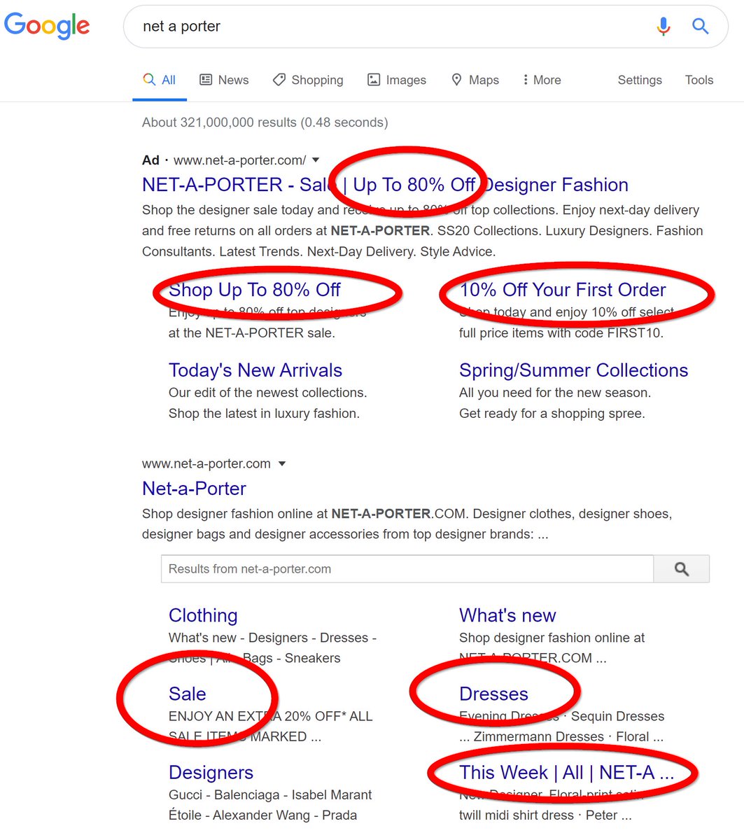
49. PPC. In some situations it's sensible to pay up for your own brand ad. Eg here, there's a block of shopping ads above the 'Watt Bike' ad when you search for their name. Ie, there's a slim chance a potential customer starts looking into a competitor's product instead.
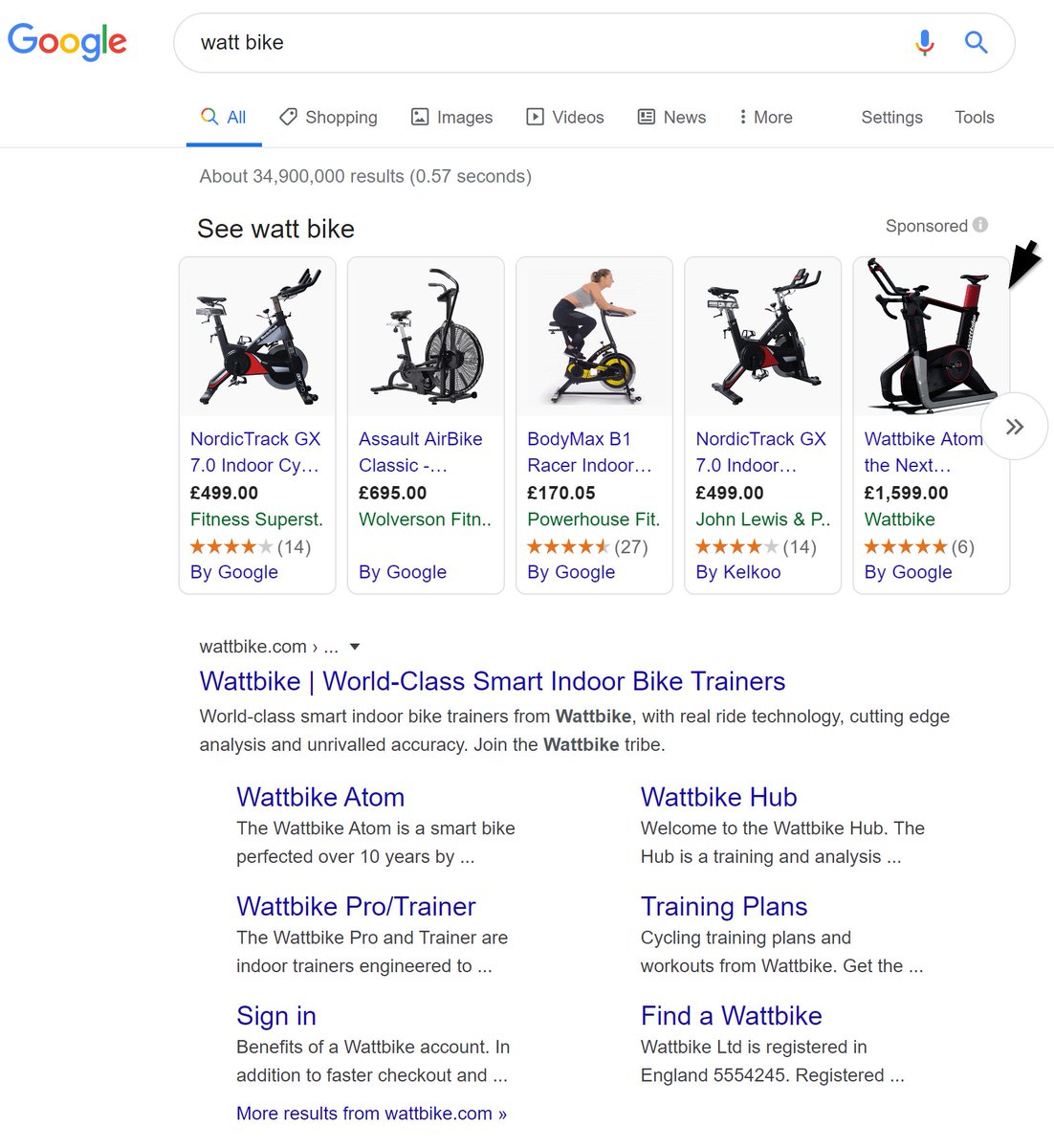
(On the above, if they ran an exact brand text ad, there's a chance they'd win out over those shopping ads (they're present, but not v noticeable). They'd therefore avoid the potential for people searching for *their* brand diverting across to competitors)
This is even bleaker on mobile, where you barely see their organic listing (at the bottom), and cheaper competitor brands are picked out by Google as links at the top (Kettler, etc).

50. PPC. Where a brand *does* rank first for their own name, there are still some minor advantages to paying for brand PPC ads, eg:
- control which links appear underneath the main listing.
- control over copy.
- extra decorations (note the 'up to 80%' offer tag at the bottom)
- control which links appear underneath the main listing.
- control over copy.
- extra decorations (note the 'up to 80%' offer tag at the bottom)

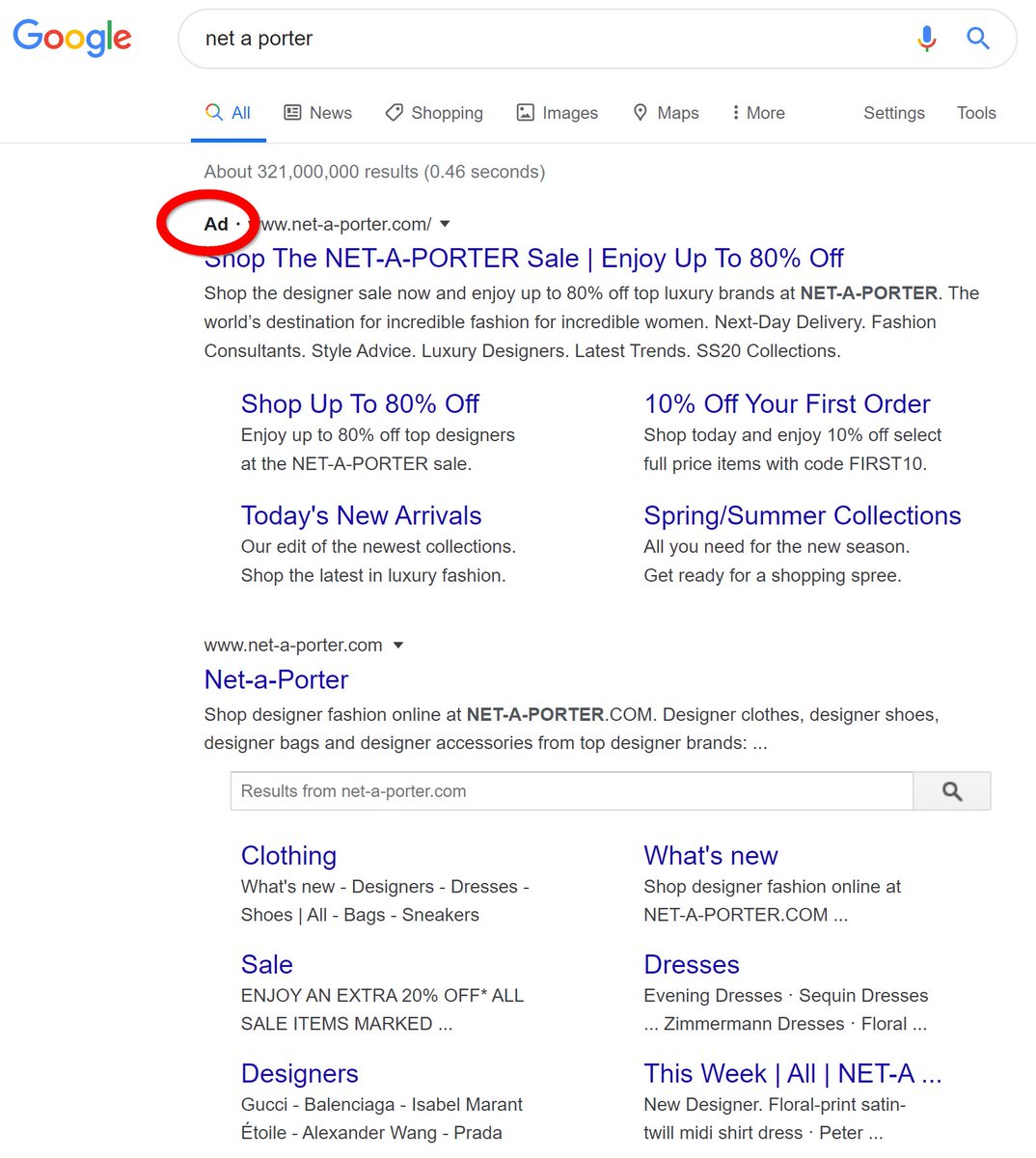
51. PPC. If brands are clever, they can differentiate brand ads for new vs returning customers, or for particular segments using Remarketing Lists for Search Ads. Eg, in that net a porter ad above they *could* hide the sale link if they recognised me as a full price buyer, etc.
52. Brand PPC/SEO.
- You can get a quick idea of what a brand thinks is high priority for their business to push by looking at their ad/sitelinks.
- You can get a quick idea of what *google* believes their customers are most interested in from their organic listing/sitelinks.
- You can get a quick idea of what a brand thinks is high priority for their business to push by looking at their ad/sitelinks.
- You can get a quick idea of what *google* believes their customers are most interested in from their organic listing/sitelinks.
53. PPC. While brand PPC is more or less a 'tax' for ecommerce, non-brand (aka 'generic') is usually used by retailers to try and acquire *new* customers. (Not all PPC agencies realise this). It's v important to be able to report on *new* separate to repeat non-brand customers.
54. PPC. If you can get into a position where you can separately target new/repeat customers via generic PPC (eg, bid differently w/RLSAs), you can choose the purpose of ads better, ie:
- to acquire new customers.
- to block competitors from potentially taking your customers.
- to acquire new customers.
- to block competitors from potentially taking your customers.
55. PPC. It's best to get in a position where you report on results from google 'shopping', 'brand', 'generic' separately.
Each is managed quite differently & reporting on all 3 as if they're the same = means you can make the wrong decisions.
Each is managed quite differently & reporting on all 3 as if they're the same = means you can make the wrong decisions.
56. PPC. Google Shopping: There's no need to have *all* of your products in shopping.
If you have low margin products, or low converting, or just low priority, having those in your shopping feed may 'cannibalise' your better products.
If you have low margin products, or low converting, or just low priority, having those in your shopping feed may 'cannibalise' your better products.
(nb: sometimes you'll see the opposite advice to this - eg 'every product is a chance to get in front of a customer'. I disagree: if you have a product where you make $1 profit, and it only converts at 1%, and it costs you $0.20 per click, you're just losing money)
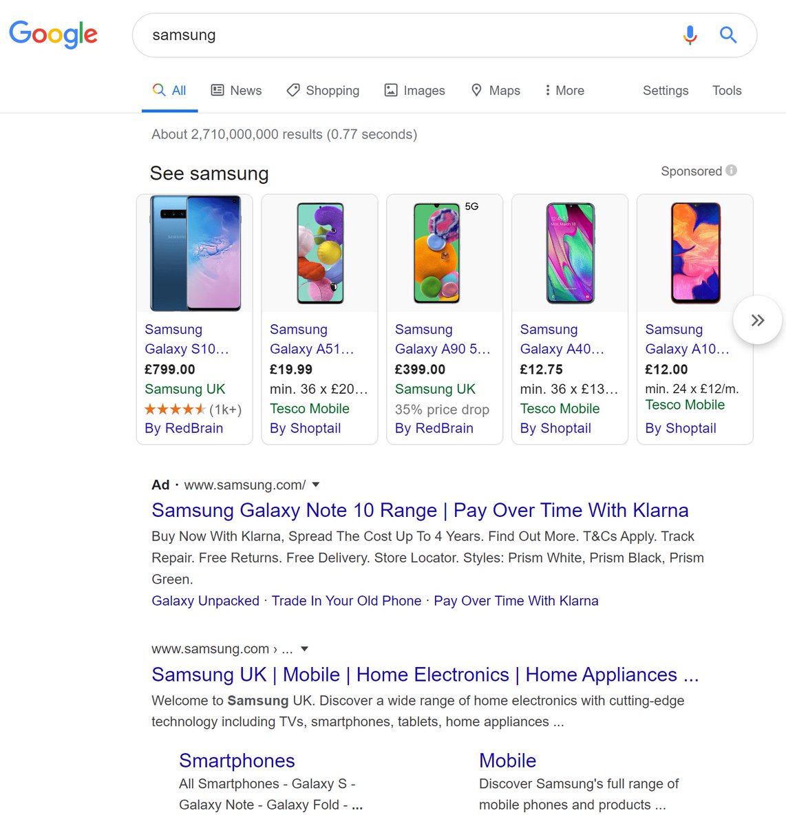
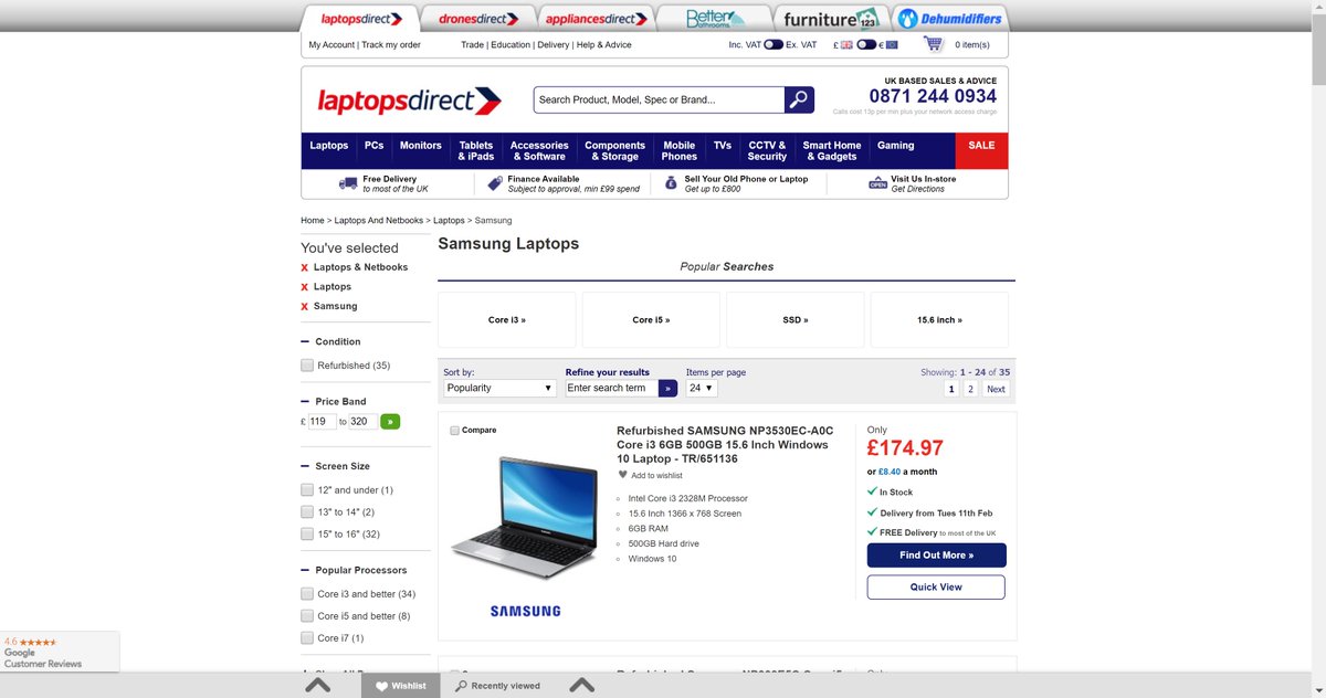
57. PPC. Google Shopping: Avoid shopping ads appearing for your main brand terms if you can. (not always possible)
Eg, here, Google shows shopping ads against the term 'Samsung'. = lots of cost on clicks, and unlikely those searching 'Samsung' want to buy a phone *right now*.
Eg, here, Google shows shopping ads against the term 'Samsung'. = lots of cost on clicks, and unlikely those searching 'Samsung' want to buy a phone *right now*.
58. PPC. Be careful with attribution. Agencies will often want to change your attribution model.
Whatever changes you make, try to get it so you can make historic comparisons. It's easy to use attribution model tweaks to make it *look* like you're improving when you're not.
Whatever changes you make, try to get it so you can make historic comparisons. It's easy to use attribution model tweaks to make it *look* like you're improving when you're not.
59. PPC. Also be careful with target cpa bidding. If *your* aim is new customers, but Google cannot differentiate your new vs repeat customers, it may be that you also end up getting lots of repeat customers within your target CPA, who may well have repurchased anyway.
(nb. in general it is good to be sceptical of any algorithmic tools. Google, and other advertising services, are there to make money. If they can create black boxes that control your advertising spend, it's then easier for them to control their profits whether/not it helps you).
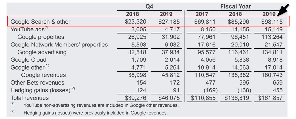
(nb. Google made $98 *billion* from 'Search & other' ads last year, up by about $30 billion over the period they've most heavily pushed toward algorithmic bidding.)
60. PPC. For most ecommerce sites, PPC landing pages revolve around the product hierarchy:
homepage (core/brand terms)
categories ('women's dresses')
subcategories ('women's maxi dresses')
brand category pairs ('ralph lauren maxi dresses')
facets ('size 16 dresses')
homepage (core/brand terms)
categories ('women's dresses')
subcategories ('women's maxi dresses')
brand category pairs ('ralph lauren maxi dresses')
facets ('size 16 dresses')
61. PPC. Whereas 'shopping ads' go to individual products, usually most text ads go to pages containing a group of products related to the search term. (this is one of the reasons google like shopping - they get multiple clicks on different products, rather than the retailer)
62. PPC. If the user is landing on a page with more than 1 product, it's useful if that page is either:
a) sorted in a way that means best-sellers are at the top (ie. appeal to broad mix of custs).
b) includes a mix of products high up that would appeal to various customer types.
a) sorted in a way that means best-sellers are at the top (ie. appeal to broad mix of custs).
b) includes a mix of products high up that would appeal to various customer types.
other products worth including high up:
- highly reviewed products.
- seasonal best-sellers.
- evergreen products that convert well.
- mix of cheap/high/mid-price products.
- mix of brands.
- mix of gender/other facets if it's a really broad term on a fashion site ('t-shirts')
- highly reviewed products.
- seasonal best-sellers.
- evergreen products that convert well.
- mix of cheap/high/mid-price products.
- mix of brands.
- mix of gender/other facets if it's a really broad term on a fashion site ('t-shirts')
63. PPC. Landing pages = also useful to include:
a) indicator of where the user has landed within the site (eg breadcrumb)
b) trust indicators (review stars/testimonial/# customers)
c) methods of filtering down further.
d) email sign up call to action for new visitors.
a) indicator of where the user has landed within the site (eg breadcrumb)
b) trust indicators (review stars/testimonial/# customers)
c) methods of filtering down further.
d) email sign up call to action for new visitors.
64. PPC. You'll notice those email sign up calls to action have grown over the last few years. It's become a much bigger priority for ecom sites to get users onto mailing lists, rather than try to sell to them there & then. Some of these are ultra-generous, and quite pushy. eg:

nb: One of the reasons for this is that sites copy each other, so once these catch on to a degree, almost everyone has them.
nb: Another reason is mobile: Desktop browsers were more likely to be in 'buying' mode (sat at home, purposefully looking to buy), on mobile people might be on the bus, watching tv, sat in a coffee shop, or at home. Ie: some might buy there and then, but less than desktop.
65. PPC. Counting 'email signups' as an outcome of PPC is useful in:
a) maximising the results of the channel.
b) claiming credit for PPC activity that might otherwise be invisible.
if you can, tagging emails 'PPC acquired' = you can see if they're more/less valuable long term.
a) maximising the results of the channel.
b) claiming credit for PPC activity that might otherwise be invisible.
if you can, tagging emails 'PPC acquired' = you can see if they're more/less valuable long term.
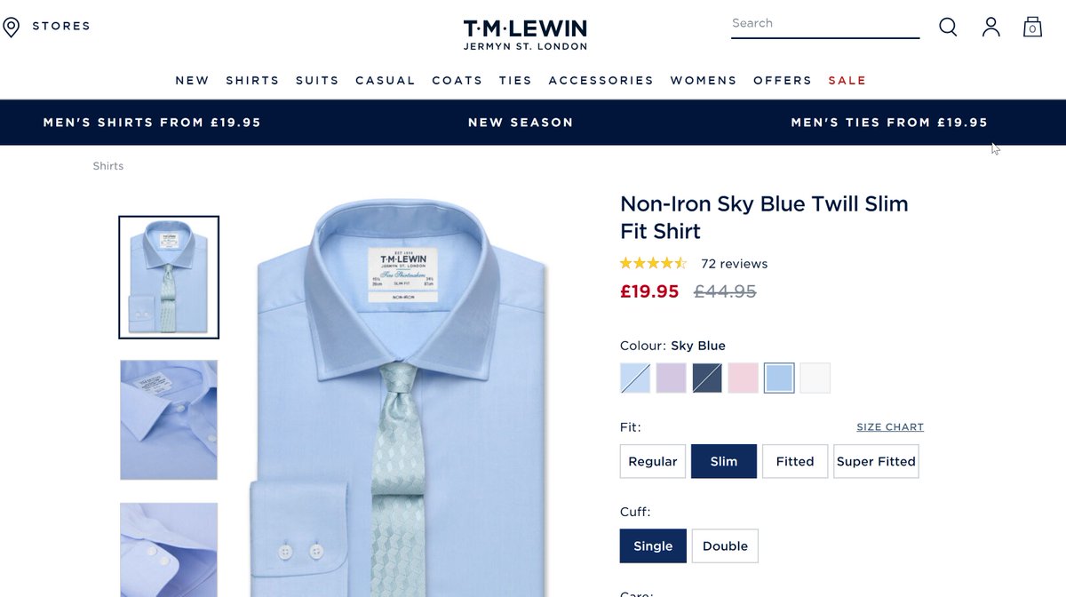
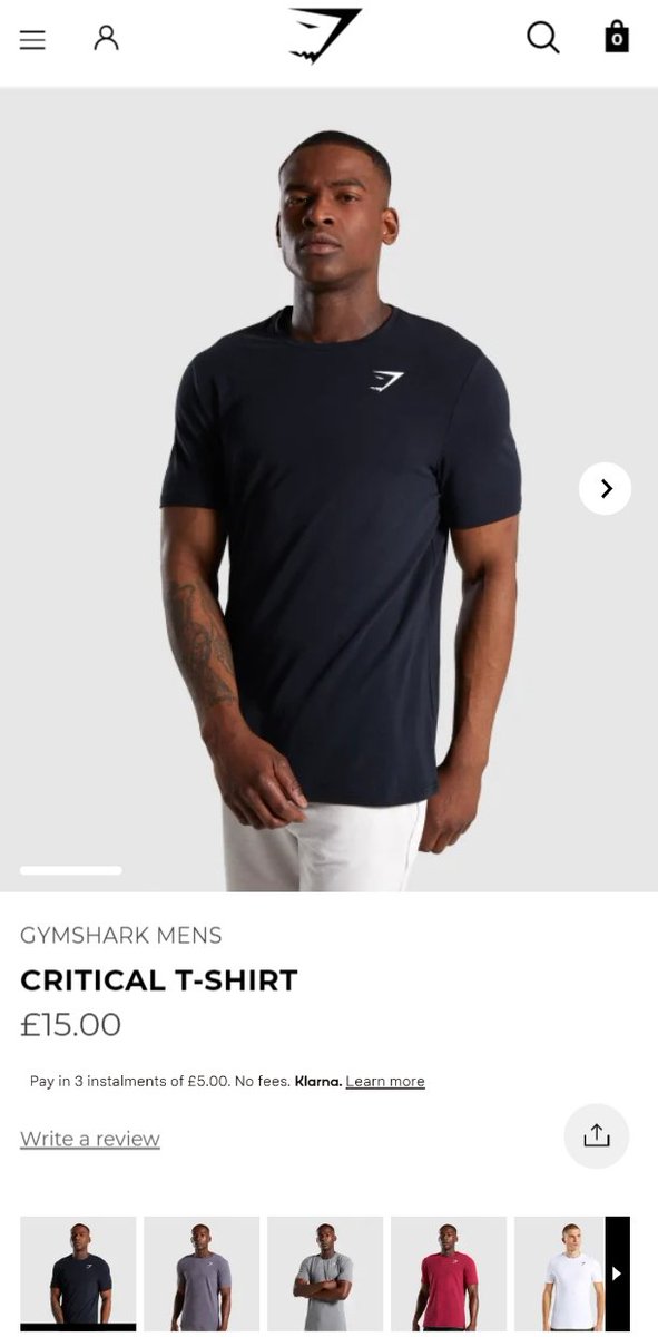
66. PPC. I mentioned *shopping* ads take users to individual product pages. *Usually* those users weren't searching for that exact individual products (see image).
Few get it right, but it's useful to therefore be able to show *other* 'blue shirts' on the resulting product page.
Few get it right, but it's useful to therefore be able to show *other* 'blue shirts' on the resulting product page.
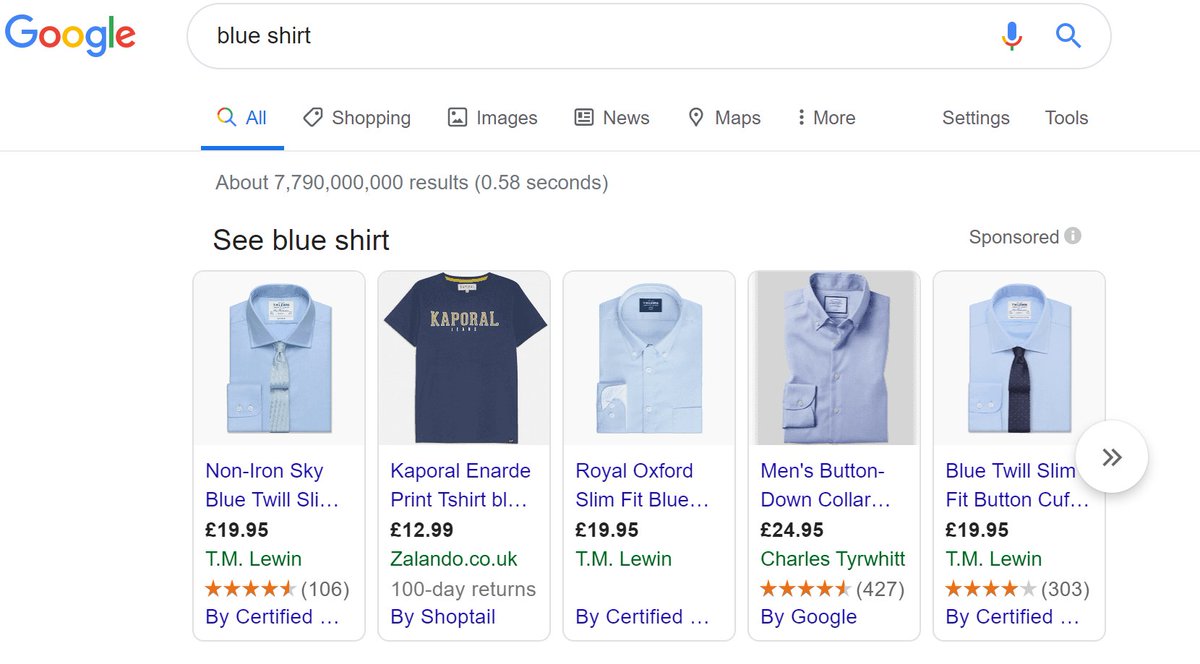
nb: Here's one of the landing pages from the above ad. It just shows the exact shirt from PPC (there are some others, but only 1 or 2, way down the page).
'Bounce rate' is not usually a useful metric, but looking at it for shopping vs regular PPC ads, you can sometimes see this.
'Bounce rate' is not usually a useful metric, but looking at it for shopping vs regular PPC ads, you can sometimes see this.
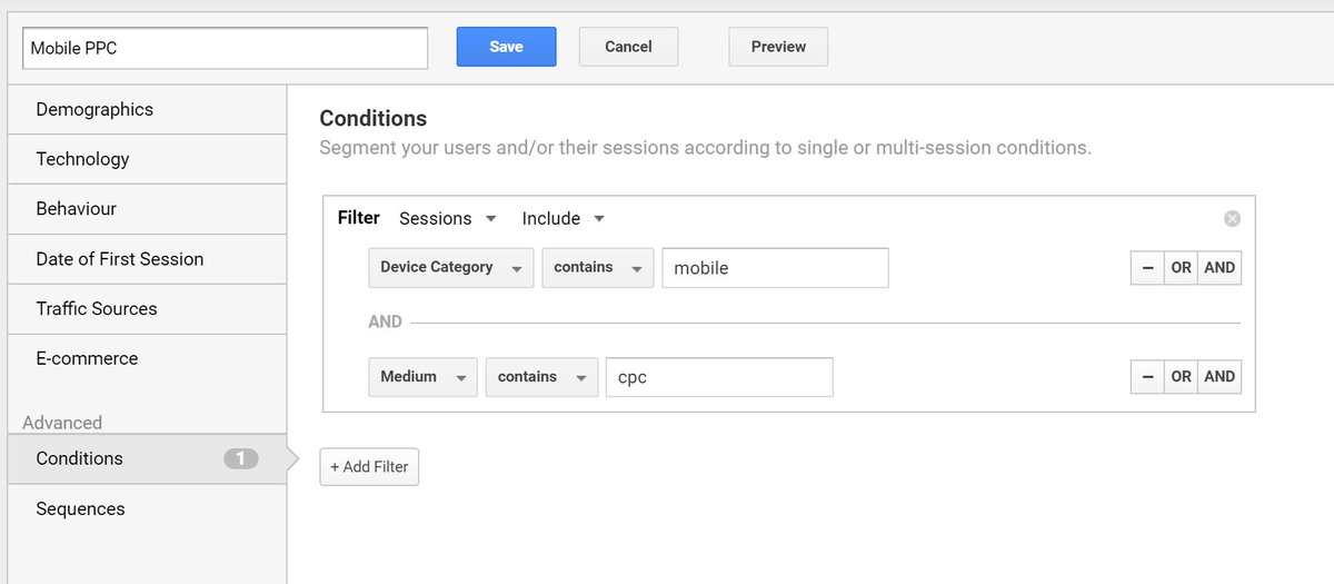
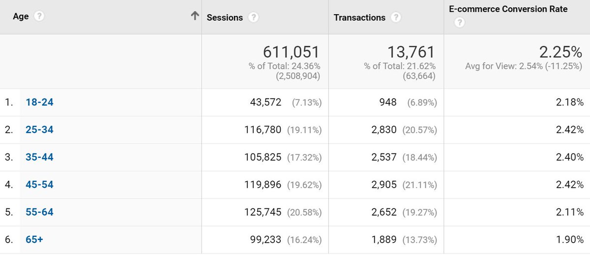
67. Here's a basic segment looking at mobile ppc for hunting for obvious optimisations. Eg, on the right is the breakdown of sessions by age/conversion rates.
If those ads had been limited to 25-54 y/os over the same number of sessions, there would have been ~1,000 extra orders.
If those ads had been limited to 25-54 y/os over the same number of sessions, there would have been ~1,000 extra orders.
68. UX.
The most important pages on an ecommerce site are usually (in order):
1. product detail page.
2. product listing page.
3. homepage.
4. bag page/step.
5. checkout.
6. thank you page. <-- this is a forgotten page, but can be used very well.
The most important pages on an ecommerce site are usually (in order):
1. product detail page.
2. product listing page.
3. homepage.
4. bag page/step.
5. checkout.
6. thank you page. <-- this is a forgotten page, but can be used very well.
69. UX.
The 'product detail page' is most important page on most ecommerce sites, as it's the page where the user makes the decision on whether to buy any given product *from you* or not.
The 'product detail page' is most important page on most ecommerce sites, as it's the page where the user makes the decision on whether to buy any given product *from you* or not.
70. UX.
Product listing page is 2nd most important. It's the template that usually makes up category/subcategory/topic/brand/search pages. Ie, where people who are looking to buy a product matching a criteria decide whether there's anything they want to take a closer look.
Product listing page is 2nd most important. It's the template that usually makes up category/subcategory/topic/brand/search pages. Ie, where people who are looking to buy a product matching a criteria decide whether there's anything they want to take a closer look.

71. UX.
Homepage is 3rd most important as there is no direct purchase decision made there, but it's:
a) the page where the largest minority of users enter the site.
b) a point where shoppers reorientate themselves.
c) a place to signpost them to things they're trying to find.
Homepage is 3rd most important as there is no direct purchase decision made there, but it's:
a) the page where the largest minority of users enter the site.
b) a point where shoppers reorientate themselves.
c) a place to signpost them to things they're trying to find.
d) a place where it's also possible to signpost them to things *you* think they may be interested in, but they're not explicitly looking for.
e) the page that usually tells them the most about who you are / what your brand is about / what range you offer / etc.
e) the page that usually tells them the most about who you are / what your brand is about / what range you offer / etc.
72. UX.
The bag page/step is next most important. It's the point at which - after adding something to their cart, there is an opportunity to either:
a) move directly to purchase.
b) find something else of interest.
The content/ux at that stage forms part of those decisions.
The bag page/step is next most important. It's the point at which - after adding something to their cart, there is an opportunity to either:
a) move directly to purchase.
b) find something else of interest.
The content/ux at that stage forms part of those decisions.
73. UX.
Checkout is next most important, as it's the step(s) where - having made a decision to pick a particular product/products, the potential customer either completes & buys, or drops out.
There are also *lots* of decisions for ecom sites here: 1 page? up sell? etc.
Checkout is next most important, as it's the step(s) where - having made a decision to pick a particular product/products, the potential customer either completes & buys, or drops out.
There are also *lots* of decisions for ecom sites here: 1 page? up sell? etc.
74. UX.
The 'thank you' page (aka receipt page) is often an afterthought for ecommerce sites. But it's here where:
a) customers are reassured they've bought the right thing.
b) have made a purchase, and are open to be provided with any/all extra information or options from you.
The 'thank you' page (aka receipt page) is often an afterthought for ecommerce sites. But it's here where:
a) customers are reassured they've bought the right thing.
b) have made a purchase, and are open to be provided with any/all extra information or options from you.
75. UX.
On the 'thank you' page, you may:
a) ask the user to opt in/install your app/etc.
b) encourage them to leave a review.
c) gather direct customer feedback.
d) show ads for other products you sell.
e) provide tracking info, etc.
f) encourage them to share via social/mail.
On the 'thank you' page, you may:
a) ask the user to opt in/install your app/etc.
b) encourage them to leave a review.
c) gather direct customer feedback.
d) show ads for other products you sell.
e) provide tracking info, etc.
f) encourage them to share via social/mail.
76. UX. On *some* ecom sites, there are other super important pages/elements that push into this.
Eg:
- on fashion sites, the 'size' steps are very important (particularly women's fashion).
- delivery/tracking info is super important on furniture/white goods sites.
etc.
Eg:
- on fashion sites, the 'size' steps are very important (particularly women's fashion).
- delivery/tracking info is super important on furniture/white goods sites.
etc.

77. Homepage UX.
People often worry about homepages being 'too long', but as long as you design in an 'upside down pyramid' format that's fine. Ie: Top portion of the screen should show things that apply to *most* users...
People often worry about homepages being 'too long', but as long as you design in an 'upside down pyramid' format that's fine. Ie: Top portion of the screen should show things that apply to *most* users...
... the further you get down, the fewer users will see it, but those who do are likely to be more dedicated users, so nicher items are fine.
77. Homepage UX.
It's fairly common for people to want to *avoid* including category links on the homepage, arguing that they're available via navigation.
a) On mobile, fewer see the whole nav.
b) Increased visibility = increased clicks.
At least show your main categories.
It's fairly common for people to want to *avoid* including category links on the homepage, arguing that they're available via navigation.
a) On mobile, fewer see the whole nav.
b) Increased visibility = increased clicks.
At least show your main categories.
78. Homepage UX.
Here's a nice example of both the 'upside down pyramid', and of showing categories on a homepage, from Boozt.
- these are really 'departments' (ie, a level above categories), but still: Organised by 'most likely to click' first, with more niche further down.
Here's a nice example of both the 'upside down pyramid', and of showing categories on a homepage, from Boozt.
- these are really 'departments' (ie, a level above categories), but still: Organised by 'most likely to click' first, with more niche further down.
79. Homepage UX
Here's the next portion of that homepage. Here you can see they've put in a 'Brands A-Z' - a catch all to pick up users who know specifically what they're looking for.
CS = 'track my package' visits.
Email signup is then designed to take up *a lot* of space.
Here's the next portion of that homepage. Here you can see they've put in a 'Brands A-Z' - a catch all to pick up users who know specifically what they're looking for.
CS = 'track my package' visits.
Email signup is then designed to take up *a lot* of space.
80. Homepage UX
The page then ends like this. Ie, trust message, followed by a 'back to top' link.
A fairly common pattern I used to see in mobile user tests was that visitors would scroll down to the bottom of mobile websites, then either scroll right back up, or click 'Menu'.
The page then ends like this. Ie, trust message, followed by a 'back to top' link.
A fairly common pattern I used to see in mobile user tests was that visitors would scroll down to the bottom of mobile websites, then either scroll right back up, or click 'Menu'.
81. Homepage UX
You'll also notice on there - the top navigation is constantly pinned. Either having it constantly pinned, or having it flow back in as soon as a user starts to scroll back up = useful.
'Always visible' means 'Cart' is just 1 click away *always*.
You'll also notice on there - the top navigation is constantly pinned. Either having it constantly pinned, or having it flow back in as soon as a user starts to scroll back up = useful.
'Always visible' means 'Cart' is just 1 click away *always*.
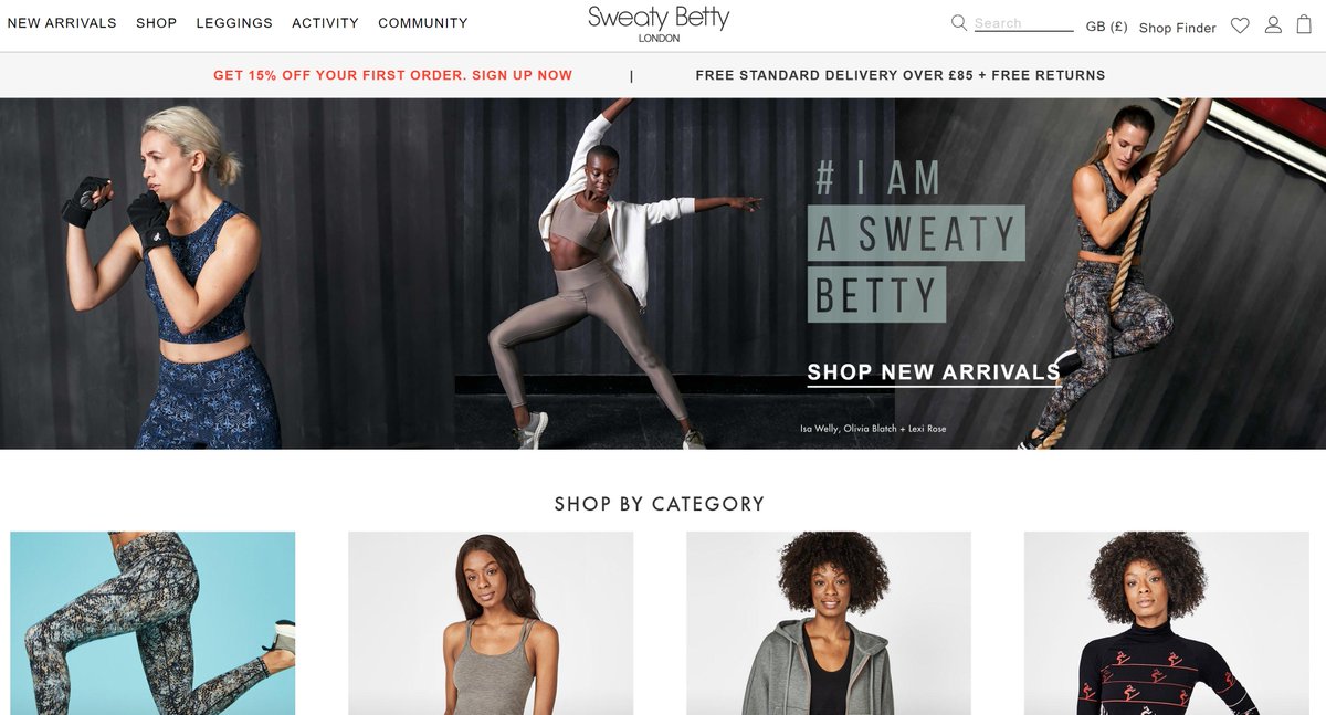
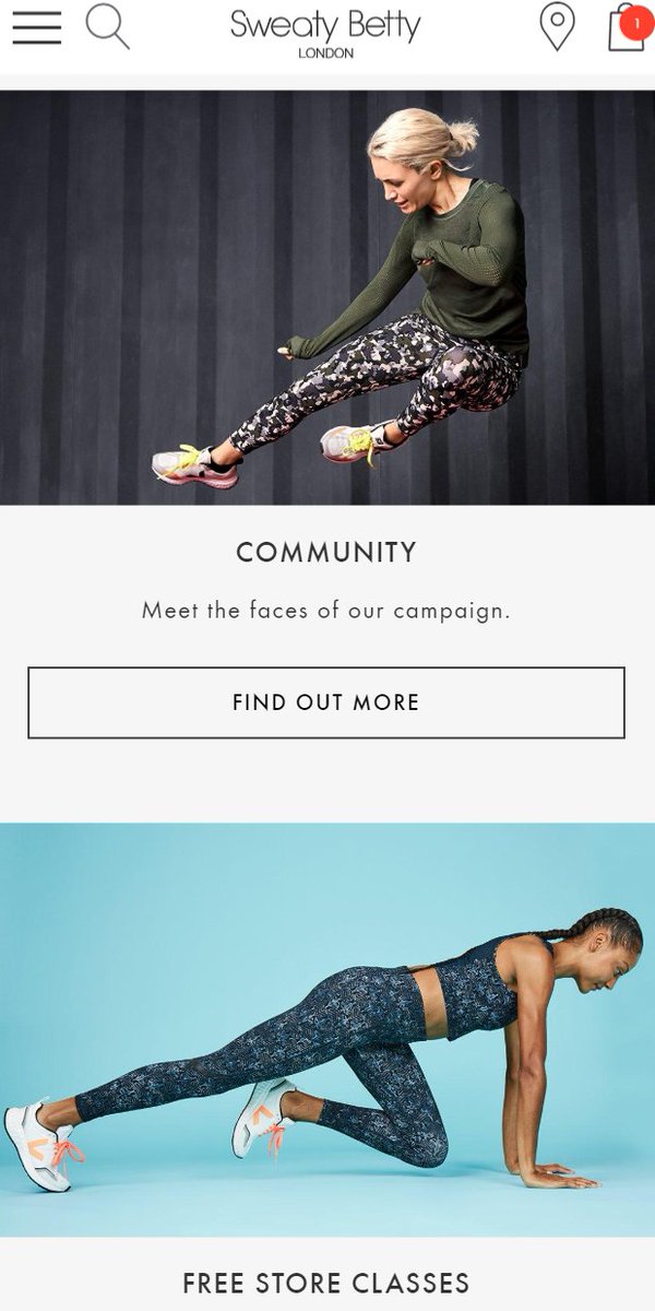
82. Homepage UX
Here's Sweaty Betty - similar pattern:
0. Menu.
1. USPs/offers in a bar at the top.
2. 'New ins' (most likely click for regular visitors)
3. 'Evergreen best-selling' cats next.
4. Then seasonal categories / trending.
5. Then niche stuff for motivated visitors.
Here's Sweaty Betty - similar pattern:
0. Menu.
1. USPs/offers in a bar at the top.
2. 'New ins' (most likely click for regular visitors)
3. 'Evergreen best-selling' cats next.
4. Then seasonal categories / trending.
5. Then niche stuff for motivated visitors.


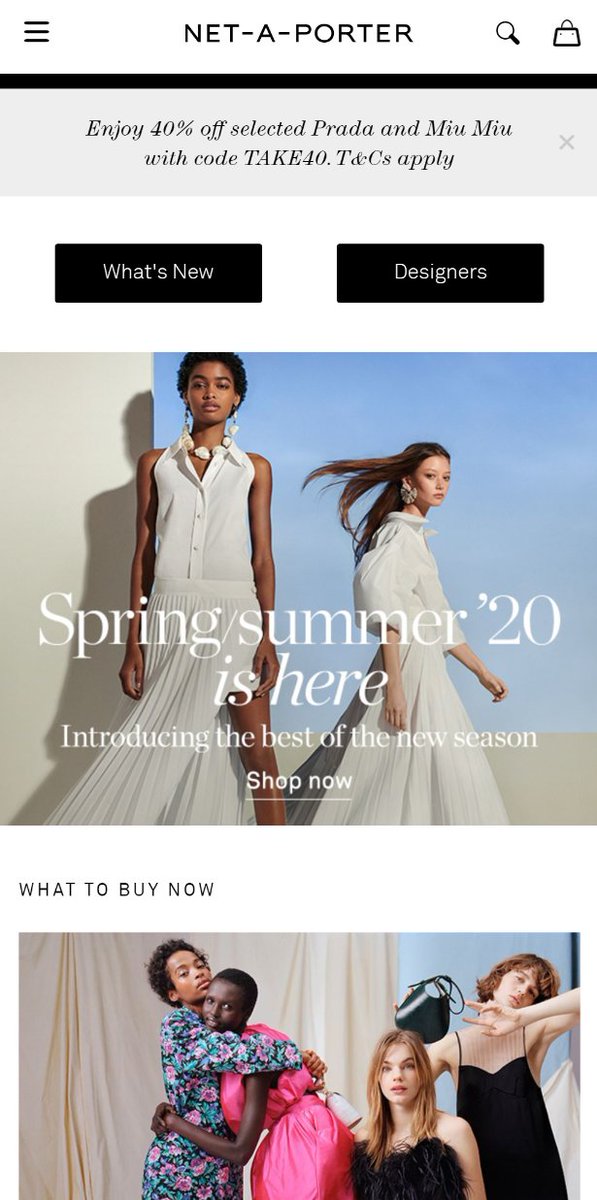
83. Homepage UX
Here's another variation on this pattern - Net a Porter:
0. Menu/top nav.
1. 'What's New' | 'Designers' in very basic click blocks <-- the 'most likely click' for visitors.
2. Seasonal content.
3. More niche the deeper you scroll.
4. Top/tailed Offer/USP bar.
Here's another variation on this pattern - Net a Porter:
0. Menu/top nav.
1. 'What's New' | 'Designers' in very basic click blocks <-- the 'most likely click' for visitors.
2. Seasonal content.
3. More niche the deeper you scroll.
4. Top/tailed Offer/USP bar.

84. Homepage UX.
Elements that most frequently appear on ecommerce homepages, roughly in order of top/bottom:
1. Menu/top nav.
2. Visible search icon.
3. Cart(+maybe wishlist).
4. Offer bar.
5. USP bar.
6. Main Category entries.
7. Seasonal categories.
Elements that most frequently appear on ecommerce homepages, roughly in order of top/bottom:
1. Menu/top nav.
2. Visible search icon.
3. Cart(+maybe wishlist).
4. Offer bar.
5. USP bar.
6. Main Category entries.
7. Seasonal categories.
...8. Entry for 'topic' collections (eg. valentine's, mother's day, etc)
9. Seasonal individual products.
10. Content.
11. Recommended products, individual/segment based.
12. Recently viewed products.
13. Services: finance, 'prime' options, etc.
9. Seasonal individual products.
10. Content.
11. Recommended products, individual/segment based.
12. Recently viewed products.
13. Services: finance, 'prime' options, etc.
...14. Email signup.
15. Testimonials.
16. Ancillary links: help/faqs/links to sister sites/delivery & returns info.
17. Social links.
18. Ts & Cs
19. Payment icons.
20. Live chat, bottom right.
21. (phone info/opening hours)
15. Testimonials.
16. Ancillary links: help/faqs/links to sister sites/delivery & returns info.
17. Social links.
18. Ts & Cs
19. Payment icons.
20. Live chat, bottom right.
21. (phone info/opening hours)
85. Homepage UX.
More niche content that regularly appears on ecommerce homepages-
22. Shop the trends.
23. Shop by body shape/by room/etc.
24. Shop by size.
25. Rebuy this product you bought.
26. Trade in your old X.
27. Blocks for USPs, instead of one simple bar.
More niche content that regularly appears on ecommerce homepages-
22. Shop the trends.
23. Shop by body shape/by room/etc.
24. Shop by size.
25. Rebuy this product you bought.
26. Trade in your old X.
27. Blocks for USPs, instead of one simple bar.
...28. SEO text (used to be everywhere).
29. Security icons.
30. Chatbot.
31. Download the app icons.
32. Store finder.
33. Product configurator.
34. Track your order.
35. Inspiration carousels.
36. B2B login.
37. Push notification opt in.
38. Blog posts/TV ad/ancillary content.
29. Security icons.
30. Chatbot.
31. Download the app icons.
32. Store finder.
33. Product configurator.
34. Track your order.
35. Inspiration carousels.
36. B2B login.
37. Push notification opt in.
38. Blog posts/TV ad/ancillary content.
39. Clearpay/Klarna/other 'buy in stages' payment icons.
40. Social content, auto pulled in/curated.
41. Editor's picks.
42. About the owner.
43. Current switcher.
44. Language switcher.
45. Gift services (gift cards/wedding lists/gift boxes).
46. The dreaded 'cookie' block.
40. Social content, auto pulled in/curated.
41. Editor's picks.
42. About the owner.
43. Current switcher.
44. Language switcher.
45. Gift services (gift cards/wedding lists/gift boxes).
46. The dreaded 'cookie' block.
86. If you sell a lot internationally, it's useful to sniff the user's IP address & - if it looks like you're serving them the wrong content - nudge them in the right direction. (Particularly if you serve regions in the same language; +particularly if baskets are per-region)
87. If you have a mix of new/returning customers, also useful to build in elements targeting them based on what you know about them. An eg block of this could be:
-> new user? show high converting products.
-> general repeat user? show recently browsed/'also bought...' products
-> new user? show high converting products.
-> general repeat user? show recently browsed/'also bought...' products
nb: You can go as deep as you like on that, depending on your customer data platform/tools. 'Barilliance' is a good tool for managing some of that.
You can do things like set up a hierarchy:
If bought X within Y months & is VIP = show X.
Unless bought Z, in which case show Q.
You can do things like set up a hierarchy:
If bought X within Y months & is VIP = show X.
Unless bought Z, in which case show Q.
nb. Sometimes measurement becomes a difficulty with things like that, as it's tough to maintain a picture of *what* was shown & to who. Worth carefully planning measurement, or it becomes tough to understand why the homepage is over/underperforming.
88. Homepage UX.
If you get a lot of traffic from users who are *not* relevant to your current products, here's a simple pattern to make that clear & gain at least something from the visits.
If you get a lot of traffic from users who are *not* relevant to your current products, here's a simple pattern to make that clear & gain at least something from the visits.
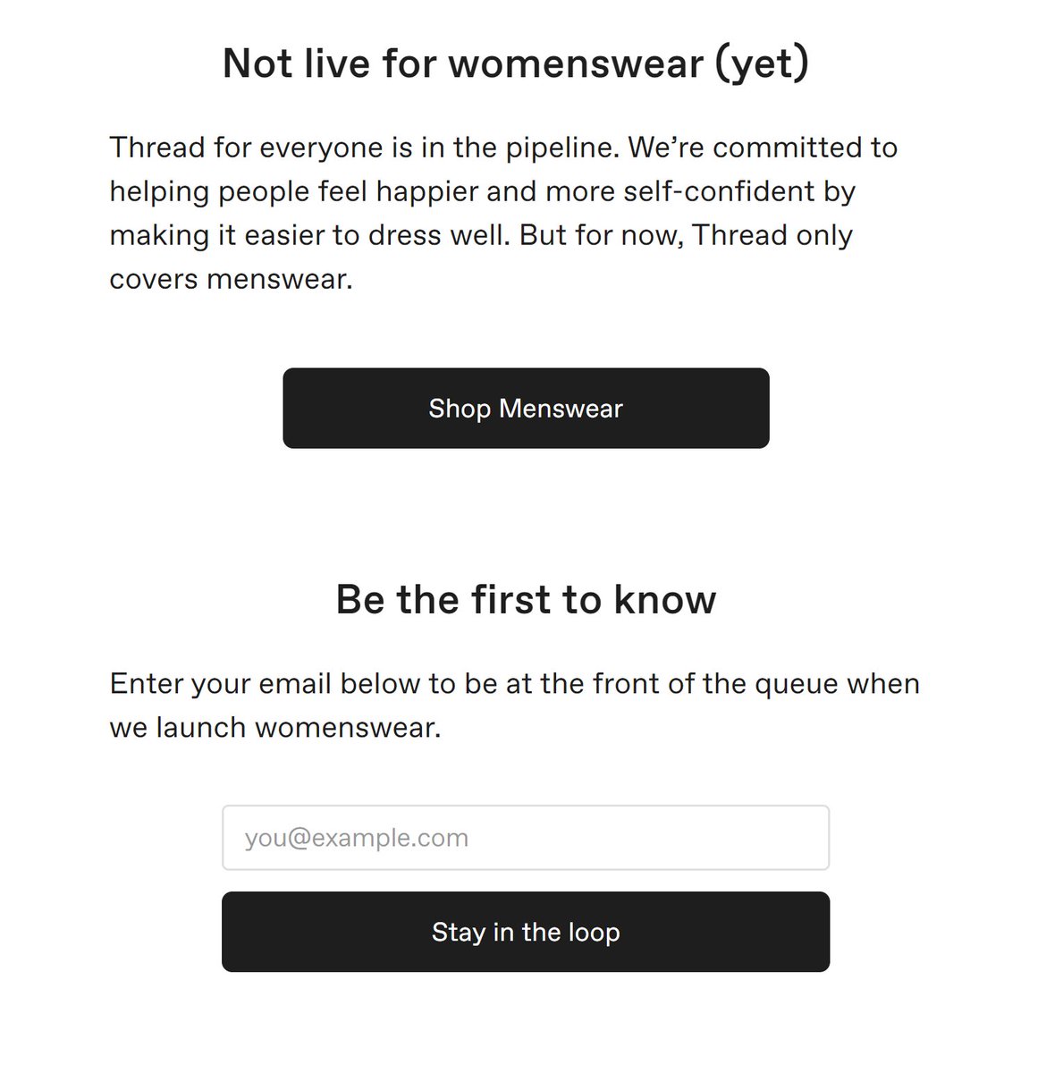
nb: Thread could probably make a fair amount of money by linking to relevant women's stores from that page - never quite sure why they don't.
89. Homepage UX.
Aesthetics are difficult to measure, but can have a big impact on likelihood of a new visitor making it past the homepage. This is much more important when:
- your product is related to aesthetics.
- your audience are interested in aesthetics/buying to impress.
Aesthetics are difficult to measure, but can have a big impact on likelihood of a new visitor making it past the homepage. This is much more important when:
- your product is related to aesthetics.
- your audience are interested in aesthetics/buying to impress.
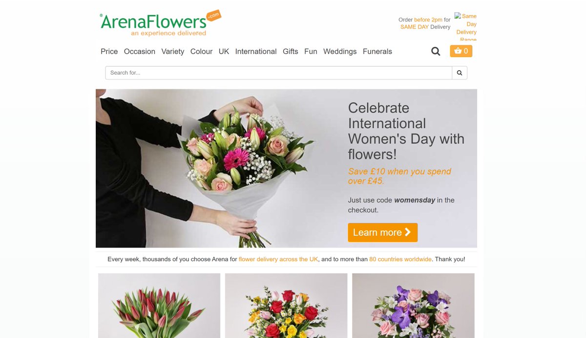

nb. Example above is Arena Flowers - before & after last website refresh. A large part of the work was basically about making the site look as visually appealing as the product. Sales = up; conversion = up. Well done @ArenaFlowers
@ArenaFlowers 90. Homepage UX.
'SEO copy' has vanished from lots of ecommerce homepages. Part of that is trying to avoid being seen as 'overoptimising' by Google. Where it *does* still exist, it gives you a good indicator of which terms businesses see as *the* most important.
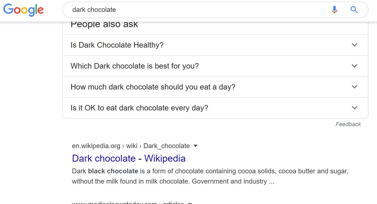
'SEO copy' has vanished from lots of ecommerce homepages. Part of that is trying to avoid being seen as 'overoptimising' by Google. Where it *does* still exist, it gives you a good indicator of which terms businesses see as *the* most important.


eg. Above, you can see Hotel Chocolat have that very weird link to their 'Dark Chocolate' page. In fact they rank in position 9 for it, which makes it seem like they (as pretty much market leader) have some work to do.
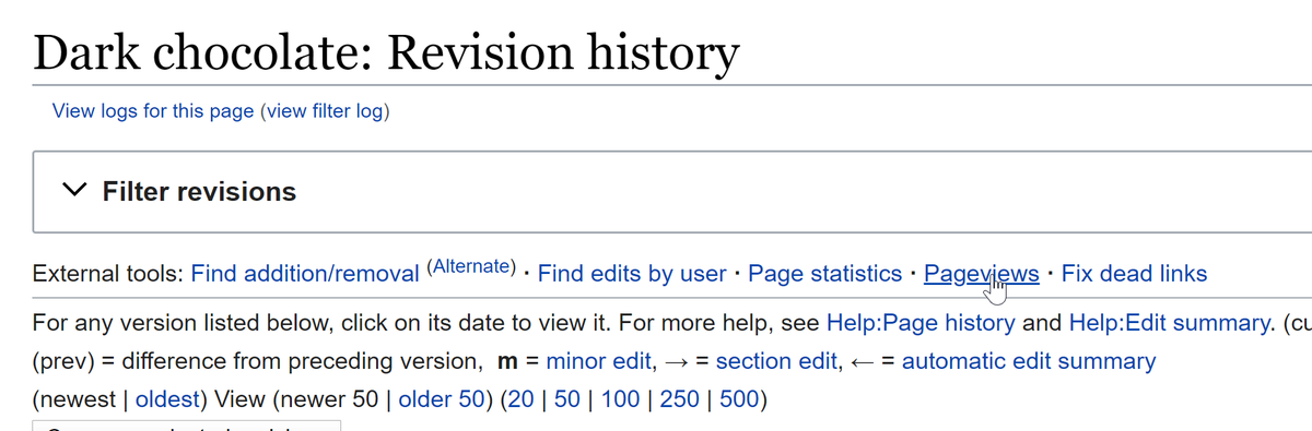
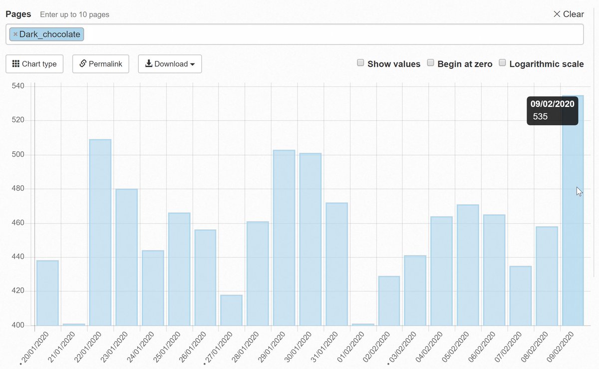
91. SEO side-topic:
Incidentally, Wikipedia rank 2nd in Google for 'Dark Chocolate'. Wikipedia make all of their data publicly available, so you can get a rough idea of how much traffic you'd get if you ranked highly for that term - sometimes useful. 🤯
Incidentally, Wikipedia rank 2nd in Google for 'Dark Chocolate'. Wikipedia make all of their data publicly available, so you can get a rough idea of how much traffic you'd get if you ranked highly for that term - sometimes useful. 🤯

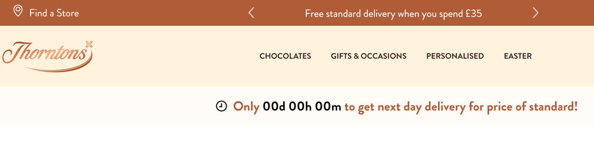
92. Homepage UX.
It's worth being more careful of the order elements load on your homepage, as it's often p1 of a user journey.
Eg - Thorntons, the timer hangs on '00:00:00' until things have loaded.
Eg - Ebuyer, the Cookie Preferences block any activity until further loading
It's worth being more careful of the order elements load on your homepage, as it's often p1 of a user journey.
Eg - Thorntons, the timer hangs on '00:00:00' until things have loaded.
Eg - Ebuyer, the Cookie Preferences block any activity until further loading
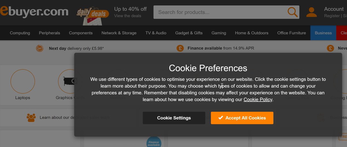
nb. One of the reasons for that is - the first page people land on, javascript & css & 'core' images won't yet be cached, so stuff loads a little slower. If you work for the company & browse the site all day you don't notice it, but is worth checking for.
93. Homepage UX.
If you know your user journeys well enough, you can play around with elements on your homepage to divert more traffic to pages.
Eg. Here's eloquii - most of the time 'New' is the left-most item on their menu. During clearance times, 'clearance' moves there.
If you know your user journeys well enough, you can play around with elements on your homepage to divert more traffic to pages.
Eg. Here's eloquii - most of the time 'New' is the left-most item on their menu. During clearance times, 'clearance' moves there.
nb. As more explanation:
- a common user journey for a repeat customer on that site is probably 'land on homepage -> click on 'New' which is leftmost'.
- by putting 'clearance' far left, where 'New' *usually* is, users habitually reaching for 'New' take a look at it.
- a common user journey for a repeat customer on that site is probably 'land on homepage -> click on 'New' which is leftmost'.
- by putting 'clearance' far left, where 'New' *usually* is, users habitually reaching for 'New' take a look at it.
94. Homepage UX.
Carousels *used* to be very popular on homepages. They are far less popular now, largely because of a few blog posts.
In some cases they are useful, but best treated with the 'show the most important item first' methodology.
Carousels *used* to be very popular on homepages. They are far less popular now, largely because of a few blog posts.
In some cases they are useful, but best treated with the 'show the most important item first' methodology.
nb. If you measure impressions & clicks on homepage carousel elements, you can also use them to test things. Eg, put something in slot 3 of a carousel, if that slot *normally* gets 2% of all clicks, but a particular item gets 10% in slot 3, you know to feature it more highly.
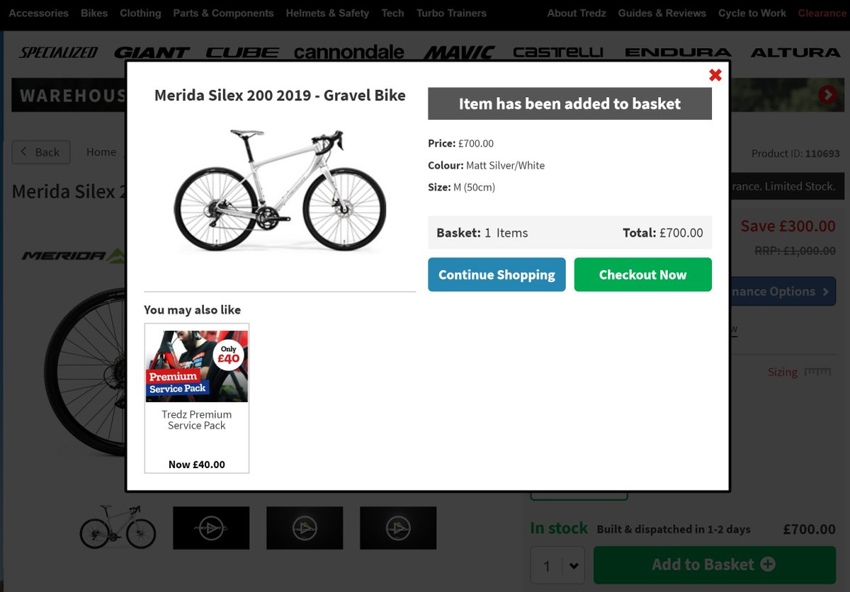
nb. The carousel featured above there - from Tredz.co.uk - is quite good - it has left/right nav icons, it rotates quite slowly, it has icons at the bottom so you can jump back/forth if you missed something, +if you hover over it it remains static so you can read.
95. Homepage UX.
If your catalogue is polarised, it's sometimes best to make the 'main' homepage simply push customers to a pseudo-homepage specifically aimed at them.
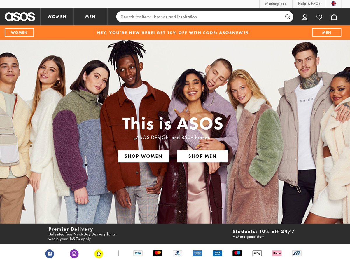
ASOS have a homepage for 'men' & one for 'women'. You can't even get back to the main homepage from them.
If your catalogue is polarised, it's sometimes best to make the 'main' homepage simply push customers to a pseudo-homepage specifically aimed at them.
ASOS have a homepage for 'men' & one for 'women'. You can't even get back to the main homepage from them.
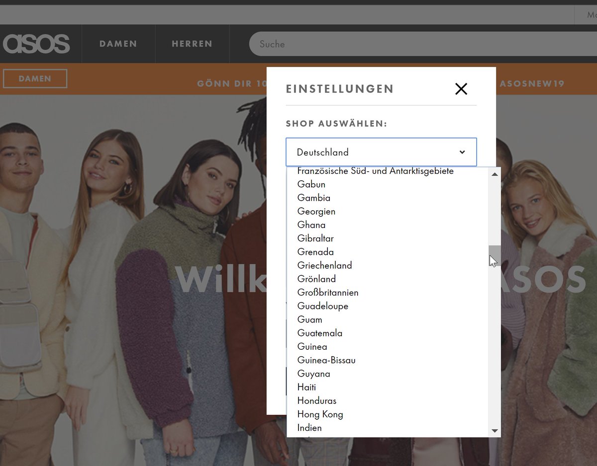
96. Homepage UX.
If you *do* serve lots of markets, it's worth spending time on your country selector. Eg, here's the German region 'Change country' dropdown on ASOS. The UK is under 'Grossbritanien', which makes sense if you speak German, but most would be looking for 'UK'.
If you *do* serve lots of markets, it's worth spending time on your country selector. Eg, here's the German region 'Change country' dropdown on ASOS. The UK is under 'Grossbritanien', which makes sense if you speak German, but most would be looking for 'UK'.
97. Homepage UX.
Stuff that *still* adds a luxury feel to homepages:
1. Large video.
2. Very large photography.
3. Images pushed *right* to the edges of the browser.
4. Classic, bold type on nav.
5. Icons only for cart/etc.
6. Elements with their own velocity when you browse.
Stuff that *still* adds a luxury feel to homepages:
1. Large video.
2. Very large photography.
3. Images pushed *right* to the edges of the browser.
4. Classic, bold type on nav.
5. Icons only for cart/etc.
6. Elements with their own velocity when you browse.


nb. Note I say 'luxury feel' - Zara, for example, is far from luxury, but they shoot photos & design the site to 'feel 'luxury.
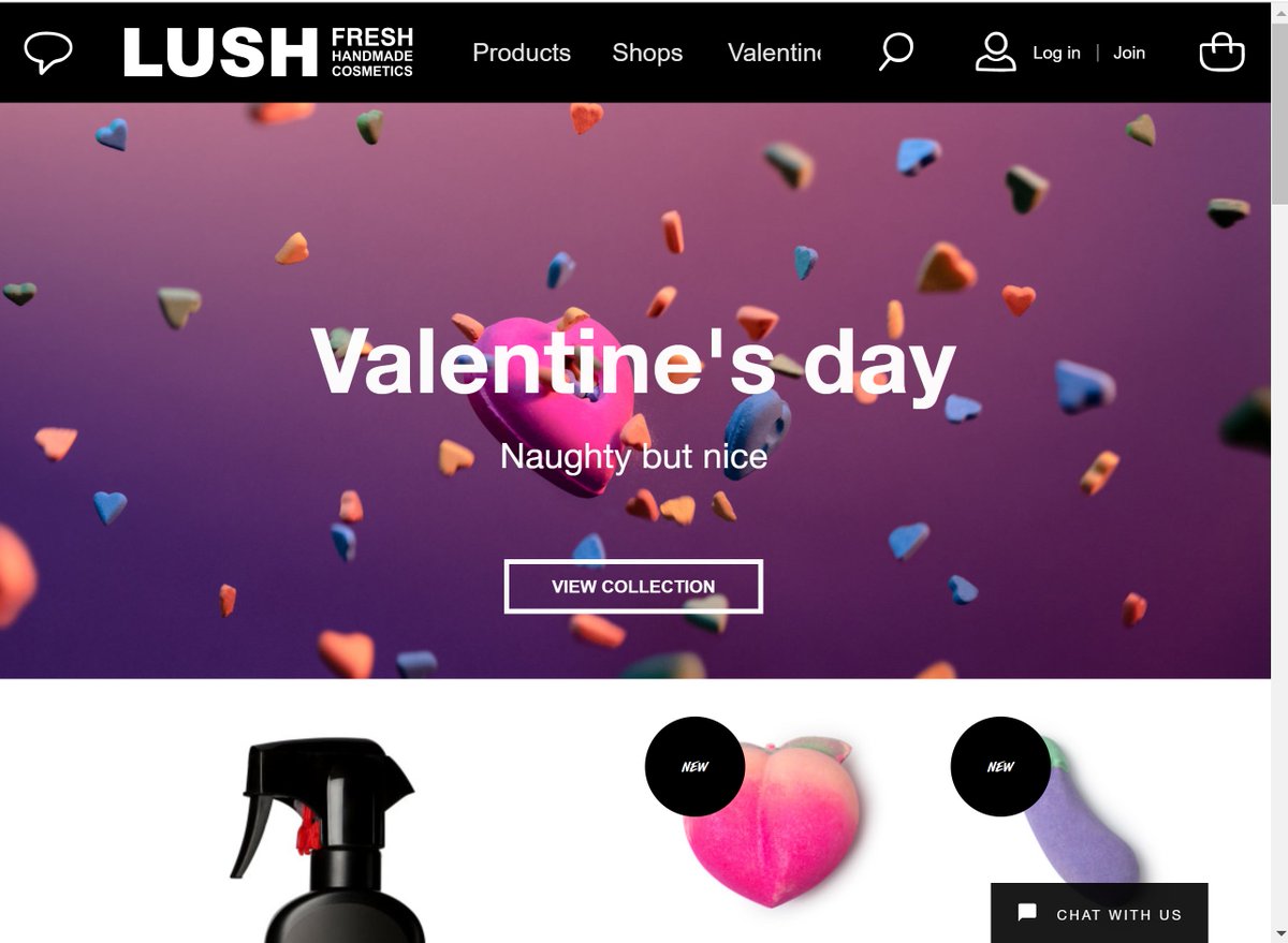
98. Homepage UX.
Be a bit careful about video on homepages. Some love it / some hate it. LUSH *used* to have video on their homepage by default, they've now killed it off.
If you do have it, 'sound off by default' = avoids angry customer service calls.
Be a bit careful about video on homepages. Some love it / some hate it. LUSH *used* to have video on their homepage by default, they've now killed it off.
If you do have it, 'sound off by default' = avoids angry customer service calls.
99. Homepage UX.
The 'USP bar' was mentioned earlier in this thread. This is a strip that contains the main elements from a company's 'unique selling proposition'.
It's become semi-standard to present this in a single bar on the homepage. Here are a few examples:
The 'USP bar' was mentioned earlier in this thread. This is a strip that contains the main elements from a company's 'unique selling proposition'.
It's become semi-standard to present this in a single bar on the homepage. Here are a few examples:


100. Tablet UX.
In some markets, Tablet is still a really big thing. Tablet browsers *tend* to be at home, *tend* to browse in 'landscape' mode. They usually convert at roughly desktop level (ie, higher than mobile).
Here's M&S, who have a specific 'tablet' responsive state:
In some markets, Tablet is still a really big thing. Tablet browsers *tend* to be at home, *tend* to browse in 'landscape' mode. They usually convert at roughly desktop level (ie, higher than mobile).
Here's M&S, who have a specific 'tablet' responsive state:
nb. Above there, they've simplified their nav a *tiny* bit, and made it very finger friendly. If you click any of those, it slides in a nav menu from the left.
Ie: much more visible than on mobile, but still turns into a click menu when you activate.
Ie: much more visible than on mobile, but still turns into a click menu when you activate.
101. Metrics.
You can run an ecommerce site successfully without paying attention to the numbers (I know some site owners who do a great job just focused on featuring great product, and putting lots of love into presenting well to customers). Numbers = make it easier to control.
You can run an ecommerce site successfully without paying attention to the numbers (I know some site owners who do a great job just focused on featuring great product, and putting lots of love into presenting well to customers). Numbers = make it easier to control.
102. Metrics.
"CPA" is a one of the most important ecommerce metrics. It stands for "Cost Per Acquisition". It's the cost of achieving an order from a new customer (another way of putting it is 'Cost per newly acquired customer').
"CPA" is a one of the most important ecommerce metrics. It stands for "Cost Per Acquisition". It's the cost of achieving an order from a new customer (another way of putting it is 'Cost per newly acquired customer').
You can measure CPA either by taking the amount of marketing $ you spend on new customers, and dividing that by the number you achieve.
Or by pretending *all* your marketing is spend on new customers, and dividing the whole lot by the total # new customers within the period.
Or by pretending *all* your marketing is spend on new customers, and dividing the whole lot by the total # new customers within the period.
nb: Most ecommerce businesses class a new customer as a customer who has ordered once only. *Some* strip out customers from that who return their entire order within a certain period.
(Some do not differentiate new/repeat, and simply have the same numbers for 'CPA' and 'CPO'...)
(Some do not differentiate new/repeat, and simply have the same numbers for 'CPA' and 'CPO'...)
103. Metrics.
"CPO" is a similar ecommerce metric. It stands for "Cost Per Order". Ie: All marketing cost over a period / all orders.
Some guide their business on CPO...
"CPO" is a similar ecommerce metric. It stands for "Cost Per Order". Ie: All marketing cost over a period / all orders.
Some guide their business on CPO...
If you know that your marketing Cost Per Order is $3, and you are making a profit of $6 per order, you know (aside from other costs) you are making a profit. You can choose to increase your CPO (spend more) to speed up growth if you're able to spend more $ to get more orders.
104. Metrics.
CPM means 'cost per thousand impressions'. Eg, an ad may cost you €10 CPM, meaning 1,000 views of the ad cost you €10.
CPM is more of a niche metric - only used by people who carry out display/video advertising.
CPM means 'cost per thousand impressions'. Eg, an ad may cost you €10 CPM, meaning 1,000 views of the ad cost you €10.
CPM is more of a niche metric - only used by people who carry out display/video advertising.
nb. CPM stands for 'Cost per Mille', for some reason that phrase is used, but at least it helps differentiate because 'cost per thousand' could mean per thousand orders, or visits, or clicks, whereas CPM is almost always related to impressions.
105. Metrics.
CPV/CPS is 'cost per visit' or 'cost per session'. Some use this metric as a rough guide to judge traffic across different channels, to see how they're performing over time (or forecast into the future), or to keep as a rough guide on profitability,
CPV/CPS is 'cost per visit' or 'cost per session'. Some use this metric as a rough guide to judge traffic across different channels, to see how they're performing over time (or forecast into the future), or to keep as a rough guide on profitability,
If your CPS is $5, and your RPS (revenue per session) is $10, then anything over 50% margin is (aside from various other costs) 'profitable'.
If your CPS has gone up over the years, and the amount of margin you make per session has gone down, your profitability is lower.
If your CPS has gone up over the years, and the amount of margin you make per session has gone down, your profitability is lower.
106. Metrics.
*Note*: You sometimes also see 'revenue per user'. I occasionally come across very misleading conversion rate optimisation tests, where they've declared a winner based on 'revenue per user' in one side of the test.
*Note*: You sometimes also see 'revenue per user'. I occasionally come across very misleading conversion rate optimisation tests, where they've declared a winner based on 'revenue per user' in one side of the test.
... that's not always bad, but occasionally if you look into them, all that's happened is one version of the test *happens* to have a few VIP customers within it, who therefore have a very high 'revenue per user', that skews the test completely.
107. Metrics.
CTR means 'clickthrough rate'. If an ad has 1,000 impressions, and 10 people click through it, that's a 1% CTR (1% of views resulted in a clickthrough).
Often it's used to compare different ads against each other. A higher CTR ad is usually better than low CTR.
CTR means 'clickthrough rate'. If an ad has 1,000 impressions, and 10 people click through it, that's a 1% CTR (1% of views resulted in a clickthrough).
Often it's used to compare different ads against each other. A higher CTR ad is usually better than low CTR.
(nb. I say 'usually', as often you're only paying on a click basis, so a lower CTR ad doesn't *automatically* mean higher cost. And... a lower CTR ad *may* convert more orders in some cases, or *may* result in higher value customers than another)
108. Metrics.
CVR means 'conversion rate' - this is the likelihood that any given visit to your website will 'convert' into an order. If you have 100 visits, and 2 of them bought, you have a 2% conversion rate.
CVR is *mainly* measured vs sessions, but some measure it vs users.
CVR means 'conversion rate' - this is the likelihood that any given visit to your website will 'convert' into an order. If you have 100 visits, and 2 of them bought, you have a 2% conversion rate.
CVR is *mainly* measured vs sessions, but some measure it vs users.
ie. if you have 100 users, they visit your site 200 times, and there are 4 orders, *most* would think of that as being a 2% conversion rate (4 from 200 sessions), some would calculate it as 4% (4 from 100 users).
On all of the above, you can look at them on different levels:
- overall CPA.
- CPA for a particular country.
- CPA for a device type.
- CPA for a particular marketing channel.
etc.
ie, they are tools for understanding the overall business, or individual parts of activity.
- overall CPA.
- CPA for a particular country.
- CPA for a device type.
- CPA for a particular marketing channel.
etc.
ie, they are tools for understanding the overall business, or individual parts of activity.
109. For example: you may look at your CPA within Google AdWords, compare it with CPA of Youtube Ads. If the CPA of your Youtube ads is lower, you may then decide to put more of your budget into that, and take budget away from AdWords. eg:
- you acquire 100 customers through Youtube at a CPA of $30 ($3,000 total spend)
- you acquire 100 customers through AdWords at a CPA of $60 ($6,000 total spend)
- you conclude you could have just spent $6k with Youtube, rather than $9k total, and achieved the same 200 customers.
- you acquire 100 customers through AdWords at a CPA of $60 ($6,000 total spend)
- you conclude you could have just spent $6k with Youtube, rather than $9k total, and achieved the same 200 customers.
(the above makes sense, and would mean that your CPA ends up lower, your overall marketing spend lower, and the number of customers you acquired the same. You could then - if you wanted to - spend the saved $3k on *more* new customers and grow faster.
Next = a caveat on that)
Next = a caveat on that)
110. Metrics.
Spending more in a marketing channel usually means the CPA goes up. Eg, if it costs you $1000 to find 100 customers through AdWords, it's likely you'll have to spend the next $1000 less 'efficiently', as you've already used the most obvious areas to spend it.
Spending more in a marketing channel usually means the CPA goes up. Eg, if it costs you $1000 to find 100 customers through AdWords, it's likely you'll have to spend the next $1000 less 'efficiently', as you've already used the most obvious areas to spend it.
nb. That might mean you spend $2000, and get 150 customers. The first 100 cost you $10 CPA, your overall CPA was $13.3. The 'incremental cost' per customer after the first 100 was $15 (ie, the batch of 50 extra customers you had to spend $15 average on each).
111. Metrics.
Metrics like the above are useful for measuring how your marketing activity is performing. They're also useful for running simple simulations to help you decide where to place marketing $.
Here's an example:
Metrics like the above are useful for measuring how your marketing activity is performing. They're also useful for running simple simulations to help you decide where to place marketing $.
Here's an example:
Eg, if you're planning to run an ad campaign at $10 CPM, and you believe there's a possible 1,000,000 impressions per month, you can figure out that will cost you $10,000.
If your CTR is 1%, you got 10,000 clicks for that. If your CVR is 1%, that means you'd get 100 orders.
If your CTR is 1%, you got 10,000 clicks for that. If your CVR is 1%, that means you'd get 100 orders.
You figure 80% of those will be new customers, meaning you have 80 new customers & 20 returning customers.
That's therefore an estimated $125 CPA (or CAC), or a $100 CPO. You can then compare that vs other marketing opportunities, and judge whether to spend the $.
That's therefore an estimated $125 CPA (or CAC), or a $100 CPO. You can then compare that vs other marketing opportunities, and judge whether to spend the $.
You may decide you're not totally sure about some of your numbers, and therefore calculate with a range (eg, 0.5% CVR low estimate, 2% high estimate; 0.3% CTR low estimate, 3% CTR high estimate). From there you can figure out a 'worst case scenario' & 'best' for the campaign.
112. Metrics.
"LTV" is an important ecommerce metric, not much talked about outside marketing: "Lifetime Value".
This is the amount of money the average customer spends with you over a lifetime. Some measure it as revenue, some as margin. 'Lifetime' is often a set length.
"LTV" is an important ecommerce metric, not much talked about outside marketing: "Lifetime Value".
This is the amount of money the average customer spends with you over a lifetime. Some measure it as revenue, some as margin. 'Lifetime' is often a set length.
For example, you may say '2 year LTV' or '8 week LTV', this is the average amount you make at a customer level over the first 8 weeks of the customer's "life" from first order with you.
113. Metrics.
One of the reasons the LTV concept is so powerful is that - if you have the cashflow available - it allows you to beat competitors who do not have lots of cash.
Eg: Across a 'lifetime' of 3 months, an average customer generates $50 of profit.
One of the reasons the LTV concept is so powerful is that - if you have the cashflow available - it allows you to beat competitors who do not have lots of cash.
Eg: Across a 'lifetime' of 3 months, an average customer generates $50 of profit.
...But per order they only generate $10 of profit.
Your competitor does not have lots of free flowing cash, so they can only afford to pay up to $10 to acquire each new customer, as they need to pay their bills with the immediate profit.
Your competitor does not have lots of free flowing cash, so they can only afford to pay up to $10 to acquire each new customer, as they need to pay their bills with the immediate profit.
You on the other hand, have lots of free flowing cash. You can therefore spend up to $50 per new customer (acquiring many, many more customers in the process), knowing that you can run the business in the short term with your cash flow...
...and the profit those customers generate will leave you 'paid back' and in the black after 3 months.
A huge amount of the business world runs on this concept - it's not nearly talked about as much as you'd expect outside of marketing/business itself.
A huge amount of the business world runs on this concept - it's not nearly talked about as much as you'd expect outside of marketing/business itself.
114. Metrics.
CPA is also sometimes known as 'CAC' - 'Customer Acquisition Cost'. Venture Capitalists & investors often use this term. They look at the 'CAC:LTV' ratio. Ie: What is the amount of $ you make from a customer over a specific period vs the amount that customer cost.
CPA is also sometimes known as 'CAC' - 'Customer Acquisition Cost'. Venture Capitalists & investors often use this term. They look at the 'CAC:LTV' ratio. Ie: What is the amount of $ you make from a customer over a specific period vs the amount that customer cost.
115. Metrics.
You can use LTV:CAC to compare 2 businesses in a similar market. You can also use it to compare:
- effectiveness of different marketing channels.
- performance across different countries within 1 business.
- performance in one period vs a past period.
You can use LTV:CAC to compare 2 businesses in a similar market. You can also use it to compare:
- effectiveness of different marketing channels.
- performance across different countries within 1 business.
- performance in one period vs a past period.
Eg: Customers acquired in France may have a very different Lifetime Value:Customer Acquisition Cost ratio to those acquired in Canada.
This is also sometimes known as 'Unit Economics' (if you don't know that phrase, it's worth remembering).
This is also sometimes known as 'Unit Economics' (if you don't know that phrase, it's worth remembering).
116. Metrics.
'Unit Economics' can be used to guide where you choose to place your time/money/effort. Eg:
A customer in Switzerland may be wildly more profitable than a customer in Spain based on LTV, *even* if it costs you 1/10th the amount to acquire customers in Spain.
'Unit Economics' can be used to guide where you choose to place your time/money/effort. Eg:
A customer in Switzerland may be wildly more profitable than a customer in Spain based on LTV, *even* if it costs you 1/10th the amount to acquire customers in Spain.
117. Metrics.
Sometimes marketers use the phrase 'cohorts' when talking about LTV, acquisition, etc.
Eg: 'The June cohort isn't performing as well as the May cohort'. That would mean the customers acquired in June are showing a lower LTV than those acquired in May.
Sometimes marketers use the phrase 'cohorts' when talking about LTV, acquisition, etc.
Eg: 'The June cohort isn't performing as well as the May cohort'. That would mean the customers acquired in June are showing a lower LTV than those acquired in May.
Those cohorts would generally be measured in their life since acquisition over the early period, so you'd look compare their 3 month LTV, rather than comparing all profit made since June from customers acquired in June, vs all profit made since May from customers acquired then.
118. Metrics.
You can use cohort performance to guide marketing spend too. Eg: If cohorts acquired in June perform better over time than those in November, next year you might wayt to spend more marketing budget in June & less in November.
You can use cohort performance to guide marketing spend too. Eg: If cohorts acquired in June perform better over time than those in November, next year you might wayt to spend more marketing budget in June & less in November.
119. Metrics.
You can also use cohorts to measure the effectiveness of A/B testing. Eg: If you run an A/B test, ordinarily you'd judge its effectiveness on the immediate outcome (ie, 'A' converts customers better than 'B')...
You can also use cohorts to measure the effectiveness of A/B testing. Eg: If you run an A/B test, ordinarily you'd judge its effectiveness on the immediate outcome (ie, 'A' converts customers better than 'B')...
... but tracking the 'A' cohort over time, you may find that their LTV is much higher than 'B'.
Eg, if you run an A/B test on your site where 50% of users are exposed to one price model, 50% to another, you may make more immediate $ from 'A', but over time the 'B' cohort wins.
Eg, if you run an A/B test on your site where 50% of users are exposed to one price model, 50% to another, you may make more immediate $ from 'A', but over time the 'B' cohort wins.
120. Metrics.
There are lots of complications & caveats to be aware of on these metrics for *ecommerce*. Eg:
- some customers are much more valuable than others - they spend more, and more frequently. When dealing with averages, that's always something to be careful around.
There are lots of complications & caveats to be aware of on these metrics for *ecommerce*. Eg:
- some customers are much more valuable than others - they spend more, and more frequently. When dealing with averages, that's always something to be careful around.
121. Metrics.
- Returns skew everything.
This is especially tough to deal with for people who have very long return periods. Eg, if you have a 90 day return policy, how do you know whether a customer is profitable after 2 months, or if they're going to return everything?
- Returns skew everything.
This is especially tough to deal with for people who have very long return periods. Eg, if you have a 90 day return policy, how do you know whether a customer is profitable after 2 months, or if they're going to return everything?
With returns, you may even end up with customers who are 'net negative' - the cost of shipping product to them, accepting the return, QAing it, booking it back in, outweighs the profit the customer produces...
eg, I remember looking into a complaint from a customer who believed themselves to be a VIP for an ecommerce company. They'd ordered hundreds of times, but kept just a handful of products, and had cost the retailer four figures in cost.
122. Metrics.
Finance/credit - for some companies, an 'unprofitable' customer based on what they purchase will actually be profitable based on the interest made through finance. Some ecommerce businesses are *only* profitable through finance.
Finance/credit - for some companies, an 'unprofitable' customer based on what they purchase will actually be profitable based on the interest made through finance. Some ecommerce businesses are *only* profitable through finance.
123. Metrics.
Attribution of acquisition/retention spend - if you are spending marketing $ on acquiring new customers AND on retaining them, it's complicated to track how much $ you've spent on retaining particular cohorts.
Attribution of acquisition/retention spend - if you are spending marketing $ on acquiring new customers AND on retaining them, it's complicated to track how much $ you've spent on retaining particular cohorts.
124. Pricing.
Lots of elements in pricing are so specific to your company/customers, you have to test. In general it is better to make 'big' tests rather than small. (changing the price of a few items by a few % and looking for impact will only work if you have v large scale).
Lots of elements in pricing are so specific to your company/customers, you have to test. In general it is better to make 'big' tests rather than small. (changing the price of a few items by a few % and looking for impact will only work if you have v large scale).
125. Pricing.
Pricing like this:
$70
$69.99
^ it's about the numbers *before* the dot rather than after.
If your audience is price sensitive, and knocking a .01 off the end moves the leftmost digit down by 1, they may work for you.
Pricing like this:
$70
$69.99
^ it's about the numbers *before* the dot rather than after.
If your audience is price sensitive, and knocking a .01 off the end moves the leftmost digit down by 1, they may work for you.
For some customers, '69.XX' sounds much lower than '70'.
Some mentally round down to '60' (you hear it occasionally in user tests).
At some price points, it feels a lot less (99 = 'less than 100')
Some mentally round down to '60' (you hear it occasionally in user tests).
At some price points, it feels a lot less (99 = 'less than 100')
126. Pricing.
69 instead of 70, or 69.90, 69.95, 69.97 are also popular variants.
And if you have very high prices, '990' is also fine vs '1000'.
Some feel these price points don't 'feel' premium, but even Apple use them.
69 instead of 70, or 69.90, 69.95, 69.97 are also popular variants.
And if you have very high prices, '990' is also fine vs '1000'.
Some feel these price points don't 'feel' premium, but even Apple use them.
nb. Here's a good example of a luxury site using them (net a porter). Note that the ultra high price product isn't knocked down, but the others are (1960 rather than 2000, 895 rather than 900). Some customers 'feel' price conscious even when spending a lot.
127. Pricing.
In general, pricing from 'high' to 'low' increases your average order value, but decreases your revenue.
If you are in a situation where the customer *is very likely* going to buy something from a category, pricing high to low may be a good strategy.
In general, pricing from 'high' to 'low' increases your average order value, but decreases your revenue.
If you are in a situation where the customer *is very likely* going to buy something from a category, pricing high to low may be a good strategy.

That's why you see wine lists often sorted from highest to lowest price.
It's also why Rightmove (etc) default pricing from high to low:
People read from top to bottom. Finding an item of interest that's higher price first, among highly motivated buyers, benefits the seller.
It's also why Rightmove (etc) default pricing from high to low:
People read from top to bottom. Finding an item of interest that's higher price first, among highly motivated buyers, benefits the seller.
128. Pricing.
Sometimes the idea of a pricepoint is more important than the pricepoint. It is a hook, but the customer will buy without it having to be exactly that.
Eg, click the '80% off' (with a tiny 'up to') here, and the top row behind it are all way less than 80% off.
Sometimes the idea of a pricepoint is more important than the pricepoint. It is a hook, but the customer will buy without it having to be exactly that.
Eg, click the '80% off' (with a tiny 'up to') here, and the top row behind it are all way less than 80% off.
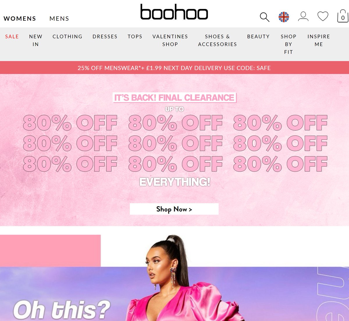

129. Pricing.
If you're in a highly competitive market, where people will check between 2 or 3 competitors, sometimes *not* having an offer = much lower sales.
(check these two. Same colours, same % off, same use of 'event', same countdown)
If you're in a highly competitive market, where people will check between 2 or 3 competitors, sometimes *not* having an offer = much lower sales.
(check these two. Same colours, same % off, same use of 'event', same countdown)
130. Pricing.
Showing % or $ discount is quite arbitrary, but a general rule is if an item costs more than £100/$100/€100, showing the discount as a £/$/€ figure is better than showing it as a % ('Save $30' on something costing $150 sounds better than 'Save 20%').
Showing % or $ discount is quite arbitrary, but a general rule is if an item costs more than £100/$100/€100, showing the discount as a £/$/€ figure is better than showing it as a % ('Save $30' on something costing $150 sounds better than 'Save 20%').
131. Pricing.
*Sometimes* it's better to hard mark down products, rather than have a discount code. Instances are:
- if you sell a lot through retargeting/product feeds (often they only show hard markdown)
- if you want customers to be able to use other discount codes on top.
*Sometimes* it's better to hard mark down products, rather than have a discount code. Instances are:
- if you sell a lot through retargeting/product feeds (often they only show hard markdown)
- if you want customers to be able to use other discount codes on top.
132. Pricing.
Sometimes *pricing up* products has little/no impact on sales.
I've run tests where products have been discounted 50%. Reining them back to 30% made no difference in sales, but a big difference in profit...
Sometimes *pricing up* products has little/no impact on sales.
I've run tests where products have been discounted 50%. Reining them back to 30% made no difference in sales, but a big difference in profit...
133. Pricing.
Sometimes *pricing up* is sensible even when it does negatively impact sales.
Eg: Product cost price = $10.
Your cost per order is $10 (shipping/handling)
Sell 100 of those at $30 = $1,000 profit.
Sell 60 at $50 = $1,800 profit.
Sometimes *pricing up* is sensible even when it does negatively impact sales.
Eg: Product cost price = $10.
Your cost per order is $10 (shipping/handling)
Sell 100 of those at $30 = $1,000 profit.
Sell 60 at $50 = $1,800 profit.
134. Pricing.
In some contexts, *pricing up* will actually increase demand.
Champagne in general is a good example of this, and Cristal a great example within Champagne. It is popular *because* it costs a lot, not because people love it 10x as much as regular white wine.
In some contexts, *pricing up* will actually increase demand.
Champagne in general is a good example of this, and Cristal a great example within Champagne. It is popular *because* it costs a lot, not because people love it 10x as much as regular white wine.
nb: this is known as the 'Veblen effect', and products in this category are known as 'Veblen goods', after Thorstein Veblen who was also responsible for the related idea of 'conspicuous consumption'.
(incidentally, along with the inventor of Monopoly, he was anti-capitalist)
(incidentally, along with the inventor of Monopoly, he was anti-capitalist)
135. Pricing.
Non-conspicuous situations where pricing up can increase demand are:
- Gifting. Eg, would you buy the cheapest box of chocolates for Mother's Day.
- Quality. Eg, you're buying a mobile phone charger, do you buy the $0.50 charger, or the $5 one?
Non-conspicuous situations where pricing up can increase demand are:
- Gifting. Eg, would you buy the cheapest box of chocolates for Mother's Day.
- Quality. Eg, you're buying a mobile phone charger, do you buy the $0.50 charger, or the $5 one?
136. Pricing.
'Price Anchoring' is also a popular tactic on ecommerce sites. Eg, on a product listing page, show a moderately priced item next to a very high priced item & it appears reasonable, even if it may ordinarily feel very expensive.
'Price Anchoring' is also a popular tactic on ecommerce sites. Eg, on a product listing page, show a moderately priced item next to a very high priced item & it appears reasonable, even if it may ordinarily feel very expensive.
137. Pricing.
Some ecommerce sites 'buy for the sale', with this in mind. Eg: Buy a $40 product that you won't sell many of during normal times at sell price $200. Put it on sale on Black Friday at 75% off, &:
a) it looks good value.
b) still make profit.
c) '75% off' headline.
Some ecommerce sites 'buy for the sale', with this in mind. Eg: Buy a $40 product that you won't sell many of during normal times at sell price $200. Put it on sale on Black Friday at 75% off, &:
a) it looks good value.
b) still make profit.
c) '75% off' headline.
138. Pricing.
Some ecom sites differ pricing by region. Here's the same product on Mango UK vs Portugal.
There may be lots of reasons for this-
Different labour, import, tax, transport costs.
Different unit economics.
Different levels of demand.
Different rules from suppliers.
Some ecom sites differ pricing by region. Here's the same product on Mango UK vs Portugal.
There may be lots of reasons for this-
Different labour, import, tax, transport costs.
Different unit economics.
Different levels of demand.
Different rules from suppliers.

139. Pricing.
Some ecommerce sites differ price by customer. This *tends* to be on the basis of a few things:
1. Loyalty schemes.
2. Volume discounts in B2B (eg, if you commit to spend £100k with us per month, you get X discount)
3. Incentives based on CRM lifecycle.
Some ecommerce sites differ price by customer. This *tends* to be on the basis of a few things:
1. Loyalty schemes.
2. Volume discounts in B2B (eg, if you commit to spend £100k with us per month, you get X discount)
3. Incentives based on CRM lifecycle.
140. Pricing.
Some also differ price by *marketing channel*. You find this more where ecommerce sites can be reached via various price aggregators/affiliates. It tends to be either an exclusive deal worked out with one of those, or the opposite: covering costs of their fee.
Some also differ price by *marketing channel*. You find this more where ecommerce sites can be reached via various price aggregators/affiliates. It tends to be either an exclusive deal worked out with one of those, or the opposite: covering costs of their fee.
141. Pricing.
Pricing is *somewhat* arbitrary if you are not selling other people's RRP products.
Some ecom sites go into lots of detail & examine price elasticity, some broad brush, some set an initial price, then have markdown rules that kick in over the product lifecycle.
Pricing is *somewhat* arbitrary if you are not selling other people's RRP products.
Some ecom sites go into lots of detail & examine price elasticity, some broad brush, some set an initial price, then have markdown rules that kick in over the product lifecycle.
Markdown rules tend to work like this:
- After X weeks online, examine whether every product is hitting its target STR (sellthrough rate)
- If equal to/above STR target, keep the same price.
- If below STR target, mark down by a set %, based on how near/far it is to STR.
- After X weeks online, examine whether every product is hitting its target STR (sellthrough rate)
- If equal to/above STR target, keep the same price.
- If below STR target, mark down by a set %, based on how near/far it is to STR.
Some also take into account product visibility with that. Eg: A product can be underselling because there is a lack of demand, in which case reducing its price is a 'hammer' to increase demand. But sometimes it's because the product has not been seen enough.
Sometimes it is also simply that something is wrong: product images not good, product details wrong/confusing, it got an early negative review that's putting people off, etc.
'Price' is the easy lever to pull to increase demand, but is quite blunt.
'Price' is the easy lever to pull to increase demand, but is quite blunt.
142. Pricing.
Differing price strategy by category is also very popular.
Eg: A laptop retailer will make very little margin selling laptops (maybe 5%), but will make huge margin on accessories (cables, bags, etc).
Differing price strategy by category is also very popular.
Eg: A laptop retailer will make very little margin selling laptops (maybe 5%), but will make huge margin on accessories (cables, bags, etc).
Often retailers like that have KPIs like 'attach rate', putting UX elements in place to maximise the likelihood someone buying a laptop will also buy a cable/bag/docking station/warranty/setup service.
A bit like mobile phone shops trying to sell you tons of add ons.
A bit like mobile phone shops trying to sell you tons of add ons.
143. Pricing.
Another area where an ecommerce company may differ product pricing is on seasonality of products:
'NOS' (never out of stock) products may very rarely/never change price.
'Trend' products are expected to sell within a few weeks/months, or need to be 'cleared'.
Another area where an ecommerce company may differ product pricing is on seasonality of products:
'NOS' (never out of stock) products may very rarely/never change price.
'Trend' products are expected to sell within a few weeks/months, or need to be 'cleared'.
144. Desktop Navigation.
The 'megamenu' is still pretty much omnipresent.
By department, with bold subheadings (sometimes links, sometimes just titles) is still pretty much the default for those with very large catalogues.
The 'megamenu' is still pretty much omnipresent.
By department, with bold subheadings (sometimes links, sometimes just titles) is still pretty much the default for those with very large catalogues.
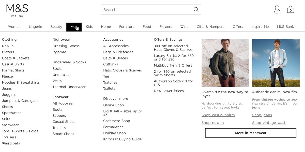
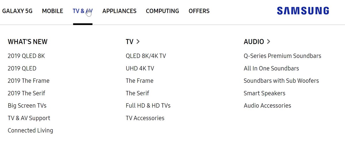
144. Desktop Navigation.
Megamenus are almost always 'top navigation'. There are some odd exceptions that go with side nav.
And the 'hybrid' is quite popular: Top navigation, with accordion menus from left to right (this has grown in popularity, as it ports well to mobile)
Megamenus are almost always 'top navigation'. There are some odd exceptions that go with side nav.
And the 'hybrid' is quite popular: Top navigation, with accordion menus from left to right (this has grown in popularity, as it ports well to mobile)
145. Desktop Navigation.
Choosing menu categorisation can be difficult. Here's a pragmatic example:
- new arrivals (popular with loyals)
- 'shop' - for those who know what they want.
- 'leggings' - most popular category.
- 'activity' - use case driven.
- 'community' - content.
Choosing menu categorisation can be difficult. Here's a pragmatic example:
- new arrivals (popular with loyals)
- 'shop' - for those who know what they want.
- 'leggings' - most popular category.
- 'activity' - use case driven.
- 'community' - content.
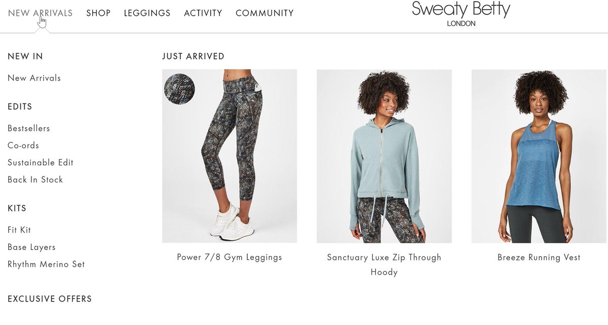
146. Desktop Navigation.
Here's an alternate approach to the *exact* same issue. In this case they've added departments on top, allowing them to serve 3 different core customer types (men/women/girls), plus 'accessories' (ie, not gender/age specific items).
Here's an alternate approach to the *exact* same issue. In this case they've added departments on top, allowing them to serve 3 different core customer types (men/women/girls), plus 'accessories' (ie, not gender/age specific items).
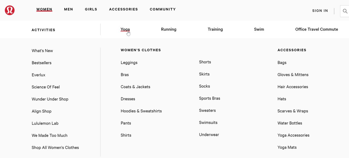
nb: in the above, you'll see the same elements as prior:
'community' is pulled out to the top level.
'activities' = stuff for loyals.
'women's clothes' = for those who know what they want.
'activity' is a pseudo-categorisation that just takes you to products filtered by a facet.
'community' is pulled out to the top level.
'activities' = stuff for loyals.
'women's clothes' = for those who know what they want.
'activity' is a pseudo-categorisation that just takes you to products filtered by a facet.
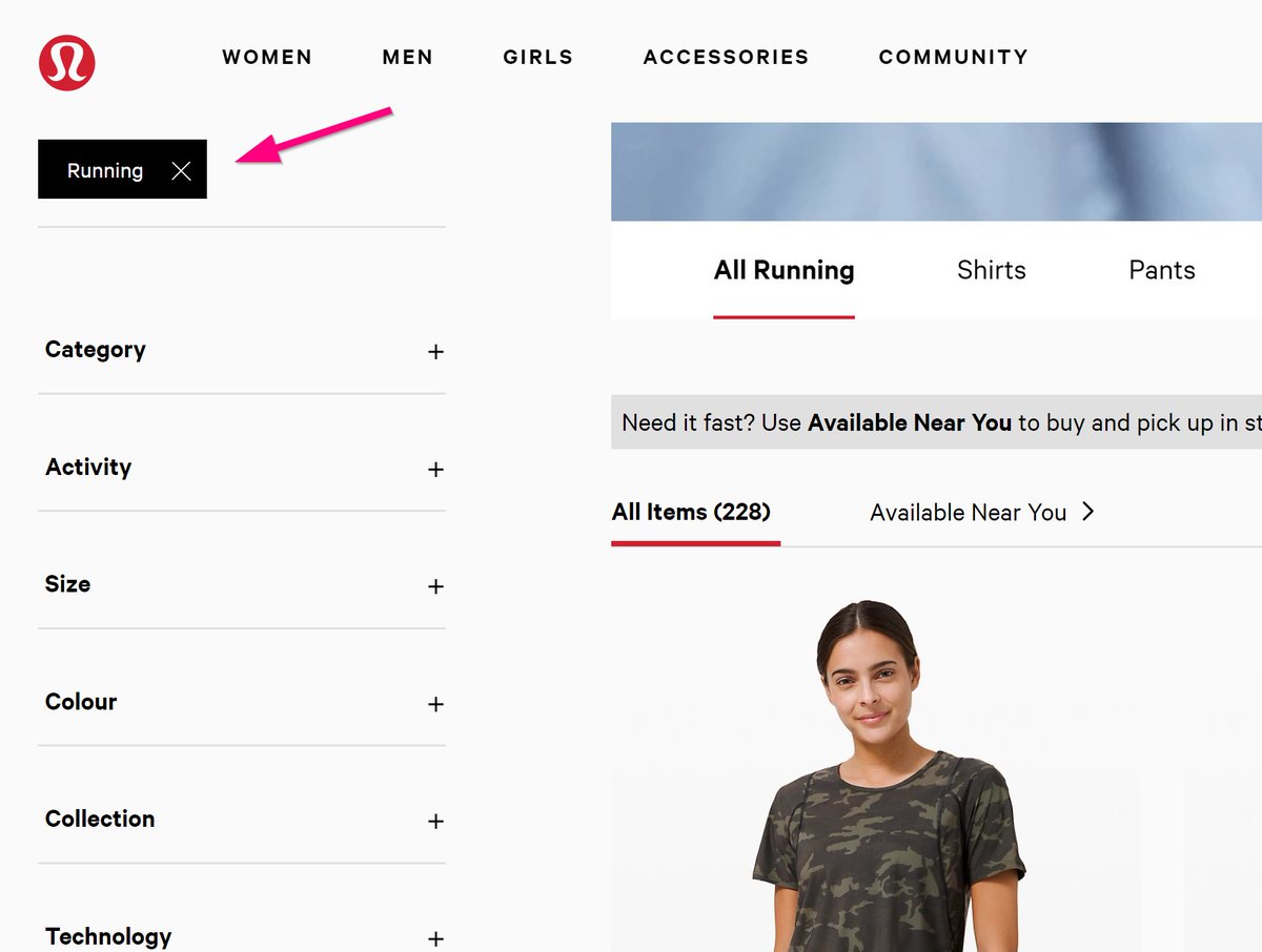
147. Desktop Navigation.
Here are 4 patterns, aside from general subcategory links, that can help you focus users' attention via top navigation:
1. Pseudo categories.
2. Highlight offers.
3. 'Now' trading trends.
4. Catch all for those who can't spot what they were looking for.
Here are 4 patterns, aside from general subcategory links, that can help you focus users' attention via top navigation:
1. Pseudo categories.
2. Highlight offers.
3. 'Now' trading trends.
4. Catch all for those who can't spot what they were looking for.
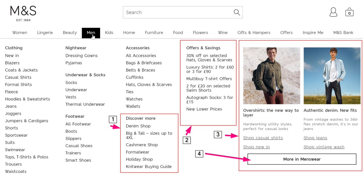
148. Desktop Navigation.
If you have a *lot* of traffic/customers, you may be able to sell space in your navigation (don't know if ASOS do or not, but Bershka & Weekday don't seem 'demand driven').
(There was a stage when Ryanair would sell you a whole top navigation tab).
If you have a *lot* of traffic/customers, you may be able to sell space in your navigation (don't know if ASOS do or not, but Bershka & Weekday don't seem 'demand driven').
(There was a stage when Ryanair would sell you a whole top navigation tab).
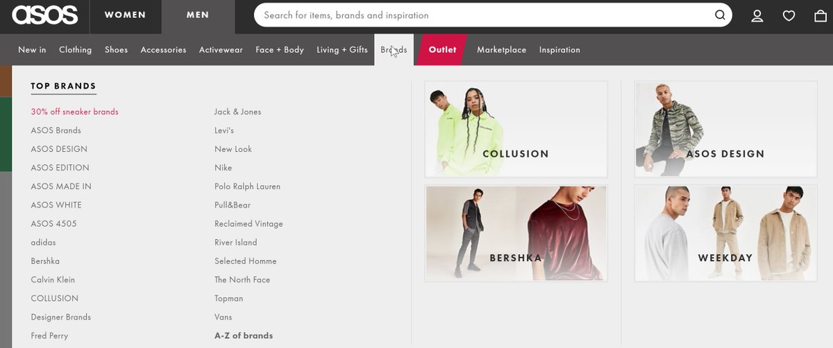
149. Analytics.
People sometimes think of a higher bounce rate as always being a bad thing. All bounce rate is, is the percentage of visits to your site where only one page was viewed. Even if someone spent 15 minutes reading that page, and then left, it's still a bounce.
People sometimes think of a higher bounce rate as always being a bad thing. All bounce rate is, is the percentage of visits to your site where only one page was viewed. Even if someone spent 15 minutes reading that page, and then left, it's still a bounce.
150. Analytics.
Bounce rate is not always bad: A page with a 100% bounce rate may still be valuable. If 1,000 viewed it, but only 1 of them landed on it, & that 1 person didn't view any other pages, it will have a 100% bounce rate, even if it was crucial to the other 999 people.
Bounce rate is not always bad: A page with a 100% bounce rate may still be valuable. If 1,000 viewed it, but only 1 of them landed on it, & that 1 person didn't view any other pages, it will have a 100% bounce rate, even if it was crucial to the other 999 people.
151. Analytics.
Bounce rate is not always bad 2: Some pages will naturally have high bounce rate. Eg, a 'contact us' page may have a high rate because a lot of people search google for 'your company hq address', land on your contact page, find what they need, & then leave again.
Bounce rate is not always bad 2: Some pages will naturally have high bounce rate. Eg, a 'contact us' page may have a high rate because a lot of people search google for 'your company hq address', land on your contact page, find what they need, & then leave again.
152. Analytics.
Low bounce rate is not always good: If you have a super low rate (eg down in single figures), it often means your analytics setup is broken: pages are tracking 2 views each, or maybe an interactive 'event' is counting single page views as if they are not bounces.
Low bounce rate is not always good: If you have a super low rate (eg down in single figures), it often means your analytics setup is broken: pages are tracking 2 views each, or maybe an interactive 'event' is counting single page views as if they are not bounces.
153. Analytics.
In general, 'bounce rate' is not a meaningful metric for most ecommerce sites at all, particularly not at the overall site level. It's very vaguely interesting, & can tell you 1 or 2 things, but there are dozens of more useful metrics. It's just a well known one.
In general, 'bounce rate' is not a meaningful metric for most ecommerce sites at all, particularly not at the overall site level. It's very vaguely interesting, & can tell you 1 or 2 things, but there are dozens of more useful metrics. It's just a well known one.
A side story: I was once asked by a well known highbrow but high volume magazine/ecom site to assess a proposal to redevelop their website. The development cost was £120k. The company were ok to spend the money, but wanted to double check it was absolutely necessary.
The proposal came about because the celebrity owner was worried about the site's bounce rate (one of the few metrics they were aware of; you also seem to get this factor with site speed). On investigating it, it turned out the site did have a relatively high bounce rate.
That's not uncommon for sites with lots of editorial content: People land on individual articles from social, or from email, and disappear again. In this case that was one factor, and in quite a good way: They sent out a daily email with an article link in it.
Many were clicking through to the article, reading it, then coming back next day.
The second factor was the homepage, which also had a high bounce rate. On investigating, that was largely from *returning* visitors (slightly unusual).
The second factor was the homepage, which also had a high bounce rate. On investigating, that was largely from *returning* visitors (slightly unusual).
Looking at the 'second page viewed' report for returning visitors landing on the homepage, it was often an article that they'd click through to. On investigating further, the reason for the high bounce rate was that some users were visiting 5 or 6 times a day...
...checking for new articles, and just leaving the site if there was nothing new, before returning again a few hours later to check.
In the end, the fix to this problem was:
1) Put more of the articles that were published onto the homepage (not all were).
2) Add some 'logical next clicks' to the end of articles.
3) Put a small amount of the budget into more content & save the rest of the £120k.
1) Put more of the articles that were published onto the homepage (not all were).
2) Add some 'logical next clicks' to the end of articles.
3) Put a small amount of the budget into more content & save the rest of the £120k.
154. Analytics.
Bounce rate *can* be vaguely useful for comparing like-for-like pages via particular channels. Eg: Super high bounce rate on a product from google shopping? Take it out the feed. High bounce rate on a particular subcategory? Check for product stock, etc.
Bounce rate *can* be vaguely useful for comparing like-for-like pages via particular channels. Eg: Super high bounce rate on a product from google shopping? Take it out the feed. High bounce rate on a particular subcategory? Check for product stock, etc.
155. Analytics.
Time on site (or 'average session duration') is a similarly not-very-useful metric. It's good to be aware that it's literally the time the last page on a site was loaded minus the time the first page was loaded. Here are some examples of how this misleads:
Time on site (or 'average session duration') is a similarly not-very-useful metric. It's good to be aware that it's literally the time the last page on a site was loaded minus the time the first page was loaded. Here are some examples of how this misleads:
- eg1: Page 1 is loaded at 12:00. The user spends 10 minutes on the site, and then leaves. 12:00 - 12:00 (last load, minus first load) = 0 seconds, so time on site was '0 seconds'.
- eg2: Page 1 is loaded at 12:00. Page 2 is loaded at 12:05. The user leaves the site at 12:13. 12:05 (last load) - 12:00 = 5 minutes. So even though the user spent 13 minutes on the site, analytics records it as 5 minutes.
- eg3: Page 1 is loaded at 12:00. Page 2 is loaded at 12:35. They leave the site at 12:37, with no more page loads. By default, Google Analytics' session length is 30 minutes, so that counts as 2 sessions, each with 100% bounce rate, each with time on site of 0 seconds.
156. Analytics.
Some fix the 'time on site' issue by firing a 'heartbeat' event every so often. In my opinion it's best to just understand the flaws in the measure, and use it if/when it's useful despite that.
Some fix the 'time on site' issue by firing a 'heartbeat' event every so often. In my opinion it's best to just understand the flaws in the measure, and use it if/when it's useful despite that.
157. Analytics.
Tracking 404 pages is a useful thing to do on an ecommerce site. Even if there's no explicit tracking set up, you can often still isolate them in Google Analytics.
Here's how, using Samsung as an example-
Tracking 404 pages is a useful thing to do on an ecommerce site. Even if there's no explicit tracking set up, you can often still isolate them in Google Analytics.
Here's how, using Samsung as an example-
Take a look at how the website treats error pages. Eg type in: samsung.com/uk/abcdefg/
Check the 'page title' there, which is 'SAMSUNG | Samsung UK' <-- that's the format it uses for any 404 page.
Check the 'page title' there, which is 'SAMSUNG | Samsung UK' <-- that's the format it uses for any 404 page.
Go to the Behaviour > Site Content > All Pages report.
Use the 'Page Title' tab, to view that by title.
Filter to find the pages matching the title you'd noted down.
Use the 'Page Title' tab, to view that by title.
Filter to find the pages matching the title you'd noted down.
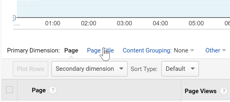

Once there, click in the table on the link matching your noted page title. That will take you to a report showing all URLs that were loaded with the page title (ie, your 404 pages).
(nb: this only works if 404s don't redirect, and have a distinct title, but that's pretty common)
(nb: this only works if 404s don't redirect, and have a distinct title, but that's pretty common)

158. Analytics.
These 2 reports (lifetime value & cohort analysis) can *almost* always be ignored for ecommerce sites in Google Analytics.
It's a shame, because *actual* lifetime value reports & *actual* cohort reports are v v useful, but - for ecom sites - these are not those.
These 2 reports (lifetime value & cohort analysis) can *almost* always be ignored for ecommerce sites in Google Analytics.
It's a shame, because *actual* lifetime value reports & *actual* cohort reports are v v useful, but - for ecom sites - these are not those.
159. Analytics.
People often criticise realtime reports as not being useful. I actually find them useful:
- for tuning intuition (watch them after an email has gone out for example)
- for debugging (step through something on the site & check it's tracked)
...
People often criticise realtime reports as not being useful. I actually find them useful:
- for tuning intuition (watch them after an email has gone out for example)
- for debugging (step through something on the site & check it's tracked)
...

- for anomaly spotting (most GA reports are sorted by high:low, meaning anomalies sit at the foot of tables, but you often spot them in realtime)
- for bringing people a bit closer to the site (put the realtime chart on the wall & people get to understand site use patterns)
- for bringing people a bit closer to the site (put the realtime chart on the wall & people get to understand site use patterns)
160. Analytics.
It's very easy to miss, but you can also filter realtime reports. Just click the links in the tables, and GA adds them as filters (see the breadcrumb here for example)
It's very easy to miss, but you can also filter realtime reports. Just click the links in the tables, and GA adds them as filters (see the breadcrumb here for example)
• • •
Missing some Tweet in this thread? You can try to
force a refresh