My Authors
Read all threads
Data Twitter, who has read Storytelling with Data by Cole Nussbaumer Knaflic?
I will share some insights

Chapter 1: There are two ways of analysis, Exploratory and Explanatory analysis.

Exploratory analysis is picking up important research findings that is importance to share to your audience. You might have many data you got in your findings,
but your audience might need just only 2 or 3 important data and not everything. You will understand better when people are trying to give you so many information and you can pinpoint any take away. it is better to give 2 findings or information and explain in great depth.
Explanatory analysis is understanding the WHO,WHAT,HOW in data storytelling.

WHO: Knowing your target audience is core in presenting data, you don't plan a story for doctors and you get to the venue and you see secondary students.
WHAT do you want your audience to know about, every data story is either for your audience to know or take audience and if your data story or presentation doesn't have that, then there is a problem somewhere.
The HOW is the mechanism of communication. What mechanism you use determines if you are in control or your audience is. For a live presentation, you are in control but a written document, your audience is.
Also is the data source. How do you get the data to drive home your points is critical in data storytelling.

The 3 min story: Learning to present at a very short time and also be concise. if you know exactly what you want to communicate, you can always make it fit the time slot
The 3 mins Story consist of problem identification, problem solving, problem feedback.

Storyboarding is big part of @dbctraining training methodology and it helps us when we do instructional designs and how we train professional. How you drive home your point start from here.
Storyboarding is the visual outline of the content you plan to create. One big advice is start storyboarding with paper not Powerpoint, or any software, use paper to create how you want your data to be told. it gives your presentation structure and flow.
Chapter 2: Choosing an effective visual

I will summarize 5 visuals and explain how we can use it to display our data
1. Simple Text
When you know you want to share a number of two, a simple text works fine. Some times using a bar chart to compare two variables, a simple text can speak volume.
If there is an increase in a category(e.g country) as compared to a another variable
, using a simple text.
E.g There is 30% growth in 2019 population count as compared to 2006.
2. Tables: Tables are good visuals for a mixed audience. Like a departments meetings and we need to see how different department achieve set objectives across timelines.
Make your the values in the tables take center stage when presenting a table.
Try not to use heavy borders across your tables, light or no borders is fine.

3. Graph: One of the best visual type in visualizations. it sticks and explain data fast. it is faster for processing information. We have 4 types of graph, Points, Lines, Bars and Area
Point
ScatterPlot: It shows relationship between two things. we might want to look if there is a relationship between the population and high covid 19 confirm cases of countries.

Line
Line Graphs: Line graph is great for any time series, month,days,years, weeks
It is a continuous visual type.
In Line Graph, there can be a single series of data i.e one line across the graph. There can be two or three series in your line graph. You can also show how different line compare to one another.
Bar Chart are easy for your audience to read and it is not boring to you use them.
Always make sure your bar charts have zero base line
You can also have single, two or multiples series of bars like line graph
Horizontal Bar Chart: when you know your category of names is long, use this chart. Since the way we process visuals, we start from top left to bottom right, we will see the categories before we see the values(data)
Visuals never to use
1. Pie Chart
2. Donut chart
3. 3D Visuals
Chapter 3
CLUTTER IS YOUR ENEMY

#Cognitive load is the mental process we go through to grasp an information or visuals.
When we tell a computer to do a work, we are depending on the computer processing power to function, same way when we ask our audience to do work, we are
relying on their mental process to work. What we try to avoid is reducing the information to process that doesn't help the audience.

Always remember to reduce the cognitive load so your audience that process faster.
Clutter is a bad cognitive load. These are Visuals elements that takes us space but doesn't increase understanding.
Always reduce Visuals.
Always know your objectives that you want to deliver and it will help you in reducing clutters.
Gestalt Principles of Visual Perception
How do people understand and interact with visuals. We will look at 6 principles:
1. Proximity
2. Similarity
3. Enclosure
4. Closure
5. Continuity
5. Connection
1. Proximity: we think of objects that are physically closer to each other. when we create visuals, we tend to create visuals for easy understanding by using the proximity logic.

2. Similarity: Objects that are similar in colours,shapes,size or orientations are perceived as
related to part of a group.

3. Enclosure: we say objects that are physically enclosed together as belonging to part of a group. Light shading is enough. You can have shaded area of a part of visual to be different another part.

4. Closure: People tends to like things to be
simple and to be fit in the constructs. The closure principle tells us that charts borders and background shadings are not necessary in Visuals.Try with any graph, you will notice that when you use graph in Excel, you can remove many unnecessary elements and our data stands out.
5. Continuity: This principle is similar to closure, our eyes tries to seek the smoothest path and create continuity in what we see even when it may not explicitly exist. Your visuals should show continuity for easy understanding.

6. Connection: The connection principle help in
creating a relationship from different data points in a visual.

If you have a line graph, how do you make the visual presentable without cognitive overload
1. Remove chart border
2. Remove gridlines
3.Remove data markers
4. Clean up axis labels(e.g september to sept or 150,000,000 to 150M)
5. Label data directly
6. Use consistent colour
Chapter 4
Focus your audience's attention

How do people see and how can we use that as an advantage in presenting our data.

There are 3 types of memory in understanding visuals; iconic,short-term and long-term memory.
Iconic memories happens super fast, without consciously realizing it. Information stays in your iconic memory for a fraction of seconds before it moves to short term memory.
It tuned to colours, size,position on a page.

Short-term memory has limitations also. we can keep 4
chunks of visuals at a given time. As we try to reduce cognitive overload, putting too much colours in visuals and differnet shapes make our audience work harder to get the information,thereby losing them in the process.

How we solve them is labeling data series so as to reduce
the back and forth between legend and data. The idea is to build coherent chunks of information so that our audience can remember easily. When information leaves short term memory,it is either lost forever or gets into long term memory
Long-term memory : This is the aggregation of visual and verbal memories. The verbal memory is important to be able to recognize or recall.

Pre-attentive attributes in text are where you highlight base on colours, size, outline,bold, italics,underline.
Pre-attentive attributes in graphs are where we highlight the bar and text we want our audience need for focus and remember.

SIZE: Size matters. when visuals size are made size, we mean they are relatively important.
The bigger the size of a visual or text, the bigger its importance.

Colour: It is one of the most powerful tool in driving attention to visuals. Never use colour for using sake.
The rules are Use it Sparingly, Use color consistently, Design with colourblind in mind,
Be thoughtful of tone that colours conveys.

Page Positioning: People see from top left to bottom right. If an information is important, make it be on the top left.
Levels of page positioning
1. Top left
2. Top Right
3. Bottom Left
4. Bottom Right
Chapter 5
Think Like A Designer

Form follows functions

1. Not all data are equally important
2. When detail isnt needed, summarize
3. Ask yourself: would eliminating that change anything?
4. Push necessary non message impacting items to the background
5. Let your design be accessible to people in and out of your field.
6. Don't Over complicate Visuals
7. Make it legible
8. Keep it clean
9. Use straightforward language
10. Remember Text is your friend
11. Be smart with colours
12. Pay attention to alignment
Missing some Tweet in this thread? You can try to force a refresh.

Enjoying this thread?

Keep Current with Itama

Profile picture

Stay in touch and get notified when new unrolls are available from this author!

Read all threads

This Thread may be Removed Anytime!

Twitter may remove this content at anytime, convert it as a PDF, save and print for later use!

Try unrolling a thread yourself!

how to unroll video

1) Follow Thread Reader App on Twitter so you can easily mention us!

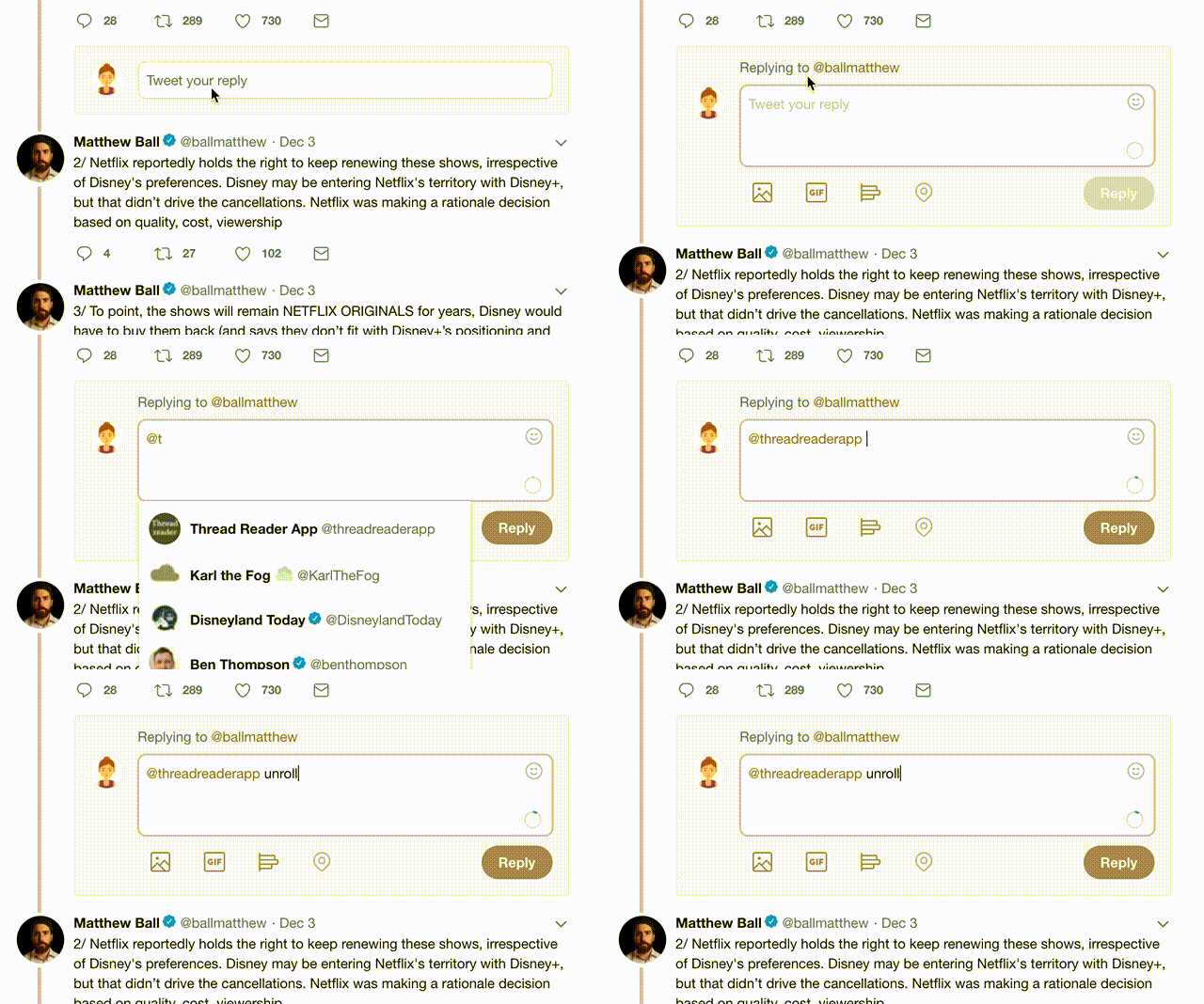
2) Go to a Twitter thread (series of Tweets by the same owner) and mention us with a keyword "unroll" @threadreaderapp unroll

You can practice here first or read more on our help page!

Follow Us on Twitter!

Did Thread Reader help you today?

Support us! We are indie developers!


This site is made by just two indie developers on a laptop doing marketing, support and development! Read more about the story.

Become a Premium Member ($3.00/month or $30.00/year) and get exclusive features!

Become Premium

Too expensive? Make a small donation by buying us coffee ($5) or help with server cost ($10)

Donate via Paypal Become our Patreon

Thank you for your support!