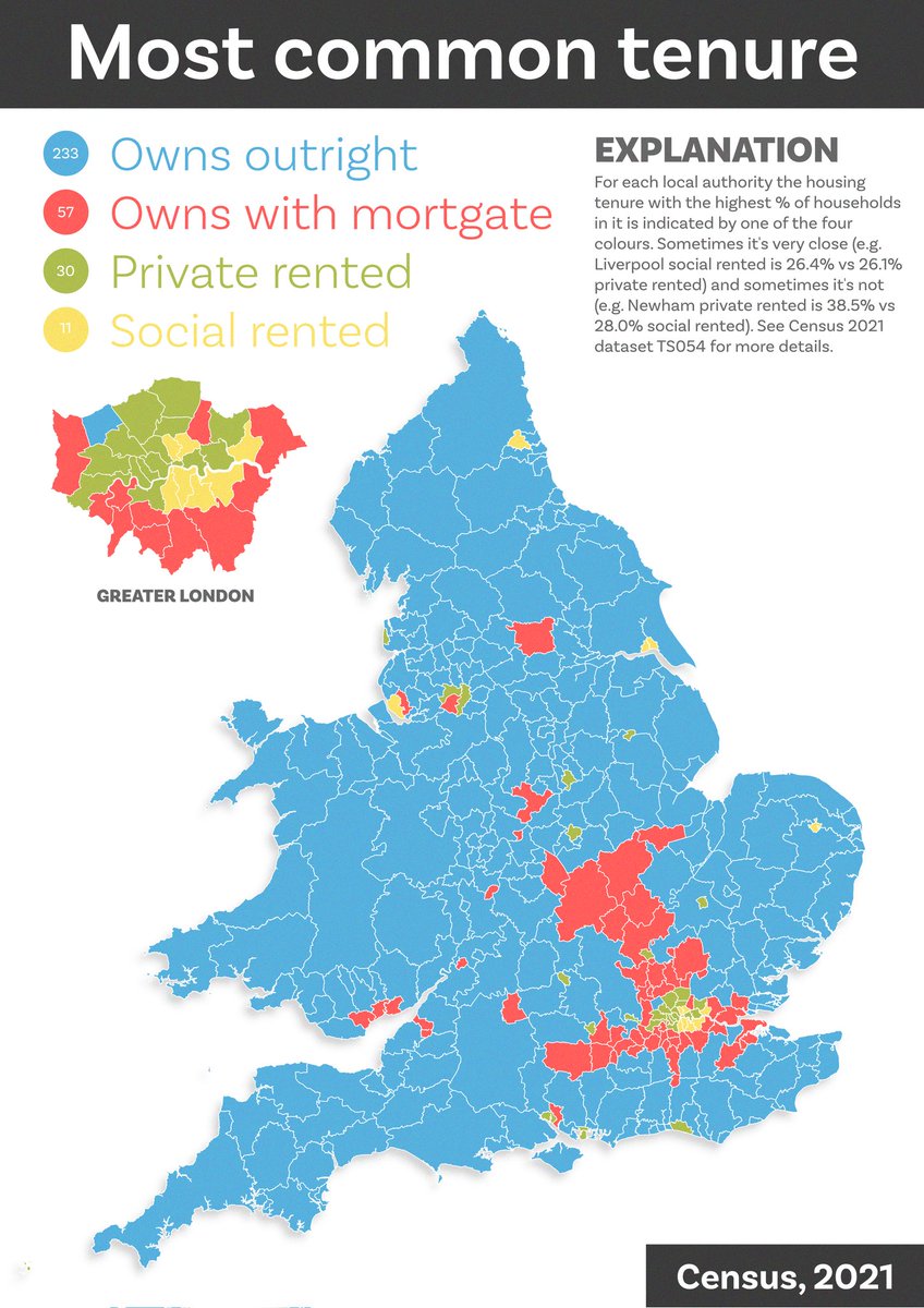
For anyone who might find it useful or interesting, I've cobbled together my tips on #aerialod into a new blog post - may be useful for teaching, experiments or just as a bit of distraction. I've shared sample data, screenshots of settings, and new images
statsmapsnpix.com/2020/03/making…


statsmapsnpix.com/2020/03/making…


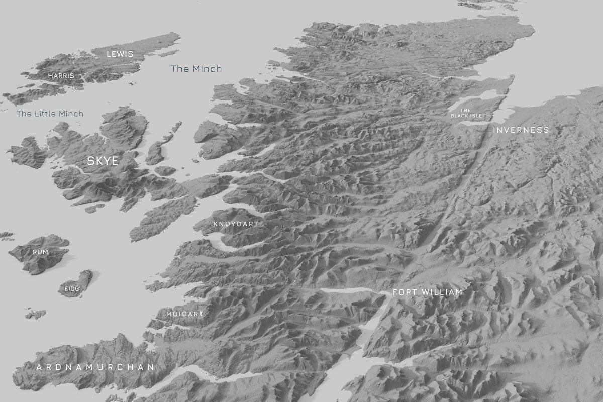
and it also works surprisingly well with larger areas, once you fiddle with the settings - I didn't get very far with labelling this one though 
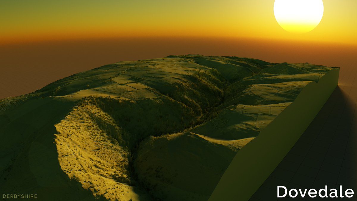
Dovedale in Derbyshire is a popular holiday spot, and also has open Lidar data (this is 50cm data), so I thought I'd add it to this thread - see next tweet for the settings 
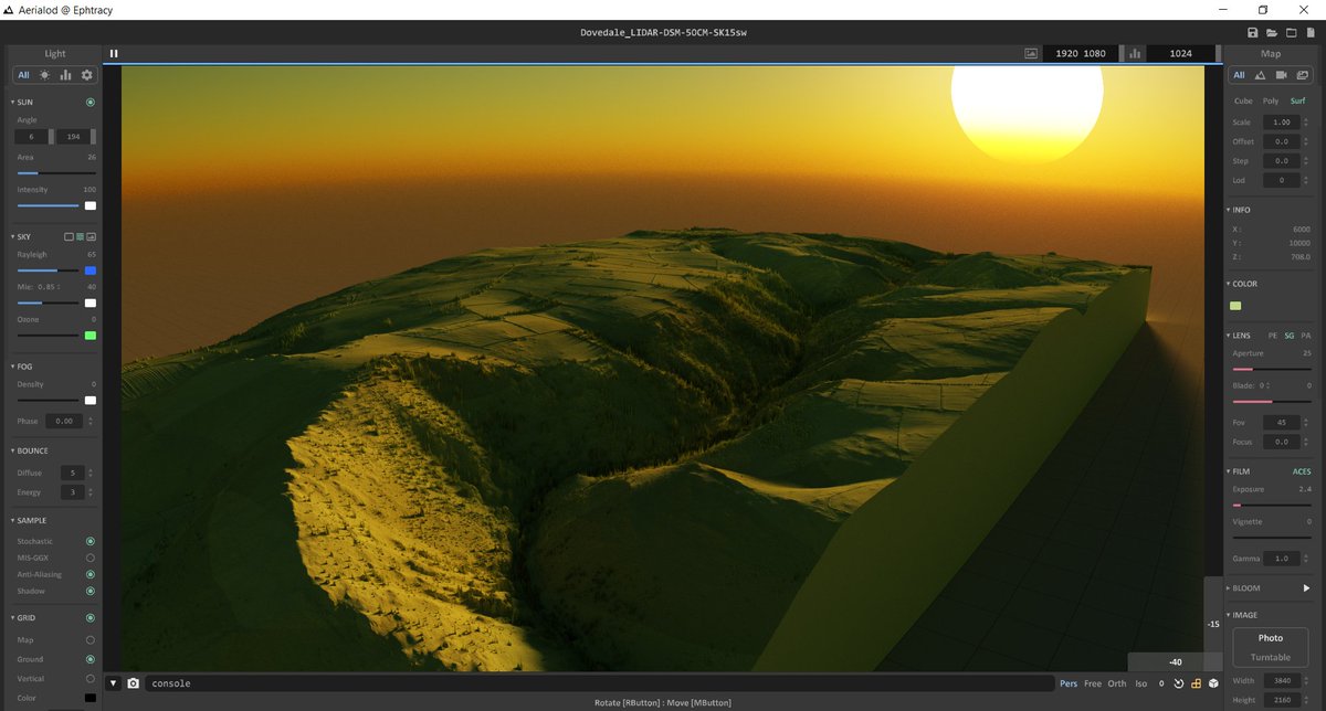
you should be able to see all the colours and settings in these screenshots, if you are planning to experiment with #aerialod
Data source: just search for 'dovedale' here: environment.data.gov.uk/DefraDataDownl…

Data source: just search for 'dovedale' here: environment.data.gov.uk/DefraDataDownl…

more tips: if you're working with a tif, jpg or png you can add some light text (which will be extruded) or dark text (will look like a hole) by just typing it on top of the image in another programme - I've added this example (as a tif) to the folder in the blog linked above 


another tip on this Aerialod malarkey - expand canvas size of a tif (I did this in Irfanview but you can do it with lots of other tools) and add a bit of text and for urban scenes like this one you can set the sun as an early morning glow that hits the taller buildings just right 
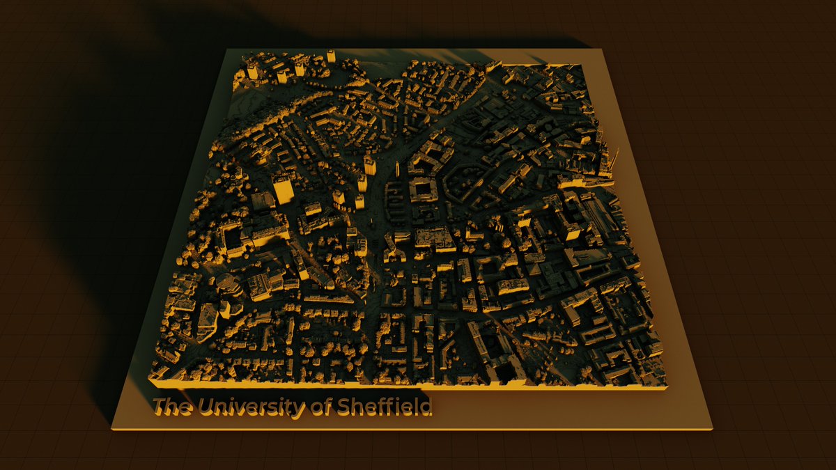
okay, some more of these to add to the fun
- another Cheddar Gorge one with funky perspective
- the isle of Eigg, with 3D text label
- another chunk of the Cairngorms
- and one just showing the highest land in the Highlands (e.g. spot the Cuillin ridge, or Cairngorm Pleateau)


- another Cheddar Gorge one with funky perspective
- the isle of Eigg, with 3D text label
- another chunk of the Cairngorms
- and one just showing the highest land in the Highlands (e.g. spot the Cuillin ridge, or Cairngorm Pleateau)


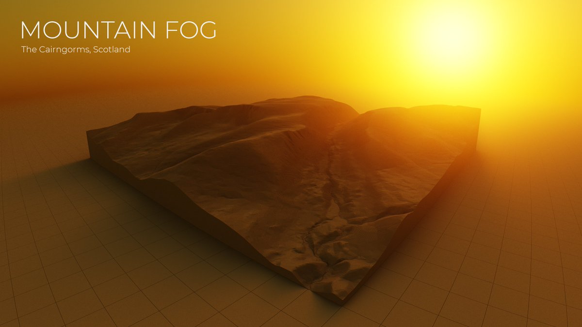
last one, because I haven't said anything about fog + sun and this is what it looks like when you mix the two 
• • •
Missing some Tweet in this thread? You can try to
force a refresh


