
Maps, stats, data, cities, density, elections, gifs, geo + QGIS training with Map Academy - founder of Automatic Knowledge

 there is also the Met Office "climate regions" map but that's a can of worms that I don't want to open, not least because of the unwavering England N / England S line


 these are all the different columns in the dataset (TS005Passports held) and the patterns are quite interesting, although I've only done a few maps as a way to explore the data
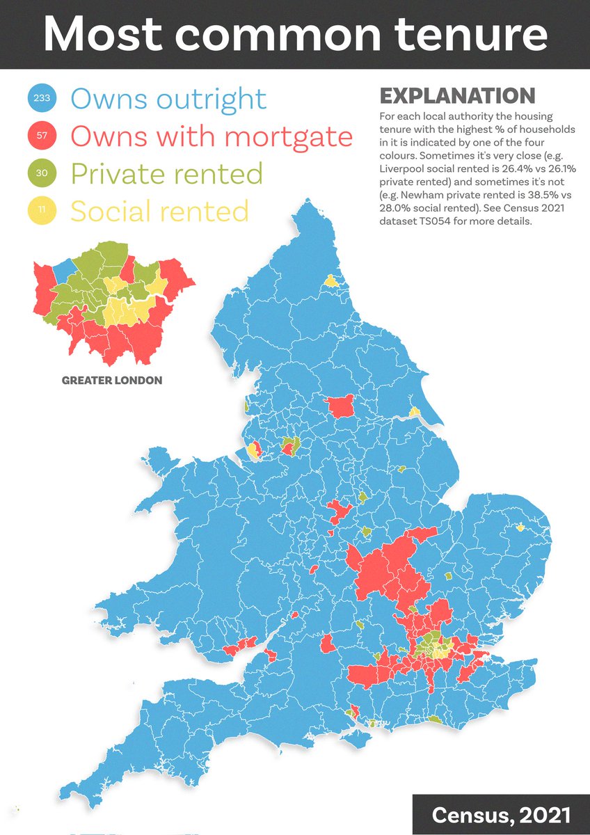 I'm working on my spelling of mortgage, probably due to the shock of seeing how many households own without a mortgage!


 and yes that is a helicopter in Richmondshire
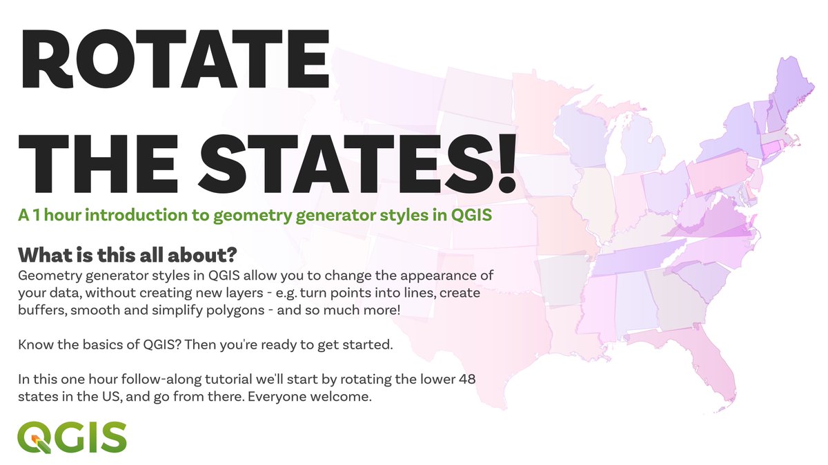 this is a bit of an experiment that I have been planning to do for a while so let's see how it goes - so long as you know the basics of QGIS you should learn some useful new stuff for design, and possibly more
 what do you get if you extend the distance to 100km around a point (e.g. as a very rough proxy for longer post-Covid commute zones) and do it systematically every 5km across the whole UK?
 I actually saw a full manuscript before the print version came out so my pristine paper copy is now about to be thoroughly thumbed
 lots of answers that could potentially also be correct - and which demonstrate next-level nerdery - but whoever goes forth with the true answer will surely be crowned twitter map champion forever


 also possibly interesting but also possibly meaningless is the line on this 'who came second in 2019' map


 there's buildings, greenspace, places, rail (stations + lines), roads, water - all for single local authorities, or for full Great Britain, if you need it - and simple file names so you can tell what's what - e.g. here's the buildings folder
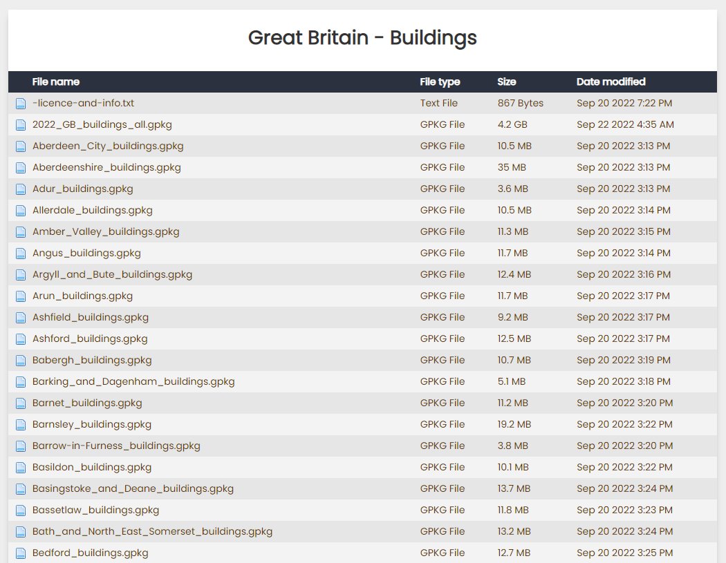


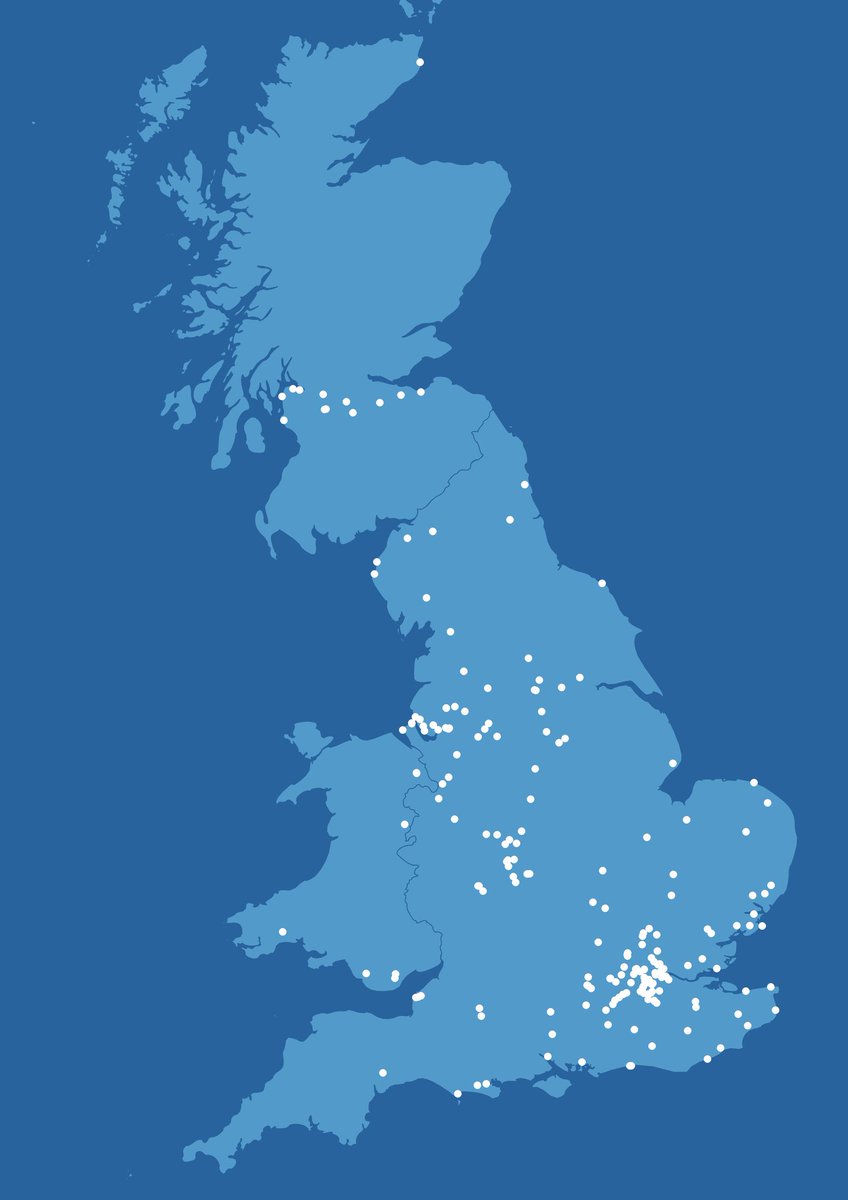 even though there are loads of points this is of course a bit pointless but I will keep the torment going and post answer eventually 🤓


 I've been working with BRES data quite a lot in recent times, so thought I'd take a closer look at the patterns - Northern Ireland sadly not included in this dataset. I was surprised by some maps, but not others


 the World Resources Institute (@WorldResources) publish the Global Power Plant Database, and this contains the location (lat/long) of approx 35,000 power plants worldwide, plus details on primary fuel and generating capacity, etc


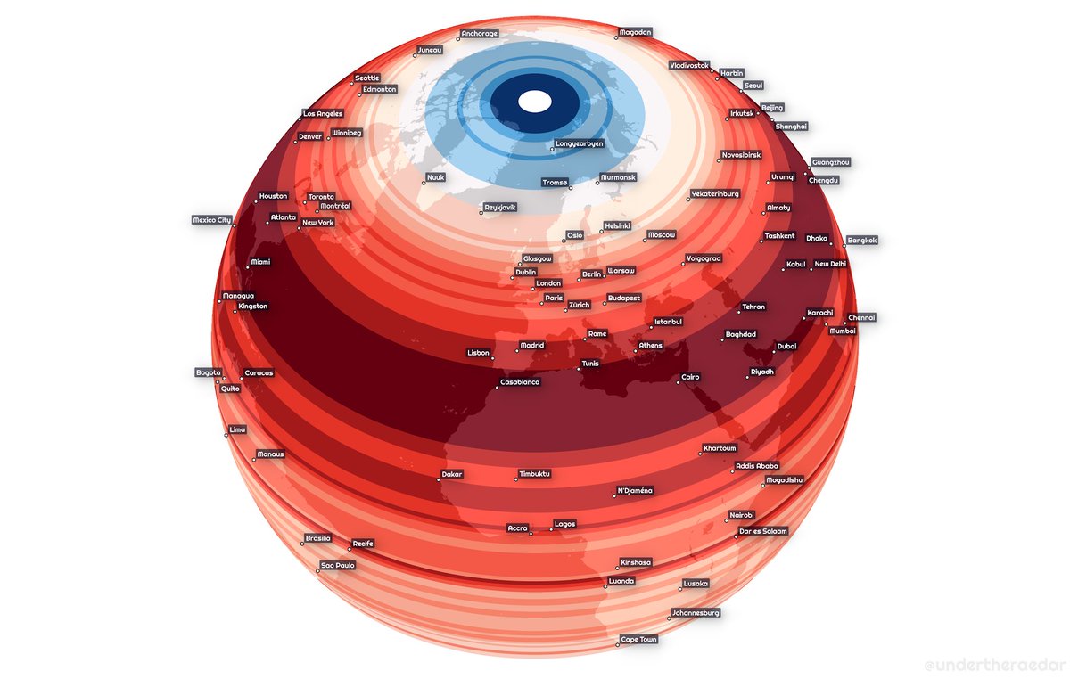

 I included a population vs land by latitude gif too, because it seems people don't like to live in the sea