1/ Hi I'm Brian Jacobs, @btjakes, Senior Graphics Editor in Nat Geo's maps & graphics department. Today I published an interactive where you can see what climate change will feel like around you and I'll be explaining the process behind it. on.natgeo.com/2K9ZexL
2/ I'm based at home these days in Washington, DC and I use code, design, and visualization to make interactive graphics. For this project I teamed up with @alejandrabee_ @EveConant (text), @rileydchampine @jasontreat (cartography & data), and Kaya Berne (research). 

3/ We wanted to express what the world might look like in 50 years using worst-case scenario climate models. The interactive in the first tweet above is a pessimistic take on climate change, showing an outcome in which we take little action to reduce it. nationalgeographic.com/magazine/2020/…
4/ You can see your location's climate analog, or the place currently on the planet that represents what your climate will feel like in 50 years. Washington, DC (where I live) will feel more like Clarksdale, Mississippi in 2070.
5/ The interactive tries to guess your current location, but if you want to learn about somewhere else, you can search for it.
6/ You can also see how your location's climate zone might shift. Climate zones are defined by temperature and precipitation patterns throughout the year and determine plant life.


9/ And it all starts with a 3D globe. That's animated in the browser using @threejs_org @greensock. Here's what happens when code misbehaves:
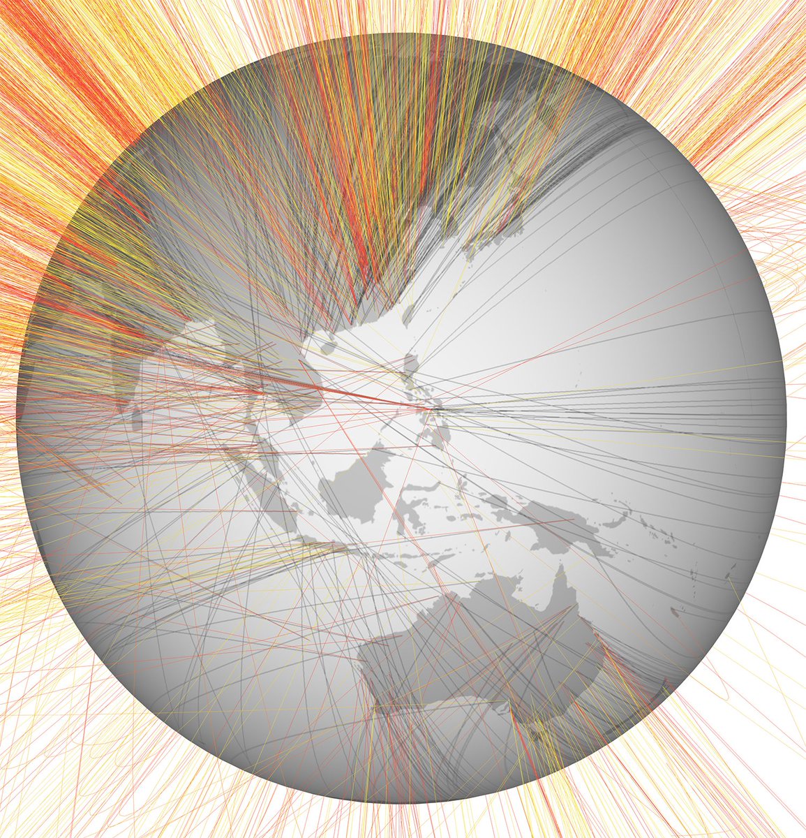
10/ Speaking of globes, here's another interactive I worked on: nationalgeographic.com/science/2019/0…
11/11 Thanks for reading! Let me know if you have any questions. And for more stories like this—and to read our special issue on Earth Day—subscribe to National Geographic: nationalgeographic.com/subscribe/maga…
BONUS TWEET: Also want to give a shout out to Matt Fitzpatrick at the University of Maryland Center for Environmental Science. He created the global climate analog data for us with a grant from National Geographic Society 🙌