NEW: Wed 15 April update of coronavirus trajectories
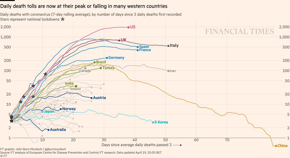
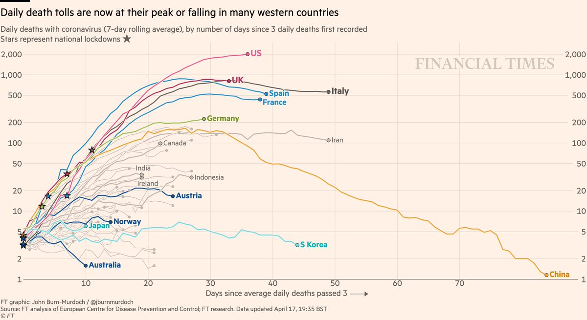
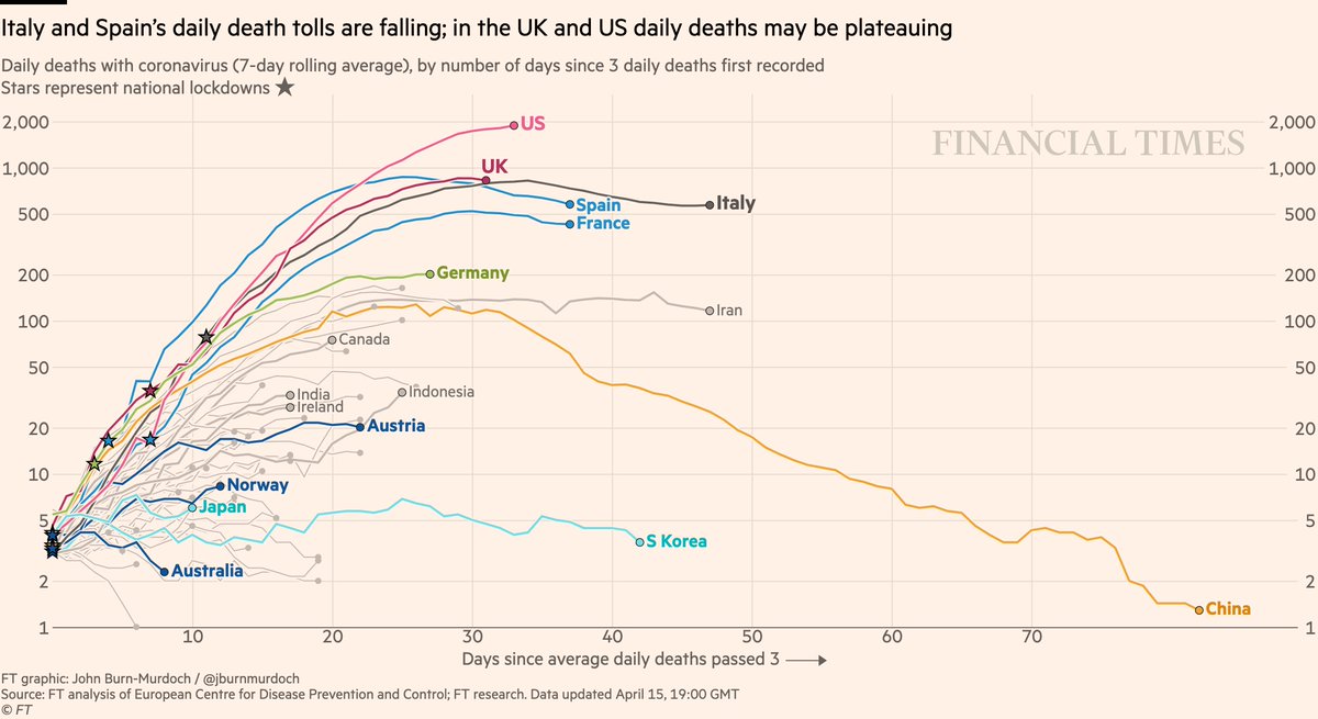
Daily deaths:
• US & UK may be peaking. Doesn’t mean battle is won, but very good news if true
• Successes in dark blue: Australia, Norway, Austria locked down early => gentle slopes
Live charts: ft.com/coronavirus-la…
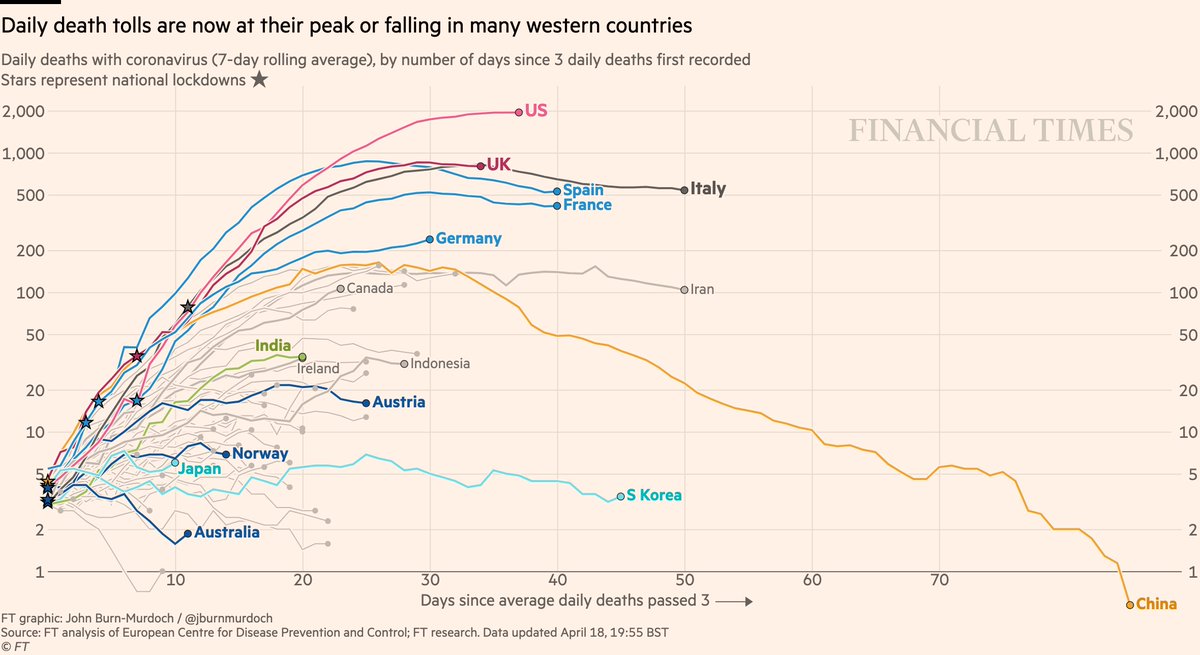
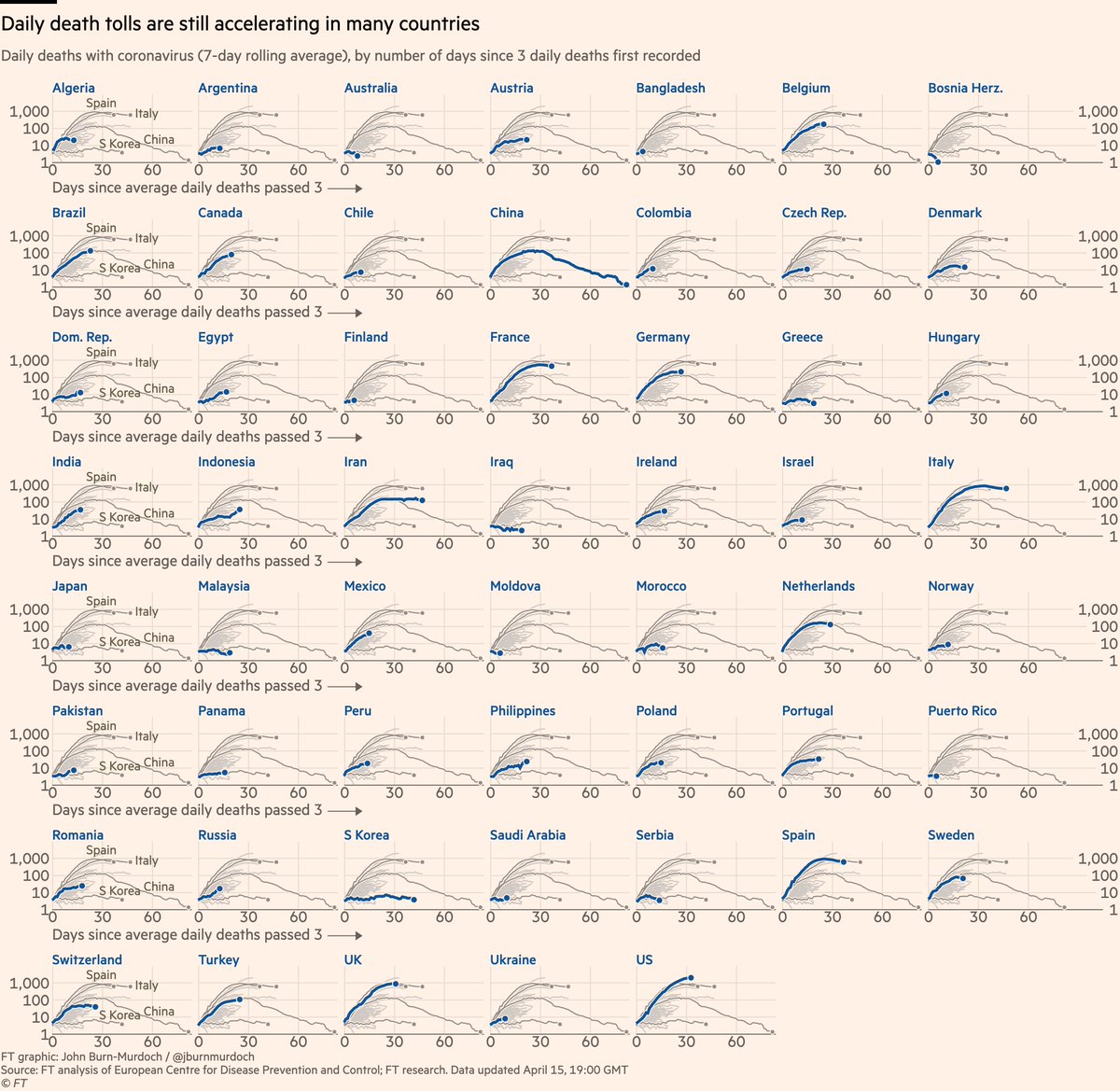
Daily deaths:
• US & UK may be peaking. Doesn’t mean battle is won, but very good news if true
• Successes in dark blue: Australia, Norway, Austria locked down early => gentle slopes
Live charts: ft.com/coronavirus-la…
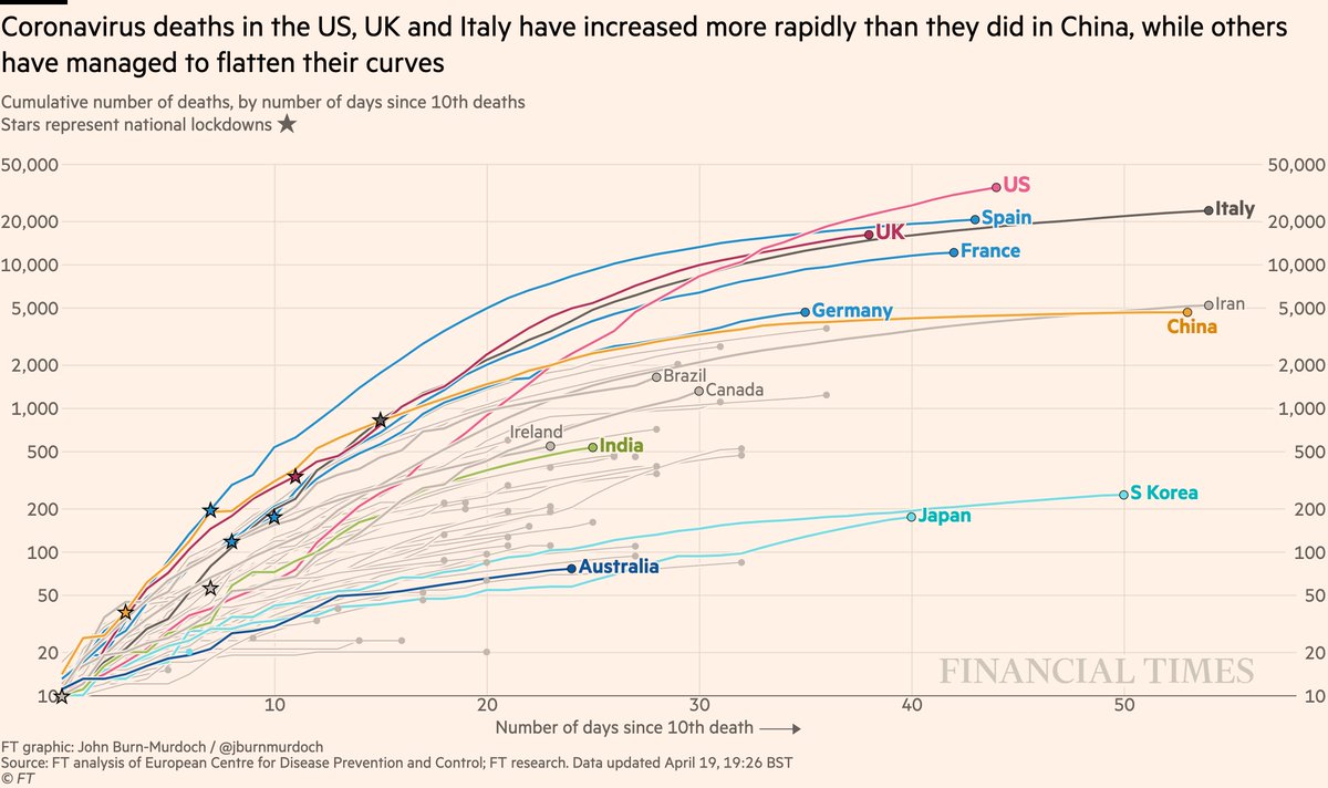
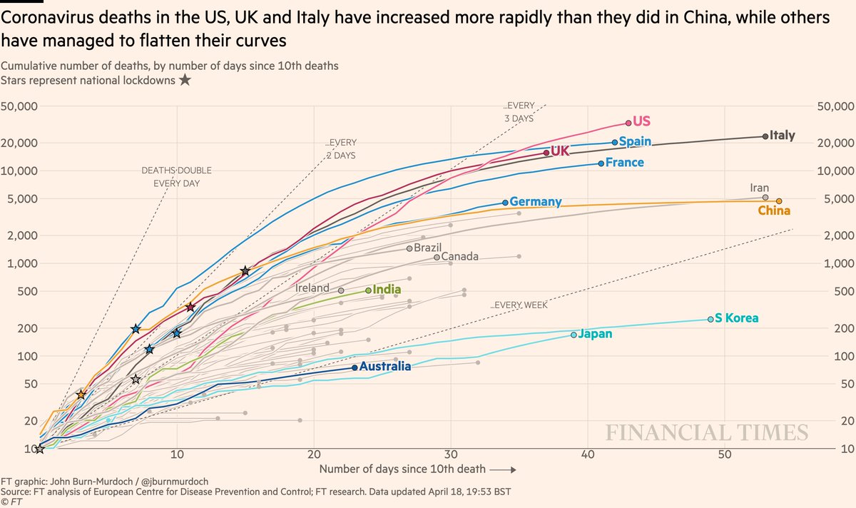
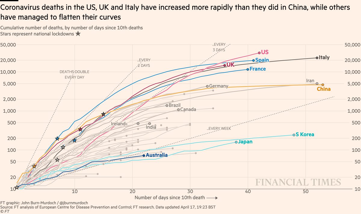
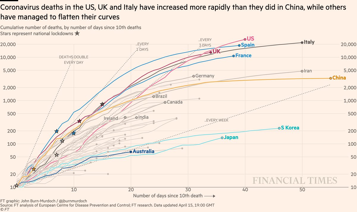
Now cumulative deaths:
• Nonetheless, US death toll now highest worldwide and still rising fast 📈
• And UK curve still matching Italy’s
• Australia still looks promising
All charts: ft.com/coronavirus-la…
• Nonetheless, US death toll now highest worldwide and still rising fast 📈
• And UK curve still matching Italy’s
• Australia still looks promising
All charts: ft.com/coronavirus-la…
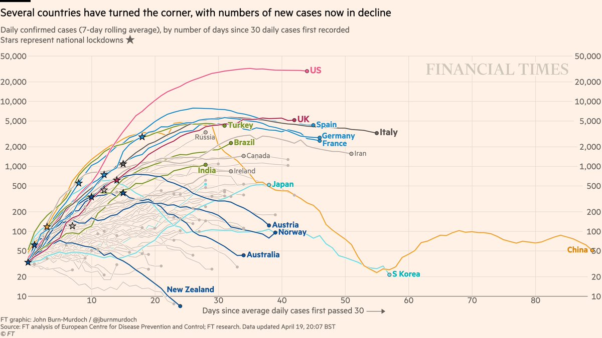
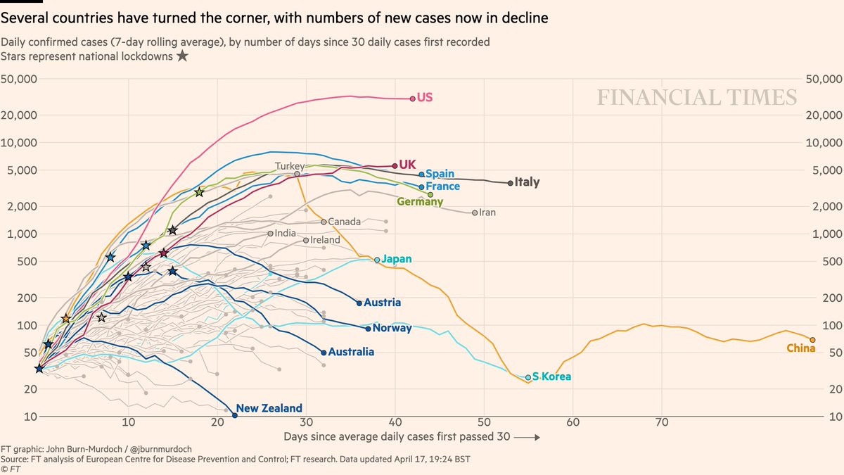
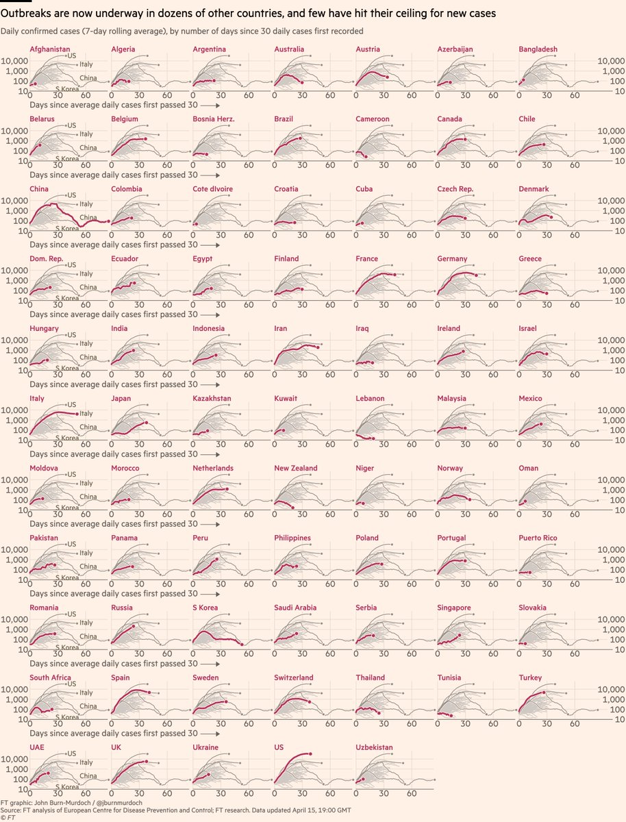
Now daily new cases:
• Feels increasingly safe to say daily confirmed infections in US have peaked
• UK is testing less, so less sure
• New cases falling in four countries that acted early: New Zealand, Australia, Norway, Australia
All charts: ft.com/coronavirus-la…
• Feels increasingly safe to say daily confirmed infections in US have peaked
• UK is testing less, so less sure
• New cases falling in four countries that acted early: New Zealand, Australia, Norway, Australia
All charts: ft.com/coronavirus-la…
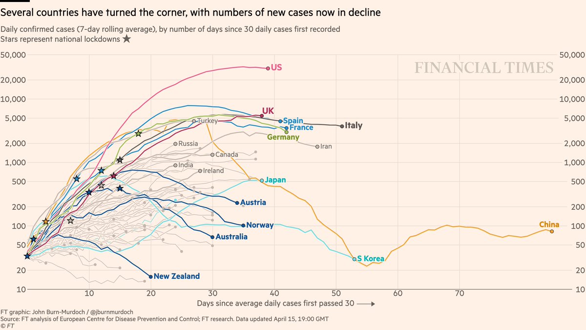
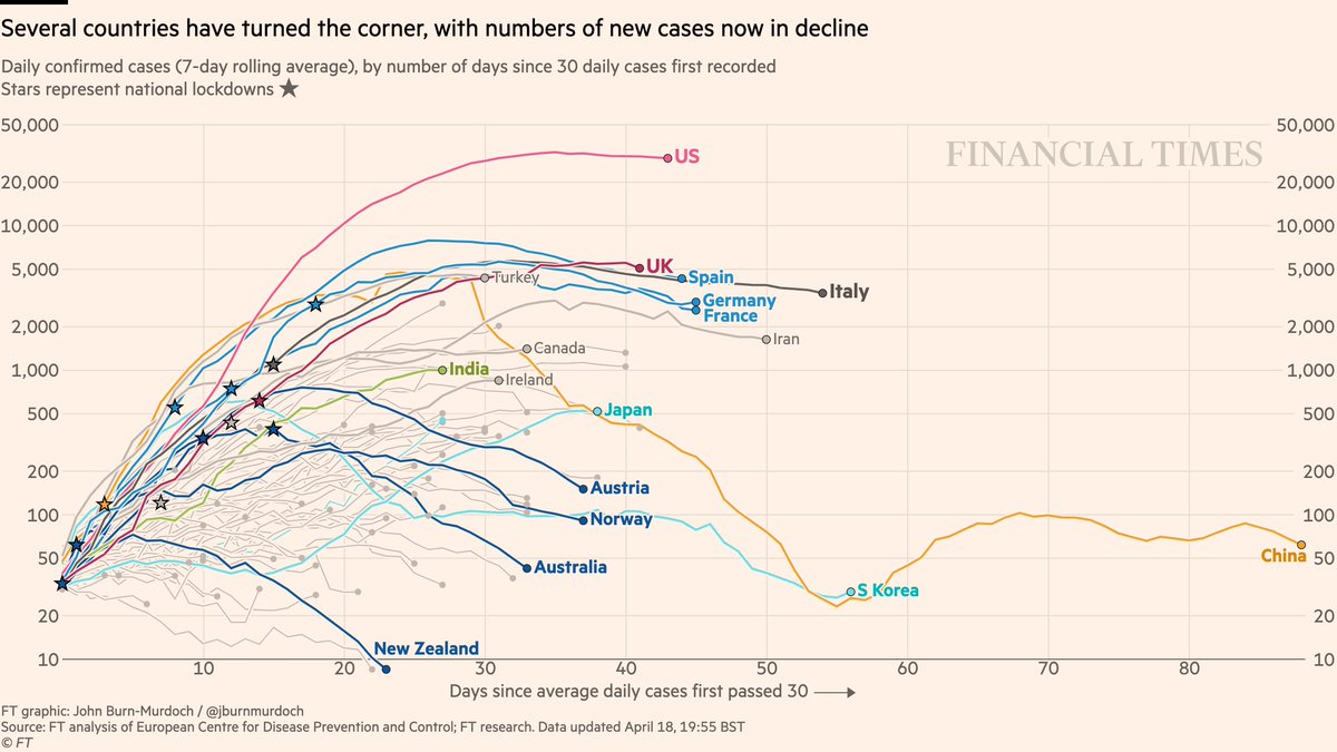
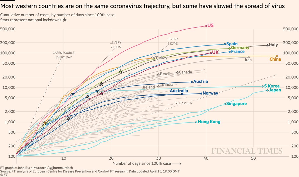
Cases in cumulative form:
• US curve beginning to taper
• Turkey still battling a severe outbreak
• Curves flattened early in Austria, Australia, Norway
• Japan could soon pass Korea
All charts: ft.com/coronavirus-la…
• US curve beginning to taper
• Turkey still battling a severe outbreak
• Curves flattened early in Austria, Australia, Norway
• Japan could soon pass Korea
All charts: ft.com/coronavirus-la…
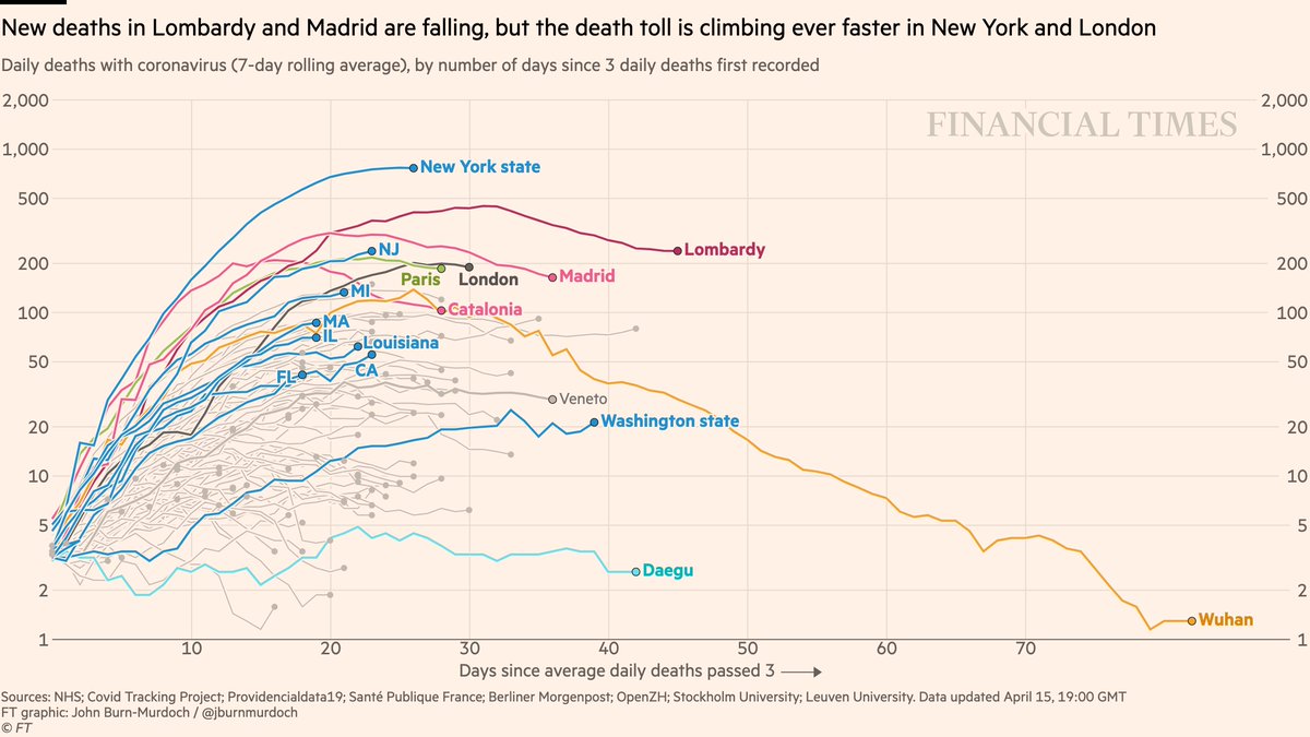
Now subnational region daily deaths:
• NY daily deaths may be peaking (notwithstanding change to their methodology)
• London too may be around peak deaths
• NY may be peaking, but daily deaths still trending up in many US states
All charts: ft.com/coronavirus-la…
• NY daily deaths may be peaking (notwithstanding change to their methodology)
• London too may be around peak deaths
• NY may be peaking, but daily deaths still trending up in many US states
All charts: ft.com/coronavirus-la…
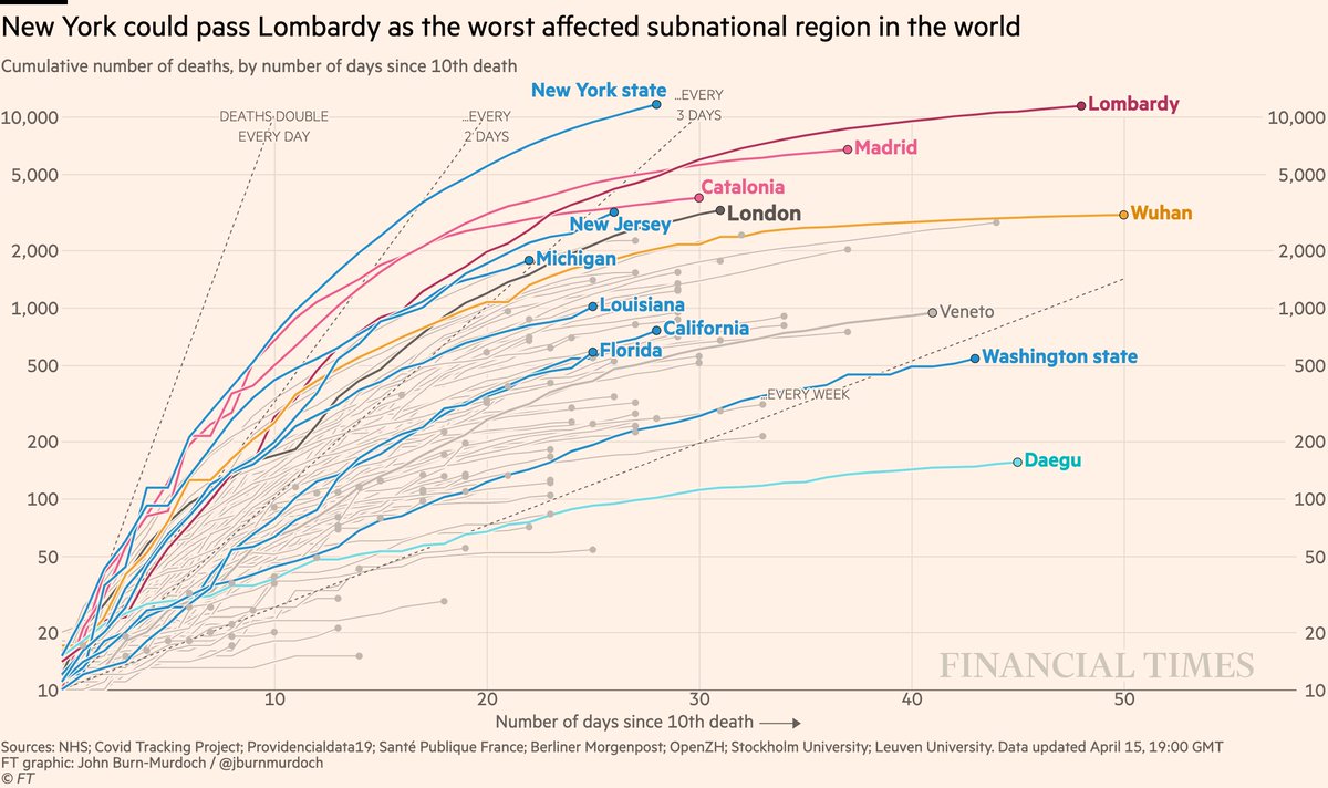
Subnational death tolls cumulatively:
• NY curve is tapering, but it has now passed Lombardy to have world’s highest subnational death toll
• New Jersey and London still sloping upwards, likely to pass Catalonian death toll
All charts: ft.com/coronavirus-la…
• NY curve is tapering, but it has now passed Lombardy to have world’s highest subnational death toll
• New Jersey and London still sloping upwards, likely to pass Catalonian death toll
All charts: ft.com/coronavirus-la…
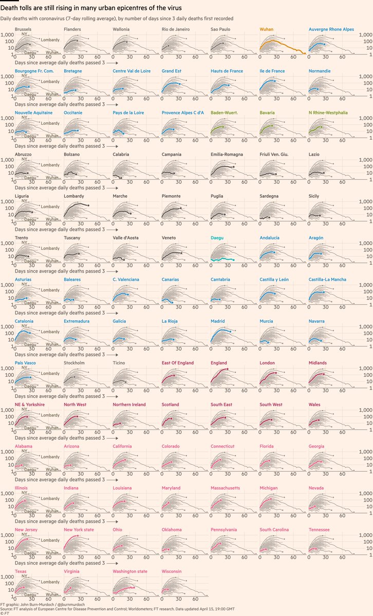
Small multiples of daily deaths in 95 subnational regions, grouped by country
• Rio de Janeiro added
• 25 US states, steepest curves include CT, IL, MD, MA, PA
• Sicily, Sardinia, Balearics, Canaries all low curves: do islands fare better?
All charts: ft.com/coronavirus-la…
• Rio de Janeiro added
• 25 US states, steepest curves include CT, IL, MD, MA, PA
• Sicily, Sardinia, Balearics, Canaries all low curves: do islands fare better?
All charts: ft.com/coronavirus-la…
Small multiples for daily new deaths in 54 countries:
• Norway locked down while Sweden didn’t; Norway’s daily death toll rising much more slowly than Sweden’s
• Australia faring well so far
• In Europe, Austria & Denmark faring well
All charts: ft.com/coronavirus-la…
• Norway locked down while Sweden didn’t; Norway’s daily death toll rising much more slowly than Sweden’s
• Australia faring well so far
• In Europe, Austria & Denmark faring well
All charts: ft.com/coronavirus-la…
Small multiples for daily cases in 75 countries:
• Bangladesh added, rising steeply
• Early action in Australia & New Zealand may have turned corner early 🇦🇺🇳🇿📉
• Austria & Norway locked down early & new cases falling
Live versions of all charts: ft.com/coronavirus-la…
• Bangladesh added, rising steeply
• Early action in Australia & New Zealand may have turned corner early 🇦🇺🇳🇿📉
• Austria & Norway locked down early & new cases falling
Live versions of all charts: ft.com/coronavirus-la…
New narratives emerging today:
1) Many Western countries hitting their peaks
Doesn’t mean "mission accomplished", does mean things are working. What it means for lockdowns remains to be seen.
Focus here will switch to excess all-cause mortality, underreporting of covid deaths.
1) Many Western countries hitting their peaks
Doesn’t mean "mission accomplished", does mean things are working. What it means for lockdowns remains to be seen.
Focus here will switch to excess all-cause mortality, underreporting of covid deaths.
2) Globally, focus shifts to developing world, two narratives:
• What looked like flat curves steepen, as testing expands from anaemic rates (👀 Indonesia)
• The story in coming weeks will be accelerating outbreaks in these parts of the world, as we start getting better data
• What looked like flat curves steepen, as testing expands from anaemic rates (👀 Indonesia)
• The story in coming weeks will be accelerating outbreaks in these parts of the world, as we start getting better data

As a result, my call-out tonight is this:
If you can point me to data on all-cause mortality (total numbers of deaths from all causes) in your country
**by week, up to and including last few weeks**
that would be incredibly useful.
Reply here or email coronavirus-data@ft.com
If you can point me to data on all-cause mortality (total numbers of deaths from all causes) in your country
**by week, up to and including last few weeks**
that would be incredibly useful.
Reply here or email coronavirus-data@ft.com
Things to watch for:
As @NateSilver538 points out, you can be more confident a peak has been reached/passed by looking at test results. If the positive share is falling, that suggests it’s a bona-fide peak, not just a drop in testing
This is true in NY:
As @NateSilver538 points out, you can be more confident a peak has been reached/passed by looking at test results. If the positive share is falling, that suggests it’s a bona-fide peak, not just a drop in testing
This is true in NY:
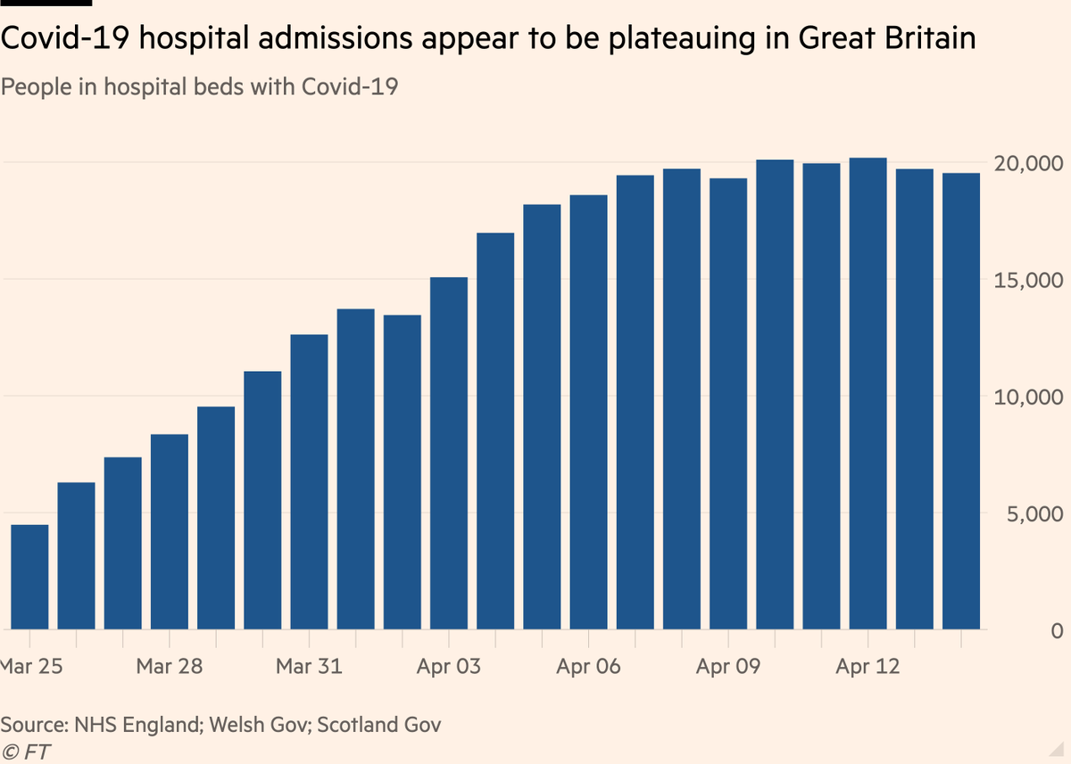
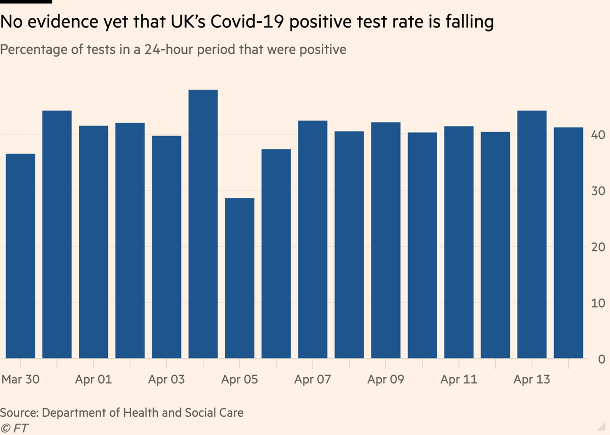
The picture in the UK is less clear:
• Covid-19 hospital admissions here appear to be plateauing (good sign), but...
• No sign that positive share of test results is falling. This suggests peak in cases may be due as much to insufficient testing as fewer infections
• Covid-19 hospital admissions here appear to be plateauing (good sign), but...
• No sign that positive share of test results is falling. This suggests peak in cases may be due as much to insufficient testing as fewer infections
Back to the main charts:
Things to note:
• Daily covid data is extremely noisy and implies false precision
• This is why we use a rolling average. Watch for general trends. Focus on slopes, not specific daily numbers
• Read this thread for more on this
Things to note:
• Daily covid data is extremely noisy and implies false precision
• This is why we use a rolling average. Watch for general trends. Focus on slopes, not specific daily numbers
• Read this thread for more on this
Here’s a video where I explain why we’re using log scales, showing absolute numbers instead of per capita, and much more:
And a chart showing why we're using absolute numbers rather than population-adjusted rates:
Please email coronavirus-data@ft.com with feedback, requests & subnational data.
All of these are invaluable, and we incorporate your suggestions and data every day.
We’ll keep getting back to as many people as possible.
Have a good night, folks :-)
All of these are invaluable, and we incorporate your suggestions and data every day.
We’ll keep getting back to as many people as possible.
Have a good night, folks :-)