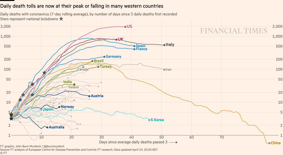
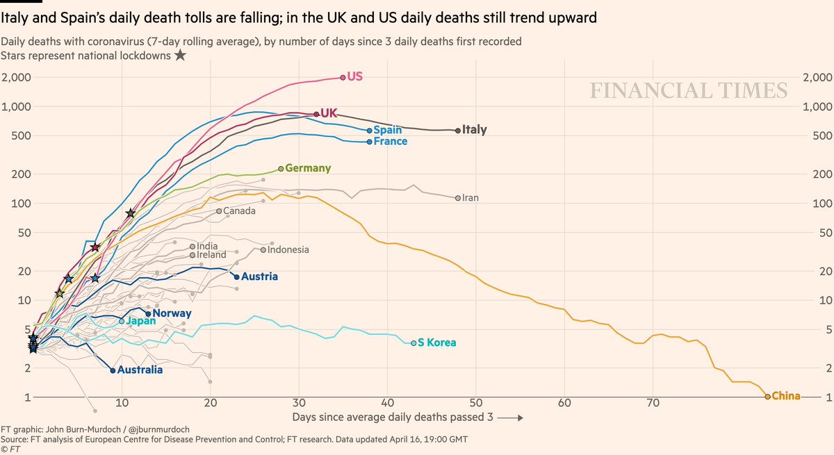
NEW: Thu 16 April update of coronavirus trajectories
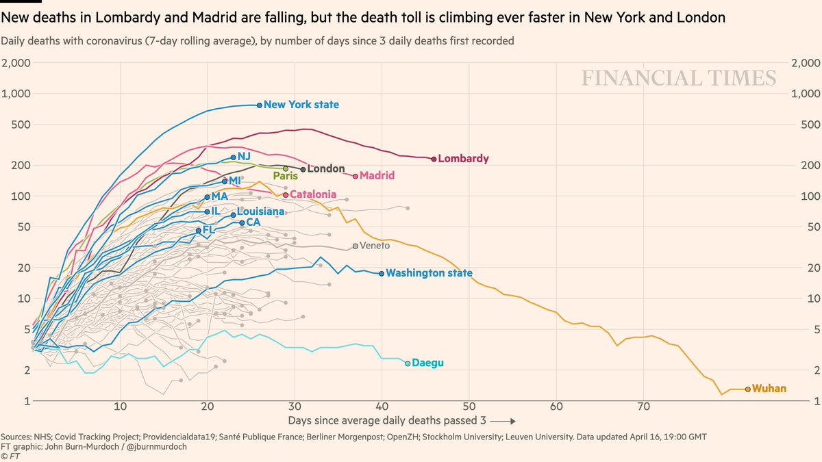
Daily deaths:
• US & UK may be peaking, though recent days show it’s still too early to say
• Successes in dark blue: Australia, Norway, Austria locked down early => gentle slopes
Live charts: ft.com/coronavirus-la…
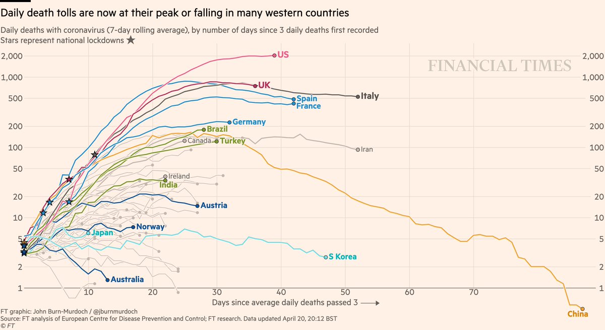
Daily deaths:
• US & UK may be peaking, though recent days show it’s still too early to say
• Successes in dark blue: Australia, Norway, Austria locked down early => gentle slopes
Live charts: ft.com/coronavirus-la…
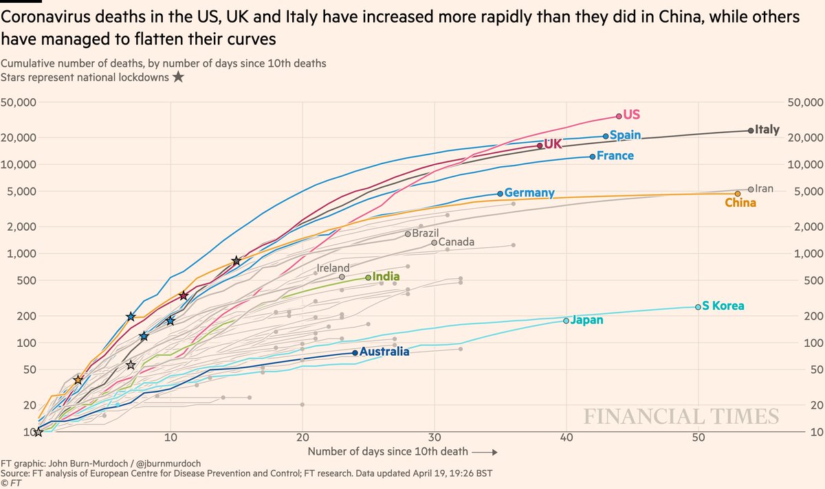
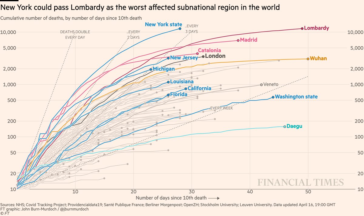
Now cumulative deaths:
• US death now highest worldwide and still rising fast 📈
• UK curve still matching Italy’s
• Australia still looks promising
All charts: ft.com/coronavirus-la…
• US death now highest worldwide and still rising fast 📈
• UK curve still matching Italy’s
• Australia still looks promising
All charts: ft.com/coronavirus-la…
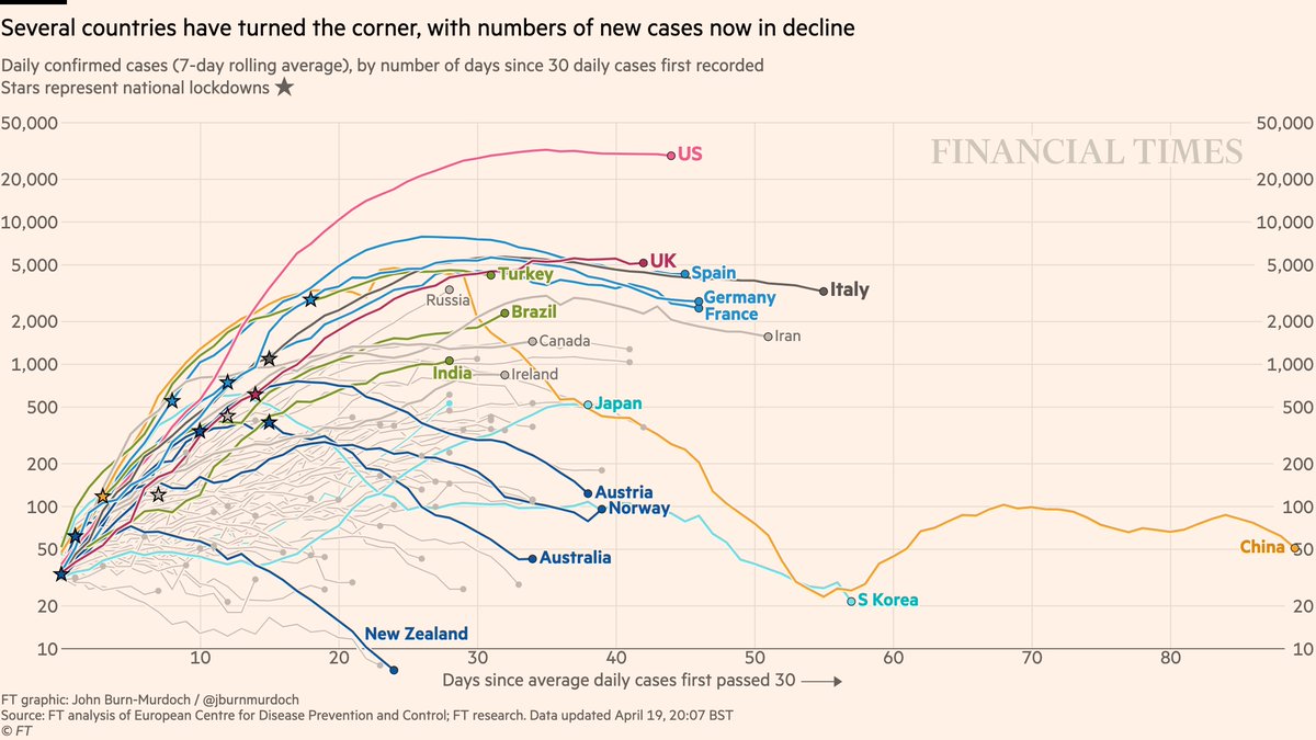
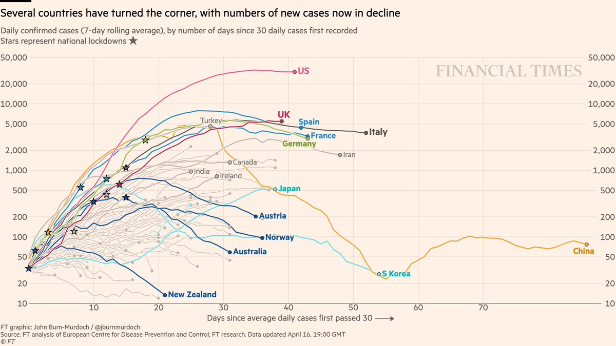
Now daily new cases:
• Feels increasingly safe to say daily confirmed infections in US have peaked
• UK is testing less, so less sure
• New cases falling in four countries that acted early: New Zealand, Australia, Norway, Austria
All charts: ft.com/coronavirus-la…
• Feels increasingly safe to say daily confirmed infections in US have peaked
• UK is testing less, so less sure
• New cases falling in four countries that acted early: New Zealand, Australia, Norway, Austria
All charts: ft.com/coronavirus-la…
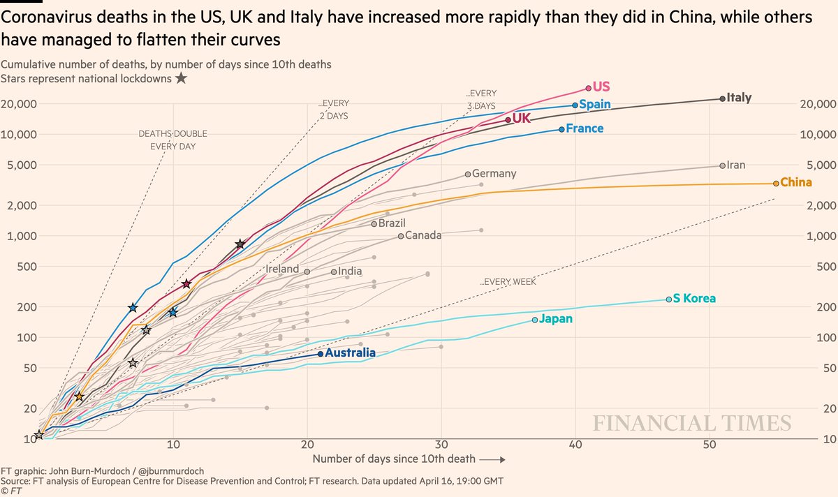
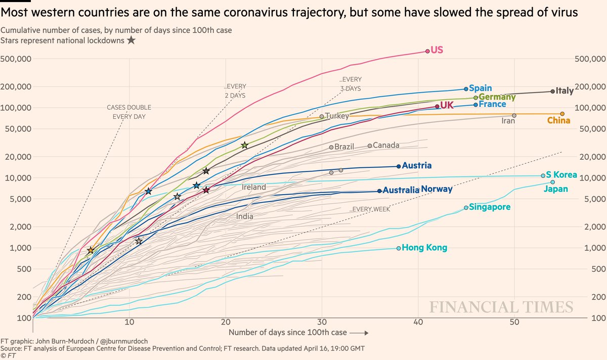
Cases in cumulative form:
• US curve beginning to taper?
• Turkey still battling a severe outbreak
• Curves flattened early in Austria, Australia, Norway
• Japan could soon pass Korea
All charts: ft.com/coronavirus-la…
• US curve beginning to taper?
• Turkey still battling a severe outbreak
• Curves flattened early in Austria, Australia, Norway
• Japan could soon pass Korea
All charts: ft.com/coronavirus-la…
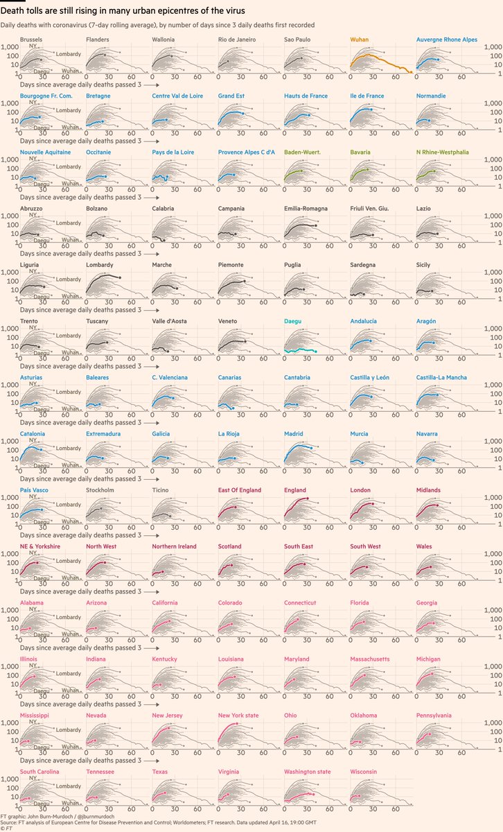
Subnational region daily deaths:
• NY daily deaths may be peaking (we’re excluding nursing homes here for comparability)
• London too may be around peak deaths
• Daily deaths still trending up in many US states
All charts: ft.com/coronavirus-la…
• NY daily deaths may be peaking (we’re excluding nursing homes here for comparability)
• London too may be around peak deaths
• Daily deaths still trending up in many US states
All charts: ft.com/coronavirus-la…
Subnational death tolls cumulatively:
• NY curve is tapering, but has now passed Lombardy for world’s highest subnational death toll
• New Jersey and London still sloping upwards, likely to pass Catalonian hospital death toll
All charts: ft.com/coronavirus-la…
• NY curve is tapering, but has now passed Lombardy for world’s highest subnational death toll
• New Jersey and London still sloping upwards, likely to pass Catalonian hospital death toll
All charts: ft.com/coronavirus-la…
Small multiples of daily deaths in 97 subnational regions, grouped by country
• 27 US states, steepest curves include CT, IL, MD, MA, PA
• Sicily, Sardinia, Balearics, Canaries all low curves: do islands fare better?
All charts: ft.com/coronavirus-la…
• 27 US states, steepest curves include CT, IL, MD, MA, PA
• Sicily, Sardinia, Balearics, Canaries all low curves: do islands fare better?
All charts: ft.com/coronavirus-la…
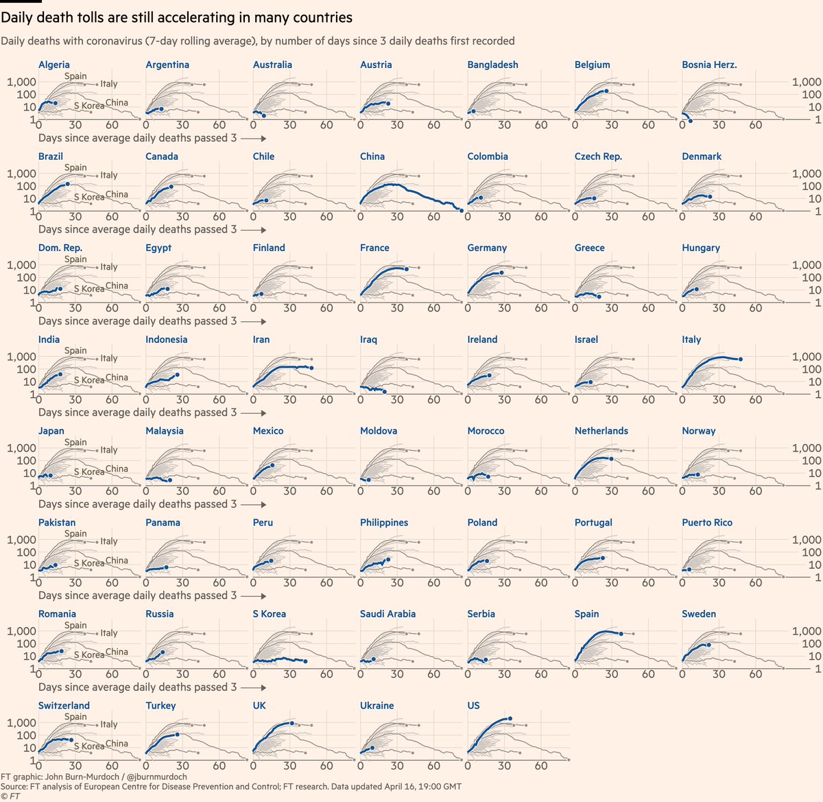
Small multiples for daily new deaths in 54 countries:
• Norway locked down while Sweden didn’t; Norway’s daily death toll rising much more slowly than Sweden’s
• Australia faring well so far
• In Europe, Austria & Denmark faring well
All charts: ft.com/coronavirus-la…
• Norway locked down while Sweden didn’t; Norway’s daily death toll rising much more slowly than Sweden’s
• Australia faring well so far
• In Europe, Austria & Denmark faring well
All charts: ft.com/coronavirus-la…
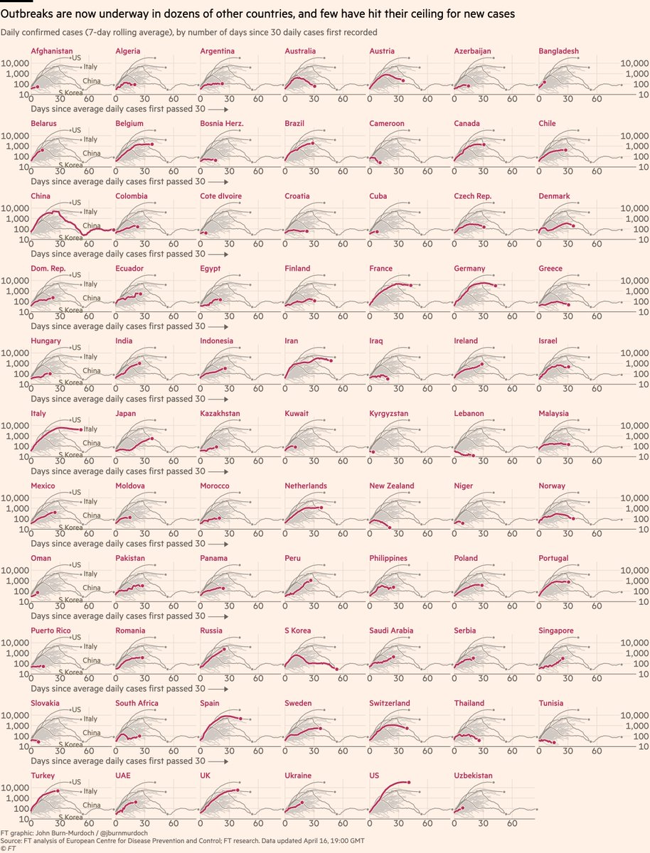
Small multiples for daily cases in 76 countries:
• Bangladesh sill rising steeply
• Early action in Australia & New Zealand may have turned corner 🇦🇺🇳🇿📉
• Austria & Norway locked down early & new cases falling
Live versions of all charts: ft.com/coronavirus-la…
• Bangladesh sill rising steeply
• Early action in Australia & New Zealand may have turned corner 🇦🇺🇳🇿📉
• Austria & Norway locked down early & new cases falling
Live versions of all charts: ft.com/coronavirus-la…
I talk a lot about whether or not peaks have been reached.
A good metric for this is hospitalisations:
• More reliable than confirmed cases (not influenced by testing regimes)
• Shorter lag than deaths
So here are some charts showing hospitalisations in various countries:
A good metric for this is hospitalisations:
• More reliable than confirmed cases (not influenced by testing regimes)
• Shorter lag than deaths
So here are some charts showing hospitalisations in various countries:
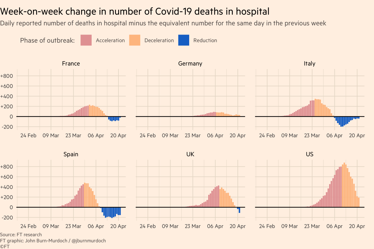
First, Italy:
Colour = phase of outbreak
• Red: more new hospitalisations every day than day before
• Orange: total hospitalisations rising, but rate of increase slowing
• Blue: fewer people in hospital than before 👍
Almost all Italian regions now in "reduction" phase :-)
Colour = phase of outbreak
• Red: more new hospitalisations every day than day before
• Orange: total hospitalisations rising, but rate of increase slowing
• Blue: fewer people in hospital than before 👍
Almost all Italian regions now in "reduction" phase :-)

Next, Spain:
• Madrid now firmly in the "reduction" phase
• But in most other regions, although the rate of increase has slowed, each day still brings more new hospitalisations than discharges
• Madrid now firmly in the "reduction" phase
• But in most other regions, although the rate of increase has slowed, each day still brings more new hospitalisations than discharges

France:
• Rate of increase in hospitalisations dropping across the board, but most regions yet to see total occupancy fall
• Rate of increase in hospitalisations dropping across the board, but most regions yet to see total occupancy fall

US:
• Hospitalisation data is patchy from state to state
• NY and Louisiana both entering the "reduction" phase, hospital bed occupancy dropping 👍
• Rate of acceleration falling in New Jersey, but overall numbers still rising
• Hospitalisation data is patchy from state to state
• NY and Louisiana both entering the "reduction" phase, hospital bed occupancy dropping 👍
• Rate of acceleration falling in New Jersey, but overall numbers still rising

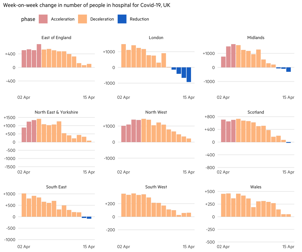
UK:
• London’s hospitals now have fewer covid patients with each day 👍
• Rate of increase slowing elsewhere across UK
• Suggests UK may be at or near peak for new infections
• London’s hospitals now have fewer covid patients with each day 👍
• Rate of increase slowing elsewhere across UK
• Suggests UK may be at or near peak for new infections
Wrapping up: our focus has now shifted to tracking excess all-cause mortality (numbers of people dying for any reason at all) as we think this avoids pitfalls of different countries’ covid-death reporting methodologies.
So my call-out tonight is this:
So my call-out tonight is this:
If you can point me to data on all-cause mortality (total numbers of deaths from all causes) in your country, by week, up to and including the last few weeks, that would be incredibly useful.
Reply here or email coronavirus-data@ft.com
Reply here or email coronavirus-data@ft.com
Final bits:
Here’s a video where I explain why we’re using log scales, showing absolute numbers instead of per capita, and much more:
Here’s a video where I explain why we’re using log scales, showing absolute numbers instead of per capita, and much more:
And a chart showing why we're using absolute numbers rather than population-adjusted rates:
Please email coronavirus-data@ft.com with feedback, requests & subnational data.
All of these are invaluable, and we incorporate your suggestions and data every day.
We’ll keep getting back to as many people as possible.
Have a good night, folks :-)
All of these are invaluable, and we incorporate your suggestions and data every day.
We’ll keep getting back to as many people as possible.
Have a good night, folks :-)