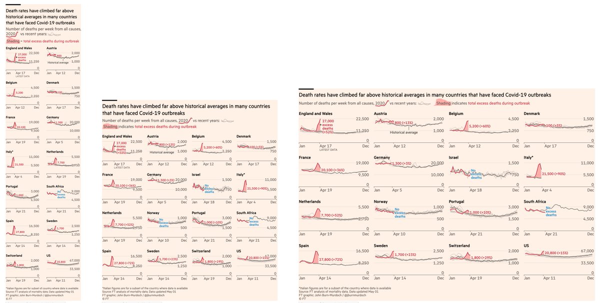
NEW: Fri 1 May update to our excess mortality tracker, adding new countries and updating all locations
• 153k more deaths than usual across the 21 countries we‘re tracking
• 58k above reported Covid deaths at the time (+60%)
All charts free to read at ft.com/coronavirus-la…
• 153k more deaths than usual across the 21 countries we‘re tracking
• 58k above reported Covid deaths at the time (+60%)
All charts free to read at ft.com/coronavirus-la…
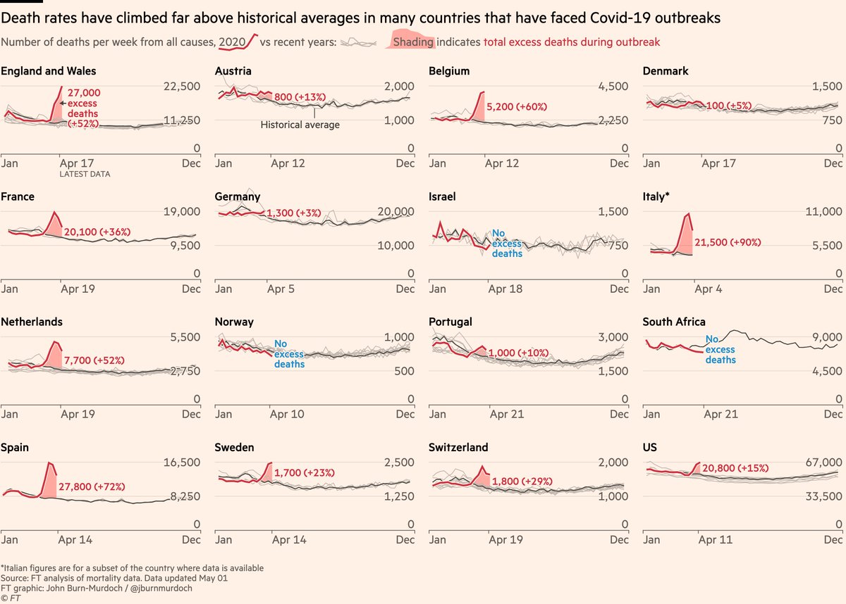
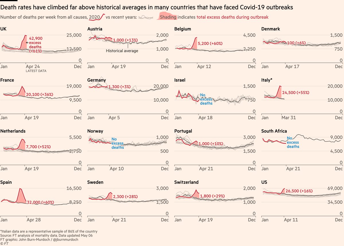
Lots of our new additions have few or zero excess deaths.
• Germany only showing a very slight excess, though its data lags by almost a month ⚠️
• Israel, Norway, South Africa and Iceland all show no excess
• Meanwhile US excess rises 📈
All charts: ft.com/coronavirus-la…
• Germany only showing a very slight excess, though its data lags by almost a month ⚠️
• Israel, Norway, South Africa and Iceland all show no excess
• Meanwhile US excess rises 📈
All charts: ft.com/coronavirus-la…

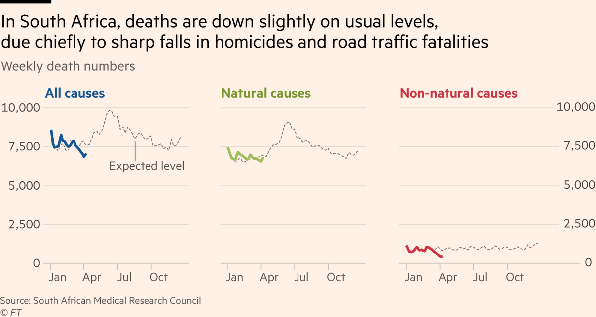
More detail on South Africa:
Earlier this week @davidpilling & I looked at how its deaths are *down* on usual levels ft.com/content/e9cf5e…
It’s a case of the upside of lockdown:
• Deaths from natural causes unchanged
• But deaths from homicides & road accidents down sharply
Earlier this week @davidpilling & I looked at how its deaths are *down* on usual levels ft.com/content/e9cf5e…
It’s a case of the upside of lockdown:
• Deaths from natural causes unchanged
• But deaths from homicides & road accidents down sharply
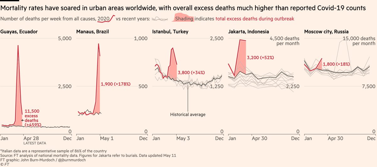
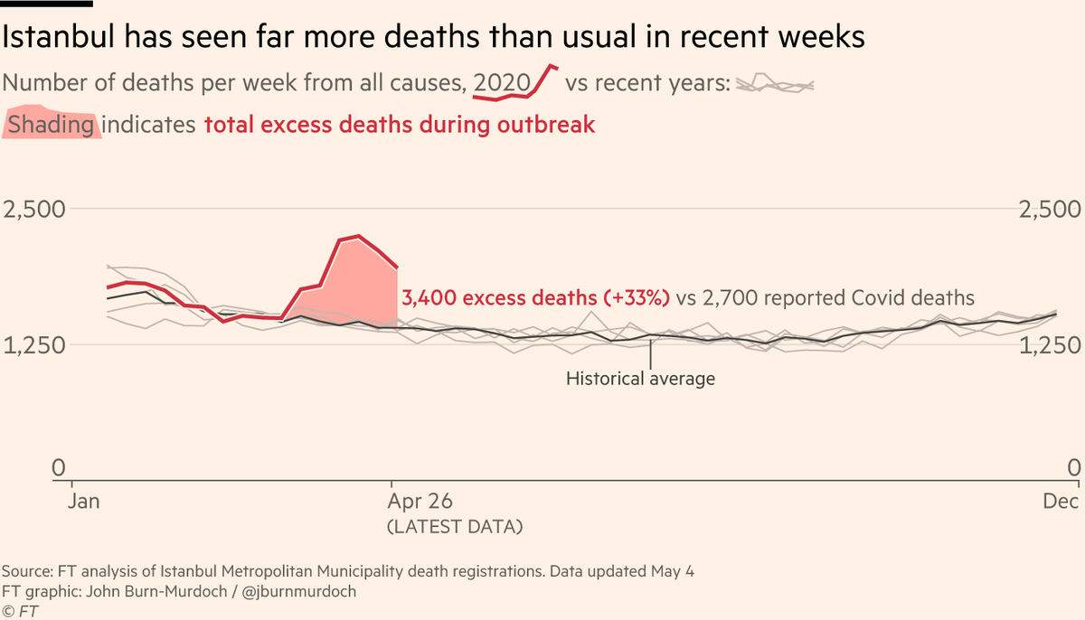
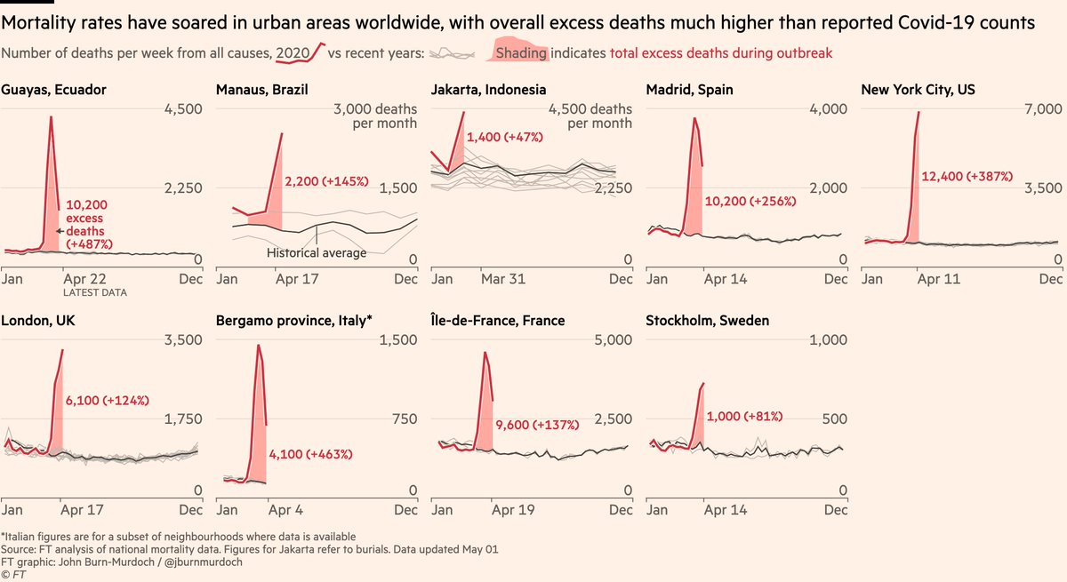
Now cities and regions:
Revisions to death numbers keep sending excess mortality in Guayas and Manaus higher, and there are reports that some people are unable to register deaths in these places due to the volume of fatalities
All charts: ft.com/coronavirus-la…
Revisions to death numbers keep sending excess mortality in Guayas and Manaus higher, and there are reports that some people are unable to register deaths in these places due to the volume of fatalities
All charts: ft.com/coronavirus-la…
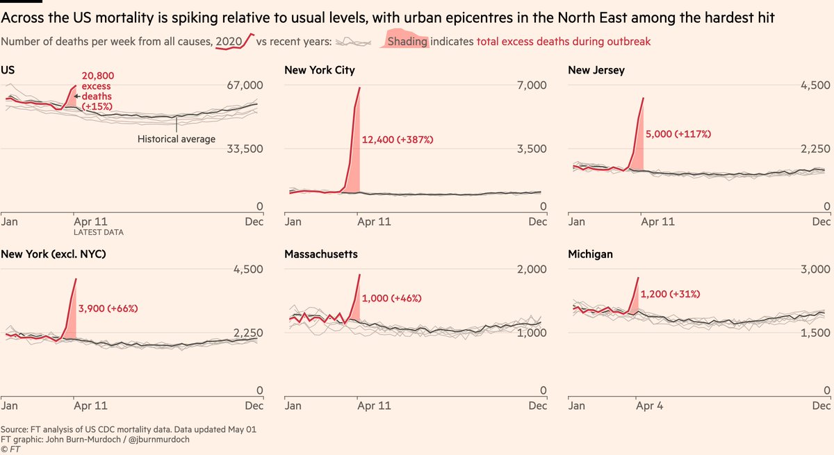
New deaths also filtering through for our US data. These deaths took place in the weeks we were already showing, but hadn’t yet been processed.
The result is US excess mort is up from +12% to +15%, and will rise as data keeps coming through.
All charts: ft.com/coronavirus-la…
The result is US excess mort is up from +12% to +15%, and will rise as data keeps coming through.
All charts: ft.com/coronavirus-la…
Please email us at
coronavirus-data@ft.com
if you can point us to data for any other countries or cities on all-cause mortality (total numbers of deaths from all causes), preferably broken down by week or day, and running right up to and including recent weeks 🙏
coronavirus-data@ft.com
if you can point us to data for any other countries or cities on all-cause mortality (total numbers of deaths from all causes), preferably broken down by week or day, and running right up to and including recent weeks 🙏
We’re enormously grateful to those of you who have already done this. None of this work would be possible without you.
We added new countries today thanks to you, and we’ll be adding more of the data you sent in the coming days.
We added new countries today thanks to you, and we’ll be adding more of the data you sent in the coming days.
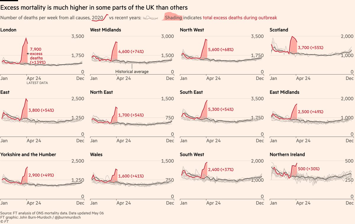
Final notes:
• Even when using official mortality data like this, there is a lag in reporting, meaning more deaths can be retrospectively assigned to past dates
• This means our excess mort numbers may rise *for the weeks we’re already showing here* as well as over future weeks
• Even when using official mortality data like this, there is a lag in reporting, meaning more deaths can be retrospectively assigned to past dates
• This means our excess mort numbers may rise *for the weeks we’re already showing here* as well as over future weeks
And now a little design note:
We continued with the "narrative legend" concept today, adding the shaded area symbology into the chart subtitle.
The idea is to cut down on the number of labels and annotations we have to add to the mini-charts themselves.
What do you think?
We continued with the "narrative legend" concept today, adding the shaded area symbology into the chart subtitle.
The idea is to cut down on the number of labels and annotations we have to add to the mini-charts themselves.
What do you think?

Oh, and for those who often ask:
These charts all made using the d3.js Javascript library.
They’re rendered directly into a browser window (mobile, desktop and XL versions simultaneously), and exported as PNGs with a single click.
No paid software required 🤓🙂
These charts all made using the d3.js Javascript library.
They’re rendered directly into a browser window (mobile, desktop and XL versions simultaneously), and exported as PNGs with a single click.
No paid software required 🤓🙂