My Authors
Read all threads
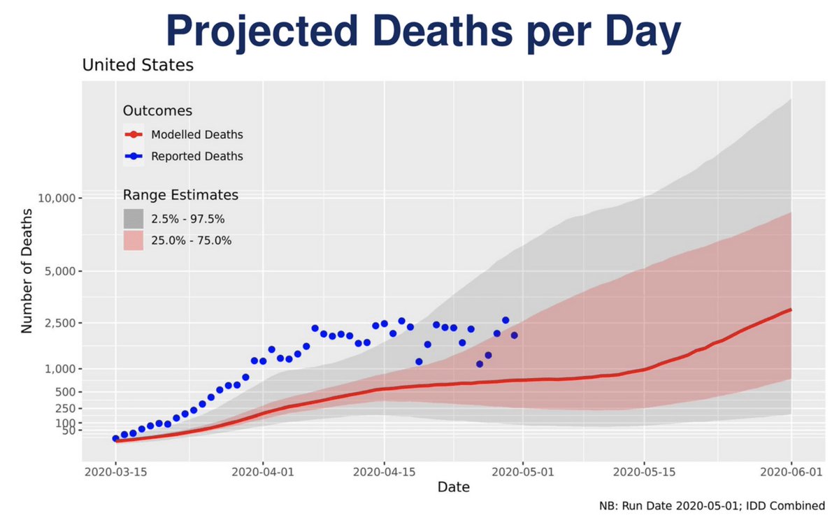
Bleak thought in here: under optimal conditions we are at a peak and deaths will fall as fast as they’ve risen. That means a best case scenario implies 60,000 additional deaths. And there are many reasons to suspect we are not in a best case scenario.
Since people are *still* comparing this to the flu, I made this chart to show what it looks like when you measure flu and COVID deaths in an apples-to-apples fashion. washingtonpost.com/business/2020/…
I'm indebted to @jeremyfaust on this, who pinpointed these figures in an excellent SciAm piece last week. blogs.scientificamerican.com/observations/c…
Missing some Tweet in this thread? You can try to force a refresh.

Enjoying this thread?

Keep Current with Christopher Ingraham

Profile picture

Stay in touch and get notified when new unrolls are available from this author!

Read all threads

This Thread may be Removed Anytime!

Twitter may remove this content at anytime, convert it as a PDF, save and print for later use!

Try unrolling a thread yourself!

how to unroll video

1) Follow Thread Reader App on Twitter so you can easily mention us!

2) Go to a Twitter thread (series of Tweets by the same owner) and mention us with a keyword "unroll" @threadreaderapp unroll

You can practice here first or read more on our help page!

Follow Us on Twitter!

Did Thread Reader help you today?

Support us! We are indie developers!


This site is made by just two indie developers on a laptop doing marketing, support and development! Read more about the story.

Become a Premium Member ($3.00/month or $30.00/year) and get exclusive features!

Become Premium

Too expensive? Make a small donation by buying us coffee ($5) or help with server cost ($10)

Donate via Paypal Become our Patreon

Thank you for your support!