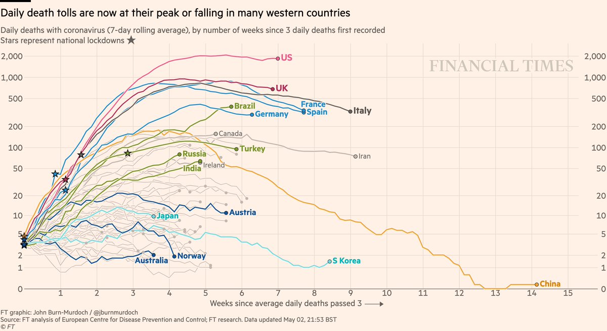
NEW: Sat 2 May update of coronavirus trajectories
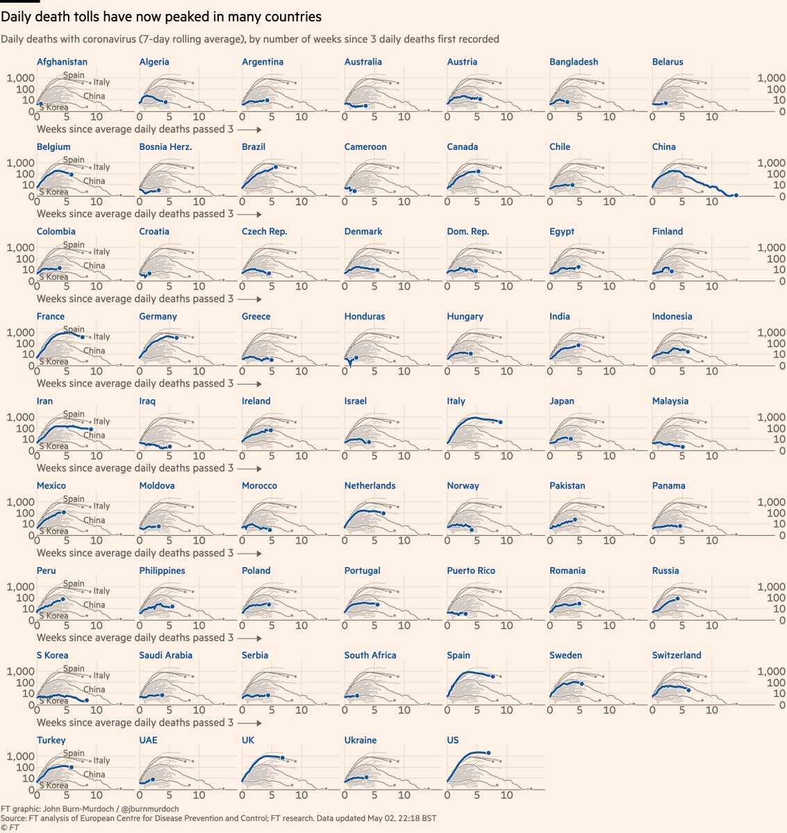
Daily deaths
• Brazil, Russia, India 📈
• UK falling 📉
• US may have peaked, but is now plateauing
• All descents slower than ascents
• Successes in dark blue: Australia, Norway, Austria
Live charts ft.com/coronavirus-la…
Daily deaths
• Brazil, Russia, India 📈
• UK falling 📉
• US may have peaked, but is now plateauing
• All descents slower than ascents
• Successes in dark blue: Australia, Norway, Austria
Live charts ft.com/coronavirus-la…

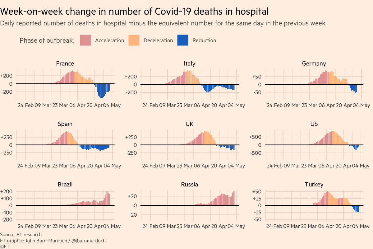
Why do I say UK & US daily deaths may have peaked?
Here’s week-on-week change in daily deaths.
This gets rid of weekly reporting patterns and asks, are more people dying than at same point last week?
In UK & US, blue bars = now seeing *fewer* deaths than same day last week.
Here’s week-on-week change in daily deaths.
This gets rid of weekly reporting patterns and asks, are more people dying than at same point last week?
In UK & US, blue bars = now seeing *fewer* deaths than same day last week.
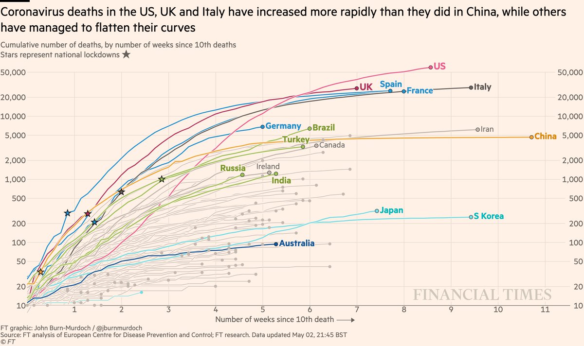
Now back to the international charts, and cumulative deaths:
• US past 60,000 and still sloping upwards
• Japan has passed S Korea
• UK, Spain, France, Italy converging
• Germany faring better than peers
• Australia still looks promising
All charts: ft.com/coronavirus-la…
• US past 60,000 and still sloping upwards
• Japan has passed S Korea
• UK, Spain, France, Italy converging
• Germany faring better than peers
• Australia still looks promising
All charts: ft.com/coronavirus-la…
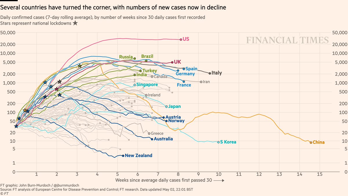
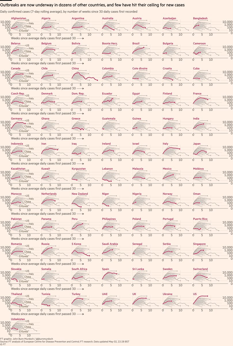
Daily new cases
• As with deaths, US may have peaked but no decline in sight. Same for UK.
• Brazil & Russia still accelerating
• New cases falling in countries that acted early: NZ, Aus, Norway, Austria
• Greek uptick was isolated incident
• Singapore battling its outbreak
• As with deaths, US may have peaked but no decline in sight. Same for UK.
• Brazil & Russia still accelerating
• New cases falling in countries that acted early: NZ, Aus, Norway, Austria
• Greek uptick was isolated incident
• Singapore battling its outbreak
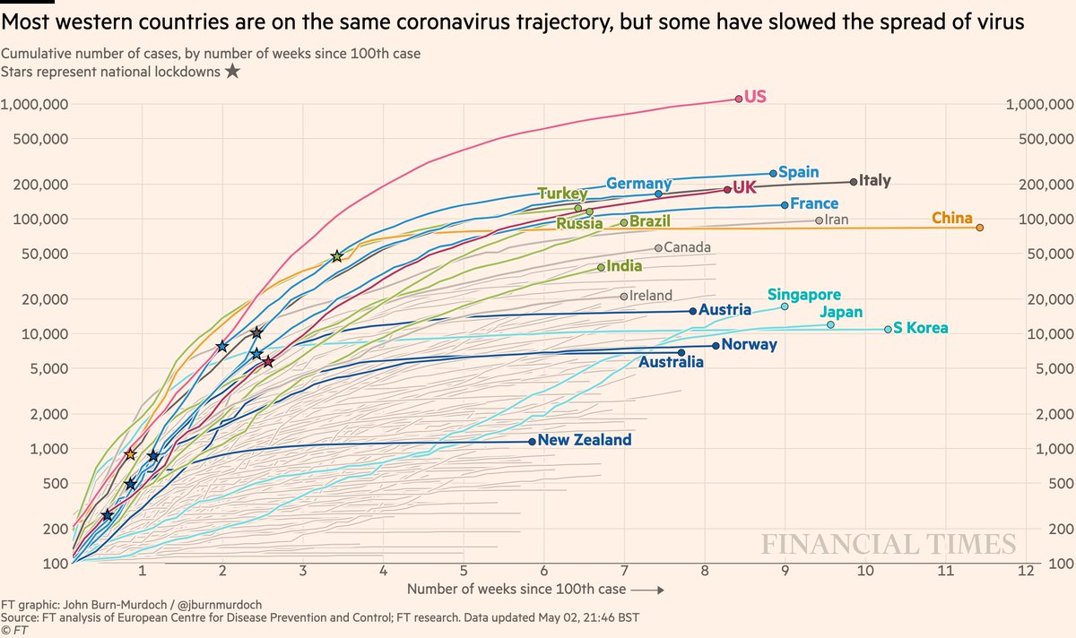
Cases in cumulative form:
• US curve still rising steadily
• Turkey, Russia & Brazil converging on Western European trajectories
• Japan has passed Korea’s total, Singapore has passed Japan’s curve: both show the danger of thinking a country has dealt with Covid
• US curve still rising steadily
• Turkey, Russia & Brazil converging on Western European trajectories
• Japan has passed Korea’s total, Singapore has passed Japan’s curve: both show the danger of thinking a country has dealt with Covid
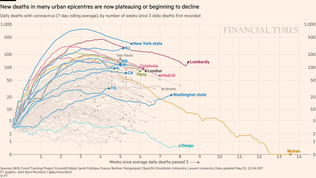
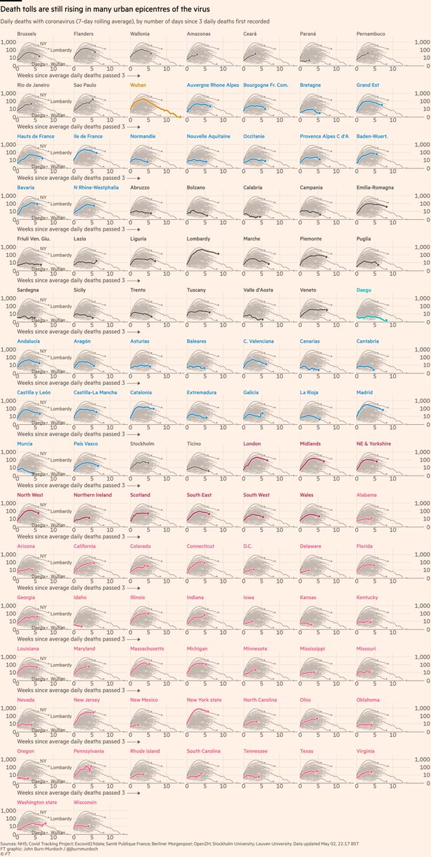
Subnational region daily deaths
• NY daily confirmed Covid deaths now descending steadily
• Daily London deaths have also peaked
• Most Western cities/regions now in plateau or decline phase
• But in Brazil, Sao Paulo still accelerating 📈
All charts: ft.com/coronavirus-la…
• NY daily confirmed Covid deaths now descending steadily
• Daily London deaths have also peaked
• Most Western cities/regions now in plateau or decline phase
• But in Brazil, Sao Paulo still accelerating 📈
All charts: ft.com/coronavirus-la…
Covid outbreaks better understood at regional level than national; here are >100 regions in 12 countries:
• Many Brazilian states look concerning, esp Sao Paulo 📈
• 36 US states now shown + DC
• Stockholm appears to have peaked
All charts: ft.com/coronavirus-la…
• Many Brazilian states look concerning, esp Sao Paulo 📈
• 36 US states now shown + DC
• Stockholm appears to have peaked
All charts: ft.com/coronavirus-la…
Small multiples for daily new deaths in countries:
• Again, Brazil looking bad 📈
• Norway locked down & Sweden didn’t; NOR daily death peaked much lower than SWE
• Australia faring well
• In Europe, Austria, Denmark, Norway faring well
All charts: ft.com/coronavirus-la…
• Again, Brazil looking bad 📈
• Norway locked down & Sweden didn’t; NOR daily death peaked much lower than SWE
• Australia faring well
• In Europe, Austria, Denmark, Norway faring well
All charts: ft.com/coronavirus-la…
New daily cases in >80 countries:
• Adding more African and other emerging-market countries every day
• Early action in Aus & NZ turned the corner quickly 🇦🇺🇳🇿📉
• Watch as countries begin to ease lockdowns 👀
All charts: ft.com/coronavirus-la…
• Adding more African and other emerging-market countries every day
• Early action in Aus & NZ turned the corner quickly 🇦🇺🇳🇿📉
• Watch as countries begin to ease lockdowns 👀
All charts: ft.com/coronavirus-la…
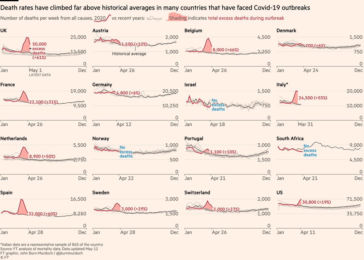
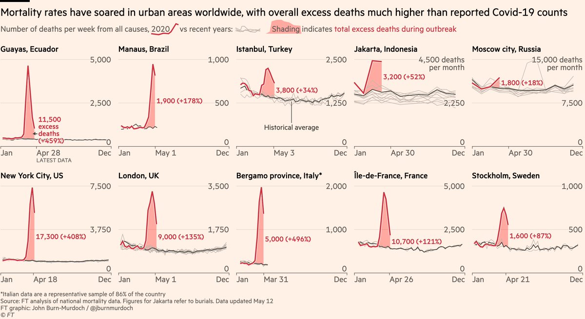
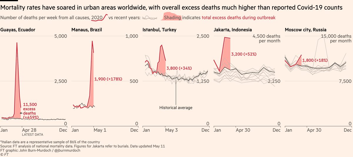
This set of charts remains good for tracking whether or not a country has reached its peak etc, but we’re now also tracking total excess mortality, which we feel is most robust measure of Covid death tolls:
I talk a lot about whether or not peaks have been reached.
A good metric for this is hospitalisations:
• More reliable than confirmed cases (not influenced by testing regimes)
• Shorter lag than deaths
So here are some charts showing hospitalisations in various countries:
A good metric for this is hospitalisations:
• More reliable than confirmed cases (not influenced by testing regimes)
• Shorter lag than deaths
So here are some charts showing hospitalisations in various countries:
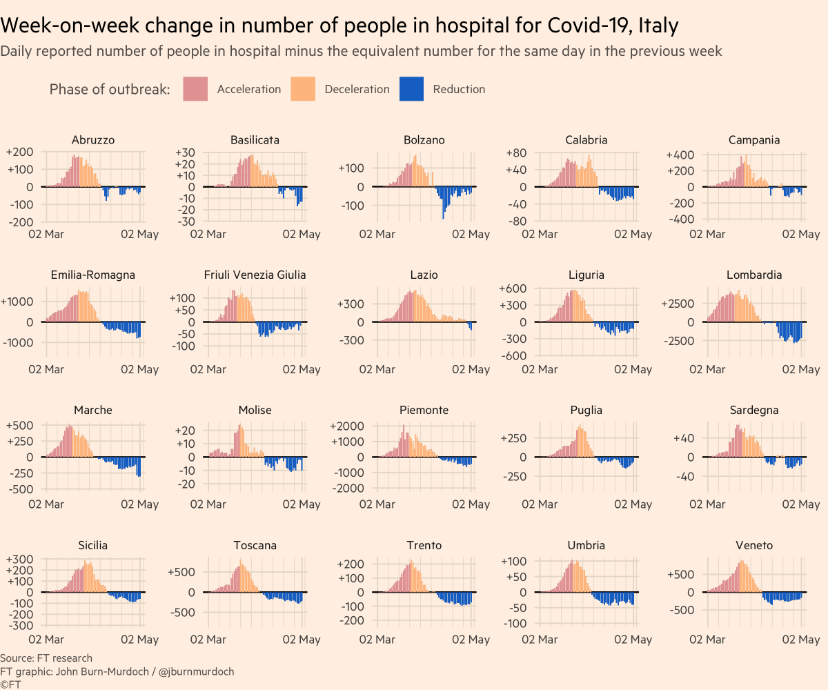
First, Italy:
Colour = phase of outbreak
• Red: more new hospitalisations every day than day before
• Orange: total hospitalisations rising, but rate of increase slowing
• Blue: fewer people in hospital than before
All Italian regions now in "reduction" phase :-)
Colour = phase of outbreak
• Red: more new hospitalisations every day than day before
• Orange: total hospitalisations rising, but rate of increase slowing
• Blue: fewer people in hospital than before
All Italian regions now in "reduction" phase :-)
France:
• All regions beginning to see total occupancy fall, including former epicentres Ile de France & Grand Est
• All regions beginning to see total occupancy fall, including former epicentres Ile de France & Grand Est

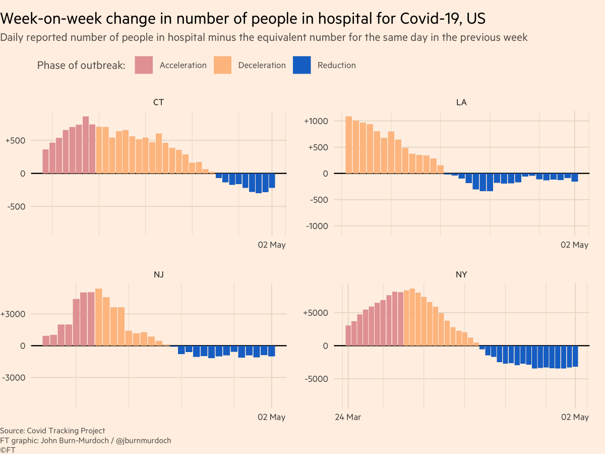
US:
• Hospitalisation data patchy from state to state, so only a selection shown
• New York state, New Jersey, Connecticut and Louisiana all in the "reduction" phase, hospital bed occupancy dropping
• Hospitalisation data patchy from state to state, so only a selection shown
• New York state, New Jersey, Connecticut and Louisiana all in the "reduction" phase, hospital bed occupancy dropping
UK:
• Hospitals across UK now have fewer Covid patients than same time last week
• Suggests we are at or near peak for new infections, though expansion of testing will shed more light, and care-homes are absent from this view
• Hospitals across UK now have fewer Covid patients than same time last week
• Suggests we are at or near peak for new infections, though expansion of testing will shed more light, and care-homes are absent from this view

UK again, but this time intensive care beds:
• Data show general declines in intensive care occupancy
• True across all UK countries
• Data show general declines in intensive care occupancy
• True across all UK countries

And now German intensive care beds:
• Steady decline here, too. More Covid patients leaving intensive care than entering
• Steady decline here, too. More Covid patients leaving intensive care than entering

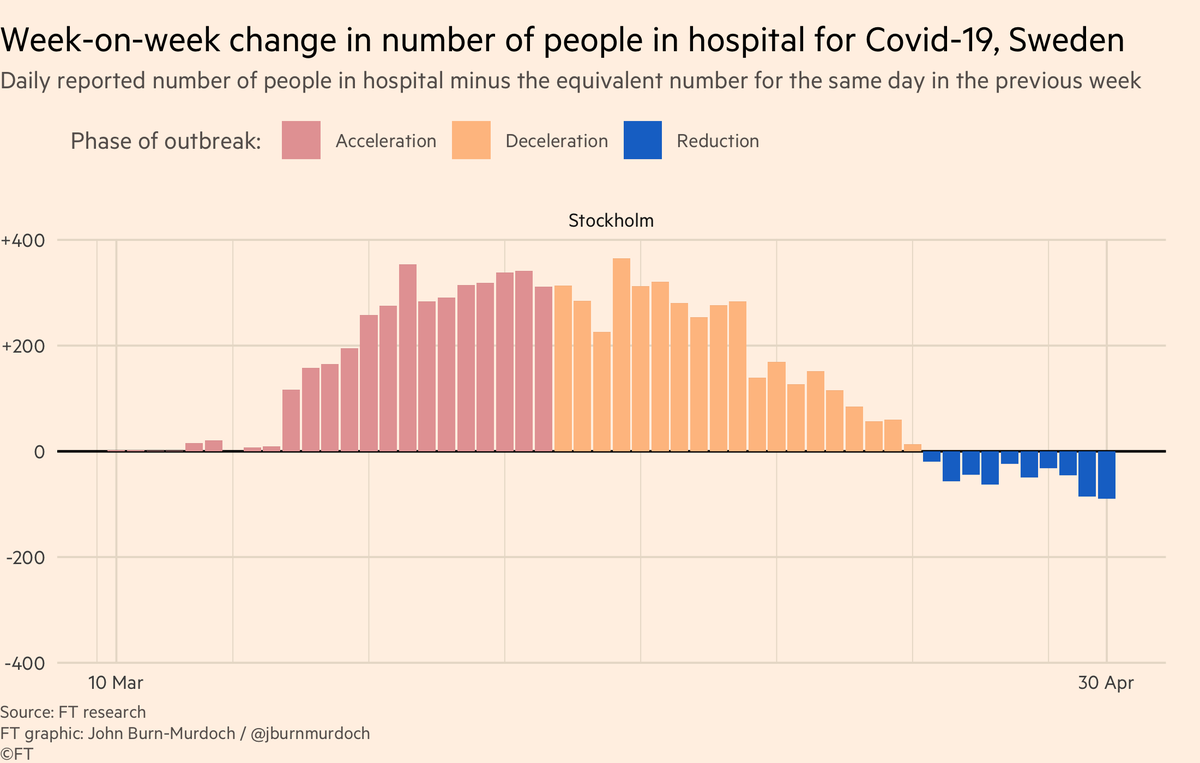
Stockholm:
• Sweden has not locked down like most places
• Data show Swedes moving around less than usual, but still plenty of socialising, closer to normal life than most countries
• But data show more people leaving hospital with Covid than entering 📉
• Sweden has not locked down like most places
• Data show Swedes moving around less than usual, but still plenty of socialising, closer to normal life than most countries
• But data show more people leaving hospital with Covid than entering 📉
Belgium:
• All regions now seeing falling hospital admissions 👍
• All regions now seeing falling hospital admissions 👍

Here’s a video where I explain why we’re using log scales, showing absolute numbers instead of per capita, and much more:
Finally, please email coronavirus-data@ft.com with feedback, requests & additional data.
All of these are invaluable, and we incorporate your suggestions and data every day.
We’ll keep getting back to as many people as possible.
Enjoy the rest of the weekend, folks :-)
All of these are invaluable, and we incorporate your suggestions and data every day.
We’ll keep getting back to as many people as possible.
Enjoy the rest of the weekend, folks :-)
And *finally* finally, a note on countries’ data:
• We’re using all-settings deaths for UK (they’ve discontinued the hospitals-only series 😒)
• Also using all-settings for France, Belgium
• But removed "probable but not confirmed" Covid deaths from Belgium for comparability
• We’re using all-settings deaths for UK (they’ve discontinued the hospitals-only series 😒)
• Also using all-settings for France, Belgium
• But removed "probable but not confirmed" Covid deaths from Belgium for comparability
As countries’ reporting methodologies continue to, well, go absolutely all over the place, I have two recommendations:
1) Focus on excess deaths. This uses a much clearer definition, and is the same in every country. A death is a death, wherever it occurs
1) Focus on excess deaths. This uses a much clearer definition, and is the same in every country. A death is a death, wherever it occurs
2) Whether looking at reported Covid deaths (trajectory charts) or excess deaths, it’s much more useful to compare countries *slopes* than their specific numbers of deaths.
Every country faces its own different circumstances, and key question is when a country flattens its curve
Every country faces its own different circumstances, and key question is when a country flattens its curve
One extra tidbit tonight:
Look at national & subnational daily deaths side-by-side.
NY daily deaths descending, but US plateau continues.
Why?
US is compound of multiple peaks like NY. As one state’s daily toll falls, another rises, keeping daily deaths high at national level
Look at national & subnational daily deaths side-by-side.
NY daily deaths descending, but US plateau continues.
Why?
US is compound of multiple peaks like NY. As one state’s daily toll falls, another rises, keeping daily deaths high at national level