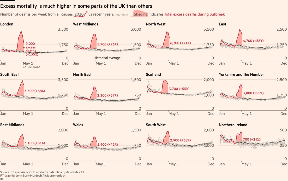
We’ve just launched an interactive version of our Covid trajectory tracker charts, where you can now highlight any country you like, and choose between log & linear scales and even ... per capita numbers 😱
ig.ft.com/coronavirus-ch…
Pick your own countries, scales & units, share that URL, and anyone clicking the link will get your exact chart & settings, letting you use these charts in conversations
e.g here’s Sweden vs Norway, per capita ig.ft.com/coronavirus-ch…
The second, masterminded by @davidcblood, tracks countries tightening & relaxing lockdowns.
This is a huge part of the story now, and you can watch as Europe begins easing restrictions
ig.ft.com/coronavirus-lo…
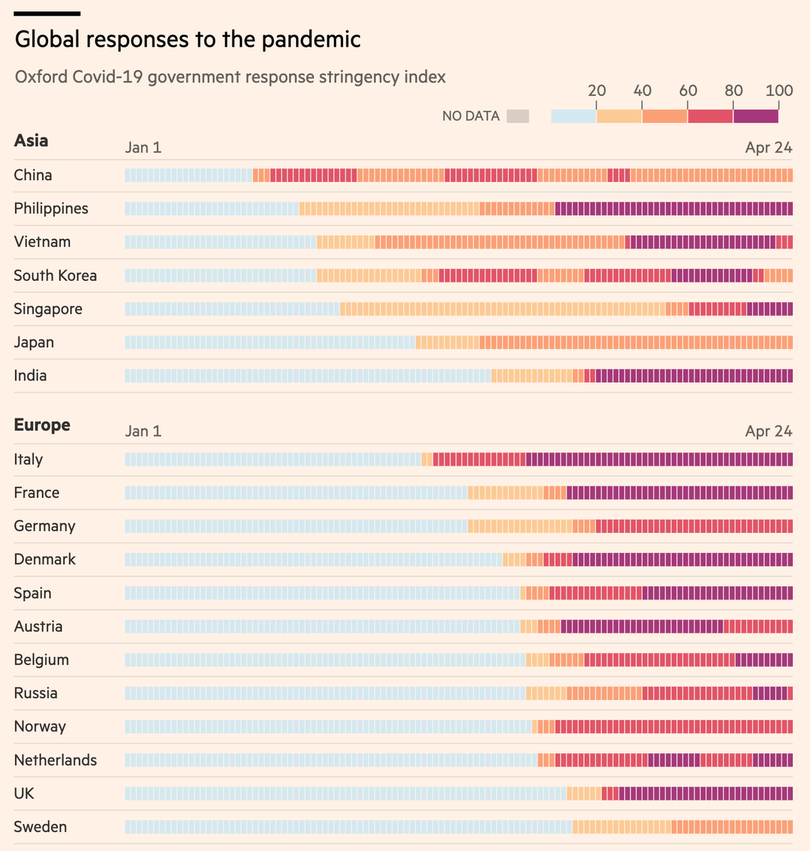
@davidcblood and I are cogs in a slick machine involving @sdbernard @maxharlow @carolinenevitt @aendrew @theboysmithy @martinstabe @alekswis @joannaskao, and we’re using data from @ECDC_EU & Oxford’s @BlavatnikSchool.
Free to read at ft.com/coronavirus-la…
We’ll be adding more countries and cities today and beyond, so keep this page bookmarked.


