My Authors
Read all threads
1. Ok. So I'm watching the "chair design" documentary (Chair Times). These are beautiful chairs! But one early chair explains the whole problem in a nutshell.

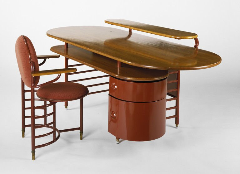
Frank Lloyd Wright's Chair for Johnson Wax, 1936.

Looks innocent enough. But hold on to your butts.. this gets wild.
2. The original design (shown) only had 3 legs. Why? Wright "believed: it would encourage better posture."

Why? Because you'd have to keep your feet on the ground to sit in it. Sound like a bad idea? It WAS.
3. Henry Dreyfuss or Ray/Charles Eames would never build a chair based on "a belief." They'd make prototypes and try them with real people. But not Wright.

He insisted on these chairs until... a fateful day.
4. Johnson, his client, complained about the chairs but Wright resisted. Johnson asked Wright to sit in one and he himself fell over!

This was was enough for Wright, so he redesigned the chair from this model, with three legs (shown in the film) to...
5. To this one, with four legs. They're apparently still in use, and some models have wheels or armrests on them.
6. But when you put a designed thing like a chair in a museum, w/o context, it becomes a work of art. Something to be admired purely for how it looks.

A chair becomes a visual object, not an interactive one. It's interactivity (falling over, uncomfortable, etc.) disappears.
7. Design museums have this problem generally. They have to preserve famous works.

But how can you think about the design of a fork in a complete way if it's just attached to a wall behind glass?

It promotes the notion that "design is how it looks".

8. The problem (in case it's not clear) I'm trying to solve is showing more people to understand design in all of it's meanings. But the one most people know is "designer clothes" - how things look.

A "movie that treats chairs look like art" doesn't move things forward.
9. That's not the problem this museum or this film (albeit I haven't finished it yet) is likely trying to solve. That's OK.

They're solving different problems. I LOVE museums because I love art.

But there's danger when designers are confused about what they're making & why.
10. That confusion, in designers and ppl, increases when we put things "made to be used" into the art world.

It's undeniably confusing as to why a chair like Wright's is being honored. I happened to know the story.

(Yes, I wish those cards next to artwork were more useful).
11. Notes:

1. I'm watching the film and sharing notes/highlights at #chairtimes
2. The Wright "falling over story" is purported, but the chairs were redesigned.
3. Here's a photo of that chair as part of the desk set.

journaltimes.com/news/local/fur…

atlasofplaces.com/architecture/j…
Missing some Tweet in this thread? You can try to force a refresh.

Enjoying this thread?

Keep Current with Scott Berkun

Profile picture

Stay in touch and get notified when new unrolls are available from this author!

Read all threads

This Thread may be Removed Anytime!

Twitter may remove this content at anytime, convert it as a PDF, save and print for later use!

Try unrolling a thread yourself!

how to unroll video

1) Follow Thread Reader App on Twitter so you can easily mention us!

2) Go to a Twitter thread (series of Tweets by the same owner) and mention us with a keyword "unroll" @threadreaderapp unroll

You can practice here first or read more on our help page!

Follow Us on Twitter!

Did Thread Reader help you today?

Support us! We are indie developers!


This site is made by just two indie developers on a laptop doing marketing, support and development! Read more about the story.

Become a Premium Member ($3.00/month or $30.00/year) and get exclusive features!

Become Premium

Too expensive? Make a small donation by buying us coffee ($5) or help with server cost ($10)

Donate via Paypal Become our Patreon

Thank you for your support!