Today's Tweetorial is courtesy of my friends Thomas Treibel, Charlotte Manisty, and James Moon!
First the challenge.
What do you make of this?
First the challenge.
What do you make of this?
Options
Well I couldn't understand the graph.
Fortunately the implausibly patient Dr Charlotte Manisty (who is an ORBITA-HQ escapee to Bart's Hospital --- come back soon Charlotte!) explained it to me a few times, until I got it.
Fortunately the implausibly patient Dr Charlotte Manisty (who is an ORBITA-HQ escapee to Bart's Hospital --- come back soon Charlotte!) explained it to me a few times, until I got it.
Here's my explanation for simple-wits like me.
Start with this sophisticated visualisation tool, that I repurposed from a Youtube Video for children.
Start with this sophisticated visualisation tool, that I repurposed from a Youtube Video for children.
Now, look just at this slice.

Looking at that thin slice only, which car is in the lead?
How did you know?
Now let's think about viruses.
What happens first?
What happens first?
Yes,
then you feel ill, and
then you get into hospital.
then you feel ill, and
then you get into hospital.
So which should curve should happen first, solely out of these two?
General population being found covid+ve?
People having to be admitted to hospital and found to be covid positive?
General population being found covid+ve?
People having to be admitted to hospital and found to be covid positive?
Now, *suppose* hospital staff were getting Covid mainly from their *non-work* (gen-population-like) activity, when would you expect their rate of Covid SWAB positivity to peak?
Let's now suppose the opposite, namely that hospital staff are getting Covid mainly *from patients*.
When would you expect their Covid swab positivity to peak?
When would you expect their Covid swab positivity to peak?
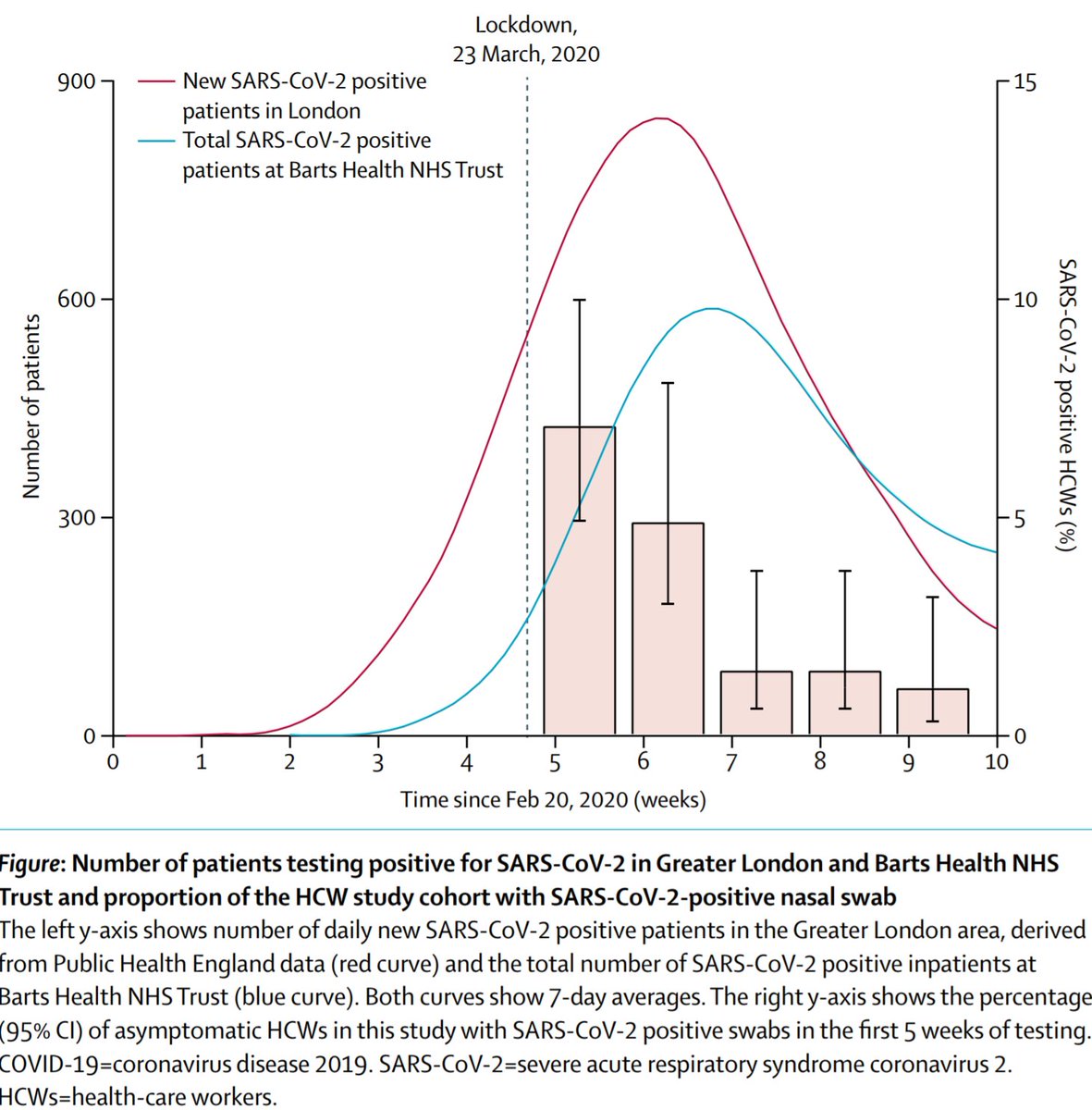
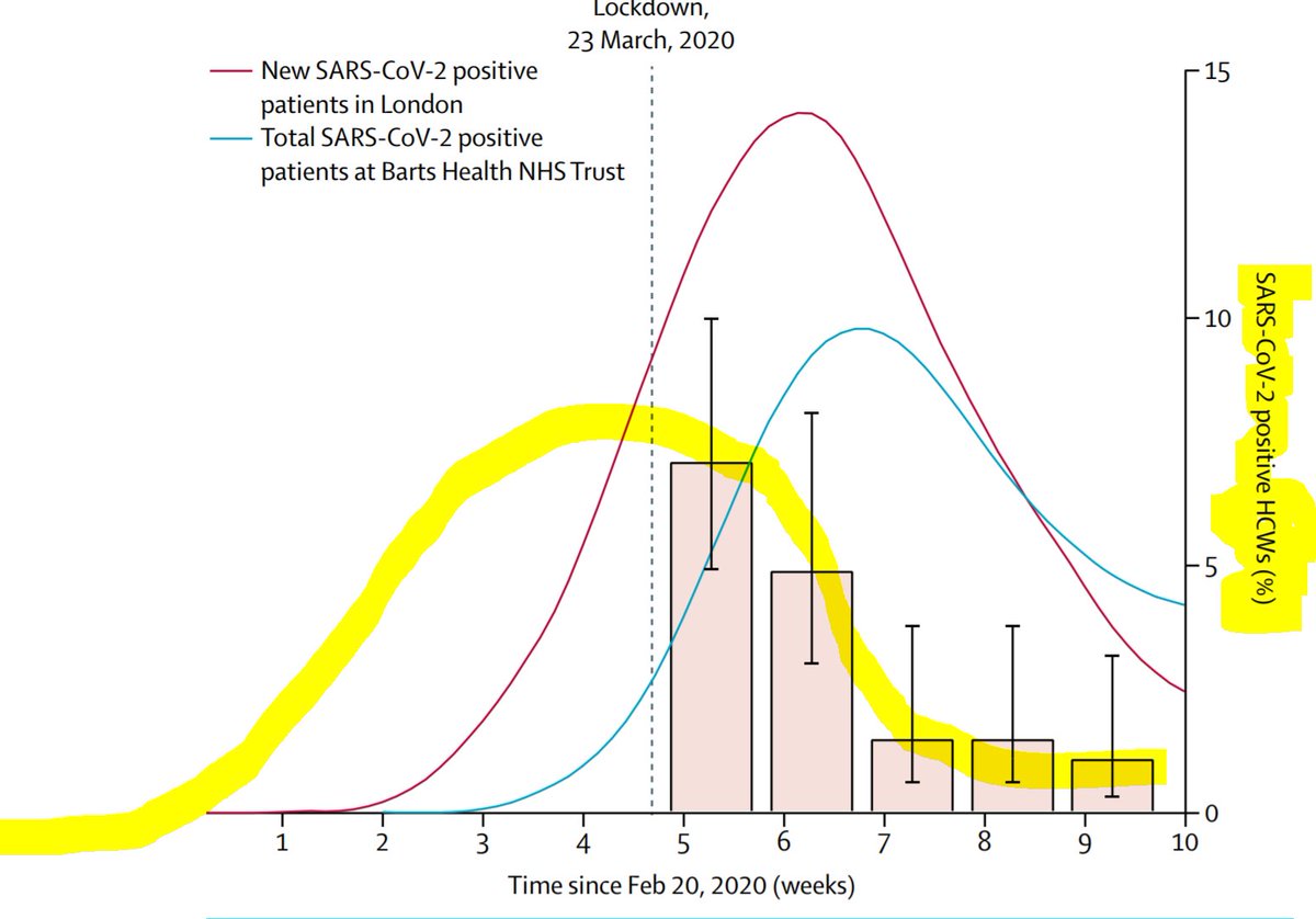
This curve is the general population rate of getting SYMPTOMS + positive covid test.
Notice it peaks about a week and a half after lockdown, which sounds about right, because it takes a while for symptoms and tests to happen.
Notice it peaks about a week and a half after lockdown, which sounds about right, because it takes a while for symptoms and tests to happen.
This next curve is the rate of people going into hospital with Covid.
In most cases, they started with milder symptoms, and then deteriorated to the point they couldn't manage at home.
So, understandably, there is a lag. Almost another week.
In most cases, they started with milder symptoms, and then deteriorated to the point they couldn't manage at home.
So, understandably, there is a lag. Almost another week.
Now comes the fun stuff. Is the rate of HOSPITAL staff being positive for viral RNA on throat swab,
peaking BEFORE the patients arrive,
or AFTER the patients arrive?
peaking BEFORE the patients arrive,
or AFTER the patients arrive?
Which?
So how did most staff catch the virus?
I can see people are keen to hand out kickings to the government, the NHS executive, and anyone who tries their best to decide what to do
But to pick these options just after seeing the data shows you are knee-jerking an emotional response rather than drawing rational inferences
But to pick these options just after seeing the data shows you are knee-jerking an emotional response rather than drawing rational inferences
If it was from Virus Positive patients, that *most* staff were getting their Covid from (note the word "most" that I carefully used), Covid-positive patients actually showing up in hospital and coughing on you, is the way to get it.
You can't get it from gazing out of the window wistfully, waiting for Covid patients to arrive in a few weeks!

Based on these data, I infer that the way *most* staff in Barts Hospital have been getting it from the general population has been the same way that *everyone* has been getting it.
From routine social contact.
From routine social contact.
Good question from Will Watson!
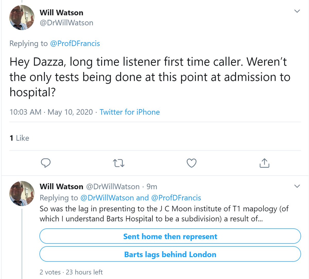
I don't know when community testing became available.
I *do* think there will have been lots of people seen in hospital with mild symptoms, tested and sent home; of them most will have settled down, but some got worse and had to be admitted.
I *do* think there will have been lots of people seen in hospital with mild symptoms, tested and sent home; of them most will have settled down, but some got worse and had to be admitted.
And yes I think James gives the Barts Trust a fair degree of autonomy, as a wholly-owned subsidiary of the T1 institute.
Here is the link to the Research Letter in the Lancet.
No Paywall (and without risking arrest and deportation to Guantanamo bay)! Thank goodness for small mercies.
thelancet.com/action/showPdf…
No Paywall (and without risking arrest and deportation to Guantanamo bay)! Thank goodness for small mercies.
thelancet.com/action/showPdf…
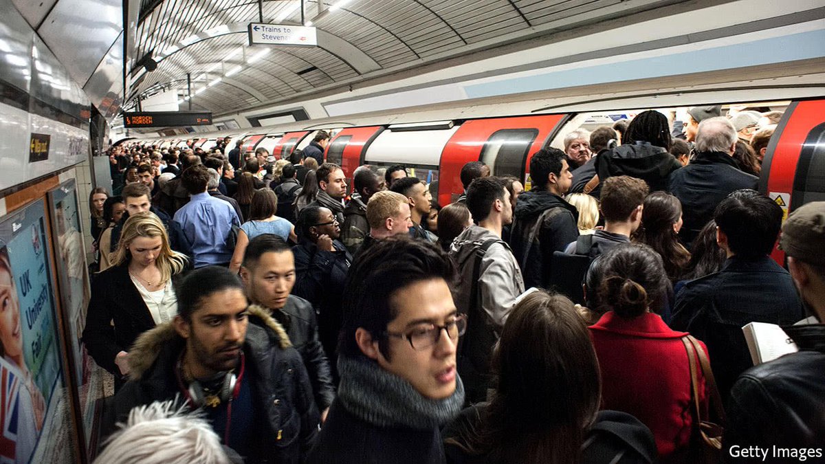
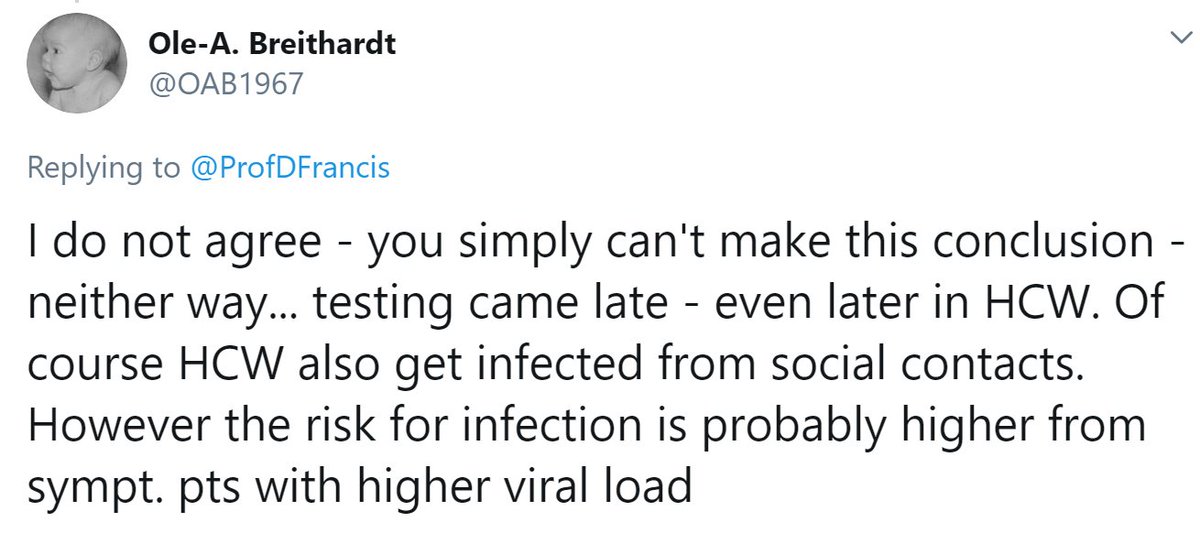
Ole is skeptical.
I agree that symptomatic patients, who likely have a much higher viral load, are a greater threat than random people on the tube.
But we wear PPE and are careful around them.
While we sprawled (to the extent possible!) on the tube before corona was big news.
I agree that symptomatic patients, who likely have a much higher viral load, are a greater threat than random people on the tube.
But we wear PPE and are careful around them.
While we sprawled (to the extent possible!) on the tube before corona was big news.
Very good points raised here.
Thanks to that excellent peer review (genuinely this time!)
Please may I revise my conclusion?
To the following:
Please may I revise my conclusion?
To the following:
Conclusion Part 1
"Currently (post Lockdown), the PPE and protocols are working sufficiently well to see infection rates amongst staff fade away, rather than rise with the covid admission rates."
"Currently (post Lockdown), the PPE and protocols are working sufficiently well to see infection rates amongst staff fade away, rather than rise with the covid admission rates."
Conclusion Part 2
"The bulk of staff infections MAY have come from patients admitted early in the epidemic, when testing was not available and PPE etc not in place or partial, OR from their everyday social contact e.g. travel. We can't tell from these data."
"The bulk of staff infections MAY have come from patients admitted early in the epidemic, when testing was not available and PPE etc not in place or partial, OR from their everyday social contact e.g. travel. We can't tell from these data."
I know that some people *know* the answer to the question in Part 2. They are just naturally confident people.
But for those who are curious to take a scientific approach, how can we test which is more likely to be correct?
Suggestions welcome.
But for those who are curious to take a scientific approach, how can we test which is more likely to be correct?
Suggestions welcome.
One nice suggestion from @TarekOmarNafee
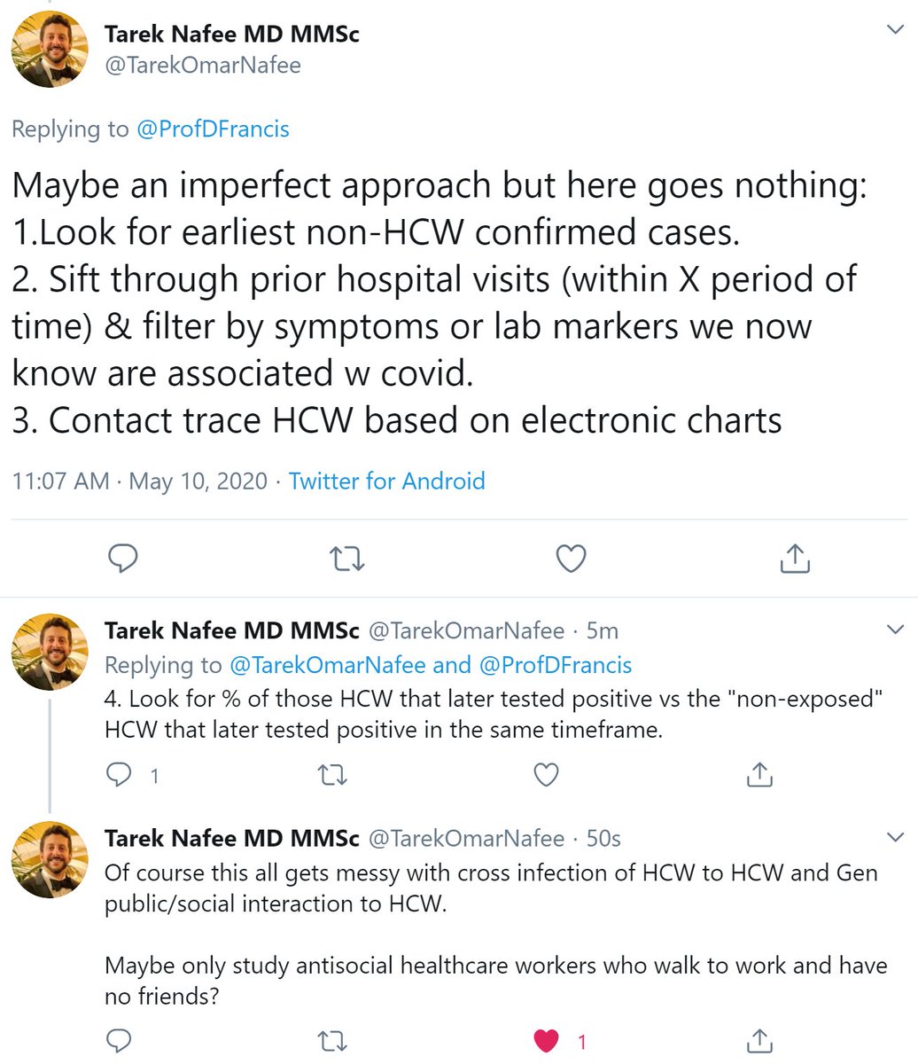
And as Tarek points out, it would be
(a) a lot of work
(b) suffer from woefully incomplete identification of early Covid positive patients (presenting with unrelated symptoms, but still infectious)
(c) get messed up with subsequent interactions between people
(a) a lot of work
(b) suffer from woefully incomplete identification of early Covid positive patients (presenting with unrelated symptoms, but still infectious)
(c) get messed up with subsequent interactions between people
and although not mentioned by Tarek, the most fatal problem is this (and as a fellow scientist I hope he will agree)
After you con various juniors into working on this for free,
And think up a brilliant way of analysing it to avoid bias,
After you con various juniors into working on this for free,
And think up a brilliant way of analysing it to avoid bias,
Nobody will believe you.
Stupid people will prefer to believe some confident nitwit who just blurts out opinion as analysis.
And even your fellow scientists won't be *confident* that you did everything well enough to avoid being wrong.
Stupid people will prefer to believe some confident nitwit who just blurts out opinion as analysis.
And even your fellow scientists won't be *confident* that you did everything well enough to avoid being wrong.
Here's a suggestion from @MCole37982909
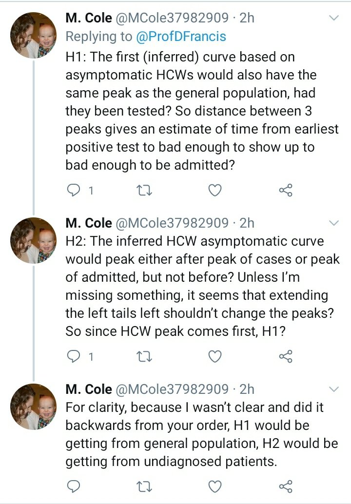
I am afraid I don't follow. The open question is
What experiment can we do that can distinguish between healthcare workers having caught it from the general population socially, versus from early patients admitted with covid (before we became generally aware of it).
What experiment can we do that can distinguish between healthcare workers having caught it from the general population socially, versus from early patients admitted with covid (before we became generally aware of it).
The experiment needs to not require going back in time and doing something different.
If your idea meets this requirement, could you please elaborate?
If your idea meets this requirement, could you please elaborate?
How about this query?

Who were the healthcare workers being swabbed?
Ok this proves Francis's First Conjecture.
People are more ready to give an opinion than develop one.
8-(
People are more ready to give an opinion than develop one.
8-(

End of the first paragraph, of a one-page Research Letter.
Surely not too difficult to expect people to look at, before opining?
Surely not too difficult to expect people to look at, before opining?

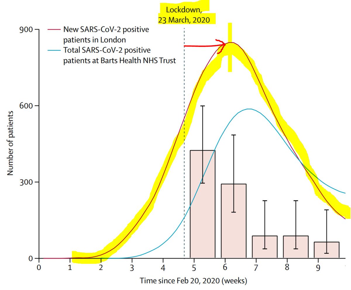
Good criticism here ! The yellow curve I drew was merely with the power of Sharpie Science (TM), of which I declare myself in charge, now that poor Neil Ferguson has unfortunately strayed one lipstick too far.

The reason I drew the yellow was that Charlotte had to keep explaining the thing to me and I wasn't getting it.
By drawing in the yellow, I got a feel for the point of the graphs.
but of course we don't know when the peak of HCW virus rates was.
By drawing in the yellow, I got a feel for the point of the graphs.
but of course we don't know when the peak of HCW virus rates was.
It is just very, very implausible that it is AFTER the peak of covid patients in hospital.
A statistically significantly less shrewd point (p<0) being made here.

Those that know me at ORBITA HQ know that I would salivate to draft and answer thus.
"If the reviewer would kindly spend more time reading the paper than pouring abuse upon it, he might notice that these two highlighted words..."
"If the reviewer would kindly spend more time reading the paper than pouring abuse upon it, he might notice that these two highlighted words..."

"The hospital count is a prevalence, how many people are in hospital on a particular day, regardless of when they came in.
In contrast the cases in the community are an incidence, a New Cases count.
Perhaps the reviewer's hospital resolves people with a day? Maybe iv bleach?"
In contrast the cases in the community are an incidence, a New Cases count.
Perhaps the reviewer's hospital resolves people with a day? Maybe iv bleach?"
"However our hospital uses more traditional care and tries not to 'resolve' people's episodes in such an unfavourable (yet admittedly timely) fashion. Our patients therefore longer for weeks. As a result our prevalence is much higher than the incidence of new arrivals."
At which point @rallamee usually says, "Very nice thank you" and presses delete.
She replaces it with "We apologise to the reviewer and have added a legend key saying new and total .... Blah blah."
She replaces it with "We apologise to the reviewer and have added a legend key saying new and total .... Blah blah."
"But it already says that on the legend, what are you talking about ?"
"Ah," she answers, "but they are never going to say that it was there before and they didn't see it, are they?"
Clever woman, Rasha.
Has more friends than me, curiously.
"Ah," she answers, "but they are never going to say that it was there before and they didn't see it, are they?"
Clever woman, Rasha.
Has more friends than me, curiously.

Useful point raised here:

Mario S Bittencourt makes a detailed and well-thought out counterargument.
Point 1.
Point 1.

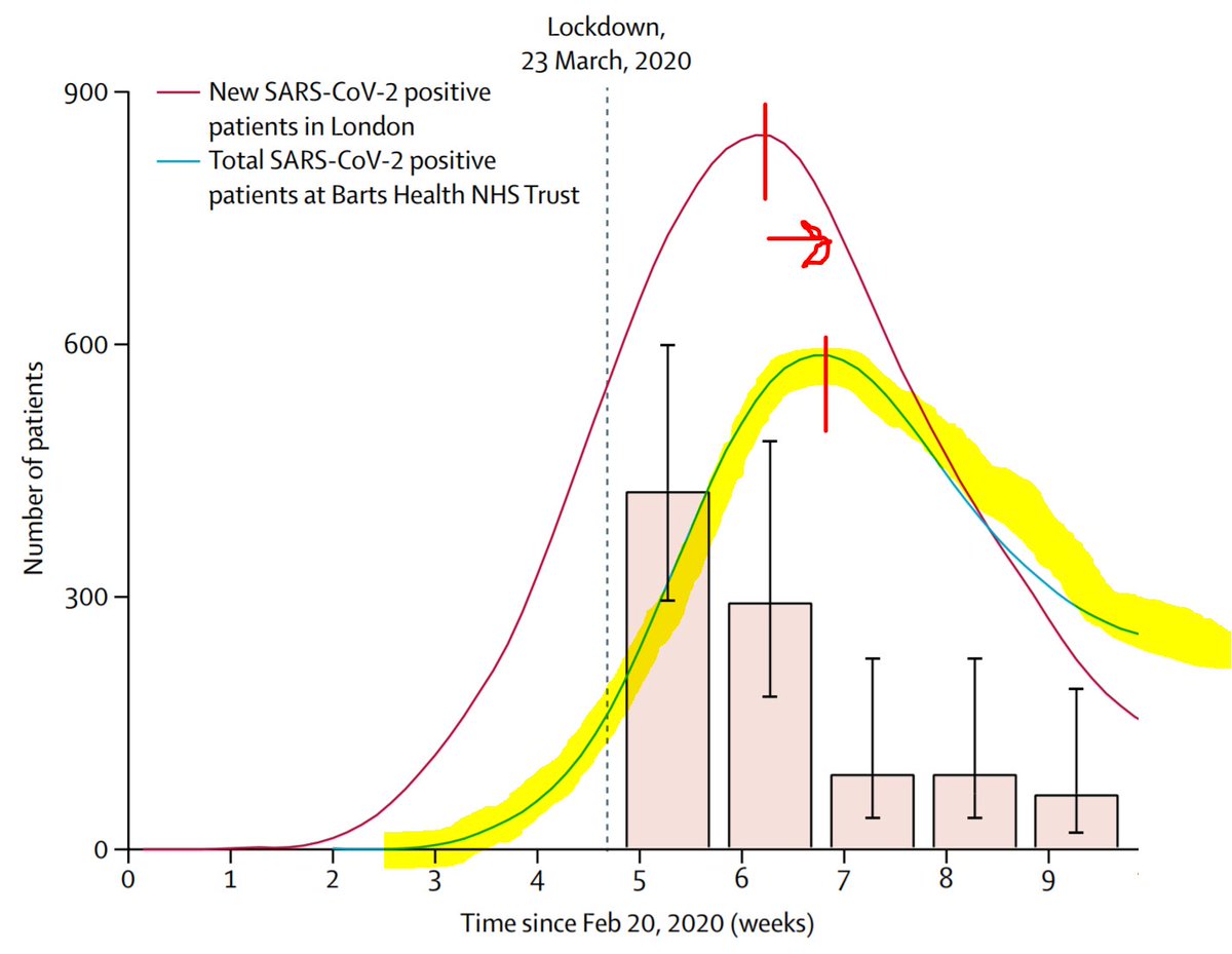
Yes, quite right. The blue curve is the number of patients prevalent in hospital at any one time, not the rate of their arrival. (I described the curve wrongly earlier in the thread, and can't edit now)
If the Barts staff were mainly catching the virus from patients DURING THE STUDIED PERIOD, wouldn't you expect the peak to be later, after the peak hospital prevalence?
I can't properly follow Point 2 but I am not a virologist or epidemiologist so it is probably my fault.

Point 3 is definitely good, and I have mentioned it to the authors, namely curiosity on why people didn't have followup swabs: if they were ill, perhaps count them as positive, etc.

However I don't understand your final point regarding 45% on my hand-drawn Yellow Curve.
The genuine data only goes up to about 7ish percent. With my Sharpie Science (TM) extrapolation I would raise it back to the lockdown time, but then drop it as we go left. Not 45%.
The genuine data only goes up to about 7ish percent. With my Sharpie Science (TM) extrapolation I would raise it back to the lockdown time, but then drop it as we go left. Not 45%.
Ah, now I understand Point 2.

I don't *think* we should be adding the pink bars together. I think each bar is a proportion of the cohort whose swabs were positive on that particular date.
It is just the rate of positivity falling, not necessarily new people keeping on being added.
It is just the rate of positivity falling, not necessarily new people keeping on being added.

Therefore I *think* that the highest proportion ever seen was ~7%, and the peak proportion (likely around lockdown time) would have been only a little higher than that.
Any comment @JccmoonMoon ? Have we misunderstood the graph? Should we be adding the pink fractions?
Any comment @JccmoonMoon ? Have we misunderstood the graph? Should we be adding the pink fractions?

1. Yes, I am saying that they probably did get it from social contact (although, thanks to peer review, I later added "OR from early unrecognised covid patients").
*But* I didn't say during the lockdown!
I meant before the lockdown, when people were not ... locked down.
*But* I didn't say during the lockdown!
I meant before the lockdown, when people were not ... locked down.
Then during the lockdown, they still had to travel, etc, without full PPE. I consider that *social contact* (i.e. contact with people and things, outside professional hospital work).
Not everyone commutes by personal helicopter or space shuttle.
Not everyone commutes by personal helicopter or space shuttle.

Yes, I imagine they travelled to and from work, like people generally do. They were not wearing PPE masks/gown etc then.
If they were caring for patients with COVID all day, they didn't know it, at the time.
If they were caring for patients with COVID all day, they didn't know it, at the time.
This is an excellent insight from peer review. Thank you @JaimeBorjas11
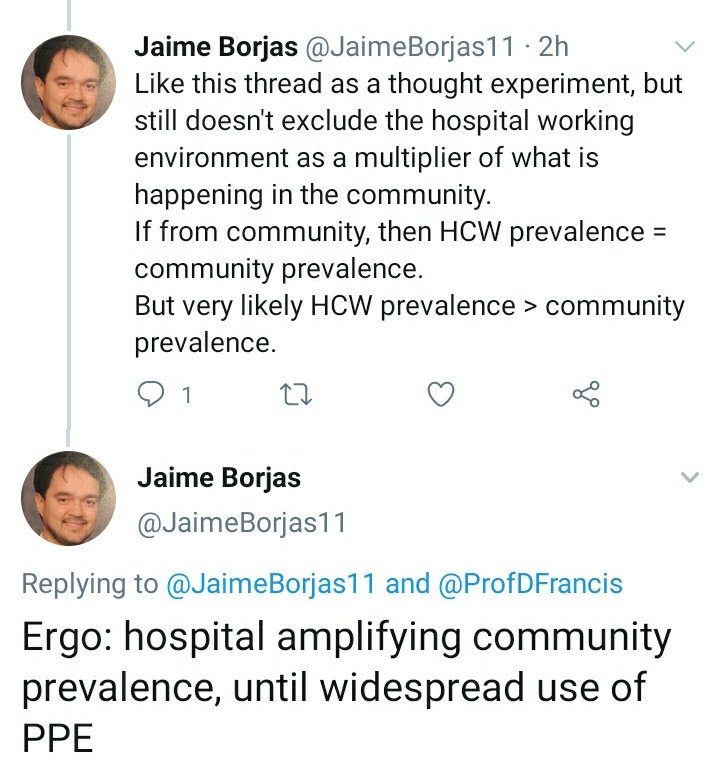
What Jaime describes is exactly what I believe. But that's just my belief
The data do not confirm or refute that. Staff got it early, either from patients or the usual way (lets call it travel, since "social contact" is misconstrued by some people as orgiastic lockdown partying)
The data do not confirm or refute that. Staff got it early, either from patients or the usual way (lets call it travel, since "social contact" is misconstrued by some people as orgiastic lockdown partying)
However Jaime offers a way of resolving whether the hospitals were acting as multipliers on staff.
Was the rate in asymptomatic staff higher than that of the asymptomatic general population.
Was the rate in asymptomatic staff higher than that of the asymptomatic general population.
That, I do not know.
But asking, is a scientifically valid contribution.
Unlike the approach of Critical Critical Care Doc, which amounts to the Fallacy of Argument from Consequences with an extra twist of Straw Man, and some Ad Hominem thrown in for fun.
But asking, is a scientifically valid contribution.
Unlike the approach of Critical Critical Care Doc, which amounts to the Fallacy of Argument from Consequences with an extra twist of Straw Man, and some Ad Hominem thrown in for fun.
This is how scientists argue. (Not like Critical Critical Care Doc - if a scientist argued like he does, all the other scientists would have a massive belly laugh at his expense)
Great thought here

The error here is the mistaken belief that staff were sent home if positive.
In reality the participants were NOT told their results. They were staff participants in a scientific experiment of serial testing.
In reality the participants were NOT told their results. They were staff participants in a scientific experiment of serial testing.
But keep the criticisms coming. I ought to bill Bart's for fielding them!
Interesting line of approach

Not sure how we can infer that rate would be >20% before lockdown. The staff swabbing started pretty promptly after lockdown, so would this be peak swab positivity? (Since swab positivity will surely take a day or two to show up)
But it is interesting.
I hope readers see how scientists reason though.
I hope readers see how scientists reason though.
From data, we move through different views on how to analyse them, and then discuss the views calmly, trying to update our analyses to reflect the useful comment contributions, and end up with an understanding of what else we should test.
Hi David!

Yes, it is *very* possible that (before the experiment began) staff were only taking precautions with patients with obvious Covid-like symptoms, and not with patients with subtle symptoms or no relevant symptoms.
Charlotte Manisty has responded that Barts staff were only using standard PHE-recommended PPE.