A colleague from Italy sent this link (I can't find the tweet so I can't properly credit them, sorry).
It is updated daily, and is from Italy's Istituto Superiore di Sanità.
It is updated daily, and is from Italy's Istituto Superiore di Sanità.
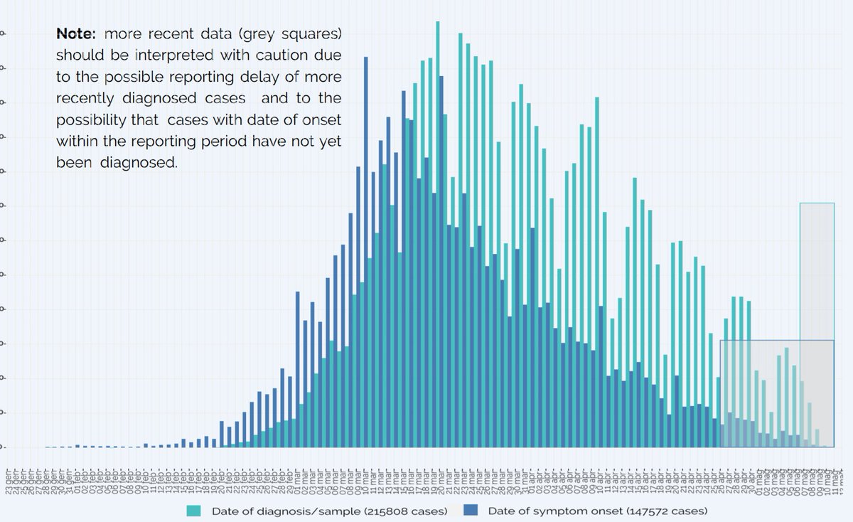
Note the regular weekend dips in the TEST results (greeny blue).
But when you ask people to describe when their SYMPTOMS started, the curve is much smoother (bluey blue).
But when you ask people to describe when their SYMPTOMS started, the curve is much smoother (bluey blue).
The curves are both coming down nicely with the benefit of lockdown, but they very importantly point out to ignore
the last few greeny ones (as tests are in progress) and a LONGER time range of bluey ones (as future positive-testing patients may project symptoms back to here).
the last few greeny ones (as tests are in progress) and a LONGER time range of bluey ones (as future positive-testing patients may project symptoms back to here).
All this and more, updated daily here (for the infographic click "Latest Available Data"/"Infographic"):
epicentro.iss.it/en/coronavirus/
epicentro.iss.it/en/coronavirus/
Here is what epidemiologists I think usually call the "infection fatality rate".
It is labelled CFR but they have explained clearly in the legend that this is people with positive tests, regardless of symptoms, and they have cited a reason, namely:
ecdc.europa.eu/en/case-defini…
It is labelled CFR but they have explained clearly in the legend that this is people with positive tests, regardless of symptoms, and they have cited a reason, namely:
ecdc.europa.eu/en/case-defini…
Anyway, it makes me feel better that I am a bit vague as to what a "Case" is, and reminds me to always check what a speaker/writer means, as there appear to be more than one commonly used meaning.

Remarkable age-sensitivity.
For each decade of increase in age, from 20's to 70's, what is the scale factor of increase in infection fatality rate, on that table?
For each decade of increase in age, from 20's to 70's, what is the scale factor of increase in infection fatality rate, on that table?
Which of these shapes best represents the graph of infection fatality rate, from age 20 to 79?

Options
That's what shocks me.
Imagine a few thousand people start street-partying thanks to the end of the lockdown.
Imagine a few thousand people start street-partying thanks to the end of the lockdown.

In this thought experiment, the partygoers consist entirely of people in their 30's and their parents, about 30 years older.
Suppose this leads to 100 funerals of the 30-somethings.
How many funerals in the 60-somethings?
Suppose this leads to 100 funerals of the 30-somethings.
How many funerals in the 60-somethings?
Yup, so try hard to resist the temptation to visit elderly relatives for a post-lockdown knees-up.
"Please don't kill your older relatives."
(Hmm... I can see why this was not snapped up by the Prime Minister's Spin team as his new logo.)
"Please don't kill your older relatives."
(Hmm... I can see why this was not snapped up by the Prime Minister's Spin team as his new logo.)
I am disappointed with the efforts at identifying the graph with 3-fold increment per decade.
The key is not the bit at the right. That is going to be fairly "uppy".
The key is HOW MUCH smaller the left bit is.
Only one curve shows the low-age bit anywhere near low enough.
The key is not the bit at the right. That is going to be fairly "uppy".
The key is HOW MUCH smaller the left bit is.
Only one curve shows the low-age bit anywhere near low enough.

Brilliant question!

Linear.
The only giveaway was the "0" at the bottom, which I carefully placed so it was definitely the Y and not X axis.
However if I hadn't put that, it could be a log scale, and then A would be right, as you say.
The only giveaway was the "0" at the bottom, which I carefully placed so it was definitely the Y and not X axis.
However if I hadn't put that, it could be a log scale, and then A would be right, as you say.
Thank you for this!

Although it is population mortality, rather than infection mortality, it shows a very similar shape. Straight-line on a log scale (which means on a linear scale it grows by a constant scale factor with age).