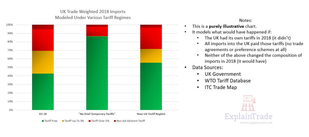
A trade weighted version of the UK's 3 tariff regimes (EU28, Temporary No-Deal and the ones just released).
Somewhat hesitant to share this as it's VERY open to misinterpretation, but doing so since @StevePeers asked.
Somewhat hesitant to share this as it's VERY open to misinterpretation, but doing so since @StevePeers asked.
Question:
"What the fuck am I looking at here, nerd?"
Answer:
"The value of all goods the UK imported in 2018, from everywhere, broken down by the tariffs that would have applied to them under the three UK tariff regimes."
"What the fuck am I looking at here, nerd?"
Answer:
"The value of all goods the UK imported in 2018, from everywhere, broken down by the tariffs that would have applied to them under the three UK tariff regimes."
Question:
"But the UK was in the EU and has FTA's and grants developing country preferences..."
Answer:
"Absolutely. All correct. This chart doesn't take any of that into account. It's just there to give you a very general comparison of how restrictive the regimes are."
"But the UK was in the EU and has FTA's and grants developing country preferences..."
Answer:
"Absolutely. All correct. This chart doesn't take any of that into account. It's just there to give you a very general comparison of how restrictive the regimes are."
Question:
"That's a lot more yellow and red on the right. Does that mean I've now missed out on massive savings?"
Answer:
"Probably not. These new tariffs likely assume the UK and EU are going to get a tariff eliminating deal done, plus FTA rollovers and preferences."
"That's a lot more yellow and red on the right. Does that mean I've now missed out on massive savings?"
Answer:
"Probably not. These new tariffs likely assume the UK and EU are going to get a tariff eliminating deal done, plus FTA rollovers and preferences."
Answer Cont.
"So in practice, most of the goods on your shelves will end up paying lower or no-tariffs, unless there's a key industry the UK really wants to product.
Also remember, a 5% tariff virtually never translates into a 5% price difference on the shelf."
"So in practice, most of the goods on your shelves will end up paying lower or no-tariffs, unless there's a key industry the UK really wants to product.
Also remember, a 5% tariff virtually never translates into a 5% price difference on the shelf."