Maybe this deserves a bit more than just making fun of it ; so let’s explain why this report is total nonsense.
(As followers know, I have spent a shitload of time looking at data worldwide and R estimations, so I think I'm qualified for a thread!)
(As followers know, I have spent a shitload of time looking at data worldwide and R estimations, so I think I'm qualified for a thread!)
I don’t min shitty statistical analysis, I read some every day. But the problem is when it comes with pompous and grand statements such as “In the absence of conclusive data, these lockdowns were justified initially.” But “millions of lives were being destroyed .. "
"with little consideration that [lockdowns] might not only cause economic devastation but potentially more deaths than COVID-19 itself.""
You can be pompous if you want, but then you'd better have a strong backup for your claims! And those charts are not at all saying what the author says they are saying.
First a quick methodological note: nobody cares if you call it R, R naught, R-star whatever: what we’re dealing here is the reproduction number: on average, if one person is infected, one many person does they infect.
It’s far from easy to estimate. I discuss it there.
Whatever the approach you use, you should be very careful when you draw conclusions because a) the data is absolutely messy b) the estimates are far from an exact science.
Whatever the approach you use, you should be very careful when you draw conclusions because a) the data is absolutely messy b) the estimates are far from an exact science.
This being said, let’s look at the two claims, starting with most stupid one, the second chart. This one is beyond stupid 
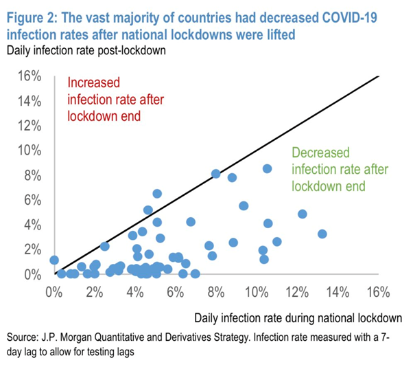
First of all, it’s obvious the data is shitty: all those 0ish numbers are dubious. But the main point is this.
The purpose of the lockdown is to bring down R way below 1.
I repeat.
The purpose of the lockdown is to bring down R way below 1.
Almost all countries did this.
The purpose of the lockdown is to bring down R way below 1.
I repeat.
The purpose of the lockdown is to bring down R way below 1.
Almost all countries did this.
ONCE R IS BELOW 1, ONE PERSON INFECTS LESS THAN ONE PERSON, SO THE DAILY INFECTION RATE GOES DOWN!
This is obvious!
Of course, the infection rate won’t go up even if R goes up and gets closer to 1 (which is dangerous).
As long as R is below 1, the infection rate goes down.
This is obvious!
Of course, the infection rate won’t go up even if R goes up and gets closer to 1 (which is dangerous).
As long as R is below 1, the infection rate goes down.
So seriously, this chart is one the most idiotic chart I have ever seen. And i have seen some lousy regressions.
The other one is trickier.
Still, there are many problems with this chart. The first one is how super tiny the effect is. If you look properly, the regression line is probably around 99% or something; R post lockdown is 1% less.
Still, there are many problems with this chart. The first one is how super tiny the effect is. If you look properly, the regression line is probably around 99% or something; R post lockdown is 1% less.
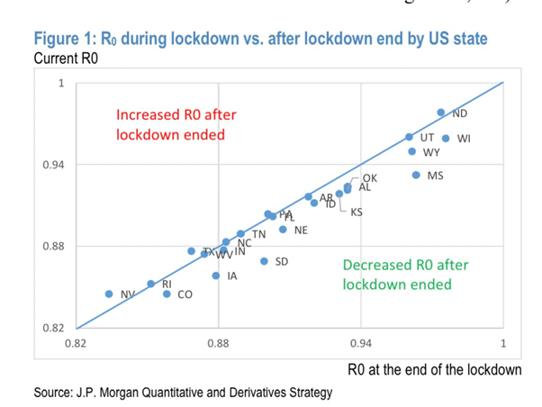
If you have looked at the data and trends in R, you know R has been very stable over time after an initial sharp drop at the beginning of the lockdowns. This is because the contacts in the population have changed dramatically: almost 0 at school, much less at work , etc.
But at some point, we reached some kind of stage where it’s difficult to reduce more: household, essential workplaces, healthcare, etc. If you read the news globally, you’ll realise that contagions now happen at home, in hospitals, slaughterhouses, etc.
Also after the lockdown, social distancing and carefulness means that R has not gone up much: people are more careful and the riskiest places are controlled.
Sometimes R has gone down simply because people are more careful at home or because hospitals are less swamped hence are less dangerous because contacts are easier to control. Once the epidemy is in control, there is no fatality that R will go up post lockdown.
This being said, it’s clear that it is way too early to have an accurate view on post lockdown R : in Australia, France, Austria, even South Korea, etc., it’s gone up post lockdown, not down, and sometimes sharply. But as long as it’s below 1, the epidemy is shrinking !!
And final but crucial point: the efficiency of lockdowns is not measured by what’s happening post lockdowns, especially by one tiny 1% change ! Anyone can understand that it’s measured by the fact that R went from 1.5, sometimes even 2 or 3, to below 1!
In some countries, we’ve seen a 200bps change! What’s the point of saying that the post lockdown change is a ridiculous 1bp ?
Maybe (probably), we could have avoided global hard lockdowns with a better policy response in February. But by March, they were absolutely necessary. Suggesting they destroyed more lives than they saved is borderline INSANE.
End/
End/
@Frances_Coppola you triggered that thread 😉
And to finish with some proper charts if you want to see how lockdown measures have affected R in a few countries
How many person does they infect*
Please an edit button ffs!
Please an edit button ffs!