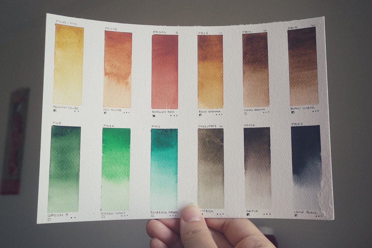
Watercolour is such a technical medium. You'd think paints are just different colours. Nope! Pigments are made of various minerals and organic compounds which influences their opacity, drying time, half-life, and toxicity.
This will be a thread where I nerd out while I paint.
This will be a thread where I nerd out while I paint.
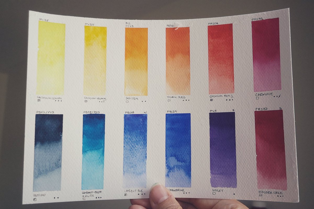
This is the first time I'm using artist quality pigments, which are wayyy more vibrant than the student ones!
To get to know my tools & practice deliberately, we'll cycle through the paints, starting from blue family. 💙
I'll update in the mornings when the lighting's better!
To get to know my tools & practice deliberately, we'll cycle through the paints, starting from blue family. 💙
I'll update in the mornings when the lighting's better!
Btw I'm trying painting as a wind down exercise before bed to replace my terrible habit of scrolling on the phone. Why fight a habit when you can replace it with an equally addictive one amirite??
So far it's working. Too sleepy to scroll. 😴😴
So far it's working. Too sleepy to scroll. 😴😴
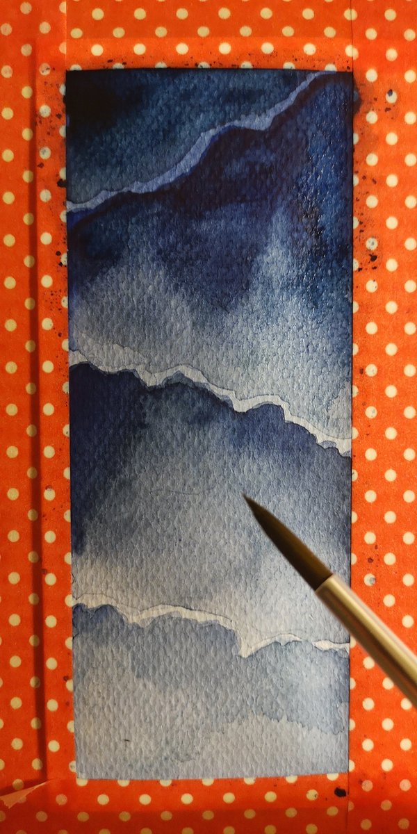
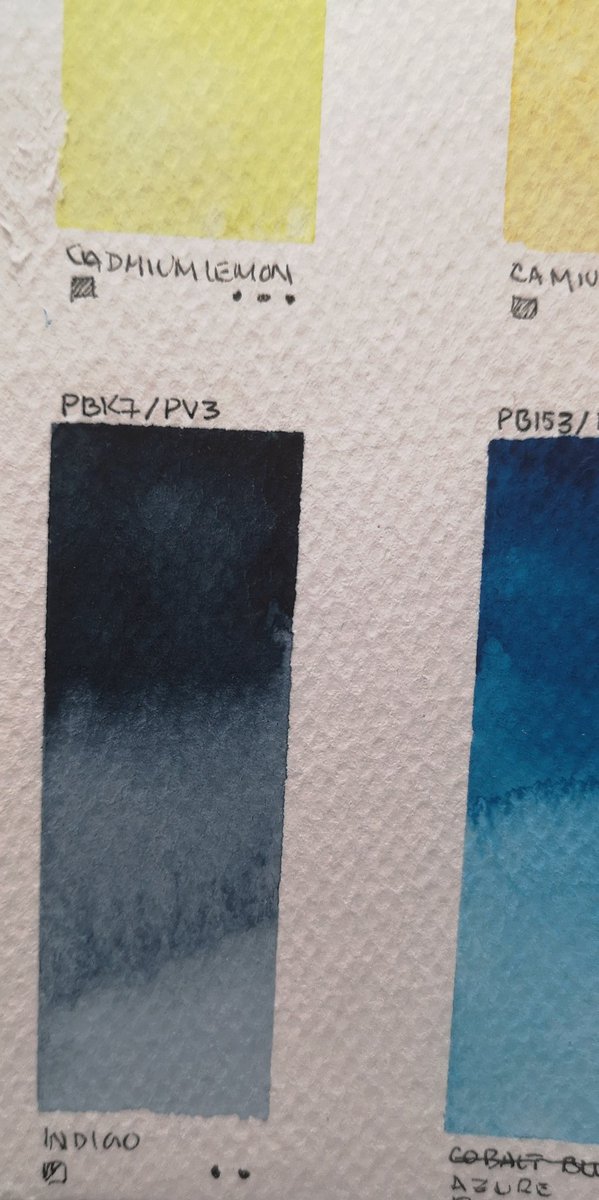
Indigo!
Natural indigo is known to fade (think of denims). Now, indigo dye is often made with indanthrene (PB60). As an organic dye, it's semi-opaque and staining.
I love it for layering. It doesn't 'lift' like other blues.
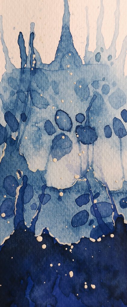
Painted indigo waves last night w/ 3 layers of wash.
Natural indigo is known to fade (think of denims). Now, indigo dye is often made with indanthrene (PB60). As an organic dye, it's semi-opaque and staining.
I love it for layering. It doesn't 'lift' like other blues.
Painted indigo waves last night w/ 3 layers of wash.
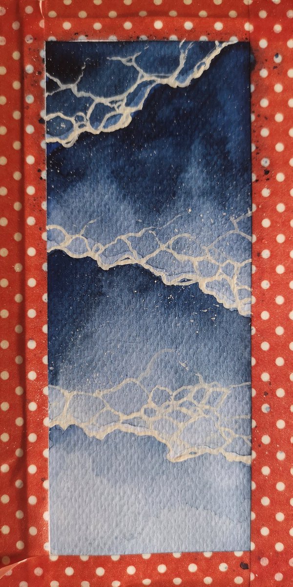
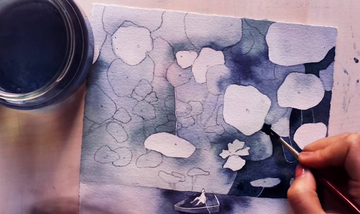
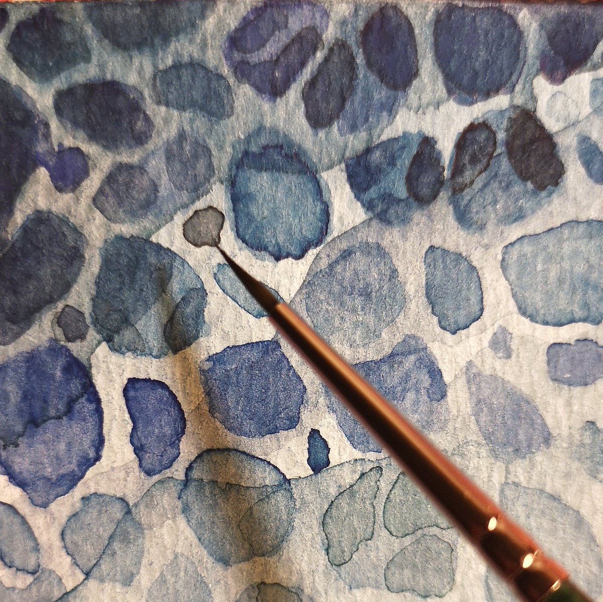
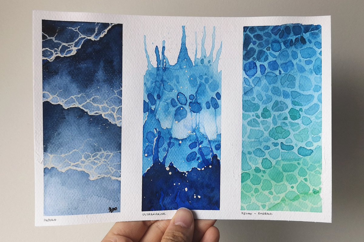
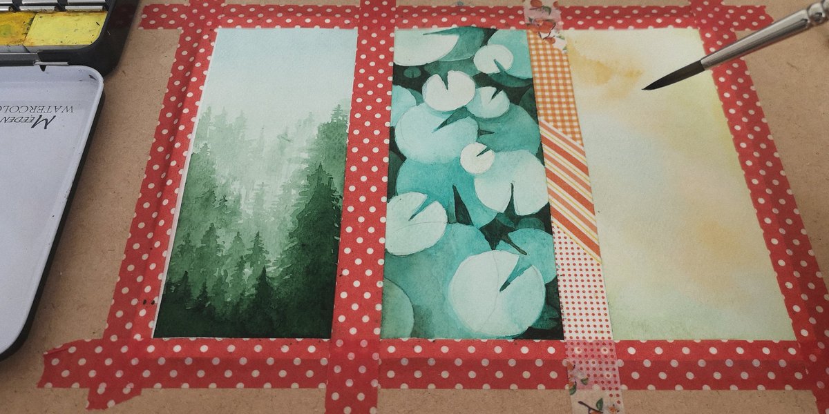
Sorry for my distracting washi tape. 😂 I'm fitting three sketches/pigments onto one page so I can better compare them side by side and to save paper.
I'll post a better shot of all 3 when I get through the blue family of pigments! 💙🎨
WIP last night applying 3rd layer.
I'll post a better shot of all 3 when I get through the blue family of pigments! 💙🎨
WIP last night applying 3rd layer.
My Indigo's pigment indx is PV3, PBK7. So it's not pure, but a mixture of blue & lamp black. The latter is carbon-based, gives it that velvety finish.
By colour theory, adding black desaturates hue, as you can see when I'm mixing indigo w/ ultramarine, the paint looks dirty.
By colour theory, adding black desaturates hue, as you can see when I'm mixing indigo w/ ultramarine, the paint looks dirty.

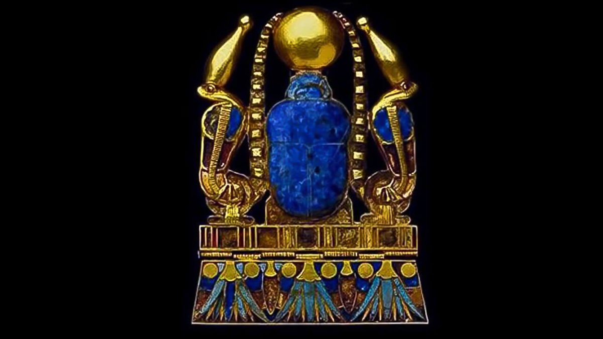
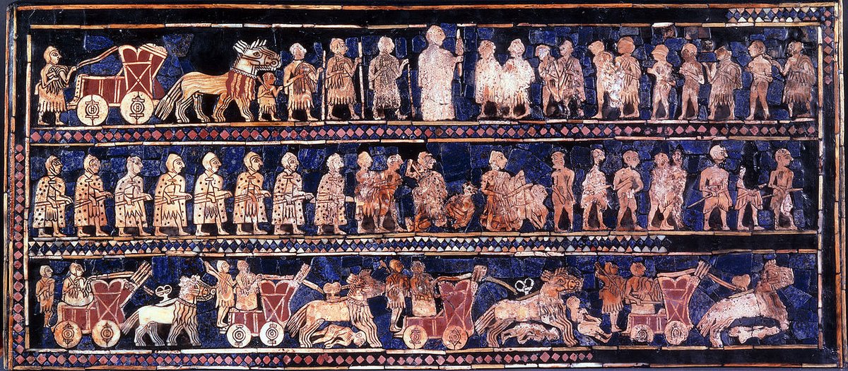
Ultramarine
Comes from lapis stones and used in many ancient civilizations. When trade connected the Silk Road, it became the most sought after pigment in Europe. More expensive than gold, until the French had enough and offered a prize for whomever invents a synthetic copy. 😅
Comes from lapis stones and used in many ancient civilizations. When trade connected the Silk Road, it became the most sought after pigment in Europe. More expensive than gold, until the French had enough and offered a prize for whomever invents a synthetic copy. 😅


The synthetic ultramarine PB29 retains much of its original properties. Additionally for watercolour:
"PB29 undergoes a very large drying shift, lightening by almost 30% and dropping almost 20% in chroma." - handprint.com/HP/WCL/waterb.…
So yeah, ultramarine is a troll. I tried:
"PB29 undergoes a very large drying shift, lightening by almost 30% and dropping almost 20% in chroma." - handprint.com/HP/WCL/waterb.…
So yeah, ultramarine is a troll. I tried:
Phthalocyanine Blue
This synthetic blue is a workhorse of industrial paint, for a good reason: it's staining (don't need many coats) and lightfast (doesn't fade over time).
My favourite property of phathlo blue PB15:3 is that when diluted, the hue shift towards green!
This synthetic blue is a workhorse of industrial paint, for a good reason: it's staining (don't need many coats) and lightfast (doesn't fade over time).
My favourite property of phathlo blue PB15:3 is that when diluted, the hue shift towards green!
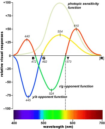
However as a masstone (fully saturated, even coat), our eyes perceive the hue closer to "true blue". This can be attributed to a scientific theory of how opposing colour wavelengths cancel each other out.
You can go down that rabbit hole here... handprint.com/HP/WCL/color2.…
You can go down that rabbit hole here... handprint.com/HP/WCL/color2.…
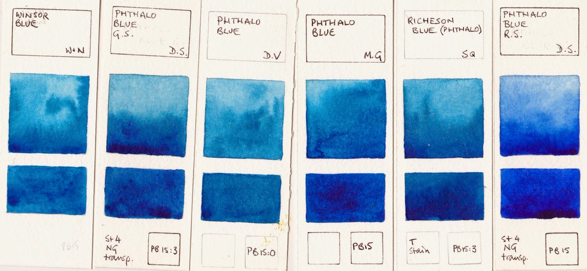
As a watercolour, phthalo blue is versatile. I prefer it over ultramarine as a base blue. Less finicky. 😅
My phthalo pigment PB15:3 biases towards green. Can see how it readily mixes w/ greens along the bottom than w/ warmer blues at the top. This bias is important for mixing.
My phthalo pigment PB15:3 biases towards green. Can see how it readily mixes w/ greens along the bottom than w/ warmer blues at the top. This bias is important for mixing.
That concludes the blue family.
What I've learned: Indigo is reliable for layering undertones. Sorry ultramarine, I prefer cobalt for mixing. Phthalo blue is my favourite - vivid and versatile, retains saturation when blended with greens.
Next we'll shift into green hues! 💚
What I've learned: Indigo is reliable for layering undertones. Sorry ultramarine, I prefer cobalt for mixing. Phthalo blue is my favourite - vivid and versatile, retains saturation when blended with greens.
Next we'll shift into green hues! 💚
Huge thank you to @kelogsloops and Weiling (instagram.com/minim_studio/) for their tutorials on painting waves.
They are both SO skillful. I paused and rewinded several times to try to follow their techniques. Check them out. 🙏🏼
They are both SO skillful. I paused and rewinded several times to try to follow their techniques. Check them out. 🙏🏼
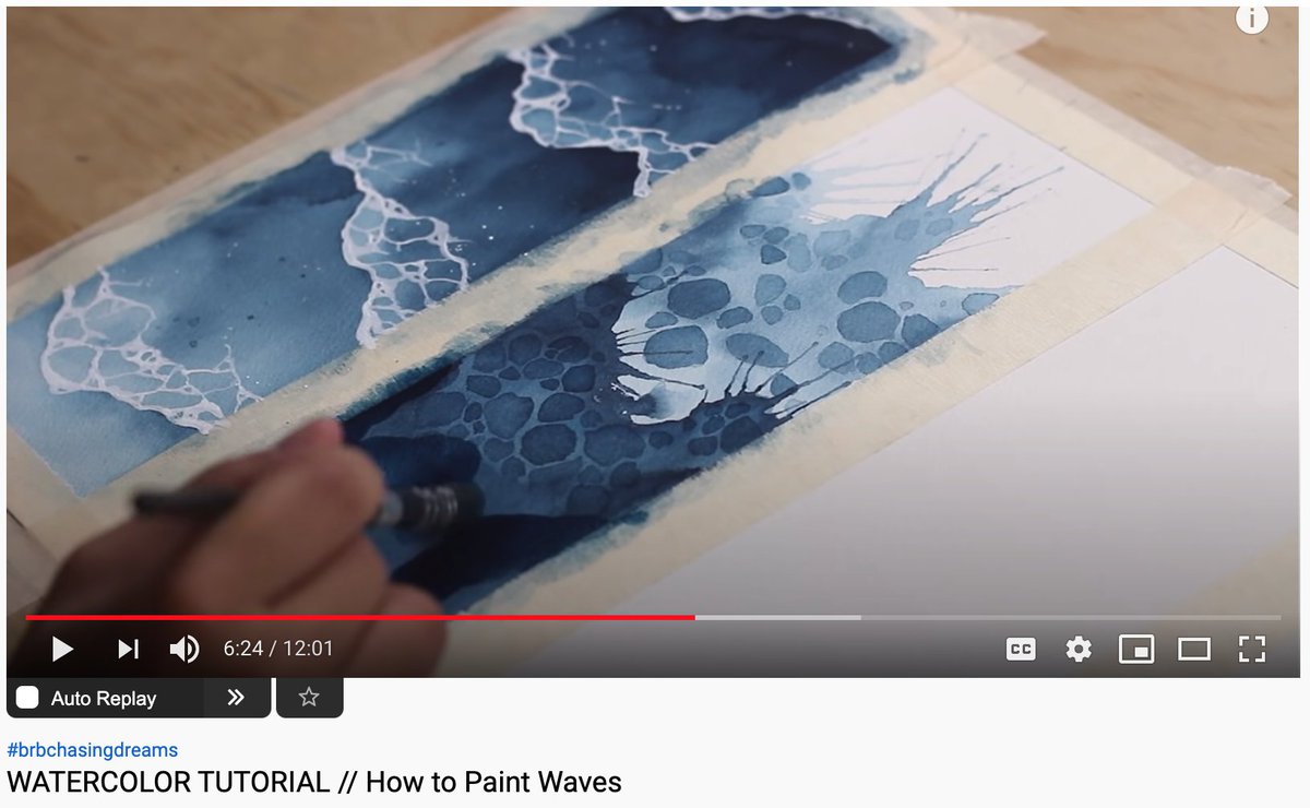
This is a form of deliberate practice I find helpful in getting to know any craft.
By following tutorials and swapping their palette with mine, I can focus on understanding my pigments through a variety of applications/techniques, while avoid getting caught up with composition.
By following tutorials and swapping their palette with mine, I can focus on understanding my pigments through a variety of applications/techniques, while avoid getting caught up with composition.
Let's continue!
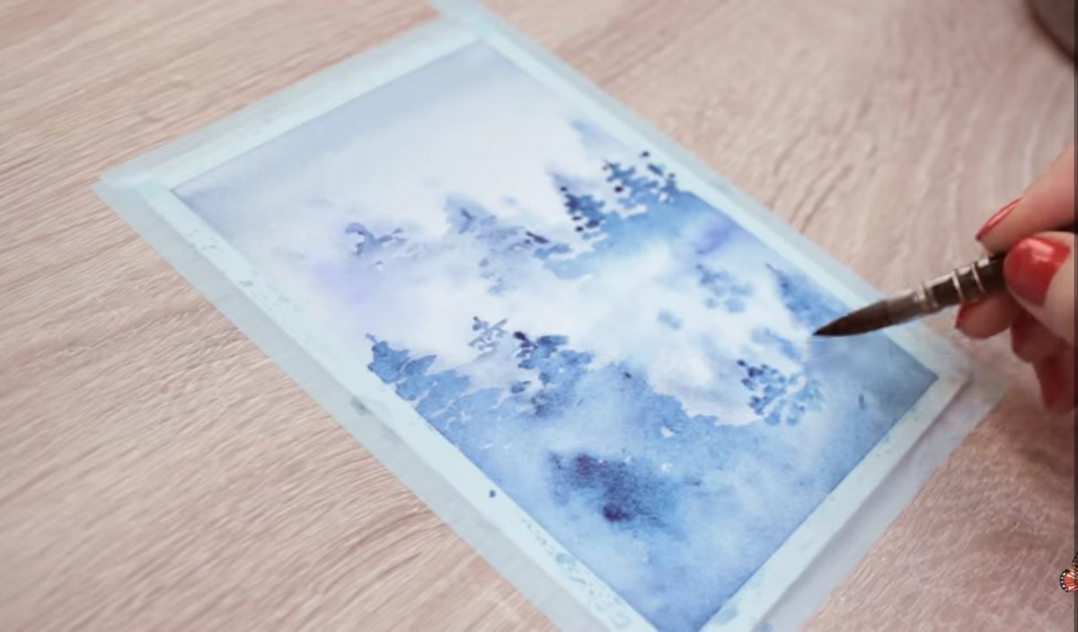
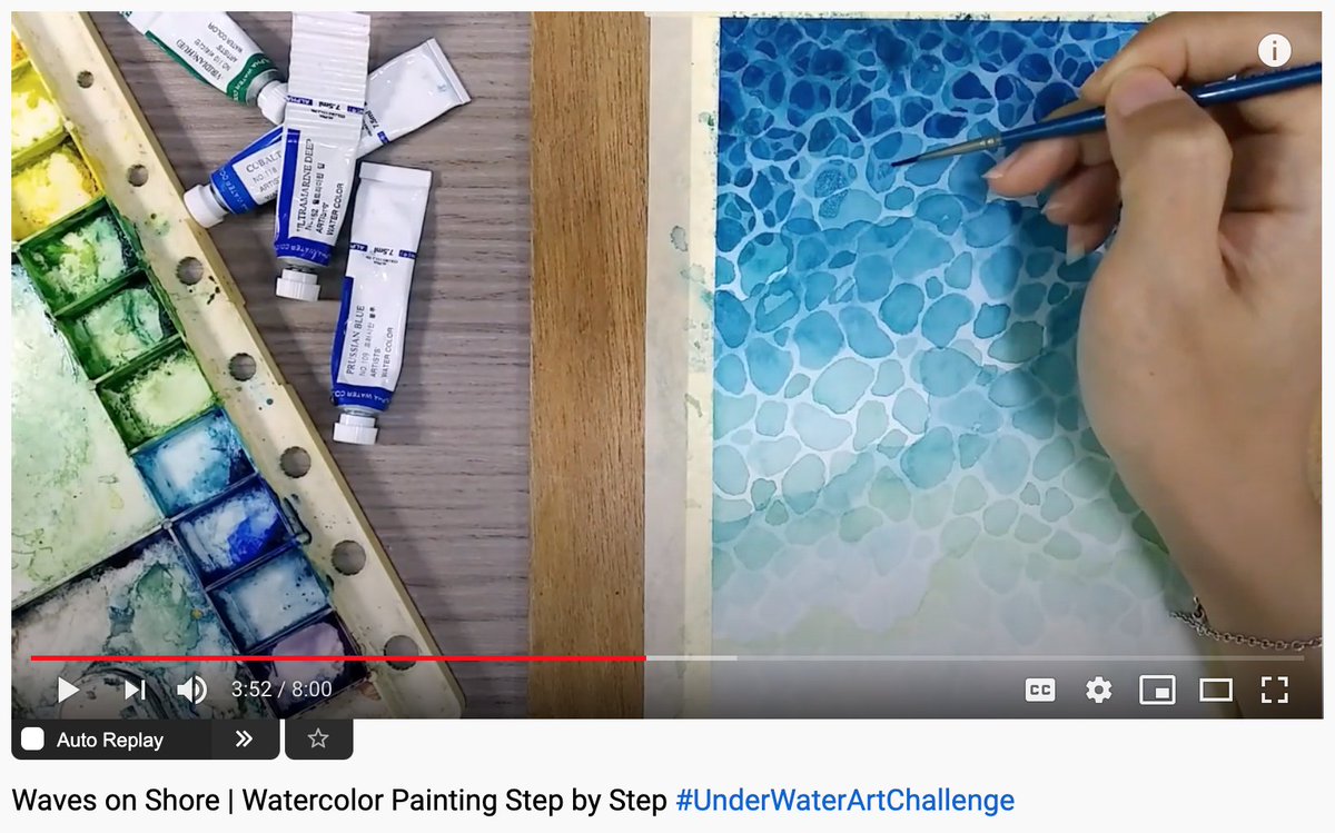
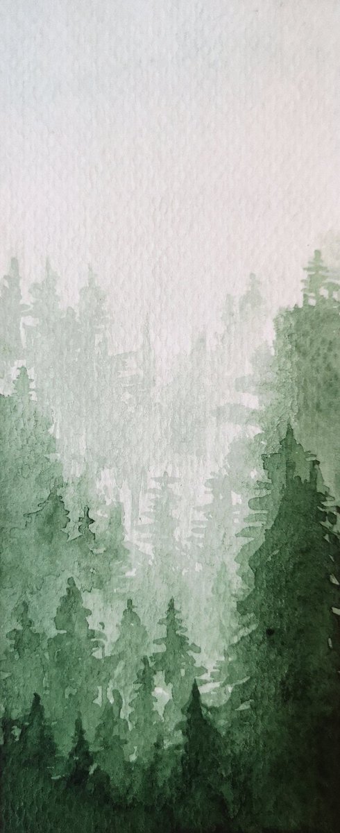
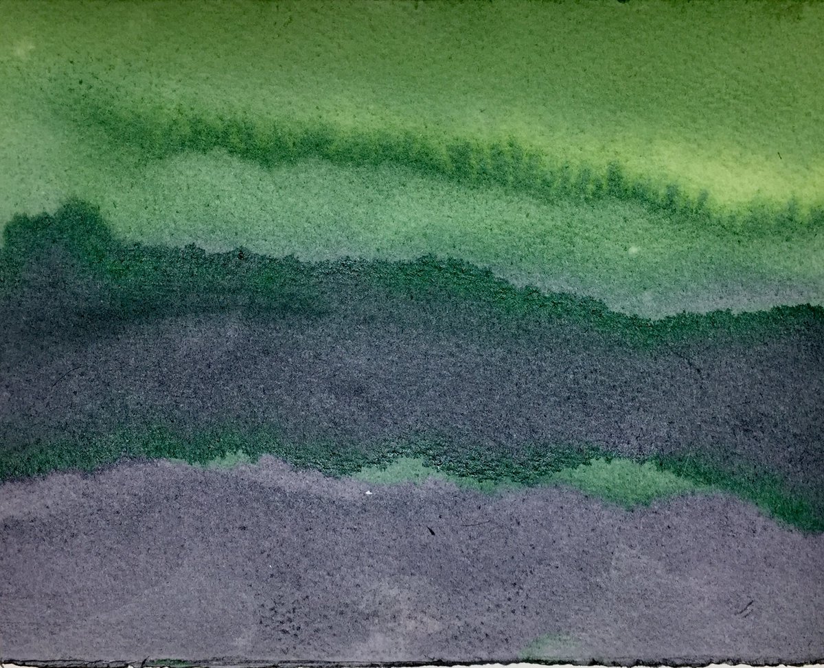
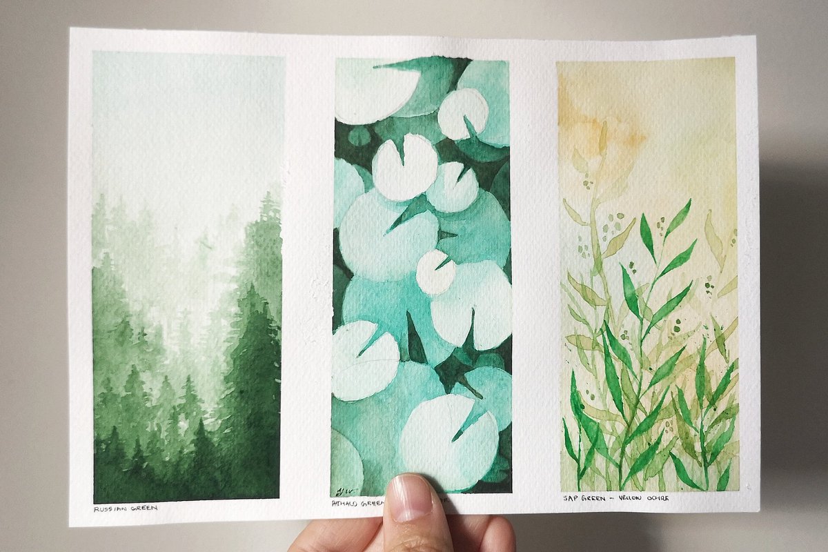
Russian Green PG8 is exclusive to my set made in St. Petersburg. Greens are often hit and miss in watercolour, but I love this one. PG8 has subtle granularity and incredible range, from ghostly undertones to a deep Christmas tree green.
Painted a foggy forest:
Russian Green PG8 is exclusive to my set made in St. Petersburg. Greens are often hit and miss in watercolour, but I love this one. PG8 has subtle granularity and incredible range, from ghostly undertones to a deep Christmas tree green.
Painted a foggy forest:
Here's a better demonstration of range.
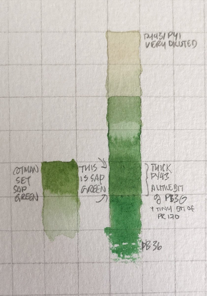
Left is sap green from my old set. It's not very strong at masstone and notice how much harder it is to achieve dilution with the same # of squares. The middle is our Russian green PG8. The right is phthalo green PG7, strong but very even.
Left is sap green from my old set. It's not very strong at masstone and notice how much harder it is to achieve dilution with the same # of squares. The middle is our Russian green PG8. The right is phthalo green PG7, strong but very even.
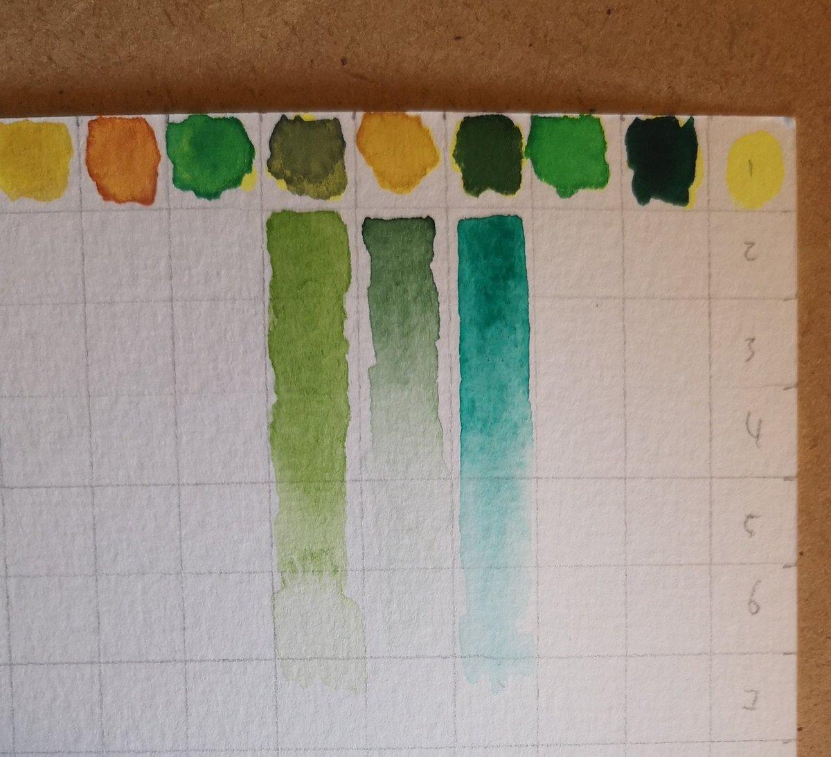
But why this difference? Earthy pigments used to be made with plants but are now mixtures of synthetic compounds, which are lighter than mineral-based pigments. So they float in the wash longer before sinking!
How to make natural pigments with buckthorn:
wendyfe.wordpress.com/2018/11/17/bye…
How to make natural pigments with buckthorn:
wendyfe.wordpress.com/2018/11/17/bye…
Phthalo green PG7
Phthalos are staining - if you use wet brush on top of a dried layer, pigment will stay as opposed to Russian green PG8 where you can 'lift' the colour for fx.
With staining pigments, lifting is best done wet. Here I'm double-dipping PG7 to lighten the layer.
Phthalos are staining - if you use wet brush on top of a dried layer, pigment will stay as opposed to Russian green PG8 where you can 'lift' the colour for fx.
With staining pigments, lifting is best done wet. Here I'm double-dipping PG7 to lighten the layer.
PG7 is an approximation of verdigris, a pigment popular with Renaissance painters for its intensity vs. organic dyes. Verdigris, or copper acetate, is responsible for oxidation on bronze. So it wasn't just toxic, it decayed too. ☠️
Rabbit hole on that!
atlasobscura.com/articles/renai…
Rabbit hole on that!
atlasobscura.com/articles/renai…
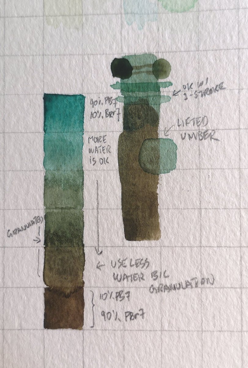
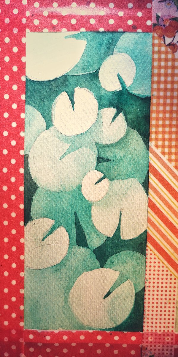
I'm comfortable now working with pthalos so we'll get a litttle fancy and add burnt umber PBr7 to deepen the green. PBr7 granulates and lifts ...a lot! So PG7+PBr7 inherits that pigment behaviour the more umber we mix in. This is why it's important to know your palette!
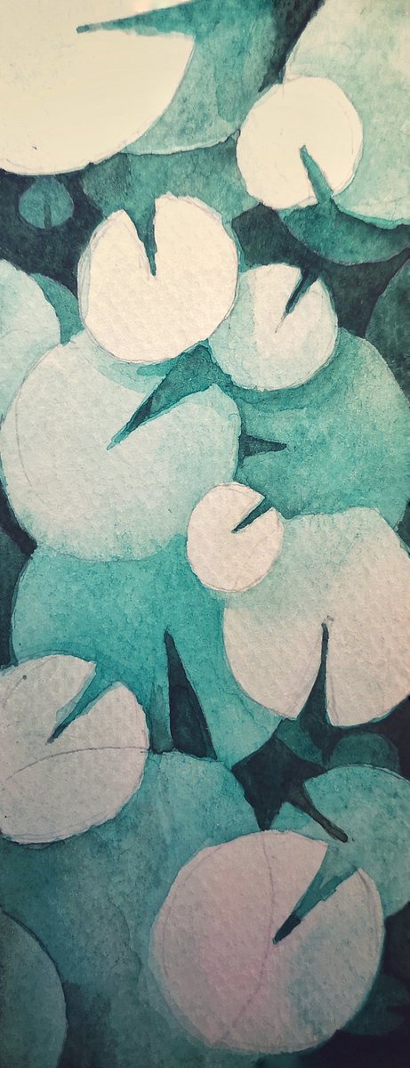
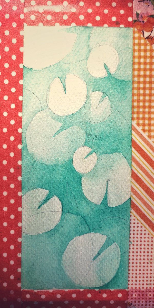
Here's a technique called negative painting.
I'm applying what I know about these two pigments: phthalo green for underpainting, and build up by mixing more umber to each layer, the granulation is a lot more controlled this way. No muddy washes or unexpected lifting!
I'm applying what I know about these two pigments: phthalo green for underpainting, and build up by mixing more umber to each layer, the granulation is a lot more controlled this way. No muddy washes or unexpected lifting!
Aside: Want to tie this back to photography. Some watercolourists are notorious for using only 5 paints in their palettes. Why? Because mixing and curation is what makes visual harmony. Pigments are just raw material. You can look at photos the same way:
Tonight I'll paint the last panel in the green family. Gotta experiment w/ sap green by combining PG36, another phthalo-based green with hansa yellow PY1 and yellow ochre PY43. Hoping I can make a better sap green than the tube from my old set!
Send me your fav plants to paint!
Send me your fav plants to paint!
I decided to finish this in natural light!
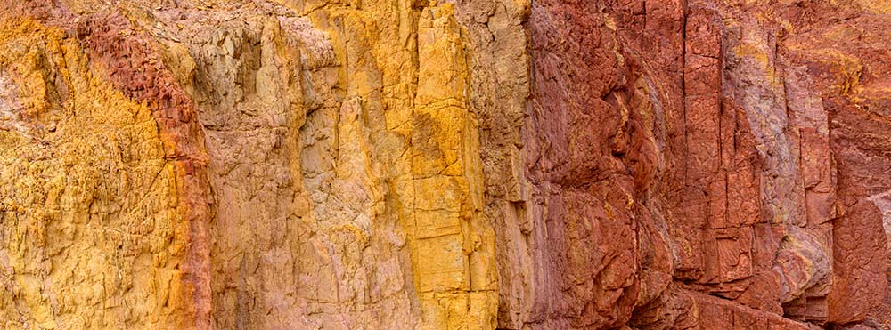
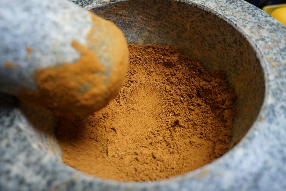
Ochre is the earliest kind of pigment used by humans some 30,000 years ago. Ochre is a mixture of sand and clay, with reddish tint from iron oxide.
My yellow ochre PY43 has naturally derived iron oxide. Just like PBr7, it granulates!
Ochre is the earliest kind of pigment used by humans some 30,000 years ago. Ochre is a mixture of sand and clay, with reddish tint from iron oxide.
My yellow ochre PY43 has naturally derived iron oxide. Just like PBr7, it granulates!
In trying to make sap green, I had to add a bit of carmine red PR170 in there to warm up the tone. The ochre is overpowered easily probably b/c it isn't synthetic. That's ok. You can see from the 5th grid my mixed sap green vs. the one from my Cotman student set. I quite like it!
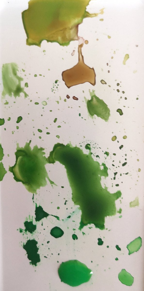
Aaand here we go: the green family!
Recap what I've learned so far: Russian green is so good on its own! Phathlo green is a versatile mixing pigment but can be overpowering. Earth pigments like ochres and umbers add depth to value, and makes the paint more granulated in wash.
Recap what I've learned so far: Russian green is so good on its own! Phathlo green is a versatile mixing pigment but can be overpowering. Earth pigments like ochres and umbers add depth to value, and makes the paint more granulated in wash.
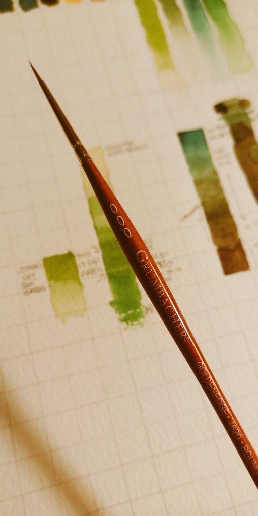
I also realized from trying to use single stroke technique to paint those plant shapes that my brushes range from TERRIBLE to mediocre to one decent 000 artist grade brush. 😭
Welp. Can't really blame student-Hannah for hoarding cheap shit.
Welp. Can't really blame student-Hannah for hoarding cheap shit.
Tutorials I drew from 💚🔥
Makoccino's wet on wet layering technique:
Pearfleur's negative painting. She's so skilled with composition:
Ceecee's monochromatic plant tutorial. Her brushwork is incredible:
Makoccino's wet on wet layering technique:
Pearfleur's negative painting. She's so skilled with composition:
Ceecee's monochromatic plant tutorial. Her brushwork is incredible: