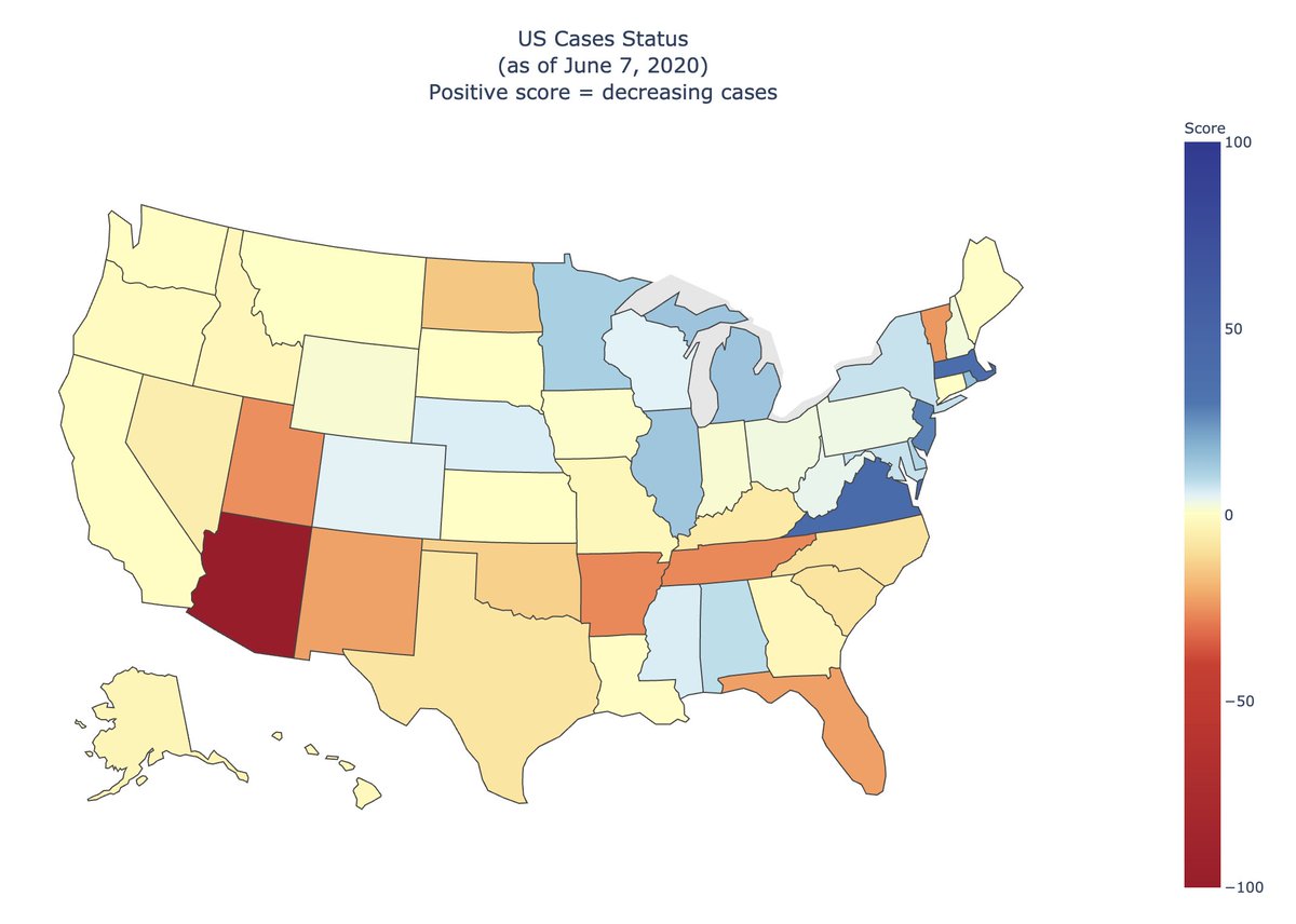
Raw changes in cases can be misrepresentative, so I created a score that tries to encapsulate a fuller picture.
Full interactive version: covid19-projections.com/maps/

Other states of concern are: TN, AR, NM, FL, UT.
On the other hand, Mid-Atlantic states continue to see a steady decline in cases.
These are simply a visualization of the raw case data from @JHUSystems.
To get a true picture, we also have to look at tests, positive rates, deaths, etc. We include those data in the interactive version on our website if you hover over each state.
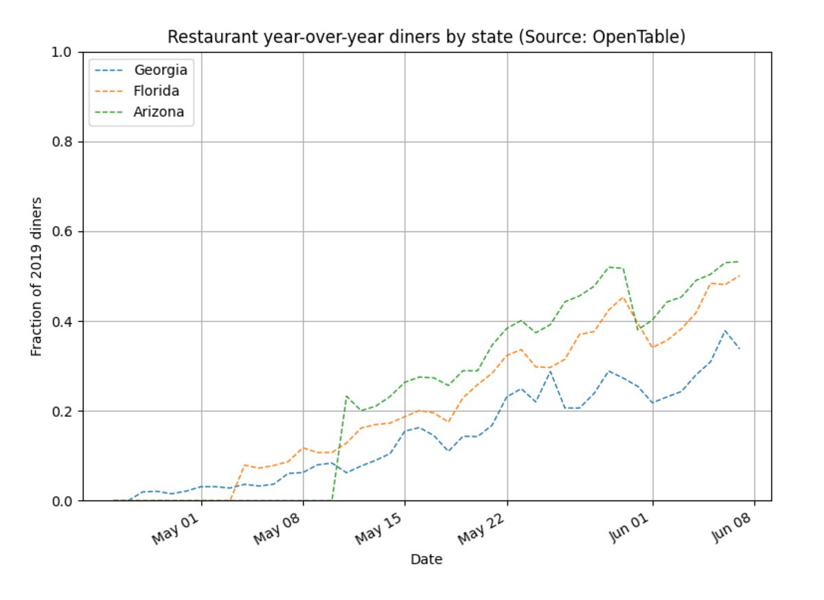
Can you guess which state has seen a large spike in cases and which state has not?


