Raoul Pal Profile picture
Jun 9, 2020 22 tweets 6 min read Read on X
Following on from Brent's excellent tweet storm on the Dollar, which I totally agree with (apart from his dollar bear bating!)

I wanted to add some charts to make you think. Just because chart patterns are there, doesn't make them a shoe in, it just increases the probabilities. The last pattern of the smaller wedge pattern failed (which was painful but part of the Great Game).
There might well be an expanded ABC channel at play in the Euro... Image
Which is also the top of the larger channel... Image
The Daily DeMark count suggests a possible reversal... Image
The Bloomberg DXY has just tested its break out and there is a lot of support here... Image
And the really big support is only 1.4% away, if it gets there... Image
The gorgeous chart of the Fed US Broad Trade Weighted Dollar Index has fully re-tested the beak out of the big cup and handle pattern.... Image
The Fed have added $3trn but the ECB only $1trn so far They have another $500bn announced. The Fed have been front loaded (hence the recent $ sell off) and the ECB back loaded, as ever. With deflation hitting EU soon, they will have to step up, thus weakening the Euro.
When adjusted for daily FX liquidity, the ECB balance sheet is due to expand at a faster pace than the US. Image
But in the end, it all comes down to rates, as ever. Falling rates are bullish for the dollar. They lead by 3 days. Image
The dollar is also an expression (like rates) of the risk of insolvency. The dollar and the GMI Index of the largest BBB debtors by sector are essentially the same chart... Image
And the dollar vs the BKX, for the same reason, is the same chart... Image
And that is also the same as the EU banks.... Image
And that brings us back to rates - are they going up or down? If they go down, they are suggestive of dollar strength, weaker credit and weaker banks. My guess is that the Chart of truth holds and 2 yrs go negative in the next 12 months, maybe sooner. Image
And inflation is set to turn to deflation both in US and EU. Here is the US CPI vs. Velocity of Money... Image
And of you don't like Velocity of Money then here is ECRI vs CPI... Image
Or even core CPI vs US Births Deaths (the demographic deflation) Image
2 yr real rates are already up 200bps and are at zero, but that is set to change and they will flip to very positive... Image
And that all suggests if rates stay at zero, real rates will soon be as high as they were BEFORE the 2001 and 2008 recessions (using Fed Funds). Hence the need to go negative over time. Image
The charts, rates, debt, banks, relative liquidity of currencies, CB printing and real rates are all additional parts of the dollar strength picture. Again, Brent and I could be wrong but I favor our odds very much still.
The Great Game is a long one.

One or two months price move of a weaker dollar are still probably noise in a much, much bigger picture. I think it goes higher. Much higher still.

Time will tell.

• • •

Missing some Tweet in this thread? You can try to force a refresh
 

Keep Current with Raoul Pal

Raoul Pal Profile picture

Stay in touch and get notified when new unrolls are available from this author!

Read all threads

This Thread may be Removed Anytime!

PDF

Twitter may remove this content at anytime! Save it as PDF for later use!

Try unrolling a thread yourself!

how to unroll video
  1. Follow @ThreadReaderApp to mention us!

  2. From a Twitter thread mention us with a keyword "unroll"
@threadreaderapp unroll

Practice here first or read more on our help page!

More from @RaoulGMI

Nov 10
We are very close to being in the Last Chance to Add Zone in crypto. The next step should be the memes breaking out and after that there is nothing to do but wait to take lifestyle chips off the table.

Here is $DOGE leading the breakout... 1/ Image
Here is $WIF about to break out... Image
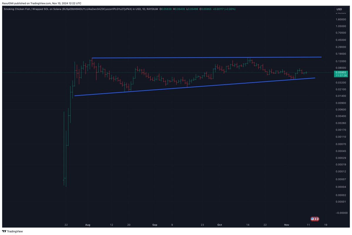
And Smoking Chicken Fish will follow suit.. $SCF Image
Read 4 tweets
Nov 5
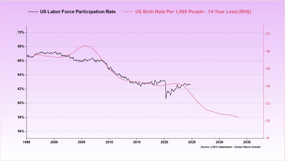
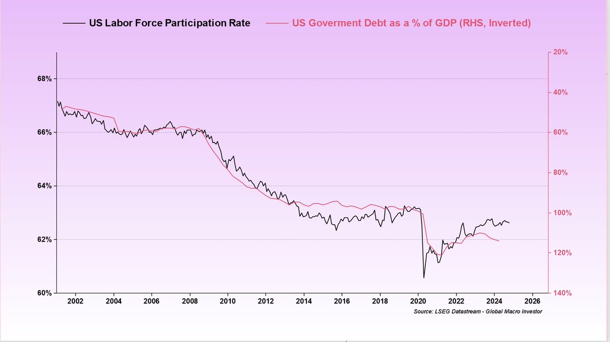
These are the three most important charts in Global Macro, along with Crypto - from this months Global Macro Investor publication:

1. Demographics are destiny. GDP slows over time as size of labour force shrinks. Image
2. Government Debt to GDP ratio is just a function of the working population. It offsets the weak growth and pays for the compunding interests on the debts. This is THE most important chart in macro. Image
3. That debt is serviced via debasement via liquidity increases over time. Image
Read 4 tweets
Oct 29
With $BTC well over $70k... Im looking for the final confirmations from some others. $SOL over $185... 1/ Image
$SUI is breaking its consolidation now and should be headed to new ATH's Image
And $DOGE is within sniffing distance... the dog can smell the ripening fruit. Image
Read 4 tweets
Sep 17
$SUI is actiing like it is going to be one of the key Chosen Ones of the major new chains, if not THE Chosen One...

The chart has broken out of the inverse head and shoulders, which is an important first step. 1/Image
But more importantly, it has broen the downtrend vs $SOL (and all the top 20 tokens). Its relative strength in a sideways market is worth paying attention to.Image
But SUI is still in its early innings and the proof will have to be in successful appplications that scale built on top of the tech stack.

TVL is a small part of this and the Circle announcement is another good step. Gaming is a potential big breakout but still too early...
Read 7 tweets
Aug 8
Sui $SUI is the groundbreaking ultra-fast L1, super efficient, full blockchain ecosystem that came out of Meta's Diem project.

The idea is that it is built for the scale of 4 billion people... i.e turning Web2 > Web3 1/
I have been looking for signs of the next big L1 mover by looking at the relative charts of many compared to each other and have mentioned this methodology on many podcasts....
$SUI is starting to look very interesting from a price perspective, although still early and unconfirmed, it is showing signs of breaking out against most tokens.

This is SUI/USD... Image
Read 11 tweets
Jul 29
Macro Summer in beginning to take hold and should last at least for the rest of 2024 and into 2025.

2 yr yields have formed a large top with a potential objective to 2.5% 1/ Image
The NDX has probably completed it's healthy correction... Image
Its perfect timing during election years... Image
Read 8 tweets

Did Thread Reader help you today?

Support us! We are indie developers!


This site is made by just two indie developers on a laptop doing marketing, support and development! Read more about the story.

Become a Premium Member ($3/month or $30/year) and get exclusive features!

Become Premium

Don't want to be a Premium member but still want to support us?

Make a small donation by buying us coffee ($5) or help with server cost ($10)

Donate via Paypal

Or Donate anonymously using crypto!

Ethereum

0xfe58350B80634f60Fa6Dc149a72b4DFbc17D341E copy

Bitcoin

3ATGMxNzCUFzxpMCHL5sWSt4DVtS8UqXpi copy

Thank you for your support!

Follow Us!

:(