Today in pulp... my Top 20 DAW book covers from the early years of this legendary imprint.
I'm only looking at the first 10 years of DAW (1972-82), but believe me there's plenty to choose from! #SundayThoughts
I'm only looking at the first 10 years of DAW (1972-82), but believe me there's plenty to choose from! #SundayThoughts

I'll choose two DAW covers from each year between 1972 & 1982, which I think set the bar for pulp sci-fi cover design. It will be quite an eclectic mix.

I'm not ranking my Top 20 DAW covers, just suggesting they're amongst the best of DAW's first 10 years in terms of capturing the feel of the 70s and early 80s. Feel free to disagree...
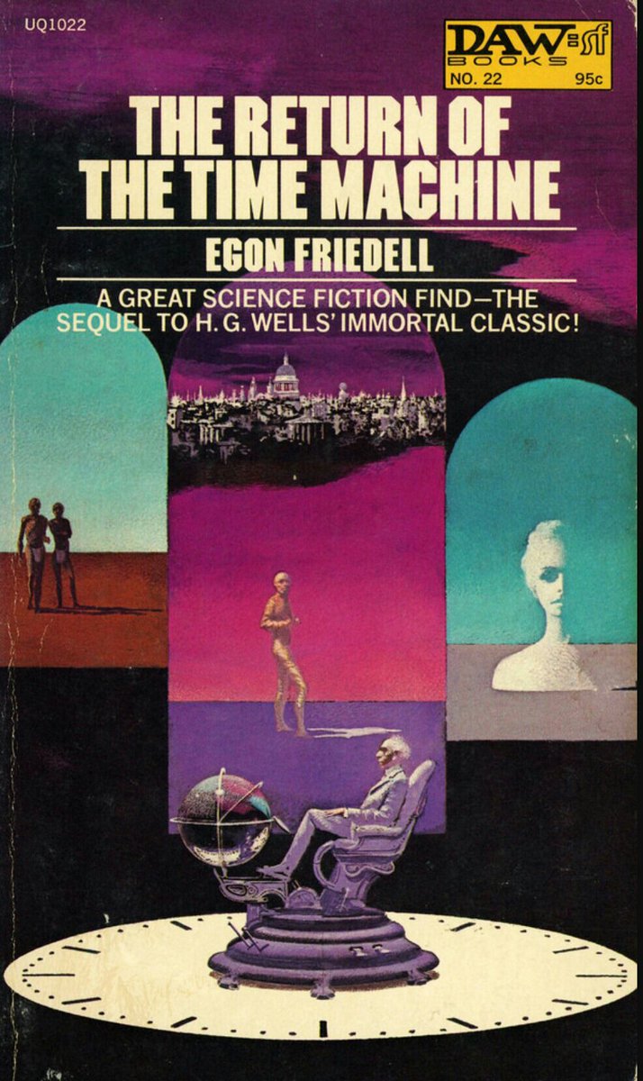
DAW book covers #Top20: The Return Of The Time Machine, by Egon Freidell (1972). Karel Thole's triptych is both elegant and evocative.
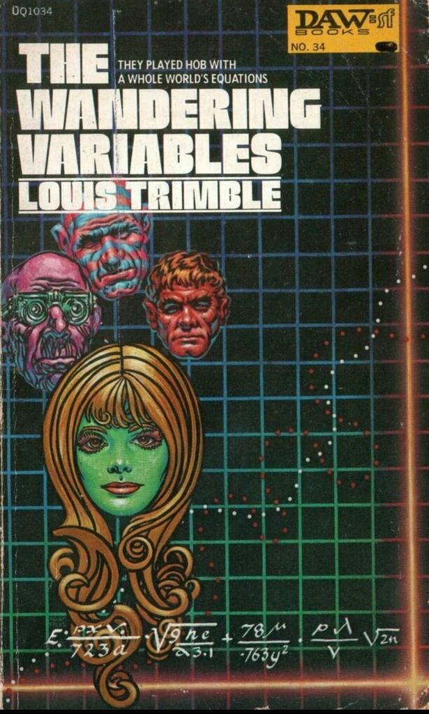
DAW book covers #Top20: The Wandering Variables, by Louis Trimble (1972). Frank Kelly Freas sums up the playful, curious nature of DAW #SF.
DAW book covers #Top20: The Tin Angel, by Ron Goulart (1973). Jack Gaughan nails it - funny, bizarre and effective.

DAW book covers #Top20: The Pritcher Mass, by Gordon R Dickson (1973). I just love the floating ferret head - art by Frank Kelly Freas.

DAW book covers #Top20: Flux, by Ron Goulart (1974). Jack Gaughan again, with a counterculture #hipster droid.

DAW book covers #Top20: Stress Pattern, by Neil Barrett Jr (1974). Josh Kirby with a bold and silly cover that could have been used for Dune.

DAW book covers #Top20: Swan Song, by Brian M Stableford (1975). Frank Kelly Freas drapes the stars over everything - quite lovely.

DAW book covers #Top20: The Year's Best Horror Stories: Series lll, edited by Richard Davis (1975). Michael Whelan's creepy eye-hand!

DAW book covers #Top20: Don't Bite The Sun, by Tanith Lee (1976). Brian Froud's artwork is spot-on for this book.

DAW book covers #Top20: The Sailor On The Seas Of Fate, by Michael Moorcock (1976). Michael Whelan's very buff Elric!

DAW book covers #Top20: Legends From The End Of Time, by Michael Moorcock (1977). I really like Bob Pepper's collage-style cover here.

DAW book covers #Top20: The Siege Of Wonder, by Mark S Geston (1977). H R Van Dongen brings a touch of Northern Renaissance to this cover.

DAW book covers #Top20: Calling Dr Patchwork, by Ron Goulart (1978). Josh Kirby's cover is simple, silly and very charming.

DAW book covers #Top20: To Keep The Ship, by A Bertram Chandler (1978). Another marvellous silly #SF cover, this time by H R Van Dongen.

DAW book covers #Top20: The Palace Of Love, by Jack Vance (1979). Gino D'Achille showing he doesn't know how bikini tops work!

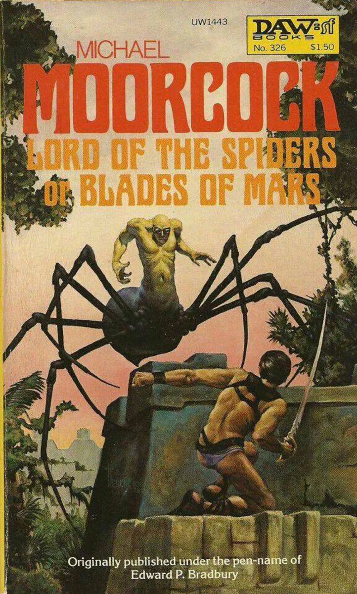
DAW book covers #Top20: Lord Of The Spiders or Blades Of Mars, by Michael Moorcock (1979). Richard Hescox's spider is very creepy!
DAW book covers #Top20: Kill The Dead, by Tanith Lee (1980). Don Maitz's cover is well balanced with just the right hint of goth.

DAW book covers #Top20: Lin Carter Presents The Year's Best Fantasy Stories: 6 (1980). A very simple but fun cover by Josh Kirby.

DAW book covers #Top20: Marune: Alastor 933, by Jack Vance (1981). David B Mattingly has great fun with the composition here.

DAW book covers #Top20: The Robot In The Closet, by Ron Goulart (1981). I love Josh Kirby's bulging eyed robo-pirate!

DAW book covers #Top20: The Dimensioneers, by Doris Piserchia (1982). Frank Kelly Freas returns to DAW with an elegant cloud cover.

DAW book covers #Top20: Karl Edward Wagner presents The Year's Best Horror Stories: Series X (1982). Michael Whelan steals the show again...

And that's it for my #Top20 DAW book covers ('72-'82). I hope you saw something you liked!

• • •
Missing some Tweet in this thread? You can try to
force a refresh