International comparisons of the mortality impact of the COVID19 pandemic are fraught with difficulty. Almost all of them are faulty in one or, more likely, several ways.
At yesterday’s briefing @CMOIreland presented the following chart (this is the best version I could find).
At yesterday’s briefing @CMOIreland presented the following chart (this is the best version I could find).
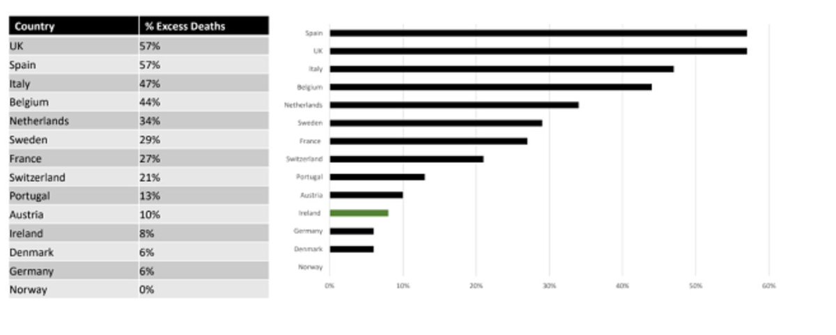
@CMOIreland Some of the statements given by @CMOIreland and the deputy CMO in relation to the chart are reported here, noting particularly the comments on Portugal:
thejournal.ie/excess-deaths-…
thejournal.ie/excess-deaths-…
@CMOIreland The purpose of this thread is not to argue that any particular figure or approach is “right” but to show that the comparison made by @CMOIreland is faulty: it is comparing apples with oranges.
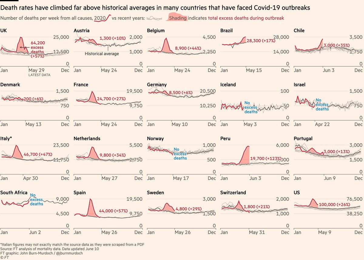
@CMOIreland It can be easily verified that the percentages in the chart and table used by @CMOIreland come from the June 10th update of @FT’s excess deaths tracker.
@CMOIreland @FT The discussion at the briefing gave particular attention to Portgual.
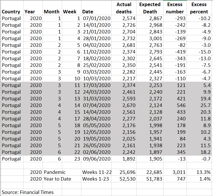
This extract from @FT's tracker shows the 13% figure used.
This extract from @FT's tracker shows the 13% figure used.

@CMOIreland @FT In a helpful move @FT have made the data they use available online.
Here are the 2020 figures @FT has for Portugal. They show that the 3,000 excess refers to the period from week 11 to week 22 and that this was 13% higher compared to the recent average for this period.
Here are the 2020 figures @FT has for Portugal. They show that the 3,000 excess refers to the period from week 11 to week 22 and that this was 13% higher compared to the recent average for this period.
@CMOIreland @FT Ireland is not included in @FT’s tracker so some figures are needed. It is not clear where the 8% figure used by @CMOIreland comes from.
However, it may be that it is based on an estimated of excess deaths since the start of the year rather than just during the pandemic period.
However, it may be that it is based on an estimated of excess deaths since the start of the year rather than just during the pandemic period.
@CMOIreland @FT As mentioned in previous threads, we can get figures to informally replicate @FT’s analysis using RIP.ie.
The equivalent weekly figures are shown in the following table:
The equivalent weekly figures are shown in the following table:
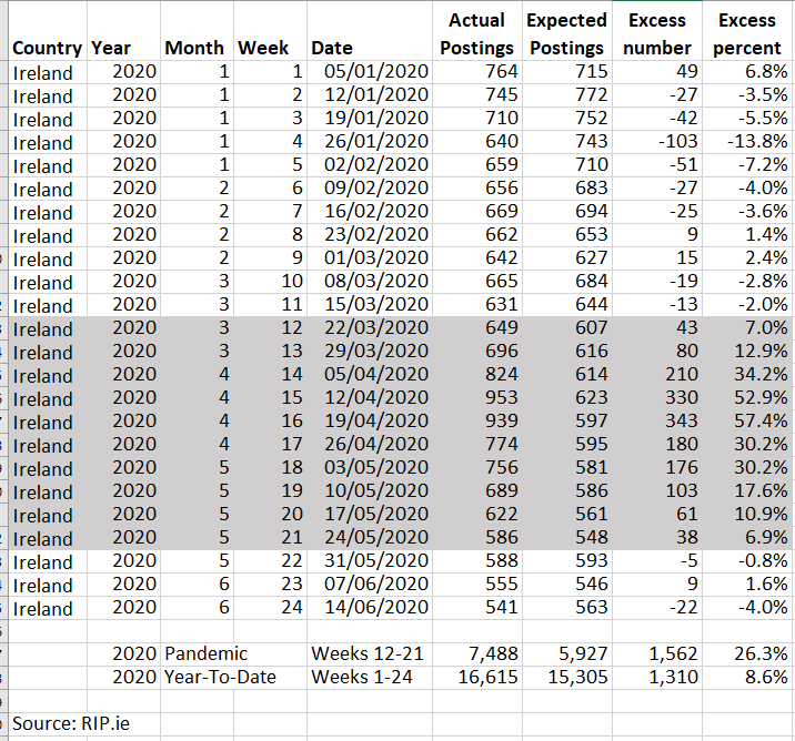
There has been c.8% more posts on RIP.ie in 2020 than might be expected.
But the percentages taken from @FT’s tracker by @CMOIreland is for the period of the pandemic.
For Ireland, this can be put at mid-March to mid-May and results in an excess of 27%.
But the percentages taken from @FT’s tracker by @CMOIreland is for the period of the pandemic.
For Ireland, this can be put at mid-March to mid-May and results in an excess of 27%.
It is not appropriate to compare an 8% figure for Ireland (excess since start of the year) to a 13% figure for Portugal (excess during the pandemic).
@FT’s 13% figure for Portugal (as well as those for other the countries) can be better compared to a 27% figure for Ireland.
@FT’s 13% figure for Portugal (as well as those for other the countries) can be better compared to a 27% figure for Ireland.
At the briefings, @CMOIreland has put significant weight on the euroMOMO.eu analysis of excess mortality. Ireland's figures come from @hpscireland.
But looking at the estimates from this would have triggered alarm bells for the chart used at yesterday’s briefing.
But looking at the estimates from this would have triggered alarm bells for the chart used at yesterday’s briefing.
@CMOIreland @hpscireland Here are the latest @euroMomo figures for Ireland and Portugal.
In particular, we look at week 14 which was close to the peak for excess mortality for both countries and not likely to be significant revised.
In particular, we look at week 14 which was close to the peak for excess mortality for both countries and not likely to be significant revised.
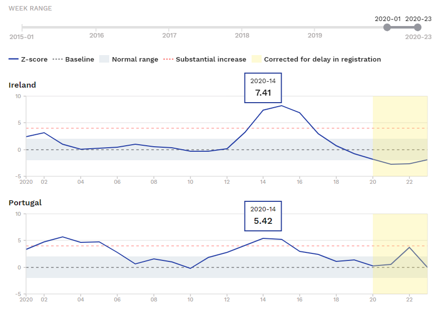
@CMOIreland @hpscireland @euroMomo The week 14 figure for Ireland is higher. And for both countries excess mortality has since fallen (though more recent figures are provisional).
The @euroMomo analysis is in line with our attempts to replicate
@FT's tracker using RIP.ie for Ireland.
The @euroMomo analysis is in line with our attempts to replicate
@FT's tracker using RIP.ie for Ireland.
@CMOIreland @hpscireland @euroMomo @FT This is not to say that any approach is "right" but that, at a minimum, any international comparison should be done on as close to a like-for-like basis as possible.
Putting an 8% figure into @FT's excess mortality tracker does not do that.
/end
Putting an 8% figure into @FT's excess mortality tracker does not do that.
/end