My Authors
Read all threads
I made a scatterplot comparing the change in coronavirus cases over the last two weeks to cooling degree days—a proxy for air conditioning use. (Thanks @jeremy_gibbs!) The hottest states have suffered the worst outbreaks.
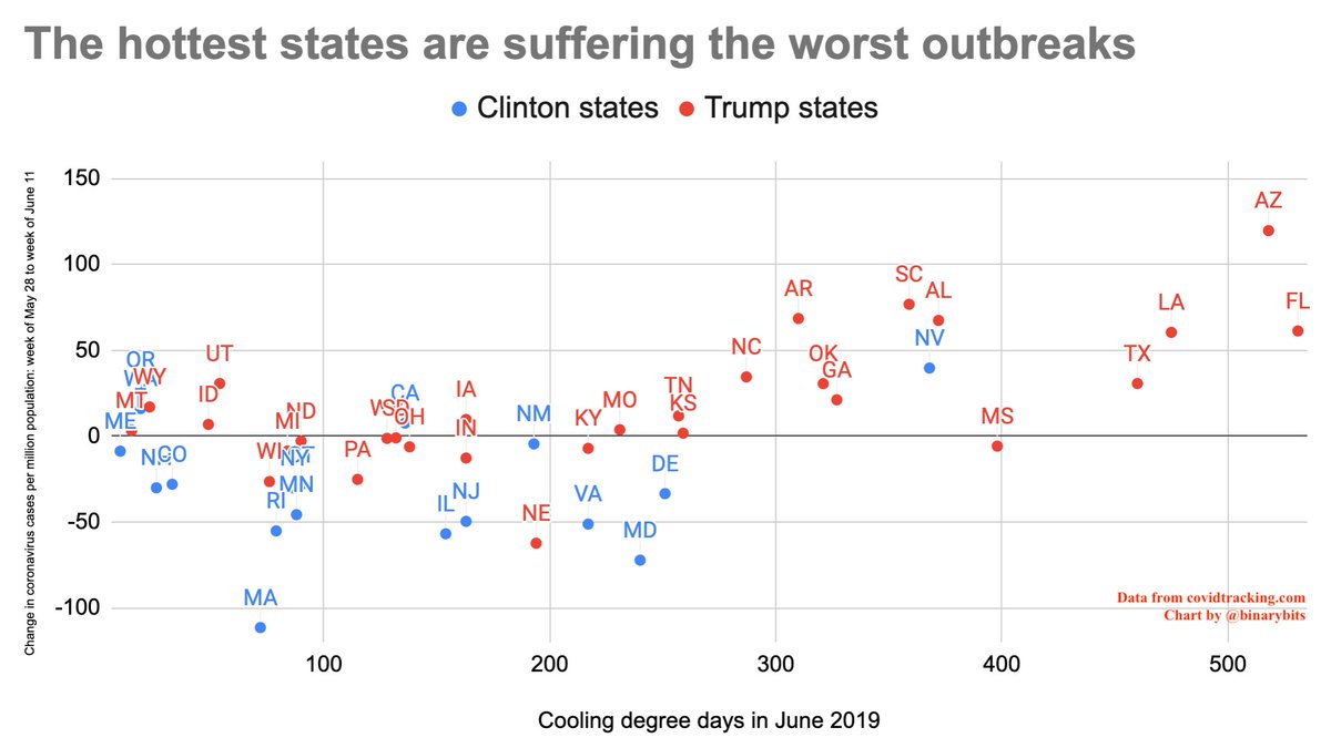
I think this effect explains a lot of the partisan divergence in this chart. The hottest states are all Republican. Still, at any given temperature Democratic states seem to doing modestly better, on average, than Republican states.
Lest you think the recent increase in southern states is an artifact of testing: a scatterplot of the positive coronavirus test rate shows a similar relationship. The hottest states are seeing coronavirus infections outstrip testing capacity.
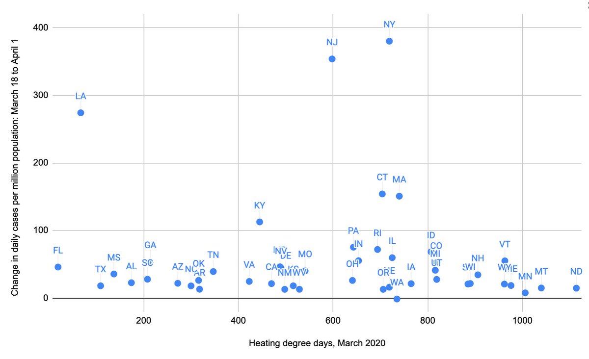
Made a quick and dirty scatterplot comparing late March covid increase to March heating degree days. No obvious relationship.
Missing some Tweet in this thread? You can try to force a refresh.

Keep Current with Timothy B. Lee

Profile picture

Stay in touch and get notified when new unrolls are available from this author!

Read all threads

This Thread may be Removed Anytime!

Twitter may remove this content at anytime, convert it as a PDF, save and print for later use!

Try unrolling a thread yourself!

how to unroll video

1) Follow Thread Reader App on Twitter so you can easily mention us!

2) Go to a Twitter thread (series of Tweets by the same owner) and mention us with a keyword "unroll" @threadreaderapp unroll

You can practice here first or read more on our help page!

Follow Us on Twitter!

Did Thread Reader help you today?

Support us! We are indie developers!


This site is made by just two indie developers on a laptop doing marketing, support and development! Read more about the story.

Become a Premium Member ($3.00/month or $30.00/year) and get exclusive features!

Become Premium

Too expensive? Make a small donation by buying us coffee ($5) or help with server cost ($10)

Donate via Paypal Become our Patreon

Thank you for your support!