🔃Case Study Thread- Nuggs
How Nuggs went from 0$ to m$ in just a year selling vegan nuggets with an INSANE branding & Marketing strategy.
Let's study their Brand, marketing strategy, Website/CRO, and their ad creatives.
👇Mega Thread👇
How Nuggs went from 0$ to m$ in just a year selling vegan nuggets with an INSANE branding & Marketing strategy.
Let's study their Brand, marketing strategy, Website/CRO, and their ad creatives.
👇Mega Thread👇

Some facts about Nuggs:
- The brand was created just a year ago and already has a great success.
- Their marketing strategy and branding are incredible.
- CEO is a 20 years guy who sold a company at 18.
- The product is far from being perfect
- 100% DTC & going on stores soon.
- The brand was created just a year ago and already has a great success.
- Their marketing strategy and branding are incredible.
- CEO is a 20 years guy who sold a company at 18.
- The product is far from being perfect
- 100% DTC & going on stores soon.
1. What is Nuggs ?
Nuggs is a DTC brand that sells vegan nuggets.
Their nuggets are gluten-free unlike of their competitors , and contain more proteins and fewer calories than regular nuggets.
ps: I don't care about their nuggets, I am just interested in the business side.
Nuggs is a DTC brand that sells vegan nuggets.
Their nuggets are gluten-free unlike of their competitors , and contain more proteins and fewer calories than regular nuggets.
ps: I don't care about their nuggets, I am just interested in the business side.

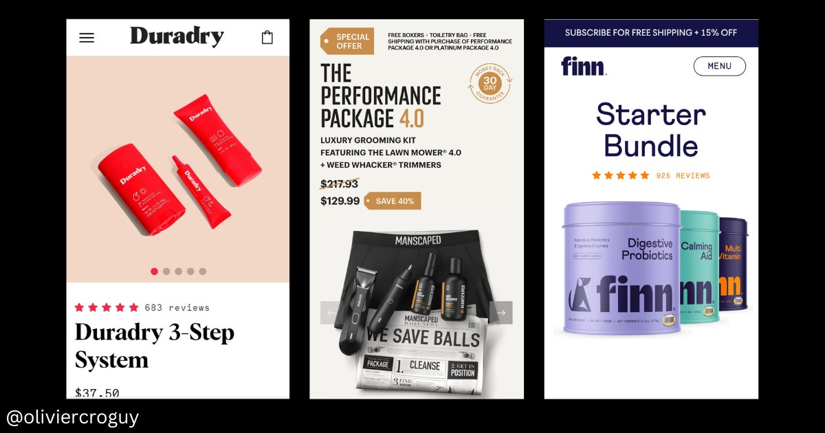
➡️Nuggs vs competitors
Unlike other vegan brands, they don't market themselves as a brand that sells products exclusively for vegans. They target everyone.
They don't want to be seen as "a vegan alternative to chicken nuggets", they want to be seen as the best nuggets.
Unlike other vegan brands, they don't market themselves as a brand that sells products exclusively for vegans. They target everyone.
They don't want to be seen as "a vegan alternative to chicken nuggets", they want to be seen as the best nuggets.

➡️Very unique branding
I can't really define precisely Nuggs personality precisely but I would say it's a mix between fun, memes, innovation, and "tech startup".
I invite you to check their website and Instagram to have a better idea.
I can't really define precisely Nuggs personality precisely but I would say it's a mix between fun, memes, innovation, and "tech startup".
I invite you to check their website and Instagram to have a better idea.
➡️Humor / fun / Tesla comparison
- "The Tesla of Chicken"
- "Nuggs vs NASA"
- "Send Nudes/Nuggs"
- 10 000$ offer "you don't need this"
- Check their Instagram also, lot of memes (i will talk about it later).
- "The Tesla of Chicken"
- "Nuggs vs NASA"
- "Send Nudes/Nuggs"
- 10 000$ offer "you don't need this"
- Check their Instagram also, lot of memes (i will talk about it later).

➡️Innovation/tech
They use a lot of "tech" and "innovation" vocabulary like tech startups do and Saas.
They emphasize a lot the fact that they are a "technology" company, not a regular food company.
-"Advanced technology"
-"Hyper-realistic simulation"
-"2.0"
-"Engineered"
They use a lot of "tech" and "innovation" vocabulary like tech startups do and Saas.
They emphasize a lot the fact that they are a "technology" company, not a regular food company.
-"Advanced technology"
-"Hyper-realistic simulation"
-"2.0"
-"Engineered"

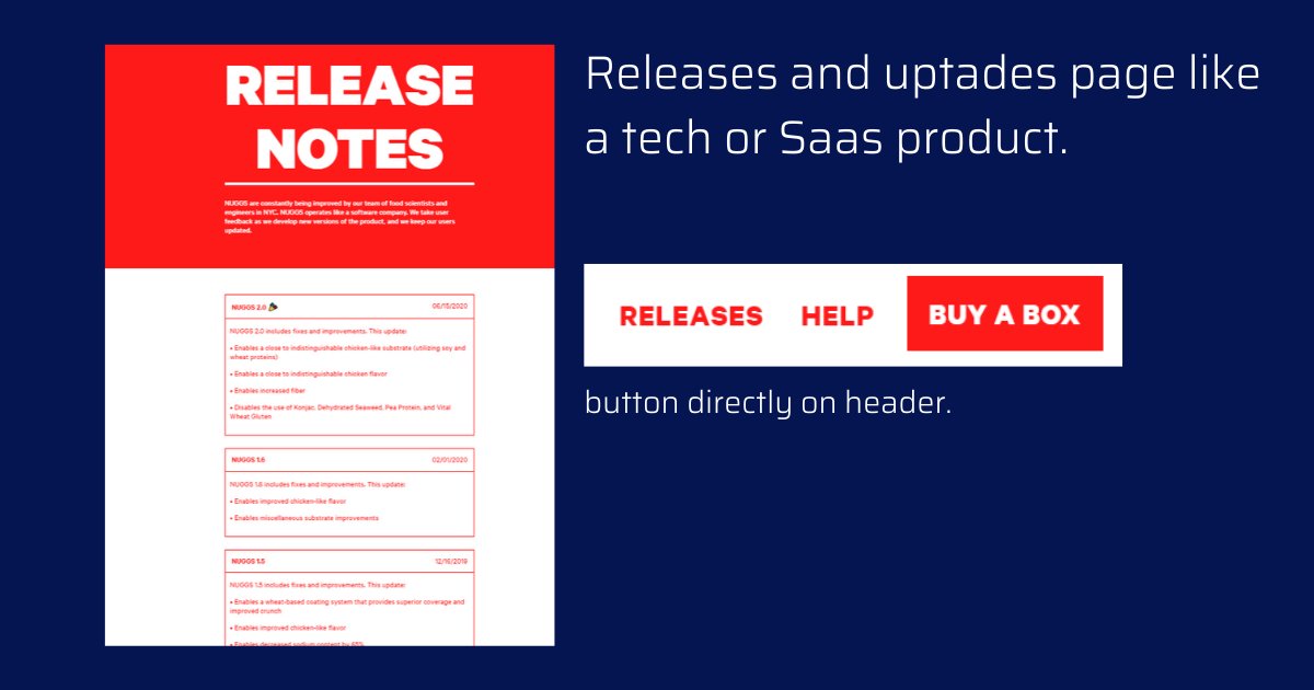
They even have a releases/updates page like Saas/tech companies do.
It's also a way to show that it's not the final version of the product, that it gets better, and it pushes people to order again.
Funny to see people every single version of nuggs even if they don't like it
It's also a way to show that it's not the final version of the product, that it gets better, and it pushes people to order again.
Funny to see people every single version of nuggs even if they don't like it
2 - The website and conversion rate optimization.
Their website is incredibly well branded (text/visuals), smooth, and optimized for conversion.
Nothing crazy in terms of CRO, but works well.
Go visit their website. I am sure you will find some inspiration.
Their website is incredibly well branded (text/visuals), smooth, and optimized for conversion.
Nothing crazy in terms of CRO, but works well.
Go visit their website. I am sure you will find some inspiration.
➡️"Try it out" over "Buy now" button
"Try it out" suggest a new and unique experience, something never done before.
It makes people more curious about testing the product.
Same as Magicspoon if you remember.
"Try it out" suggest a new and unique experience, something never done before.
It makes people more curious about testing the product.
Same as Magicspoon if you remember.

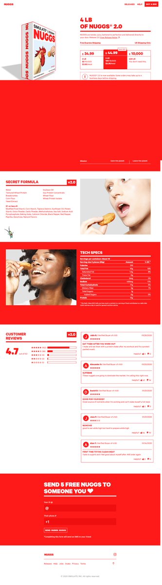
➡️Split price pricing strategy + Discount.
People are more likely to take the 44.99$ offer because it seems much more valuable compare to the first one.
Why?
-Color contrast in red + bigger square
-The offer seems more valuable with the discount + price divided into "/meals"
People are more likely to take the 44.99$ offer because it seems much more valuable compare to the first one.
Why?
-Color contrast in red + bigger square
-The offer seems more valuable with the discount + price divided into "/meals"

➡️Sicky "Buy now" button on the product page to direct checkout.
It's nothing crazy of course, but I think it is just very nicely done.
It's impossible to miss the CTA with the color contrast and the way it's displayed"
Very nicely done on mobile too.
It's nothing crazy of course, but I think it is just very nicely done.
It's impossible to miss the CTA with the color contrast and the way it's displayed"
Very nicely done on mobile too.

➡️Classic but powerful product page structure (AIDA).
1 - Most valuable information at the firsts seconds: Price, discount, cta, Free US shipping in bold.
2 - Features + competitors comparison + "the secret formula"
3 - Tech specs
4- Reviews
5- CTA clickable at any moment
1 - Most valuable information at the firsts seconds: Price, discount, cta, Free US shipping in bold.
2 - Features + competitors comparison + "the secret formula"
3 - Tech specs
4- Reviews
5- CTA clickable at any moment
3 - Social media marketing strategy
➡️Paid influencers and organic videos on Youtube.
They mostly work with Youtube influencers.
Vegans and also non-vegans.
➡️Paid influencers and organic videos on Youtube.
They mostly work with Youtube influencers.
Vegans and also non-vegans.

➡️ Branded content and memes/viral on Instagram.
Their engagement on Instagram is absolutely insane.
Sometimes 6k likes (reals) for 52k Followers.
They do it only by posting branded memes and funny posts.
I believe they hired someone just for creating& posting memes on insta
Their engagement on Instagram is absolutely insane.
Sometimes 6k likes (reals) for 52k Followers.
They do it only by posting branded memes and funny posts.
I believe they hired someone just for creating& posting memes on insta

➡️Very active community on Instagram posting a lot of content (ucg)
They also have a very active community of people posting a lot of videos of themselves eating nuggs.
-A lot of UCG content
-Organic traffic.
They also have a very active community of people posting a lot of videos of themselves eating nuggs.
-A lot of UCG content
-Organic traffic.

➡️They are also active on Tik Tok (i download twitter just for this)
I am not going to really comment on anything since I know nothing about this social media.
12.5k subscribers, 476K likes.
I don't really know how it's possible but this video got 4.3M views and 458k likes.
I am not going to really comment on anything since I know nothing about this social media.
12.5k subscribers, 476K likes.
I don't really know how it's possible but this video got 4.3M views and 458k likes.
4 - Ads and creatives
I don't think a huge part of their traffic comes from Facebook ads but anyway, their creatives are really great.
I don't think a huge part of their traffic comes from Facebook ads but anyway, their creatives are really great.
AD 1 : This ad made me discover the brand.
-Catches the attention at first seconds because unusual
-Epic music, suggests a "new experience"
-good color contrast, and vocabulary like "perfectly crisp" "amazingly juicy"
-The ad generates curiosity, interest, and it's absurd
-Catches the attention at first seconds because unusual
-Epic music, suggests a "new experience"
-good color contrast, and vocabulary like "perfectly crisp" "amazingly juicy"
-The ad generates curiosity, interest, and it's absurd
AD 2: Same as the AD 1 but with different music styles and different purposes.
This ad is probably retargeting people who already bought nuggs before.
It introduces the "V.2"
This ad is probably retargeting people who already bought nuggs before.
It introduces the "V.2"
AD 3: The social proof UCG ad.
This one is targeting only vegans.
-Catches the attention at the first seconds "sorry to my vegan community"
-Nice and dynamic montage (video & audio)
-Social proof
This one is targeting only vegans.
-Catches the attention at the first seconds "sorry to my vegan community"
-Nice and dynamic montage (video & audio)
-Social proof
AD 3: Great Retargeting ad.
I am adding this one because I think a very good example of a retargeting ad that gets people to take action.
It makes the buying/shipping process look easy, fast, and painless. Same for the nuggs preparation.
I am adding this one because I think a very good example of a retargeting ad that gets people to take action.
It makes the buying/shipping process look easy, fast, and painless. Same for the nuggs preparation.
That's it for Nuggs !
If you enjoyed it perhaps like or retweet the thread🙏🔃
Let me know if you have any questions/suggestions.
If you enjoyed it perhaps like or retweet the thread🙏🔃
Let me know if you have any questions/suggestions.
@edortizv What do you think about this pricing strategy ? 🙏
Thanks @social_savannah I found this ad on your Facebook group !
• • •
Missing some Tweet in this thread? You can try to
force a refresh